
Now that customer success is the focus of the Universal GUI, we can prioritize User Experience too.
This blog is the first step, introducing quick win UI Styling updates that require no Model changes or changes in User Experience. Later, we'll introduce and discuss Data Density improvements and more comprehensive UX & Universal Theme implementations.
In the past years a lot of features have been added to the Universal GUI, but in the meantime the visual side of this interface hasn’t changed a lot. Comparing our Universal GUI to other enterprise applications, we do notice that our interface lacks a little conviction. We want to improve on this together with you, to ensure that our ideas support you and your users. So please, join in the conversation and let us know what you think.
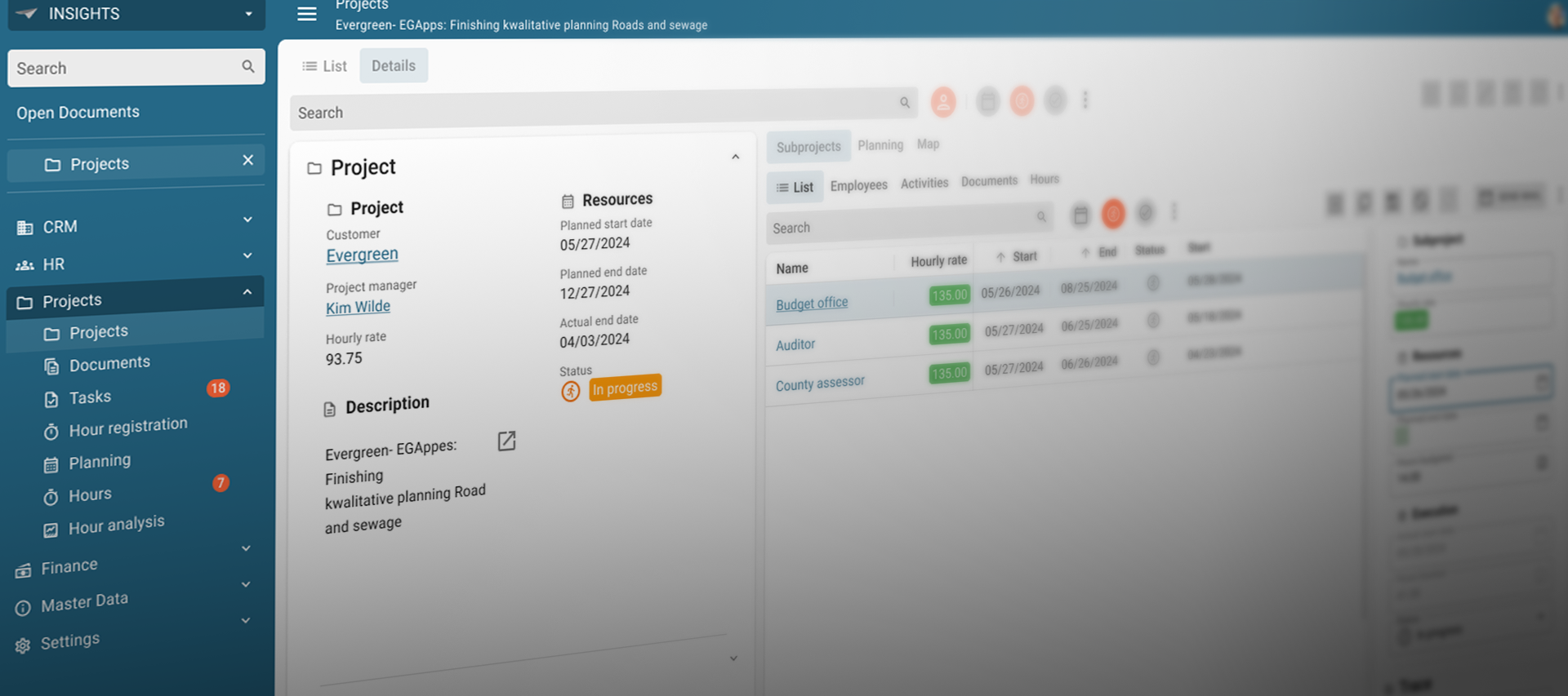
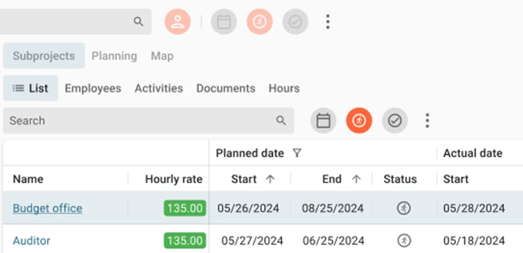
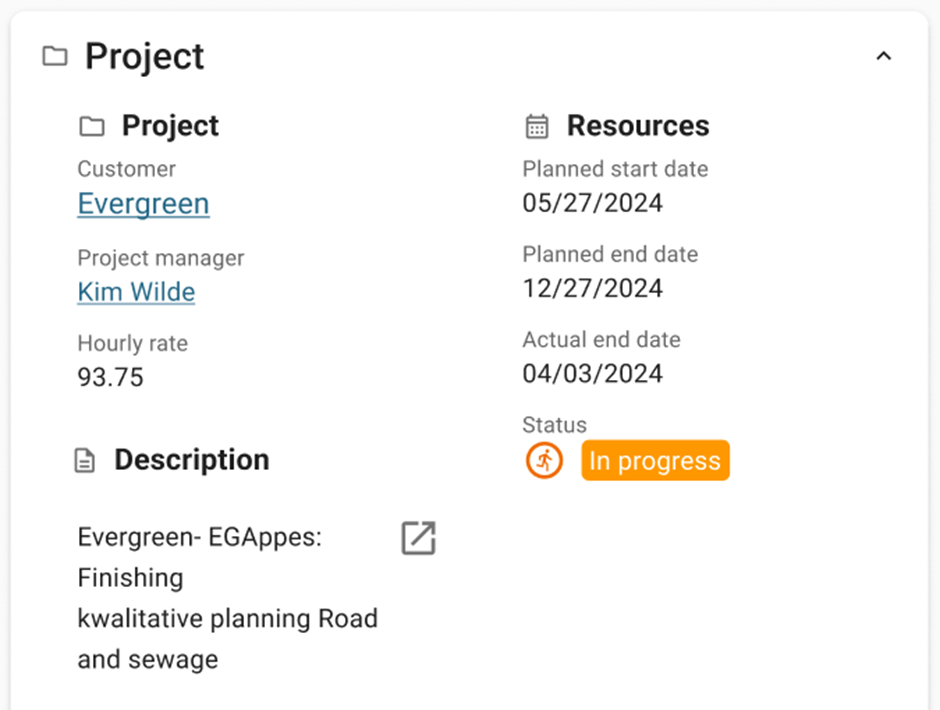
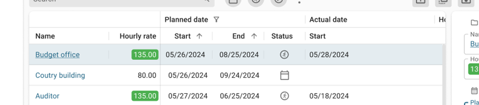
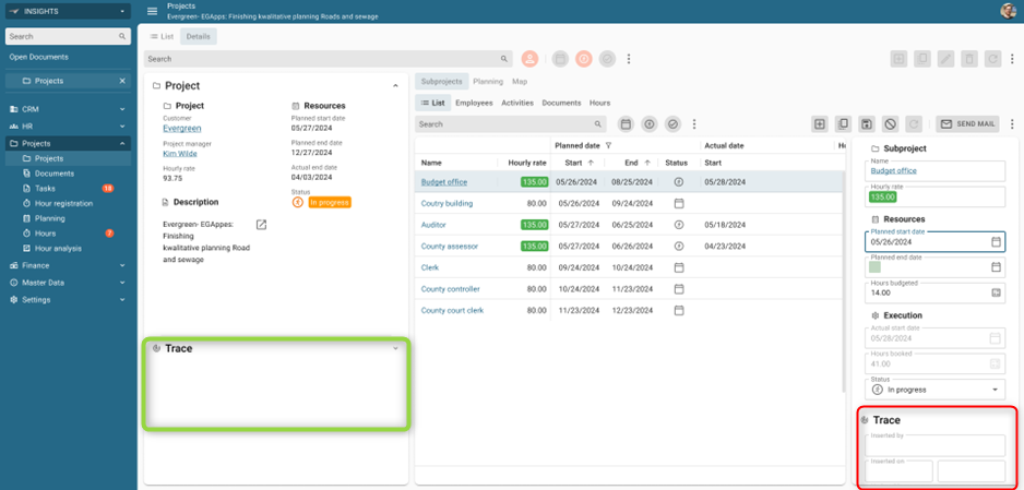
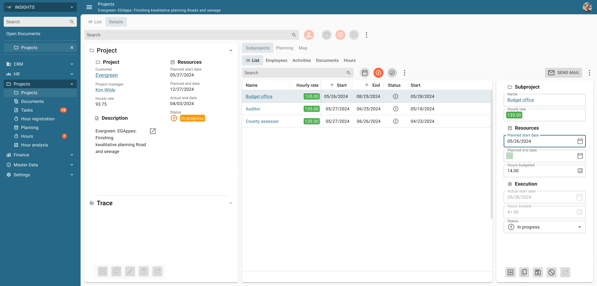
We took the Insights application as a benchmark.
There is a lot going on in this screen, which means our users have a lot of elements to visually look through.
We think we can do better.
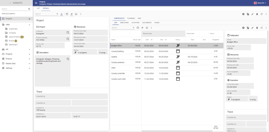
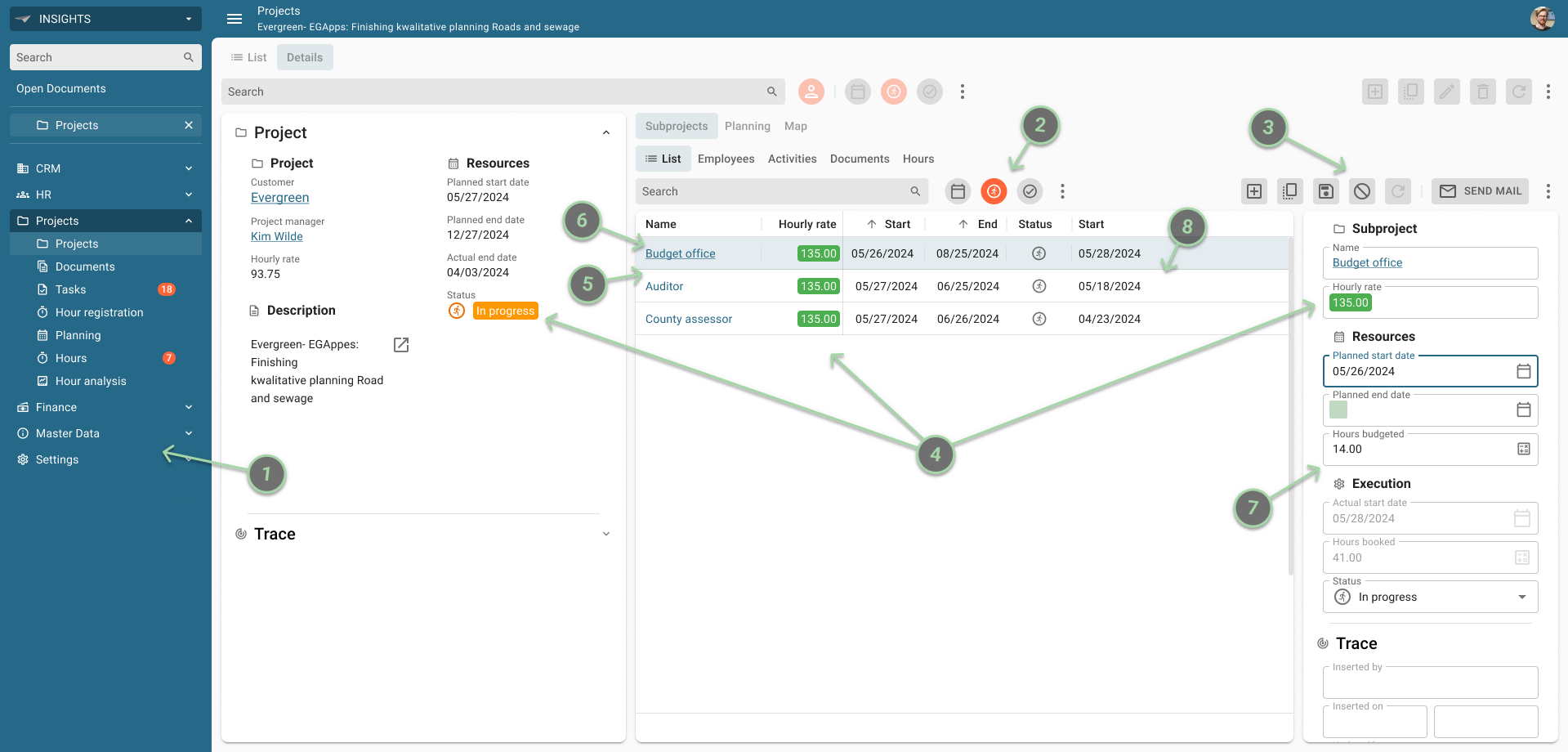
Based on the Material UI components and the 10 Usability Heuristics we altered the UI styling, bringing us to the following design:
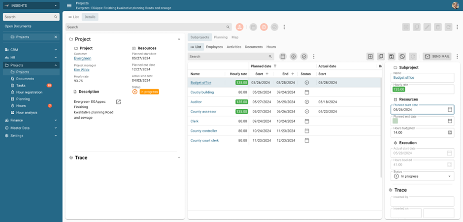
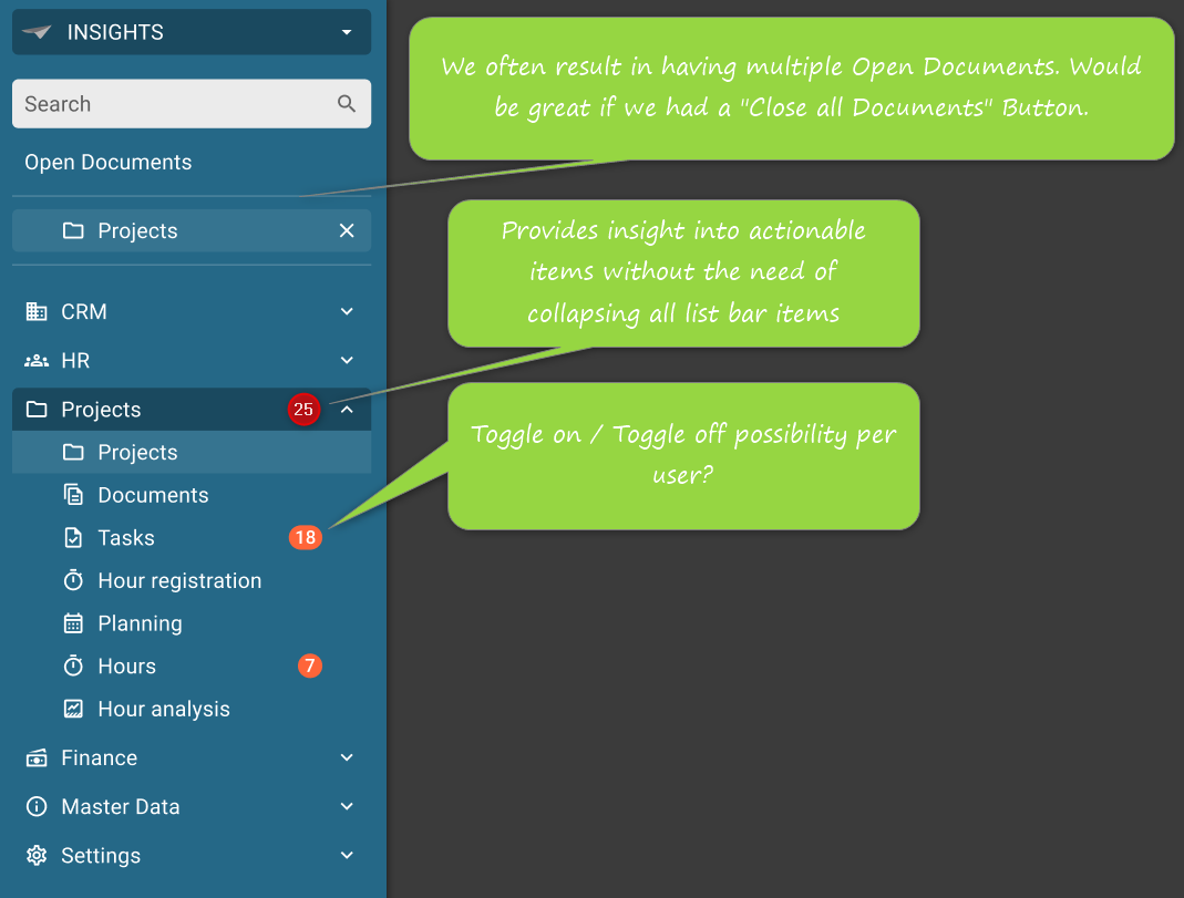
This is the same Projects screen in the Insights application, with only visual alterations. Let us take you through it, so you know what is going on.
-
Menu
Currently, the background color in the menu has the same color as the general background of the rest of the application, which can distract the user in their navigation through an application.
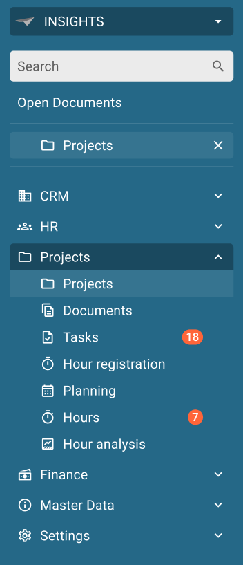
We want to introduce the primary color as background of the menu.
This provides a better visual hierarchy and helps the user focus on the data. With this change, we also introduce a lot more color in the application.
We also want to change the alignment of the Open Documents (aligned with the submenu items) and the badges in the menu (make them stick to the right).
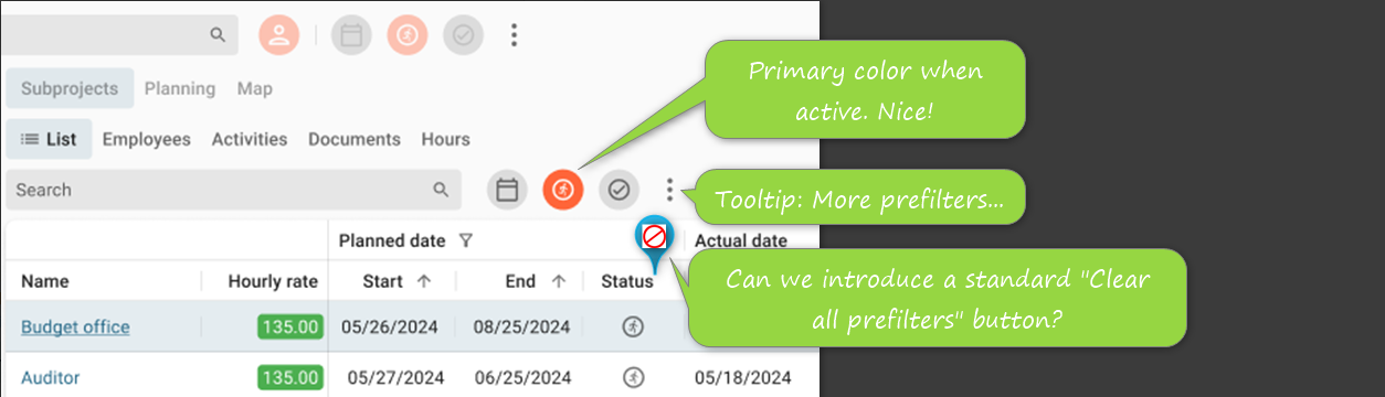
- Prefilter buttons
The current setup of the Prefilter buttons is based on an icon, with a primary-colored underline when the prefilter is active.
Like you, we think this can improved by making the Prefilter button a more distinctive button, by introducing a solid background in a round shape.
When the prefilter is active, the background could get the primary color or secondary color.
Which do you prefer, the primary or the secondary color for active prefilter?
-
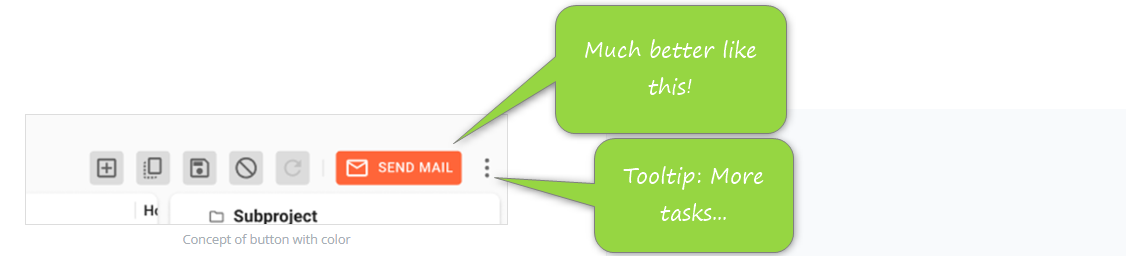
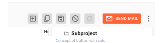
CRUD and Task/Report buttons
Like with the prefilters, we introduce a solid background for the CRUD and Task/Report buttons.
By making these button backgrounds square, they are better distinguishable against the round prefilter buttons.
Also, we would like to know what your stance is on introducing the primary/secondary color to the Task buttons to make it a clear Call To Action button.
What do you think of introducing the primary or secondary color to the CRUD and Task/Report buttons?
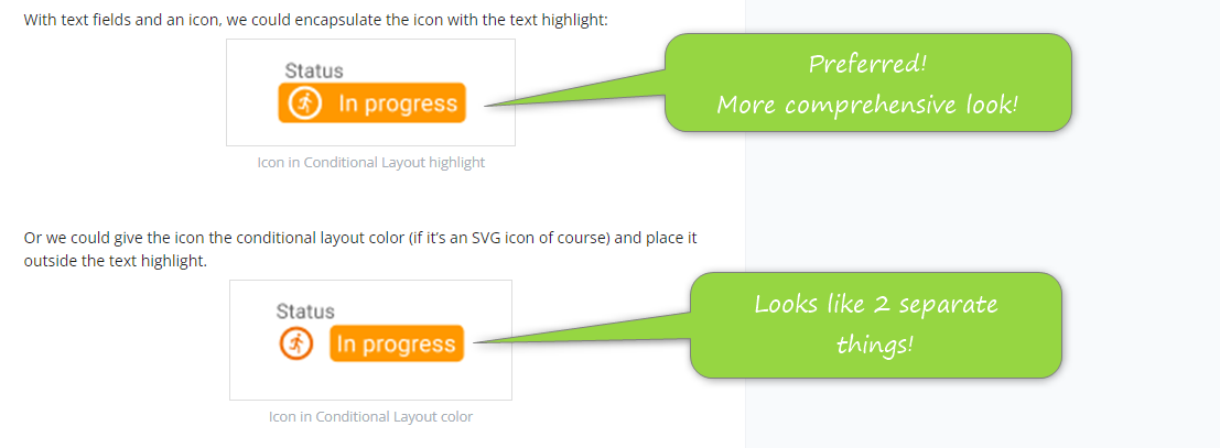
- Conditional layout
The current setup of the Conditional layout colors the entire cell. We want to improve on this visual cue, highlighting the text only.
With text fields and an icon, we could encapsulate the icon with the text highlight:

Or we could give the icon the conditional layout color (if it’s an SVG icon of course) and place it outside the text highlight.

Which one do you prefer?
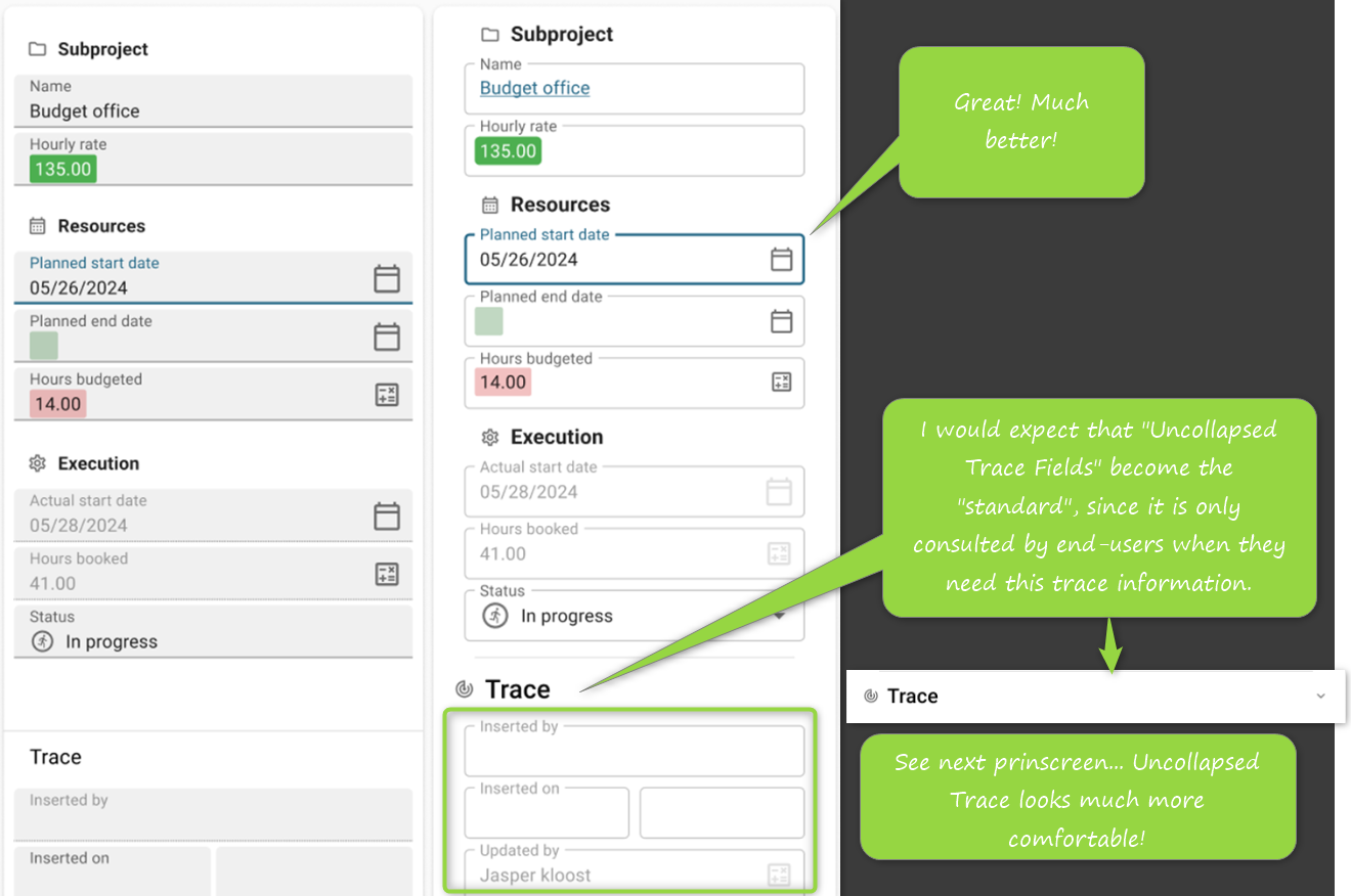
- Lookup control
Especially in read-only Grids, the lookup control needs a little love.
To make the Universal GUI more consistent with other controls like the email, map, URL or phone number control, we want to change the current lookup control into a hyperlink. This way we follow behavior the users expect from other platforms.
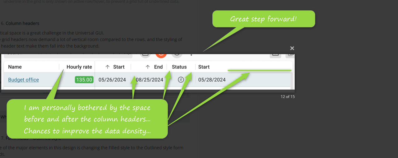
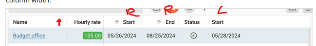
- Column headers
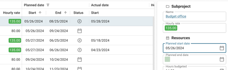
Vertical space is a great challenge in the Universal GUI.
The grid headers now demand a lot of vertical room compared to the rows, and the styling of the header text make them fall into the background.
In this design, we want to introduce a lower header bar and a bold font style. Subtle vertical dividers between the columns in the header and the active row are also added to emphasize column width.
What do you think of this Column headers design?
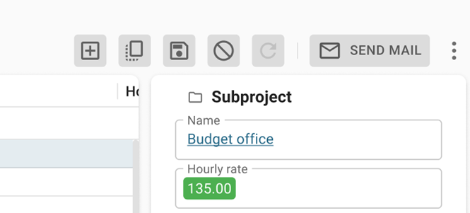
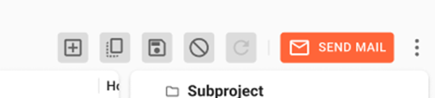
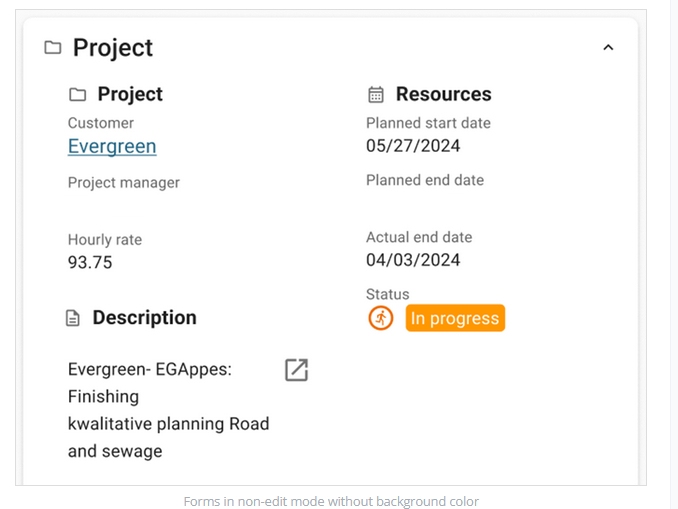
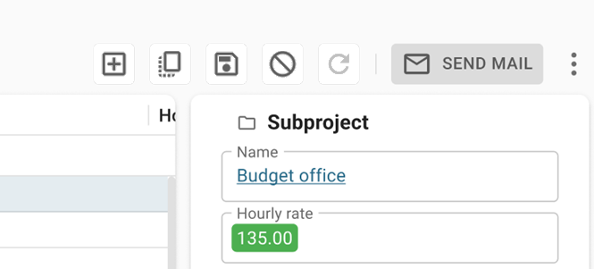
- Form fields – Outlined style
One of the major elements in this design is changing the Filled style to the Outlined style form fields.
We think the Outlined style holds a lot of answers for data density, control alignment, conditional formatting, visual hierarchy, focus indication, etcetera.
To give you an impression, we put the current Filled style next to an Outline style setup. The field content and setup are the same.
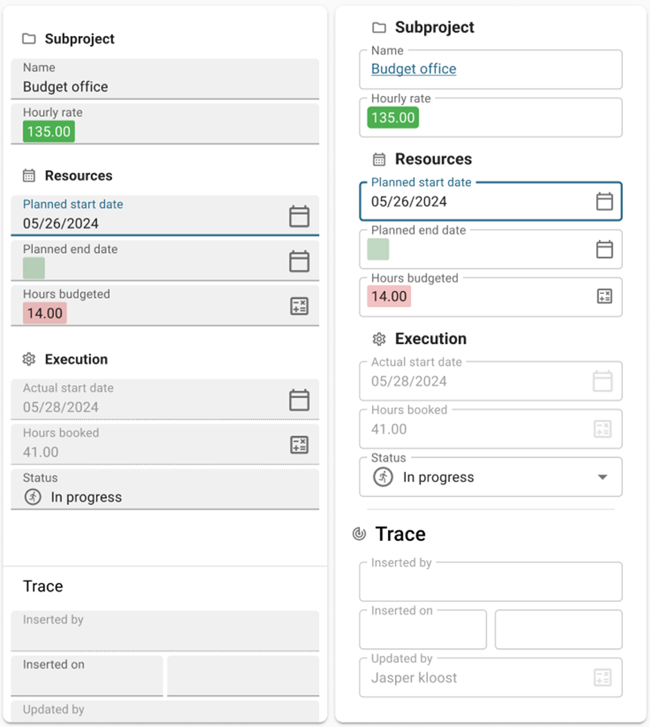
Because this will be a major change, this is not exactly a ‘quick win’. We want to get rid of the Form field background color setting and implement this idea. This also means that forms in non-edit mode have no background nor outline.
What do you think of the Outlined Style for Form fields replacement?
- Active row color
Universal uses grayscales to draw the attention of the user, we think that color is a better guidance and looks nicer.
While using a hint of the primary color (a pass through of 12% to be precise), the active row would stick out a lot more.
What do you think of coloring the active row?
Conclusion
As stated in the intro, these Design changes are predominantly focused on visual changes. They will have an impact on how the Universal GUI looks and feels, but not on its behavior.
To react to the designs, use the number of the subject and place your comment next to it, so we know which subject you are referring to.
We look forward to your opinions!


