Have separate icon for a filter when Active and when Inactive (on/off)

Related products: Software Factory Intelligent Application Manager Universal GUI Indicium Service Tier

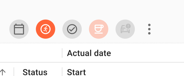
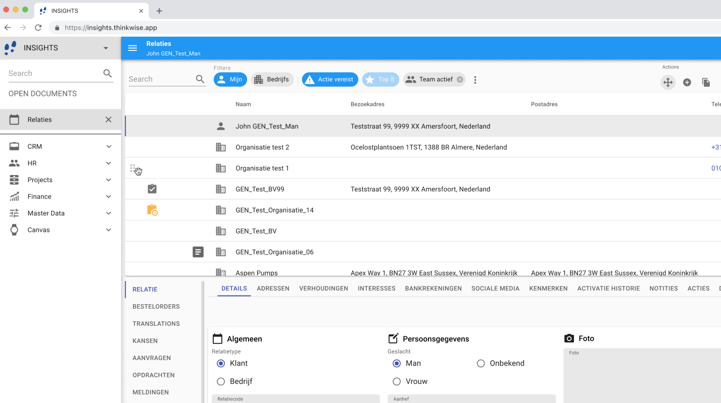
Goal is to have a separate icon defined for a filter when Active and a different one for Inactive.


We came to a situation where we need to have a filter icon more visible towards when active or inactive. Currently the only separation between the 2 states is the underscore under the icon itself.

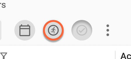
The idea is to be able to define the icon for Active like


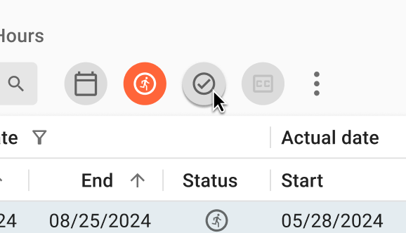
and when Inactive like

We can use icons of opposite state for defining the Active and Inactive state.

Hi @mperrott  looks like we have the same idea. I posted Styling active pre-filters with different icon earlier and have 1 upvote which makes this the best idea :-D


Hi Jaap,

I would have voted yours but I missed it, end goal is the same so it needs to be merged :)

Thanks


The following idea has been merged into this idea:

All the votes have been transferred into this idea.
Updated idea status NewOpen

Hi @Mark Jongeling, 15 updates 😉 Yes!
Is it possible to post an status update about this open idea?


Not much to tell I think, it's not yet on the backlog but seeing the amount of votes, I'm sure this will be on there in some time. The idea first has to be thought out well and implemented by multiple teams, so the Universal GUI team also needs to have time for this :wink:

At first glance, the Software Factory implementation is quite simple as you would only have to upload another icon for it. For the GUI on the other hand, it might be challenging but to be honest, I'm not the guy that can judge the implementation in the Universal GUI :sweat_smile:  Keep the votes coming!


PI is working on Icons in database | Thinkwise Community (thinkwisesoftware.com) right now. I thought maybe it can be combined with each other :yum:  


Basically this is an essential feature the Universal GUI must have and will be used everywhere. A similar functionality like ticking a checkbox and enabling/disabling (activating/deactivating)something.


@Jaap van Beusekom, Correct, we are working on that and we hope to have the idea implemented by 2021.3 but we are also working on other features which have more priority over the Icons in database idea. I understand combining them looks like a good idea, but considering the complexity of the idea, it's not desirable to combine these ideas and implement them both.

(I actually started working on that Icon idea :wink:  but it is quite a big change and has a lot of impact that we likely will implement over multiple versions; this also to limit the impact of the 2021.3 version)


@Spyros.Neofytou, I understand this idea is great and I also think it should be implemented, but it's also important to prioritize all features and ideas to be implemented. The most I can do right now is passing on that this idea is very much desired by our Community, should be looked at, and considered to be implemented.


Updated idea status OpenOn the backlog

“You can lead a horse to water, but you can't make him drink”


I’d like to see this added 👍


@mperrott How about actually displaying the Pre-filter icons with sort of a Toggle in the background/around it that more clearly shows whether it is active or not? Then also the UX should look like toggling when clicking a Pre-filter. Would it in that case suffice to have a single icon?

I know @Bart Metselaar does have some ideas about this. We also raised a TCP this week to request a better distinction between Pre-filter icons and Tasks displayed as Icon.


@mperrott@Jaap van Beusekom and @Arie V, I want to share an idea with you where I'm working on as a solution for the prefilters in the Universal GUI.

The use of a switch has crossed our minds, but has some challenges

  • Where to put them visually (under the icon, when the prefilters are shown in a horizontal manner? Or on the left/right? But then, how will a user know which switch belongs to which prefilter button? And how will we show them when the prefilters are aligned vertically?)
    • The necessary space for an added switch will be a discussion of itself
  • Disabled prefilters can be visually difficult to differentiate
  • When a lot of prefilters are shown next to each other, there will also be a lot of switches. These switches will visually become an object of themselves, distracting the user of the function of the prefilters next to them:


So, I think this feature needs a different approach alltogether.

I am thinking about introducing Chips as the vessel to show a prefilter.

I made a quick example on how this could look like:

In my opinion, there are a lot of benefits (and challenges!) when using chips;

  • On/off is distinctly more obvious thanks to the whole chip getting colorized
    • Active/not active is shown with the primary color
    • Disabled state is more prominent
  • Default active filters which are not able to be switched of by the user (in this example: Top 8 filter)
  • User defined filters are a more distinct option, which can also be deleted (in this example ‘Team actief’)

And, with this Chip component, we can show this element in other components as well, like the Pivot Grid (where there are some differences in the chip functionally, like being able to be dragged, and the delete button doesn't delete the filter, but removes it from the filter dimension) but the idea stays the same. 

In this example, 2 prefilters are shown in a Pivot Grid. One of them is active:


However, like I said, there are some drawbacks, which I need your opinion on:

  • Larger object than current prefilters
    • The objects take a lot more horizontal space
    • There are screens with more than 10 prefilters, how can we cope with these situations?
      • Use on touch interfaces will become an extra challenge
  •  More color in the screen
    • Can distract the user
    • Big difference compared to current solution
  • How will we show prefilters in Chips when the buttons are vertically aligned?
    • We want to prevent vertically aligned text, as it is more difficult to read

I would love to hear your opinions, and as stated before, these are ideas, not designs yet. 


@Bart Metselaar thanks for sharing your ideas, let’s iterate on this as both options don’t feel ideal just yet.

Why do you show the prefilter name with the Chips? Would love to see that design without the name included, so only as background color for the icon. Could you share something like that?

  • Chips with icon only  would not cost additional space
  • Chips with icon only reduces the additional color in the screen
  • Chips with icon only don’t have a vertical display issue

For me it’s perfectly fine to see the Prefilter name only on hover over and in the overflow menu.

Agree with @Arie V , the proposed Chips are not a winner in my opinion. 

Although I don't know how ecstatically it will turn out.. can't you play with the visual height (raised vs flat) of the icon/button of the pre-filter?