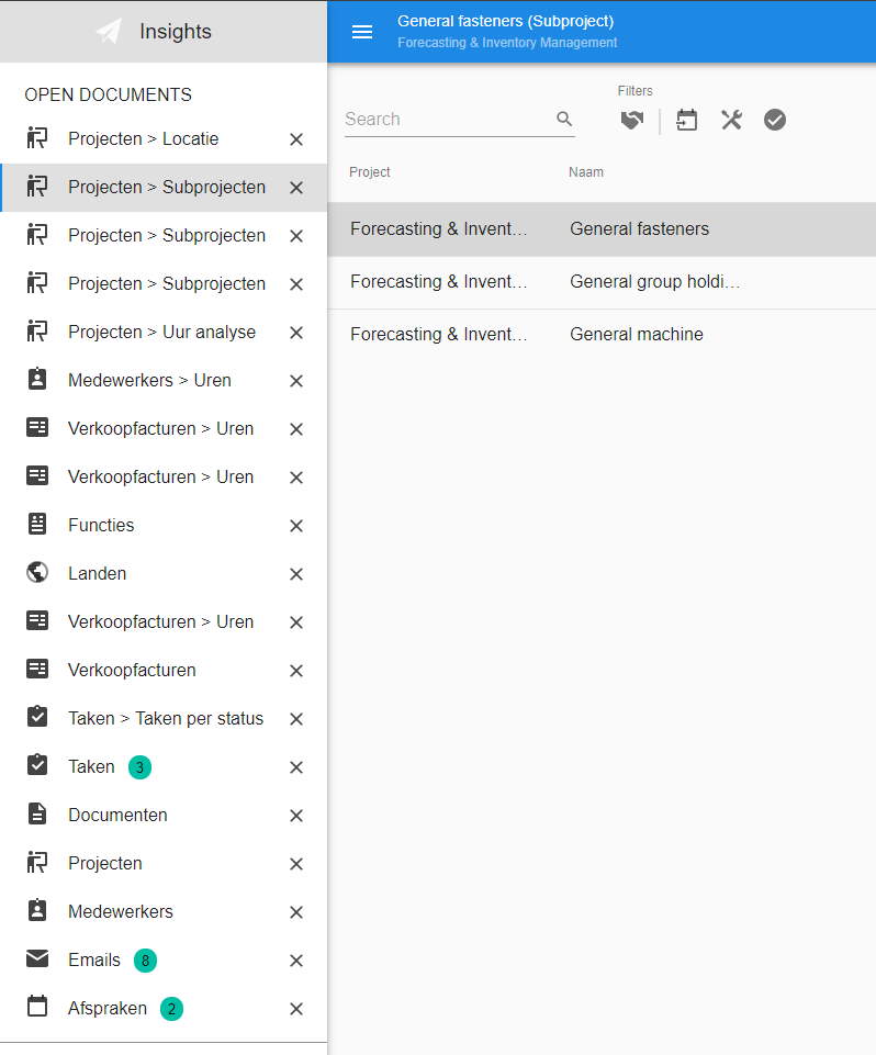
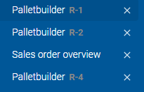
In the universal GUI opening (a lot of) documents can make the navigation panel cluttered and even push the menu out of sight:


Some suggestions to improve this:


  • Split the navigation panel in two panels with seperate vertical scroll-bars as soon as the number of open documents exceeds a certain treshold
  • Add levels for detail-documents beneath open documents and collaps them the same as the menu tree with (automatic) collapsing and expanding
  • Add context (part of the breadcrumb) to the title or mouse-over of detail-documents to prevent having to open a document to see wich one is the right one

Another suggestion:


  • An option to lock an open document, so that it is available the next time I login to the application
Hi JeanPaul,


Thank you for your suggestions. That's a lot of open documents!


A few notes as we've delved into this before with our UI/UX experts.


The shared scrollbar between the open documents and the menu is intended to help usability when using a mobile device. We don't want the user user to feel like he's scrolling in the 'wrong' part of the menu or that he has to aim for the lower scroll region. The treshhold where a scrollbar would be introduced for open documents would also be a bit arbitrary.


Grouping zoomed detail documents under their parent document was something that was considered but this was deemed not an option as the parent document can be closed at any time. When the parent document is closed, the zoomed detail documents will remain open.


Allowing the user to collapse the open documents might be a good solution for your scenario. Would this be a good solution in your opinion?


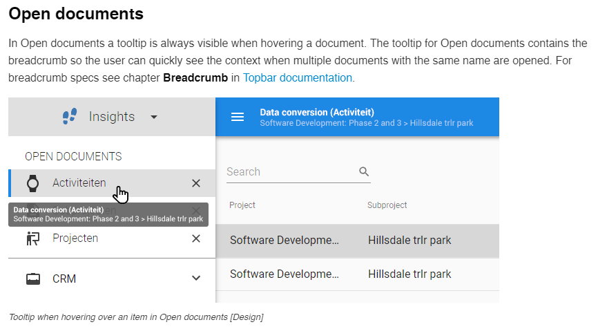
Our UI/UX experts have prototyped several options for displaying the breadcrumb for a document in the open documents. Your suggestion for a tooltip was the conclusion here as well. This is planned to be developed soon. An excerpt from the design documentation:


Start objects are planned to be implemented as pinned documents just like you described. This is a bit further down the road as we have a lot of features that have more priority.
Hi Anne,


Thanks for your reply. Good to hear you allready considered some of my suggestions. Your arguments are fair and I see the callenge ;-)


Your suggestion to allow the user to collapse the open documents in one node can become quit restless I think, because opening a menu-item again probably expands the full list in one go, so I should consider a grouping of open documents in seperate nodes like the menu-tree itself. And thinking a bit further along that line....


Did you also consider grouping the open documents inside the menu-structure itself?
Hi JeanPaul,


Yes, we did consider grouping the opened documents themselves as well. The problem with this we identified was that users are generally very aware of the order in which documents are opened.


The moment we start grouping the opened documents, we let go of the absolute order in which the documents were opened. The full list is deemed important because of that.


It's a bit of an arbitrary decision for now, I know. It will be interesting to see how this plays out when users start working with this GUI in production environments.


Statistics about the average number of open documents and how often users switch to the wrong open document would be valueable to make a substantial claim on what is more important - a grouped set of opened documents to save vertical space or opened documents in their original order.


We will continuously monitor and gauge the reaction of both users and developers to features like this and adjust accordingly.

Allowing the user to collapse the open documents might be a good solution for your scenario. Would this be a good solution in your opinion?

Our UI/UX experts have prototyped several options for displaying the breadcrumb for a document in the open documents. Your suggestion for a tooltip was the conclusion here as well. This is planned to be developed soon. 

@Anne Buit Good to see that breadcrumb information in the tooltip is there already!

Having the ability to collapse the Open Documents sounds like added value to me too. Is that still in the pipeline? What updates can we expect related to this backlog item (and when)?


Collapsible open documents is on the backlog, but has not yet been assigned a planned release yet. We are focusing on some of the core features of Universal first.

We are also looking into the option of hiding the open documents altogether in the menu and providing a different way for users to navigate between opened documents. 


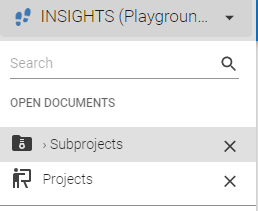
Detail documents are now recognizable within the Open Document area. This is introduced as part of the 2023.1.16 beta release of last Monday.

In this example "Subprojects” is the detail document opened from main subject “Projects”.

The tooltip containing the breadcrumb was already there and now a visual indicator is added to make it even more clear it is a detail document.


I have a similar problem with open document, is there an update for this?


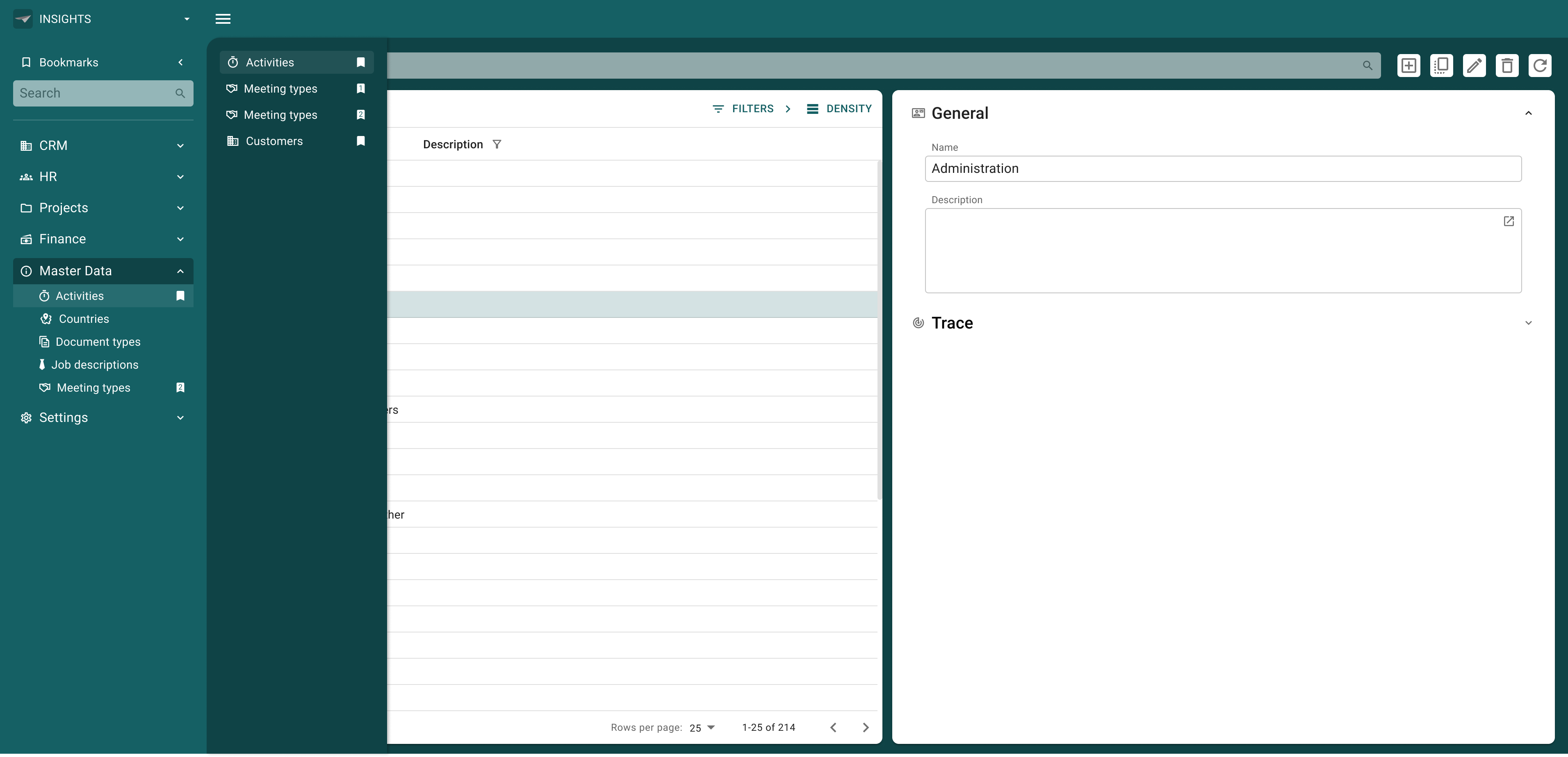
And what if we'd look at Open Documents at a different angle?

Technically, sure, they are (previously) opened Documents we want the user to be able to quickly navigate back to.

In the industry, there are similar concepts, one of which, I think, bookmarks is a prime example.

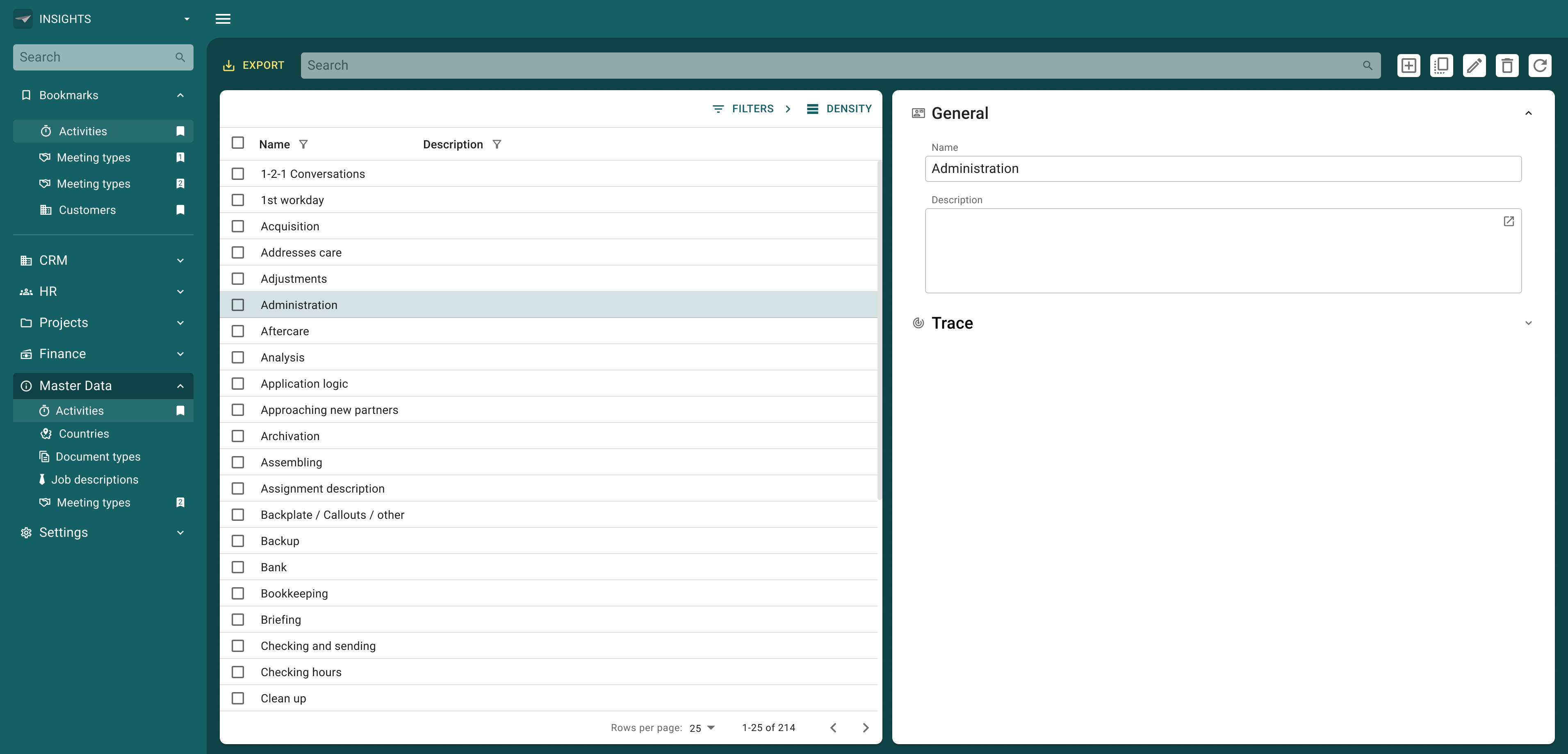
I made an example in which ‘Open Documents’ becomes ‘Bookmarks’ which in this quick concept is collapsible (I think this is not the way, as this will move the menu up and down, I think a slide out panel would be better), active bookmarks are highlighted not only in the bookmarks, but also in the list groups themselves (also, multiple opened instances could be emphasized with a counter in the Bookmark icon)

Bookmarks concept

With a ‘slide out panel’ I mean something like this:
 

This concept, however, completely changes the way users can sift through the current Open Documents, as it needs the user to open a separate panel. Would that be too intrusive to our users? Especially with larger groups of Open Documents.