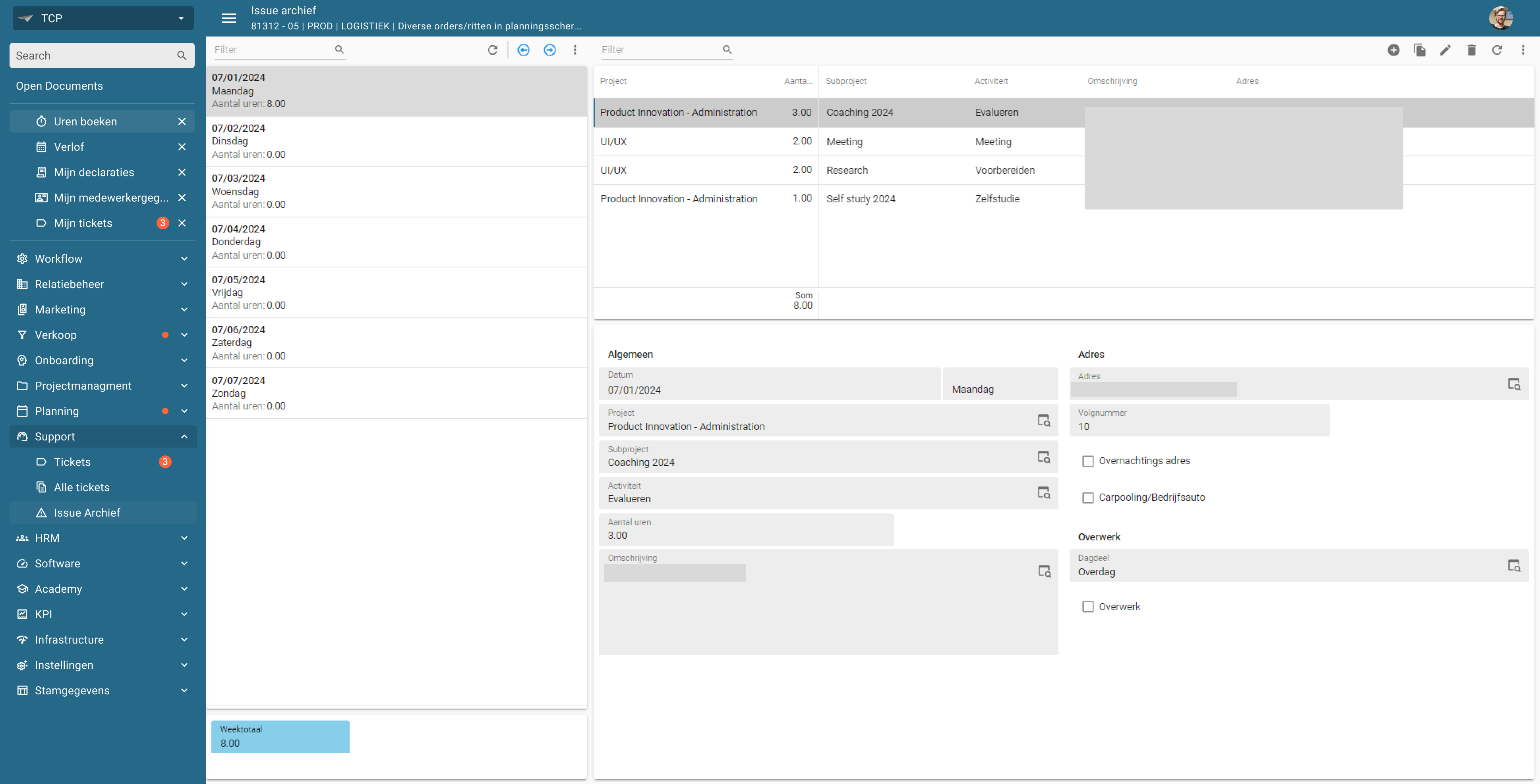
Badges are great for attracting the attention of the user. We’re for example using them to help our users see their pending actions in our ERP system. However, to see these badges the user needs to open the list bar group. This kind of defeats the purpose since the user now needs to search for the badges by opening the list bar groups instead of seeing the totals right away when they open the Universal GUI.
Idea
Make it possible to show the sum of Badges on the List bar group, this way a user can easily see which items need his attention instead of only noticing this when they open a list bar group.
Page 1 / 1
New→Open
I like your idea, and I think there is another way we need to take into consideration.
Can you elaborate why you suggest a summarized number in the badge versus a dot badge in the menu group? What would the addition of the number in this summarized badge need to tell the user?
An example of the dot badge in the menu group:
While I do see the dot badge serving the most important goal, I could think of three possible benefits of having a summarized badge over a dot badge:
If there is only one menu item with a badge, it gives the value without needing to open the menu group.
It gives an indication whether it is a relative low or high number, helping the user to set the priority of current tasks.
It could tell the user if something changed. For example if the badge has a value of one but the user knows a collegae is working on it.
An alternative thought: make it possible to set a menu item with a badge to always show at open documents (or just below) if the badge has a value. I know it is possible to set start-up items, but if the user closes the menu item (when there is no value at that time), the user misses the indication when something is changed and the badge does get a value.
If there is only one menu item with a badge, it gives the value without needing to open the menu group.
It gives an indication whether it is a relative low or high number, helping the user to set the priority of current tasks.
It could tell the user if something changed. For example if the badge has a value of one but the user knows a collegae is working on it.
Interesting angle, however, how could a user know that only 1 item has a badge without opening the menu group? Especially if there are different menu groups that do have more than one menu item with a badge. That will be a challenge for the user to find out we need to prevent.
I think we definitely need to add a way to notify the user an action is needed, whether it is a badge (where I think a dot would already offer the user the means to be aware of a needed action) or maybe even a notification center?
Your last idea is interesting! There are some situations I know of that will have implications though. For instance, this could mean that during navigating the menu the menu shifts because suddenly and unexpectedly an Open Document with a badge is opened, potentially making the user click on something which was not meant to be clicked on. Also, I know of customers having users with 20+ opened documents (which is already way to much) which could let the automatically open document with badge disapear in the large list of other items. That is why I would opt for a concept with a dedicated area for any priority items like a notification center, preventing these circumstances
Hi @Bart Metselaar,
I think a dot might be better, since it solves the problem by indicating to the user something needs to be done in one of the underlying documents. Furthermore I think adding the numbers as originally suggested, might cause the GUI to be too crowded and reduce the overall UX.
Open→Planned
This is planned to be resolved with the Roadmap 2025 H1 efforts.