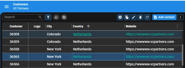
How would you like the idea to have a lookup icon on the grid when you are in read only mode?

Currently we can see the lookup icon only in Edit mode:


Why not have it also when we are in plain view read only mode similar to the FORM.

It could be controlled via CSS to hide and make it visible on Hover or hide all together.

Updated idea statusNewOpen

Think it would make the grid really cluttered with this option enabled on full page size grids.
But to have the option might be useful in certain cases. 


Think it would make the grid really cluttered with this option enabled on full page size grids.
But to have the option might be useful in certain cases. 

@Hans Pot As long as the icons only show when hovering with the mouse over a specific column of a specific row, that is not really an issue I would say.


OpenPlanned

This is planned to be resolved with the Roadmap 2025 H1 efforts.