Blog

Styling update of the Universal GUI

Related products:Universal GUIUI/UX
Styling update of the Universal GUI
Did this topic help you find an answer to your question?
Show first post

37 replies

Bart Metselaar
Moderator
Forum|alt.badge.img+3
  • Author
  • UI/UX Designer
  • 114 replies
  • November 18, 2024

Currently, the Menu elements of this Styling update are in development.


Arie V
Community Manager
Forum|alt.badge.img+12
  • Community Manager
  • 1034 replies
  • December 18, 2024

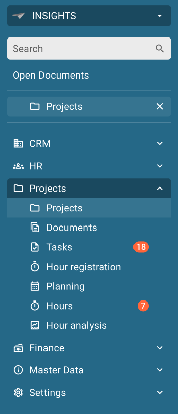
All, it has been silent on this topic for a little longer than hoped and promised. Sorry for that, but I’m glad we at least delivered the first and most colorful part of the UI Styling update with the Universal GUI 2024.3.13 (release candidate) today: the menu restyling! Most significant changes:

  • Menu uses the Primary color as background too
  • All Badges are aligned at the right
  • Open documents are aligned with submenu items instead of the menu groups
https://community.thinkwisesoftware.com/product-updates/release-notes-universal-gui-2024-3-13-release-candidate-5624

I would also like to shed some light on the next steps. We need a couple of releases which will result in the full implementation of these UI Styling changes, and also the Data density changes on Grid, Form and Collapsible Form tabs (this last one requires a Model change with Release 2025.1).

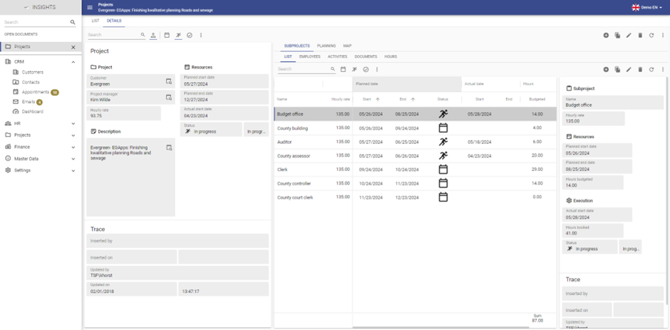
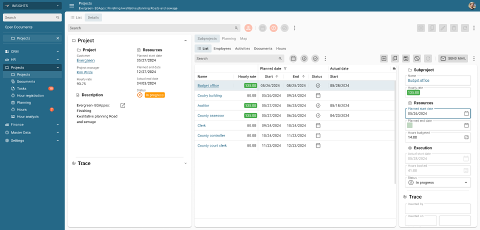
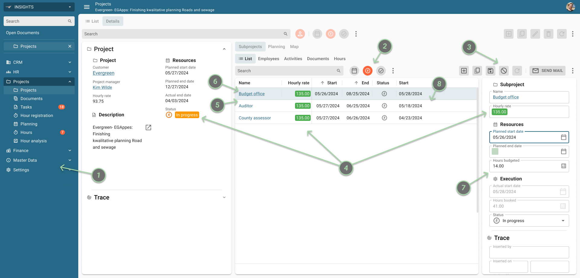
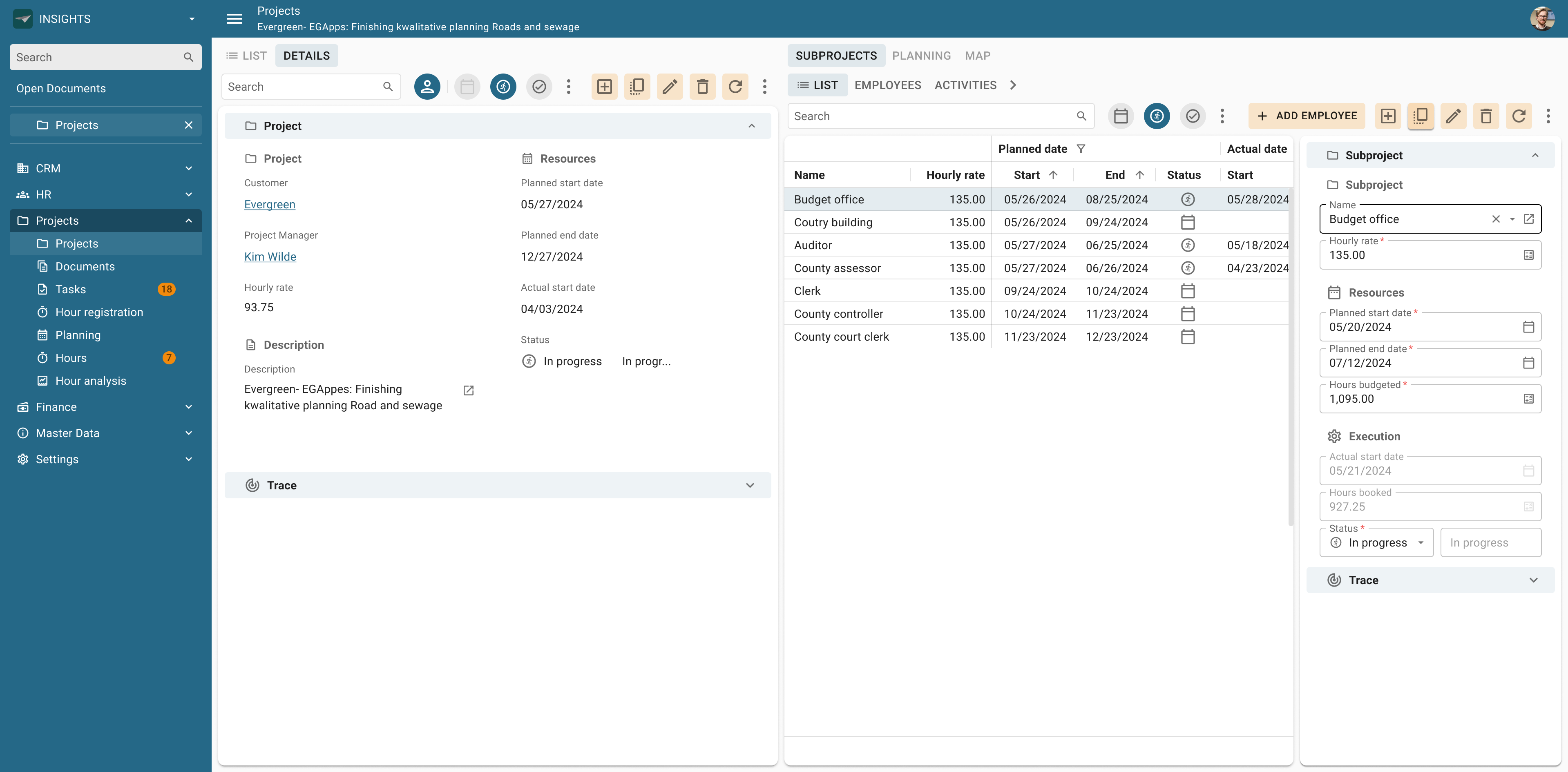
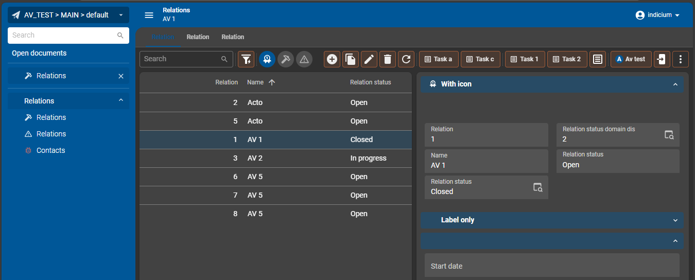
Basically we can distinguish 3 groups (releases) of changes, most of which you can see in the below design image:

Grid

  • Column headers (point 6)
  • Reduce padding to 4px (mentioned in Data density)
  • Use tooltip for total label (mentioned in Data density)
  • Active row color (point 8)

Action bar

  • Pre-filter buttons (point 2): note that we’ll go for using the Primary color.
  • CRUD and Task/Report buttons (point 3): note that we’ll go for using a gradient of the Secondary color instead of gray to highlight the fact that these are ‘action’ buttons. We’ll later on introduce the ability to highlight a particular ‘Call To Action’ using the Secondary color with the same gradient as Badges.

In addition, the 2025.1 Release will introduce much more flexibility in configuring your Action bar, as explained by Anne in a response to this Idea:

Freddy

Form / Controls

All Control types will have to be re-styled. 

  • Conditional layout (point 4): we’ll encapsulate the icon with the text highlight
  • Lookup control (point 5)
  • Form fields - Outlined style (point 7)
  • Tab header font size (mentioned in Data density): we believe these can become the same size as Group headers, since they’ll be displayed within a slightly colored collapsible bar (gradient of primary color - see below design)
  • Collapsible form tab (mentioned in Data density - see below design)


Kevin Horst
Thinkwise blogger
Forum|alt.badge.img+5
  • Thinkwise blogger
  • 33 replies
  • December 19, 2024

Hi team,

Those are some great improvements to the UI already, I think these really enhance the over user experience and there are some great things yet to come!

However, I noticed that the original mockup with rounded corners hasn’t been implemented yet. It’s a bit of a shame because I really liked that design element.

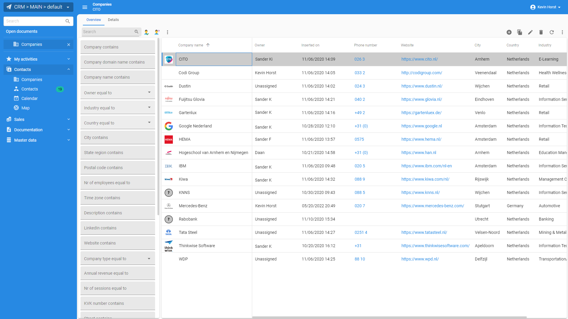
After some trial and error with custom CSS, I managed to get the rounded corners working consistently in my demo application:


If anyone is interested, I’d be happy to share my approach.

Is this feature still on the roadmap?

Anyway, keep up the great work!


Bart Metselaar
Moderator
Forum|alt.badge.img+3
  • Author
  • UI/UX Designer
  • 114 replies
  • December 20, 2024

Hi Kevin,

Thanks for taking the time and look through the changes.

Correct, the rounded corners (and not only the rounded corners on the top left of the workspace area, also on menu items/Open Document items) the corners have not yet been rounded. We are aware of it, and is still on the roadmap!

Regarding the top left workspace area corner, we do our best to include it in the next release, however, I can not give a guarantee of this visual element to be included. This would then be postponed to a next release candidate.


Bart Metselaar
Moderator
Forum|alt.badge.img+3
  • Author
  • UI/UX Designer
  • 114 replies
  • January 23, 2025

Hi all!

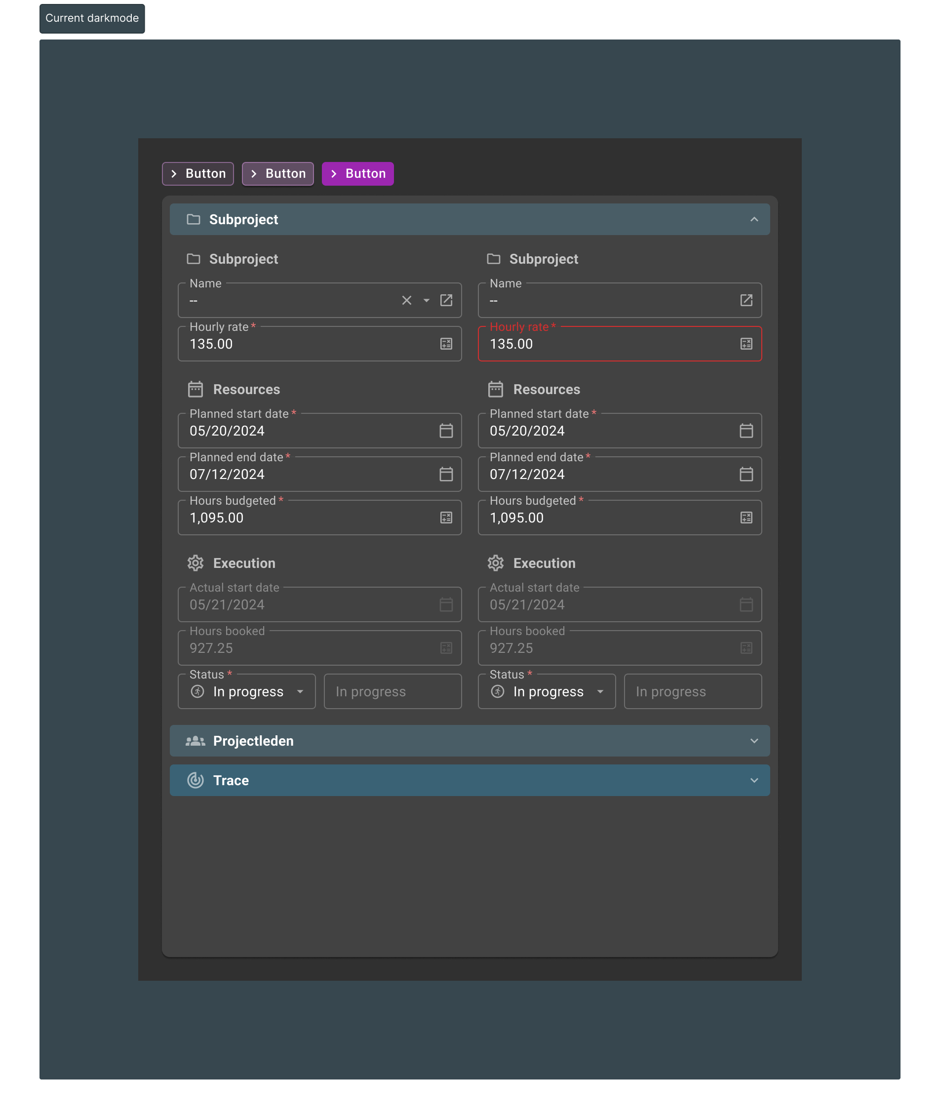
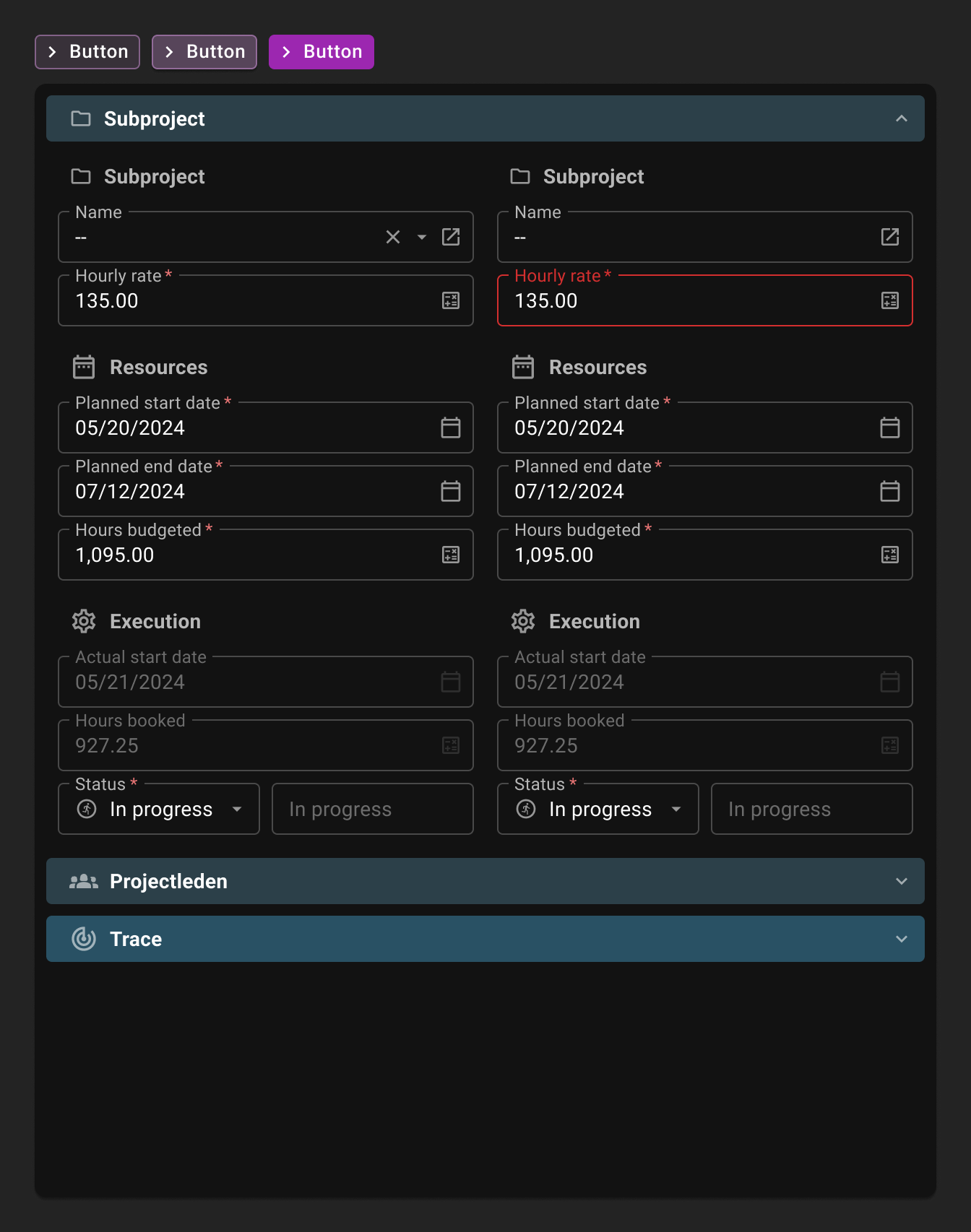
During the design updates of the form we saw that the current darkmode settings of the Universal UI seem off. The chosen colors for the background make further design choices hard, as the current color is too light. 

This causes several challenges: outlines and text are harder to differentiate versus the background, due to contrast values being too low. This also causes error colors to lack emphasis in color. And that is just the start. 

Here, see for yourselves:

In this example, we see the current Universal Darkmode with a couple of buttons (in the new styling) with a form and the collapsible form sections.
The colors seem flat, dull and the error color is hard to spot

Now, let's change the values in the exact same screen:

In this example, the background color of the paper is made the darkest (which makes it ‘higher’ in the visual hierarchy. The colors are far more brighter which prevents straining the eyes looking for fields that need attention. Error fields pop and guide the user far better

Changing the background darkmode color instantly improves readability, contrast values and offers a lot of wiggle room for future changes. 

If you have any remarks, I hope to hear from you!


Forum|alt.badge.img+5

I have one problem with the update, think that is should be possible to choose if and when you switch to a new layout. 

The problem is that a layout change can also make that you have to change things in the application, and the application looks different in instruction videos and documentation.  

I would like to wait until all the changes can be done at once, and plan if and when we do the update. 


Forum|alt.badge.img+5

To add, there are some design changes I would really like. It would be great if those improve.

  1. If you don’t fill out a mandatory field the error message changes the location of all the controls in the form (I don’t like that).
     
  2. The fact that the label becomes big in edit controls makes that you can not quickly see which controls are empty.
     
  3. I did a lot of work last year to highlight empty “pseudo mandatory” cell’s, to give a stronger visual effect and guide the user to the most important cells in a large form. ( “pseudo mandatory” means that you can save the record as draft).

    It would be great if it would be possible to do something like this with an effect like a slightly darker border instead of the background. ( And I just learned that the background is going to change… being able to change it to a border effect would be a large improvement ).
     
  4. It would be a large improvement to have clear css classnames, with a custom part, for example from the layout procedure, in the html output as there is no “one shoe fits all” style. A large form with 40 input fields has different requirements then a small form (for example that you want to be able to save it as draf like in point 3).

I understand that both point 3 and 4 require model changes. But that would give most flexibility. It would also be nice to have a “strikethrough” option in the conditional layout settings (that is a small one which also requires a model change).
​​​​​​


Bart Metselaar
Moderator
Forum|alt.badge.img+3
  • Author
  • UI/UX Designer
  • 114 replies
  • February 7, 2025

Hi Daan!

Regarding with waiting with an update, we implemented the new UI styling as an upgrade instead of the old one.

This new UI version is based on the premise that no model changes are needed, these are purely visual changes of existing elements. (We are aware that color choices for Main and Accent color in the theme settings of a project might need attention though, use the adobe color wheel if you have difficulties selecting complementary colors). Colorwise, the UI will indeed look different, but for the rest the layout of everything should remain the same. 

Also, we have some other features coming up, like Configurable Action Bars and Collapsible Form Sections, which will improve usability of our platform. Waiting with updating will prevent your users from access to these features. 

To answer your further quiestions:

  1. We are aware of this, and we are working on solutions. 
  2. Showing the label as a placeholder on empty form fields is something we've planned to work on, another reason to stay up to date!

Indeed, as point 3 and 4 require model changes, and your fifth point about strikethrough in conditional layout options surpasses this design, I am afraid these ideas will disappear in this comment section. If you haven't already, can you raise them as separate ideas?


Arie V
Community Manager
Forum|alt.badge.img+12
  • Community Manager
  • 1034 replies
  • February 24, 2025

In addition to the earlier released Menu styling (point 1 of the blog), Release 2025.1.10 includes the styling update for the new Action bar (point 2&3) and the Active row (point 8).

I would like to clarify a couple of things, including some deviations from the original design we applied thanks to your feedback:

  • The Custom action bar and Action bar are two new Screen components in Platform Release 2025.1, replacing the old Toolbar Screen component.
    • New styling is not yet applied to the Toolbar and individual bars at different locations in the screen (Prefilter/Cube view/Task/Report/Search bars). This will be added in a later Universal release.
  • Contrary to the initial design, we have decided to use the Main color for Prefilter styling. In addition, a gradient of the Accent color is applied to all the Actions by default, highlighting that these represent actions a user can take (this color is also used by Badges). In the next Platform version we aim to implement the ‘Call To Action’ concept that will allow you to apply the full Accent color to CRUD / Task / Report actions using Business logic.
  • Active row color is now based on the Main color, as suggested in the initial blog.
    • In addition, the Main color is applied to Sections on Forms
  • @Kevin Horst The rounded corner has been implemented since Universal GUI 2024.3.15, together with some other small improvements.

Arie V
Community Manager
Forum|alt.badge.img+12
  • Community Manager
  • 1034 replies
  • June 2, 2025

All, the Universal GUI 2025.1.14 Release Candidate of today includes a few more items discussed in this Styling blog, as well as the Data Density blog. Another great Milestone in our efforts to improve the UI Styling!

Basically most Grid-related improvements are now delivered (Grid height in Edit mode is the only remaining change, which depends on the Control re-styling):

  • Column headers (point 6) - since Universal GUI 2025.1.12 already
  • Active row color (point 8) - since Universal GUI 2025.1.10 already
  • Reduce padding to 4px (mentioned in Data density)
  • Use tooltip for total label (mentioned in Data density)

On Form the changes to Tab header font size & Collapsible form tab have been delivered:

  • Tab header font size (mentioned in Data density) - since Universal GUI 2025.1.10 already
  • Collapsible form tab (mentioned in Data density) - since Universal GUI 2025.1.10 already

Contrast changes in the current release:

  • Text color of active Detail tab changed to black/white instead of Primary color
  • Clickable values in Grid/Form changed from Primary to Accent color
    • Both above changes allow for using more colors as Primary color. Note that we have some work to do on all Pop-up screens like Filter/Import/Export etc.
  • Dark mode is darkened (per design of Bart above)


FUTURE: This leaves us with the most daunting task: all Control types will have to be re-styled. 

  • Conditional layout (point 4): we’ll encapsulate the icon with the text highlight
  • Lookup control (point 5)
  • Form fields - Outlined style (point 7)

Mustafa Kazanc
Moderator
Forum|alt.badge.img+1

Hi Community!

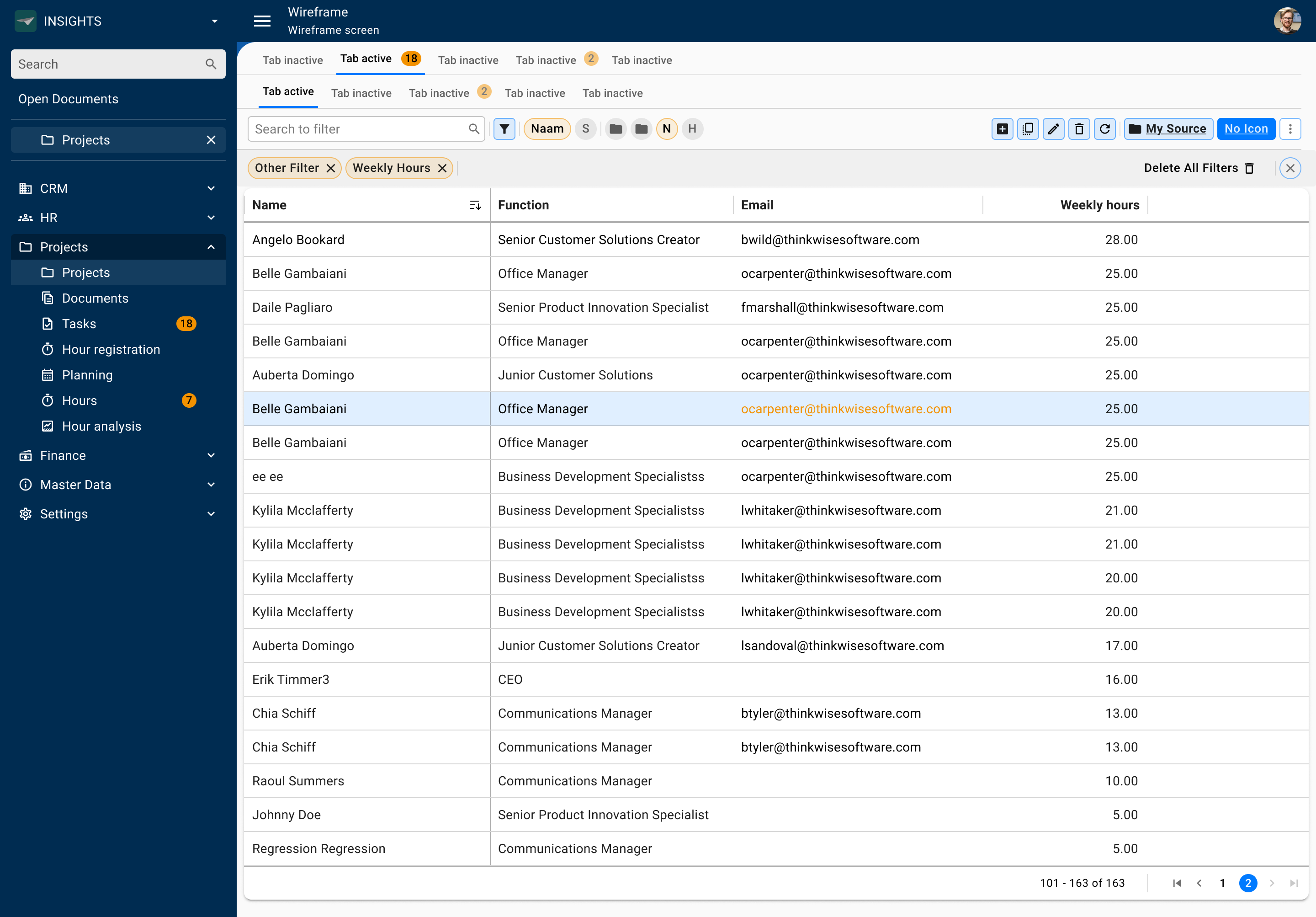
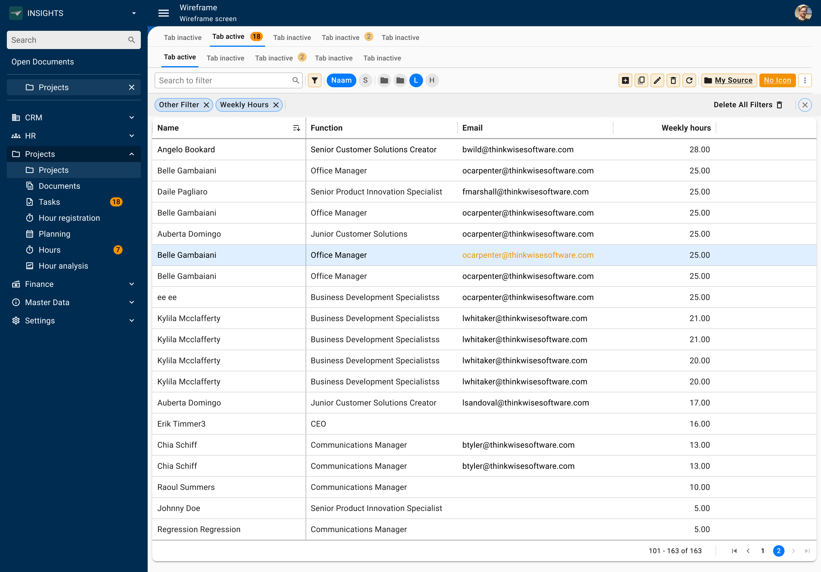
Following some recent feedback, for example the lack of a clearly visible Call to Action in one of the concepts, we've taken a step back to re-evaluate our visual styling. Our goal is to create a clear visual hierarchy, allowing users to instantly see what's important, without distraction.

We’re curious to hear what you consider most and least important.
This concerns the prefilters, action bar, and pill bar. We've created a few concepts and would really appreciate it if you could share your preference, along with a brief explanation.

Thanks in advance for your input, it really helps us make better design decisions!


Concept 1: Interaction in Main color


Concept 2: Main and accent colors vary based on the most important interaction.


Concept 3: As is with Call to Action added


Freddy
Forum|alt.badge.img+16
  • Thinkwise Local Partner Brasil
  • 533 replies
  • June 20, 2025

@Mustafa Kazanc for me concept 3.  Accent color for 'default' action elements..    and main color application specific stuff.  I would probably advocate for reports/task to be also main color in this scenario. 


Reply


Cookie policy

We use cookies to enhance and personalize your experience. If you accept you agree to our full cookie policy. Learn more about our cookies.

 
Cookie settings