We need to set a global setting to set the header label to stay small and not to move to the location where the field is. Similar to having a field with an empty value (not a NULL value).
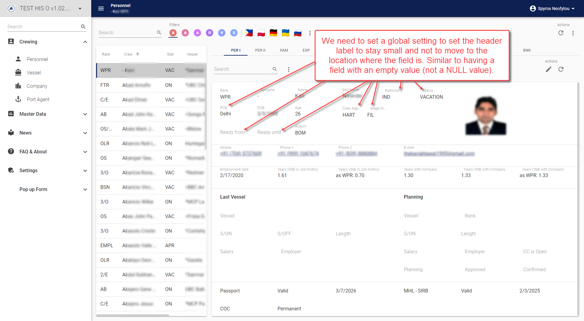
 

Hi @Spyros.Neofytou Not sure if ‘a global setting’ is the desired solution here. But the functional issue that my end users are also complaining about is the fact that empty fields in Read mode (or empty Read Only fields in Edit mode) do attract unnecessary attention with the current GUI design of enlarging the headers of these empty fields.

I would think that simply always showing the headers as small in Read mode / Read Only fields is the most straightforward solution. If you agree with that, you have my vote and a change of title of this Idea might be useful.

Disclaimer: I DO LIKE the fact that Editable fields in Edit mode do have the header displayed a little larger for empty fields! A slight remark is the inconsistency with Domain with Elements or Lookup fields, these headers are never enlarged for some reason…


Hello @Arie V , yes we agree with your comments. Having big headers for empty fields draw unnecessary attention. We tried setting ‘empty’ values to keep those headers small but that does not work with date and number fields. Ideally we want the field headers to be small by default and stay in the same location and same small size (the same as it is when there is a value in the fields).


Updated idea status NewOpen

@Mark Jongeling Given the reply from @Spyros.Neofytou: could you make the topic title more in line with the desired solution? Something like “Header in Form should not be enlarged for empty columns in Read mode”


Yes, I agree with @Arie V . @Mark Jongeling  please change the title, as i cannot change it once theIDEA is created.


Thanks @Mark Jongeling !


As a temporary solution the following CSS could be used to make the labels always small and on top:

.MuiFormControl-root .MuiFormLabel-root {
  transform: translateY(1.5px) scale(.85) !important;
  margin-top: 4px !important;
  margin-right: 12px !important;
  margin-bottom: auto !important;
  margin-left: 12px !important; 
}


OpenPlanned

This is planned to be resolved with the Roadmap 2025 H1 efforts.