

During our work on the Universal GUI Styling Update, we’ve had several discussions and deep-dives about topics like the form and grid suggestions of the Styling blog with some of you. In those meetings, and as an extra assignment, we investigated improving the data density of our Universal GUI. A common topic on the Community and during conversations is that predominantly the height of several components demands too much space.
Our challenge from the perspective of UX is finding the balance between functional presented data and preventing a visual cluttered interface.
We are in the midst of trying to reduce the height of components such as form fields and grid rows, but we also think that we have to look into other options, where data may be offered in a different way.
Let’s take a look at the suggestions in order of expected impact.
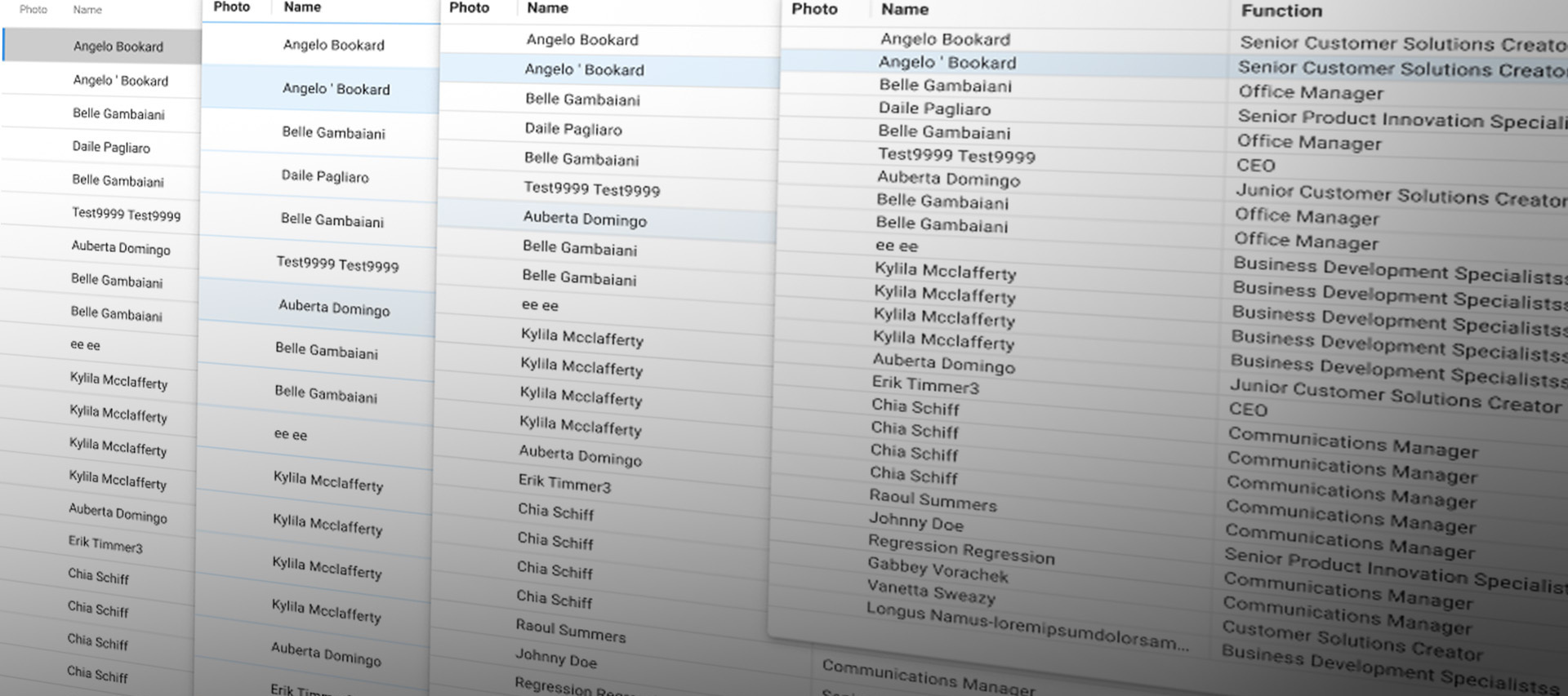
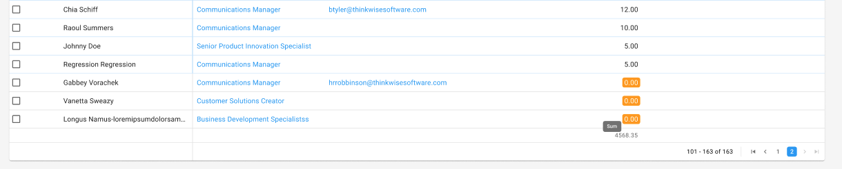
Grid elements
- The current Universal default row height is 36px. We want to bring that down to a default of 28px.
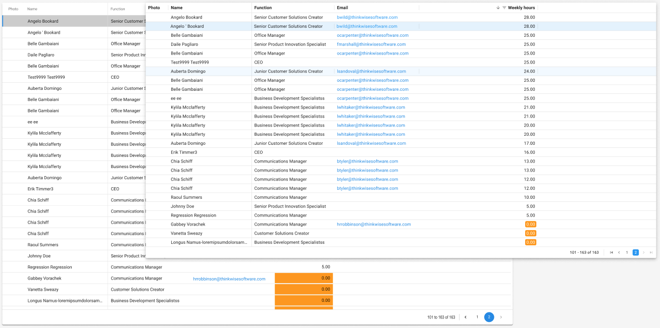
- Currently, Universal only supports an adjustable lower row height for non editable grids. In the new design we aim for a minimal row height of 20px for both the editable and non editable grid (this would bring this feature to the same minimal possible row height as the Windows GUI).
Do keep in mind though, that the controls of editable grid cells become very small and that you must prevent those grids to be presented to users on touch interfaces! We stray far away from the path of UX for touch targets, which suggests a minimal touch object of 44x44 pixels (iOs guideline) or 48x48 pixel (Material Design guideline).
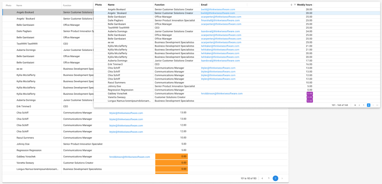
- As stated in the UI Styling blog the headers height is also altered (the new default column header height will become 32px, vs the old default height of 44px), and will also be independent from the row height settings.

- The width of the columns is now influenced by 8px of padding around the text and the data field. 4px is the minimum, as the controls in editable grids need a surface around them to be selectable and Conditional Layout needs space around the data to be shown correctly.
What if we changed this to 4px instead of 8px?
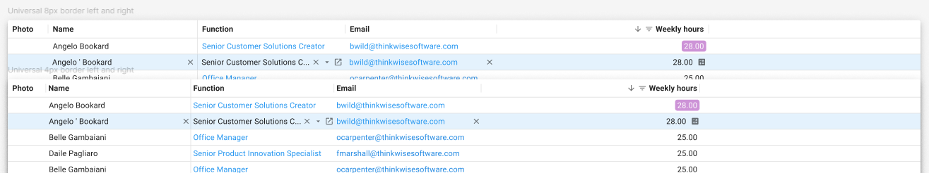
- Currently, we show totals in a separate row below the grid with additional text like ‘Amount’ or ‘Count’ added to the number, above the value, demanding extra space.
What if we use a tooltip instead of the text, similar to the Windows GUI?
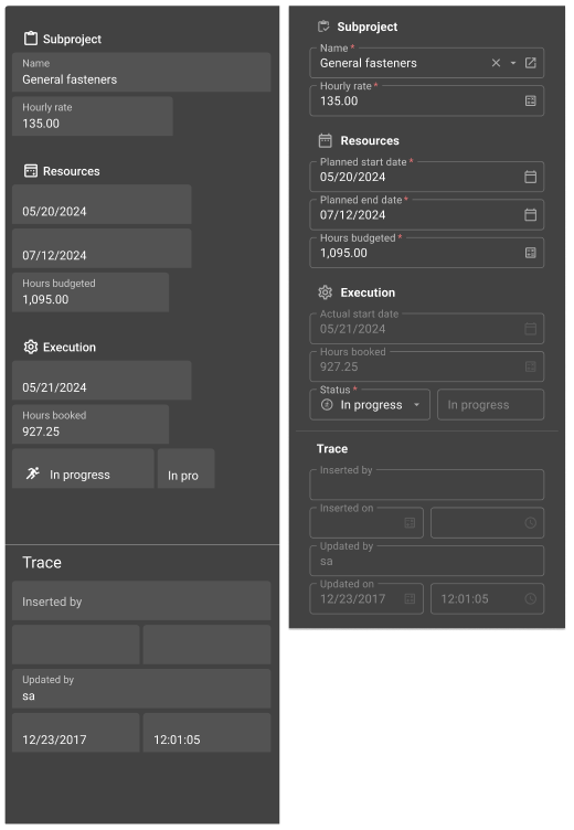
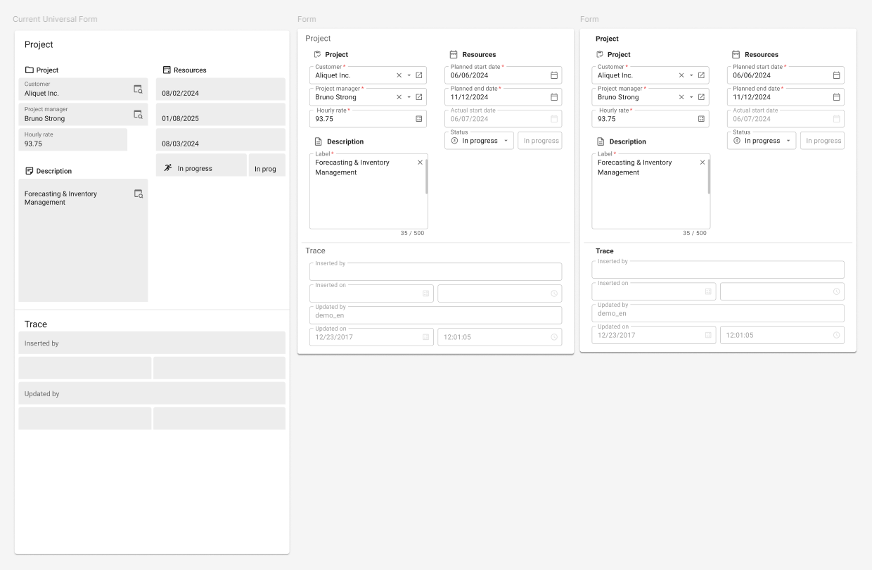
Form
- The current Form fields in the Universal GUI are by default 46px high. With the new Outlined Form fields, they are 41px high. This seems like a little difference, but, the header is now included in the outline, making it visually a lot smaller. Also, the padding around the group headers has been altered, which makes form a whole lot more compact.
- A legacy styling that crawled into the Universal GUI, is the font size and padding of Grouped Tabs (Windows GUI) which are now labels in the form of the Universal GUI.
What do you think of tab headers gaining the same font size/weight and padding as standard group headers?
Collapsible form tab
- As a replacement of the tabbed behavior in the Windows GUI, we are thinking about collapsible form tabs.
Do you wish to configure for each Next tab in Subject > Component > Form whether it should be expanded or not? Do you want to set the default to all tabs open, closed, or default only first tab open?
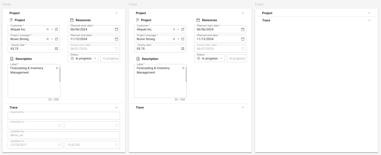
Collapsible components
- Next to collapsible Form Tabs, we worked on a concept to make Screen component splitters collapsible. With this concept, splitters would become collapsible on click/expandable on click, to give users the tools to show/hide data on demand.
How do you feel about this concept?
Improving the Data density with above suggestions aims to streamline the transition from the Windows GUI to the Universal GUI. Future UX improvements will put more emphasis on Touch interface design. As always, we are curious to hear your opinions!


 ( "compact")

