We have been live in Production with the Universal GUI since November 2020. During the past few years the functionality of the Universal GUI has been massively improved by Thinkwise. In the meantime we as Thinkwise customer have learned a lot from our end users regarding their User Experience with the Universal GUI. Based on our experience, we believe the UX can and should be improved a lot by Thinkwise!
And since
I really expect the below Ideas to improve the UX for all Thinkwise customers' end users. Please vote on each Idea listed below that you believe serves your needs too and add a comment below to keep the topic ‘alive’!
And since this list is nowhere near exhaustive, feel free to add additional Ideas in the comments below! NOTE: this is topic is specifically meant to improve end users' User Experience, not that of Developers and/or IAM Administrators.
‘Bugs’: these bugs/missing features really hamper the user as it is non-intuitive GUI behavior
- Automatically update Universal GUI to the latest version:
It all starts with using the latest and greatest, and for a web-based application it shouldn't be dependent on the end user if the latest version is installed.
- Mandatory checkbox without asterisk:
To end users a checkbox with an asterisk next to it triggers them to always check it, just like they are used to on consumer-facing website. Due to the existence of the asterisk a user error is quickly made.
- Action bar positioning is confusing:
Users can't find the Action buttons quickly or click the wrong ones due to this behavior.
- Label for empty Form fields should not be enlarged:
Attention is drawn to the wrong fields: user attention in Read mode should be drawn to data that is available, not empty fields.
- Activate Screen Component for opened Document:
The user intends to work on an newly opened screen, the focus of the cursor should support immediate action on that screen.
‘Quick wins’: these small adaptions to the Universal GUI would improve user flow and improve user understanding
- Display more data on a single screen:
Material Design is a nice starting point, but for Universal GUI to support a fully-fledged, data-dense ERP system, Material Design standards are not suitable. Fixing this will prevent a lot of scrolling for end users.
- Show Tooltip with Translation for Grid Image combo:
Showing the translation for an Image combo allows to use more icons in the Grid, which would significantly reduce the width of a Grid column compared to text. As it's hard to always select self-explanatory icons, this simple tooltip would lower the threshold to apply image combos in Grids more often.
- Auto-refresh upon revisiting a page:
- Pull to refresh:
A mobile-friendly and very common means to refresh an Open Document.
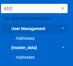
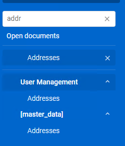
- Navigate back to Main tab when clicking Menu-item of an already Open Document:
Users can get lost in some obscure Detail tab and returning to the Main tab is currently not always quick and easy. Automatically navigating back to the Main tab when clicking the menu item again would give them a known starting point again.
- Detail tabs dropdown menu:
Prevent scrolling and make it easier to quickly go to the right Detail tab, just like in the Windows GUI.
- Distinguish Zoom screen in Open Documents:
The Zoom screen is always filtered on a specific row_id and it's not possible to remove that filter. So an indication that it's a Zoom screen would help user understanding.
- Show lookup control in Grid Read only mode on hover over:
A simple and effective measure to allow a user to quickly look at some context information in a Lookup pop-up.
- Open Document as pop-up:
A simple and effective measure to allow a user to quickly look at some context information in a Lookup-like pop-up.
- Show different icon for Active vs Inactive Pre-filter:
Draw more attention to the Pre-filter settings and the impact of the applied setting.
- Show Task icon only:
Results in a cleaner and more consistent Action bar. If Tasks need more space or attention we could use the Detail Tiles already.
- Placeholder text / Input mask:
- Standard Tooltips:
Helps to add explanation to the use of a column. Allows to give user guidance without users having to go to an external support page.
- Form double click > Edit field:
Allows to do very quick data manipulations to existing records, helps to keep a data clean and correct.
- Search hidden records:
Make it easier to show results that are hidden behind a Pre-filter.
Model additions: these changes would require changes in the Software Factory and are extensions to the current Thinkwise model
- Push notifications:
- Add custom Menu items to topbar:
- Display multiple Detail tabs on a single page:
Introducing an additional Screen Component and assigning a Detail Group to it, would allow to replace a lot of clicking through Detail tabs with scrolling through multiple Detail tabs’ data in a single screen. Much more mouse- and mobile friendly.
- Tasks on Grid line:
- Swipe for Tasks:
Should not be too hard to add once the previous Idea of Tasks on Grid line is delivered.
- Intelligent Tooltip for Lookups:
Show some additional columns from a Lookup table without having to click/navigate to it.
- Add intelligent Search box to Universal GUI header:
Something that is very common in modern applications and allows users to find a specific record without having to navigate a lot.
- Drag and Drop multiple files:
- Multi-value Lookup / Tag Box
A convenient way to link multiple values to a single record instead of the cumbersome alternatives you need nowadays.
-
Offer ways to have a different number display format versus the actual stored/editable value
Formatting number fields in such a way that they are easier understood by End Users and show more valuable information (f.e. a Currency).
-
Ability to assign Tasks, Reports and Prefilters to a dedicated bar
Currently the GUI will display a Task, Report and Pre-filter multiple times if you assign multiple bars/tiles to a screen. Implementing this idea allows for more flexibility.
-
Support right-to-left languages
To better support our international customer base and a large part of the world population, it would be great to have improved right-to-left language support.
-
Include / exclude Screen Types available for User Preferences
Provide more granular control on the Screen Types that are available for User Preferences on a particular Subject.
Again, please vote on each Idea listed below that you believe serves your needs too and add a comment below to keep the topic ‘alive’!