Solved

task parameter "next column" works in Windows GUI but not in Universal GUI


Forum|alt.badge.img+6

Hi,

I finally was able to fully upgrade to 2025.1 and fix all validations that prevented me from using the Universal GUI (only remaining is the Excel style filtering 🤐).
I'm currently testing one of our applications in the Universal GUI and I notice that there is a discrepancy between the Windows- and the Universal GUI while displaying, at least one of my, dialogs:
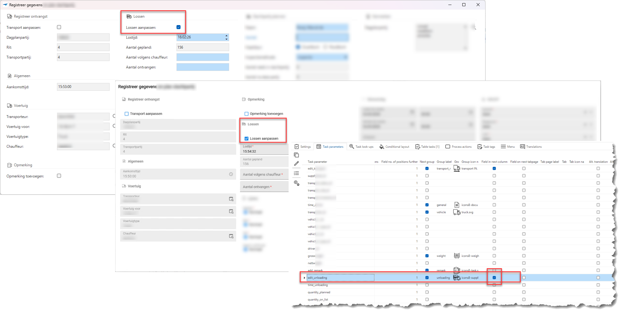

Even though I’ve set in the SF that the edit_unloading (Lossen aanpassen) checkbox should be at the top of the next column it is shown not at the top of the next column in the Universal GUI.

I suspect that the Universal GUI uses a maximum height for the dialog and because of that moves the  add_remark group to the next column!?
Is there anything I can do to prevent this?

But that wouldn't account for this similar situation in the same application:
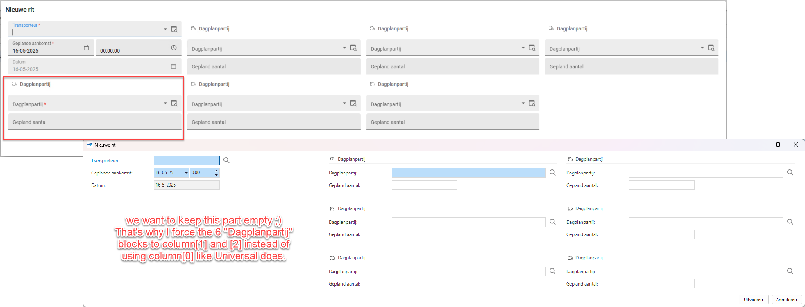
 

The fact that Universal choose to use 4 columns instead of 3 isn't a real big issue, I only added a “Field in next column” for the first “dagplanpartij” so the GUI is free to pick the 3 columsn like the Windows GUI does or the 4 that the Universal GUI prefers.
 

Best answer by Arie V

cvhrn wrote:

@Arie V 

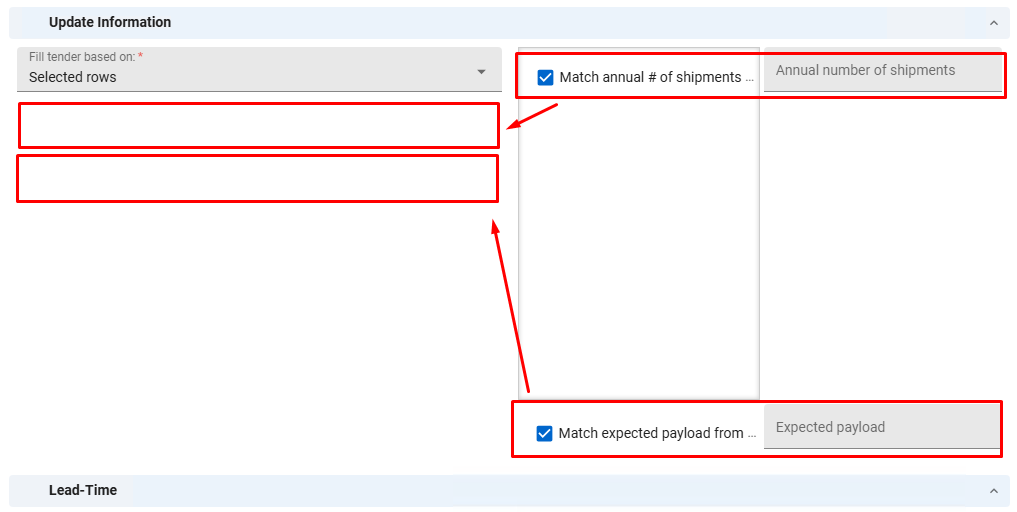
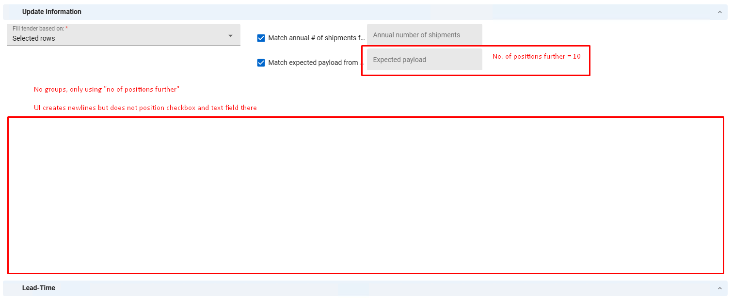
Ideally we'd want the checkbox and text fields next to each other, and all the pairs under each other. Mobile users are currently out of scope. We tried setting the columns to 2 and experimented with the no of positions, but the “Match annual # of shipments” field would always just create more empty lines and be positioned next to the “Fill tender based on” text field.

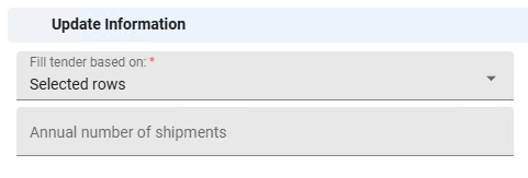
If we remove the checkbox and simply set “no of positions further” on the textfield to 1, it functions as intended:

CSS could work for us but we'd like to avoid it, as it could make the application more difficult to maintain.

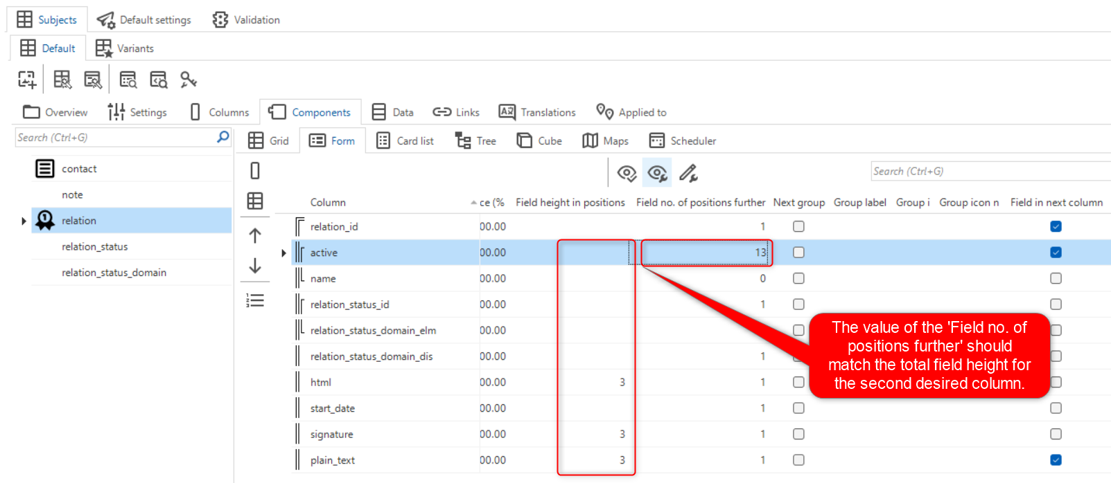
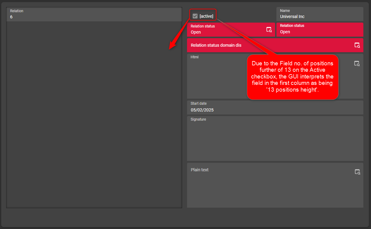
@cvhrn Based on your first screenshot, I think you are confusing two settings. You should play with the Field no. of positions further in order to ensure the checkbox+text field is on the second column. The value of that field should match the total Field height in positions that you expect to have for the second column. See how I believe I got your scenario working:


View original
Did this topic help you find an answer to your question?

9 replies

Arie V
Community Manager
Forum|alt.badge.img+12
  • Community Manager
  • 1030 replies
  • May 16, 2025

@Alban_T I’m not certain what explains the behavior of your application. Could you check two things:

  1. Did you run the Universal enrichment ‘Keep ungrouped form fields vertically aligned’?
  2. Would this blog help in clarifying the behavior you see?

P.s. I know Excel-style filter is dearly needed, we hope to get to it in the next 2 months!


Forum|alt.badge.img+6
  • Author
  • Hero
  • 86 replies
  • May 20, 2025
Arie V wrote:

@Alban_T I’m not certain what explains the behavior of your application. Could you check two things:

  1. Did you run the Universal enrichment ‘Keep ungrouped form fields vertically aligned’?
  2. Would this blog help in clarifying the behavior you see?

P.s. I know Excel-style filter is dearly needed, we hope to get to it in the next 2 months!


I didn't run that enrichment yet when I posted the question but I have now and the result is still the same ☹️

When I read the blog I think I recognize the “Principle 3: Fields are dynamically positioned to minimize white space” but later it describes the use of Field in next column to override the default behavior. That is exactly what I'm doing, but apparently it behaves differently in my Universal GUI than it did in my Windows GUI.


Arie V
Community Manager
Forum|alt.badge.img+12
  • Community Manager
  • 1030 replies
  • May 21, 2025

@Alban_T I played around a bit to try and reproduce your scenario and I managed to do so. It does indeed work a bit different from what I expected. Would you be so kind to raise a ticket for this in TCP?

I do think that you can get the desired behavior in the Universal without breaking the Windows GUI by doing the following:

  • For the Task ‘Registreer gegevens’: Add a ‘Field no. of positions further’ value to the first field of the desired 3rd column that ensures that the counted number of positions for the second column ‘Lossen’ equals the number of positions of the first column.
  • For the ‘Nieuwe rit’: Set the ‘Field no. of positions further’ value for the first ‘dagplanpartij’ to 7 instead of 1. 

  • Rookie
  • 2 replies
  • May 21, 2025

Hello,

We are experiencing a similar issue with the Universal GUI and popup forms.

We have pairs consisting of a checkbox and a text field, and we can't get them to properly display under each other. We tried both “Field in next group” and “Field in next column” but the pairs are still layed out horizontally.

We also tried the "No of positions further” option, but this only works for just text fields. As soon as we add the checkboxes the layout is incorrect and the UI adds empty lines instead of repositioning the pairs.

The only way we could render the form properly is by using tabs, but these are not very intuitive and we currently have to place them in between each pair.

Any help or tips would be appreciated.


Arie V
Community Manager
Forum|alt.badge.img+12
  • Community Manager
  • 1030 replies
  • May 21, 2025

@cvhrn Could you clarify what your ideal Form setup would be for all fields, how many columns would you have for instance?

  1. Should depend on the available Screen size
  2. Always a maximum of 1 or 2 columns

As far as I can tell, you want the Checkbox and the Text field to be a logical group.

  1. Does this mean you ideally & always want them next to each other on the same line?
  2. Or would you also want to see them below each other on smaller screens like mobile phones?

Depending on your answers you could try different things:

  • Set a No. of columns in form value of 1 in Subject/Task settings
  • If 2 Columns are preferred, set a No. of columns in form value of 2 AND a 'Field no. of positions further’ to 7 for 'Match annual # of shipments from clients’
  • Use Custom CSS to hide the Next tab bars (see suggestion by Anne Buit here: Option to hide collapsible form | Thinkwise Community)


  • Rookie
  • 2 replies
  • May 21, 2025

@Arie V 

Ideally we'd want the checkbox and text fields next to each other, and all the pairs under each other. Mobile users are currently out of scope. We tried setting the columns to 2 and experimented with the no of positions, but the “Match annual # of shipments” field would always just create more empty lines and be positioned next to the “Fill tender based on” text field.

If we remove the checkbox and simply set “no of positions further” on the textfield to 1, it functions as intended:

CSS could work for us but we'd like to avoid it, as it could make the application more difficult to maintain.


Forum|alt.badge.img+6
  • Author
  • Hero
  • 86 replies
  • May 22, 2025
Arie V wrote:

@Alban_T I played around a bit to try and reproduce your scenario and I managed to do so. It does indeed work a bit different from what I expected. Would you be so kind to raise a ticket for this in TCP?

I do think that you can get the desired behavior in the Universal without breaking the Windows GUI by doing the following:

  • For the Task ‘Registreer gegevens’: Add a ‘Field no. of positions further’ value to the first field of the desired 3rd column that ensures that the counted number of positions for the second column ‘Lossen’ equals the number of positions of the first column.
  • For the ‘Nieuwe rit’: Set the ‘Field no. of positions further’ value for the first ‘dagplanpartij’ to 7 instead of 1. 

@Arie V it's logged thru TCP as case 11738


Arie V
Community Manager
Forum|alt.badge.img+12
  • Community Manager
  • 1030 replies
  • Answer
  • May 23, 2025
cvhrn wrote:

@Arie V 

Ideally we'd want the checkbox and text fields next to each other, and all the pairs under each other. Mobile users are currently out of scope. We tried setting the columns to 2 and experimented with the no of positions, but the “Match annual # of shipments” field would always just create more empty lines and be positioned next to the “Fill tender based on” text field.

If we remove the checkbox and simply set “no of positions further” on the textfield to 1, it functions as intended:

CSS could work for us but we'd like to avoid it, as it could make the application more difficult to maintain.

@cvhrn Based on your first screenshot, I think you are confusing two settings. You should play with the Field no. of positions further in order to ensure the checkbox+text field is on the second column. The value of that field should match the total Field height in positions that you expect to have for the second column. See how I believe I got your scenario working:


Anne Buit
Community Manager
Forum|alt.badge.img+5
  • Community Manager
  • 653 replies
  • June 5, 2025

Hi ​@cvhrn, did the suggestion above by Arie V work out?


Reply


Cookie policy

We use cookies to enhance and personalize your experience. If you accept you agree to our full cookie policy. Learn more about our cookies.

 
Cookie settings