


Hi everyone!
In this blog I want to take you through my thought process regarding the Filter, Sort, and Search functionalities in the Universal GUI. I’m introducing a couple of concepts for which I’m particularly curious to hear your thoughts.
Introduction
Over time functionality has been gradually added, each of which has improved the Universal GUI. However, we also notice that it can resulted in a more cluttered and less intuitive user interface where certain elements are hidden or not very user-friendly.
Based on my own review, drawing from my experiences and comparing with best practices around Filter, Sort, and Search, I came to the following conclusion:
- Filters are hidden: The filtering option is not immediately visible and is buried under the … menu.
- Unclear status of active filters: While filtered results are shown after applying a filter, the positioning of the filter interface is not always intuitive, making it hard to find and unclear whether a filter is currently active.
- Sort: is not working as it should - Sorting is possible, but there is no option to resets it back to the default sorting.
With the 2025.1 release, we've made significant progress. Related to this topic, for example, the active and inactive states of the pre-filters have been improved. It is also now possible to enhance usability in the Universal GUI to some extent with the Configurable Action bar. The Action bar is customizable according to your needs. This gives you the freedom to tailor it to your own requirements or those of your users. I’ll tell you more about this in my blog about the capabilities of the Action bar.
As indicated on the Roadmap 2025 H1 topic (Roadmap 2025 H1 | Thinkwise Community), Filter, Sort & Search will get more advanced features soon. Behind the scenes, we have been working on how to gradually optimize this topic. Currently, we are focusing on areas such as the Filter in the Detail Tab and AND-OR filtering.
To avoid going too far off-topic, I will walk you through the concepts I have developed. As previously explained, I have done this based on my own experiences, best practices, and also your earlier feedback on this topic.
Criteria for the desired to-be state:
- Visible Filter button: Filters should be directly accessible and not hidden.
- Clear indication of (in)active Filters: Adding visual cues to clarify whether Filters are active or inactive.
- Replace the Quick Filters: Optimizing Quick Filters for a more intuitive experience.
- Improving the Filter: Enhancing the structure and usability of the Filter form.
- Improving the Sorting: By adding a reset to going back to the default Sorting
With these improvements, we aim to create a more intuitive and user-friendly filtering system.
Wireframe concepts
To begin with, it's important to understand that the concepts below are wireframes. This means they serve as a digital sketch of the interface. The primary purpose of a wireframe is to gain insight into the functionality and structure of a design, without involving design, color usage, or visual style. Wireframes help define interaction and user experience early in the process, ensuring the focus is on usability and logic rather than aesthetics.
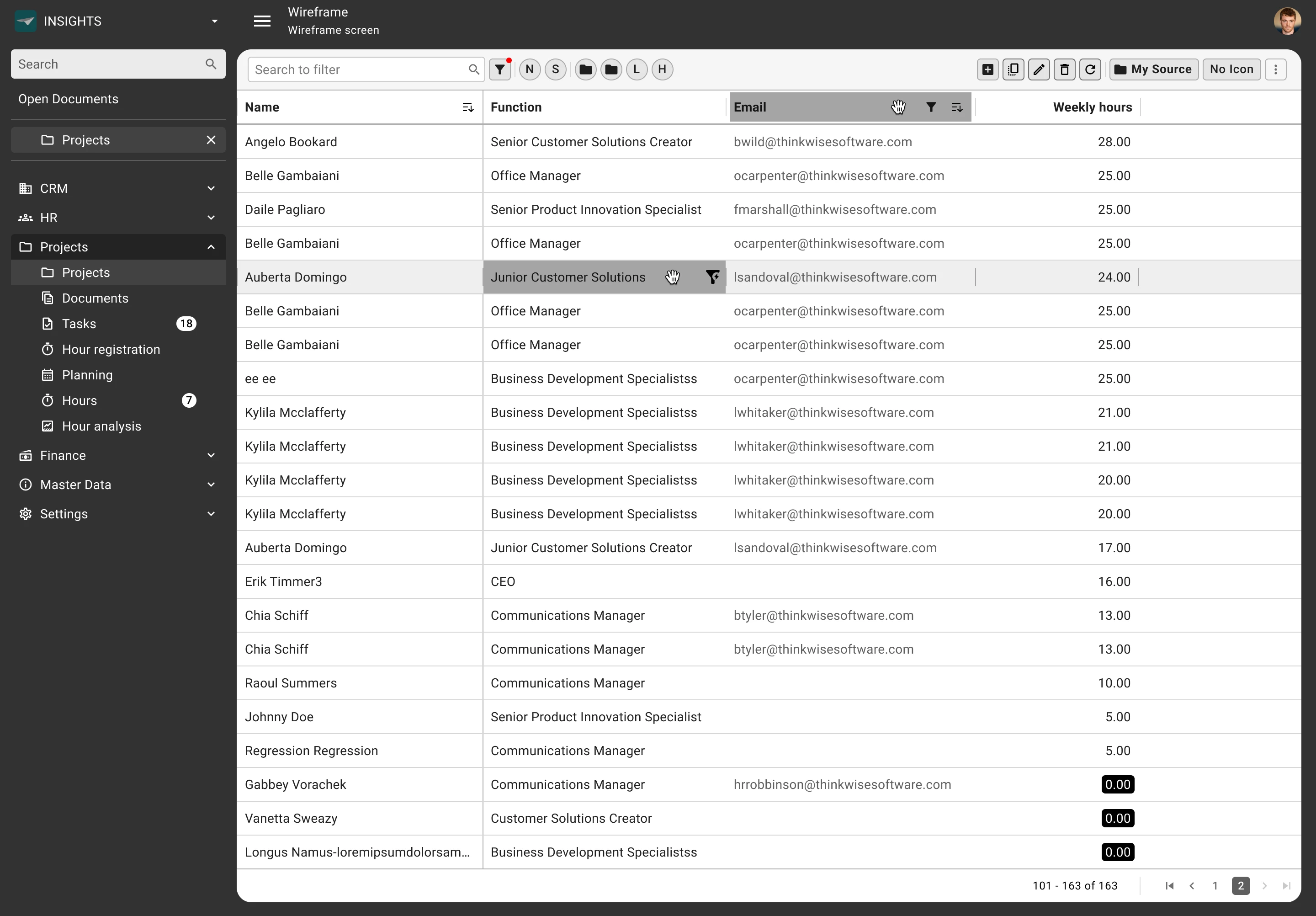
Concept 1: Quick win
In Concept 1, the filter has been removed from the overflow menu and placed next to the Search bar and Pre-Filters, ensuring that filtering takes place specifically on the left side. Additionally, the Quick Filter has also been removed from the overflow menu and now becomes visible on hover within the cell. The Excel Filtering remains unchanged, but its icon has been applied consistently and will be visible when an filter is active. And the sorting starts with the default order. When clicked once, it sorts A-Z or 1-9. A second click reverses the order to Z-A or 9-1, and a third click resets it back to the default sorting.
The ideas of the Quick Filter, Excel Filter and Sorting are applied to all concepts.
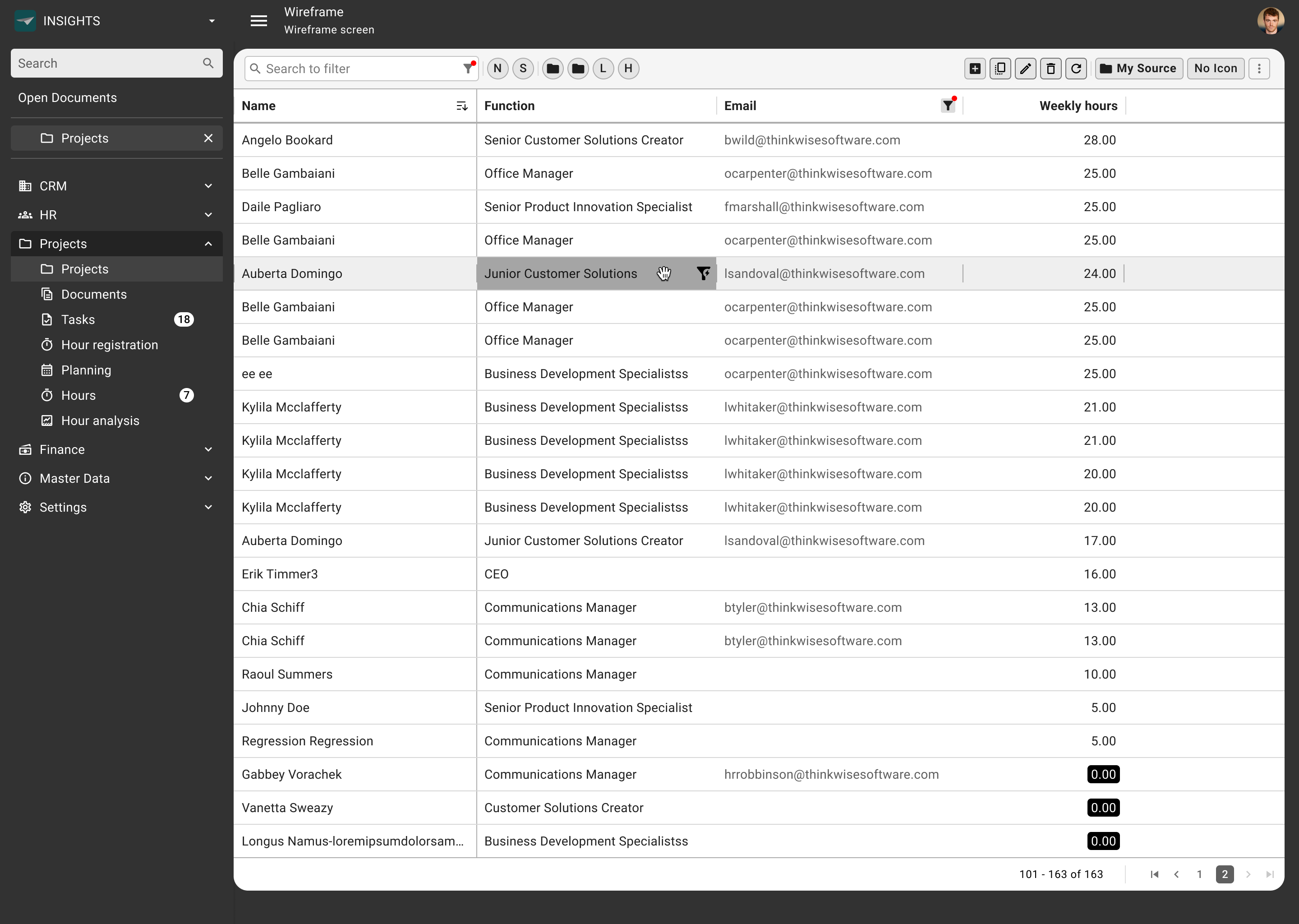
Concept 2: Improved Filter Form
This concept builds on the quick win. The idea behind it is that the filter button allows users to open a predefined Filter Form. This form contains a selection of 4-6 frequently used filters, including the Search function, which can be further configured in the Filter Pop-up. The Search function is integrated into the Filter Form to reduce Action bar buttons and trigger users to use Column-specific filtering first, ensuring a faster and more responsive interaction with the GUI. Filters from the Filter Form can also be adjusted within the pop-up.
Additionally, in this concept, the display of active filters has been clarified. When a filter is active, a small "X" appears in the input fields, allowing users to easily remove it. At the column level, the filter icon remains visible at all times, with a warning indicator to show that a filter is active. This also applies to the filter next to the search bar, which, like the column-level filter, now visually indicates its active status.

Concept 3: Filter in Search
The idea is to filter directly from the Search bar, similar to how it works in Outlook and Gmail. In this concept, the Filter icon becomes redundant, as all filtering can be done via Search queries. However, if the Filter icon is clicked, the filter pop-up will still appear with the previously explained functionalities.
To enhance visual recognition, a red indicator is used to clearly show when a filter is active, making it easier for users to see which filters are currently applied.
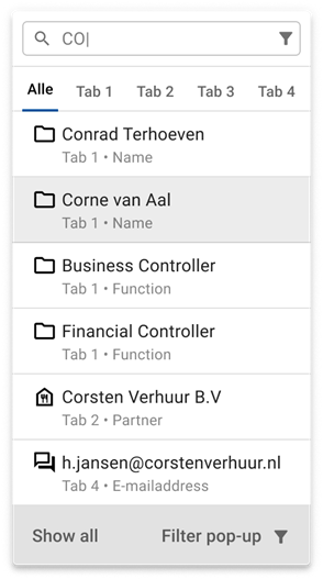
Filter by typing
Something that should complement the Search in Filter concept well is an idea I have visualized.
When a user searches for a specific word, the first results are displayed immediately. At the top, the user has the option to search within the detail tabs, with the default setting set to "All."
The search term is not only matched with the content of the columns in the main view but also with the columns within the detail tabs, ensuring a clear and structured display of the results.
From this view, the user has the option to open all results or activate the filter pop-up for further refinement of the Search query.
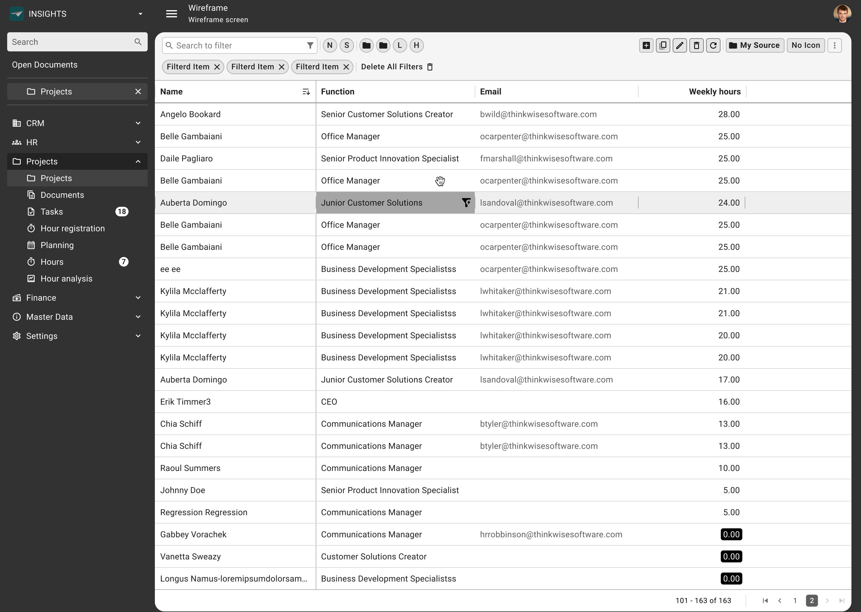
Concept 4: Pills
This concept builds on Concept 3, where the "Search in Filter" functionality remains the same. As an enhancement, I’ve introduced Pills to clearly display active filters as visual elements, giving users an even clearer overview of the filters they have applied.
When filtering via the search bar or the pop-up, Pills appear on the screen. This best practice provides a visual representation of active filters and allows users to easily remove them. In practice, multiple filters are often active at the same time, causing the Pills to be displayed side by side. This ensures a clear and manageable overview of all active filters, making it easier for users to adjust or remove them when needed.
Concept 5: Collapsible filters
In this concept, i’ve moved the prefilters below, keeping the row with the search bar, filters, and action bar clean and organized. All filters including prefilters, active filters, and related buttons are now grouped on a lower level, which can be shown or hidden using the filter toggle or close button. This approach gives us a clean and streamlined GUI that can easily expand when the user needs more filtering options, without overwhelming the main interface.

I hope I have been able to give you a clear understanding of my approach and the reasoning behind my concepts. Could you let me know which concept you prefer and why?


