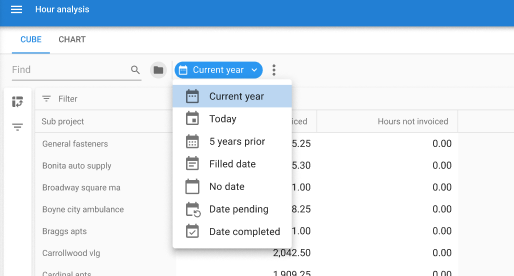
The new posibilities of action bar are really nice.
In de dropdown list we like to see all prefilters, because on small devices this is needed to see the title of the prefilter and users get confused when grouped prefilters are split in two places.

 +21
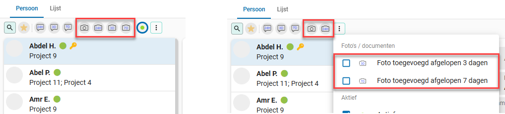
+21The new posibilities of action bar are really nice.
In de dropdown list we like to see all prefilters, because on small devices this is needed to see the title of the prefilter and users get confused when grouped prefilters are split in two places.
Enter your E-mail address. We'll send you an e-mail with instructions to reset your password.