We recommend and expect that Developers read these, as these communicate any (breaking) changes to the product. Theme changes in particular have to do with the UI Styling efforts we are working on and are described in the Universal GUI Release Notes.
We recommend and expect that Developers read these, as these communicate any (breaking) changes to the product. Theme changes in particular have to do with the UI Styling efforts we are working on and are described in the Universal GUI Release Notes.
Did you’ve upgraded from 2024.3.15 to the latest 2025.1 version of our platform? The new UI styling changes, stated in this design blog, don't require any model changes.
However, there ís a lot more color, where the menu background (SF theme main color) and badge (SF theme accent color) might need some attention to make sure contrast levels are maintained.
The reason why we changed the visual layout can be read in the design blog, but in short, the old UI styling did not sufficiently help the user to navigate through our platform. The old menu styling, for instance, looked the same as the other components, which is why we introduced a background as to minimize the cognitive load on the user. We also made the action buttons and prefilter buttons visually different, so that the user can instantly recognize the function of those objects.
In this new release we also introduced the Collapsible Form Sections.
This feature might require model changes.
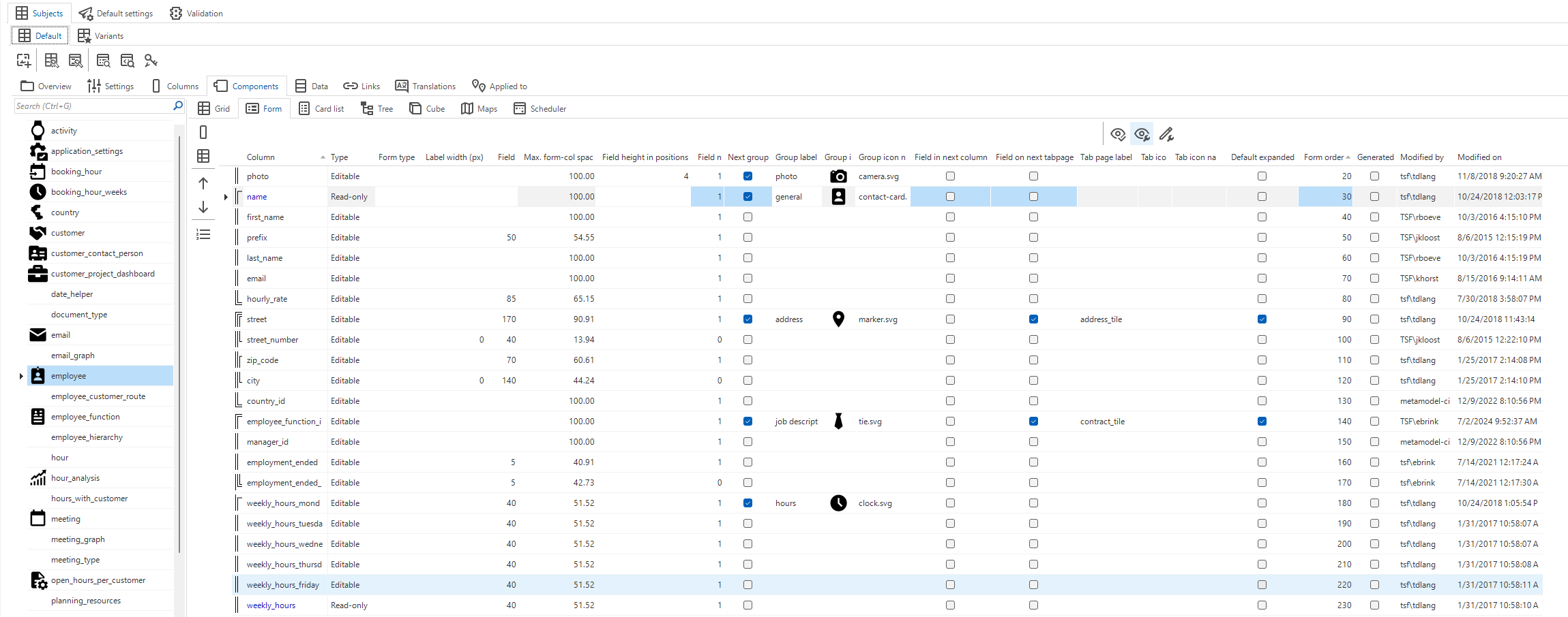
This feature is the Universals’ version of the Form tabs of the old Windows GUI. To control this feature, you can use the ‘Field on next tabpage’ checkbox in your Subjects screen in the SF
‘Field on next tabpage’ checkbox, note the ‘Default expanded’ checkbox as well
This introduces a collapsible section in your form. The ‘Default expanded’ checkbox gives you the means to show a form section default expanded or closed.
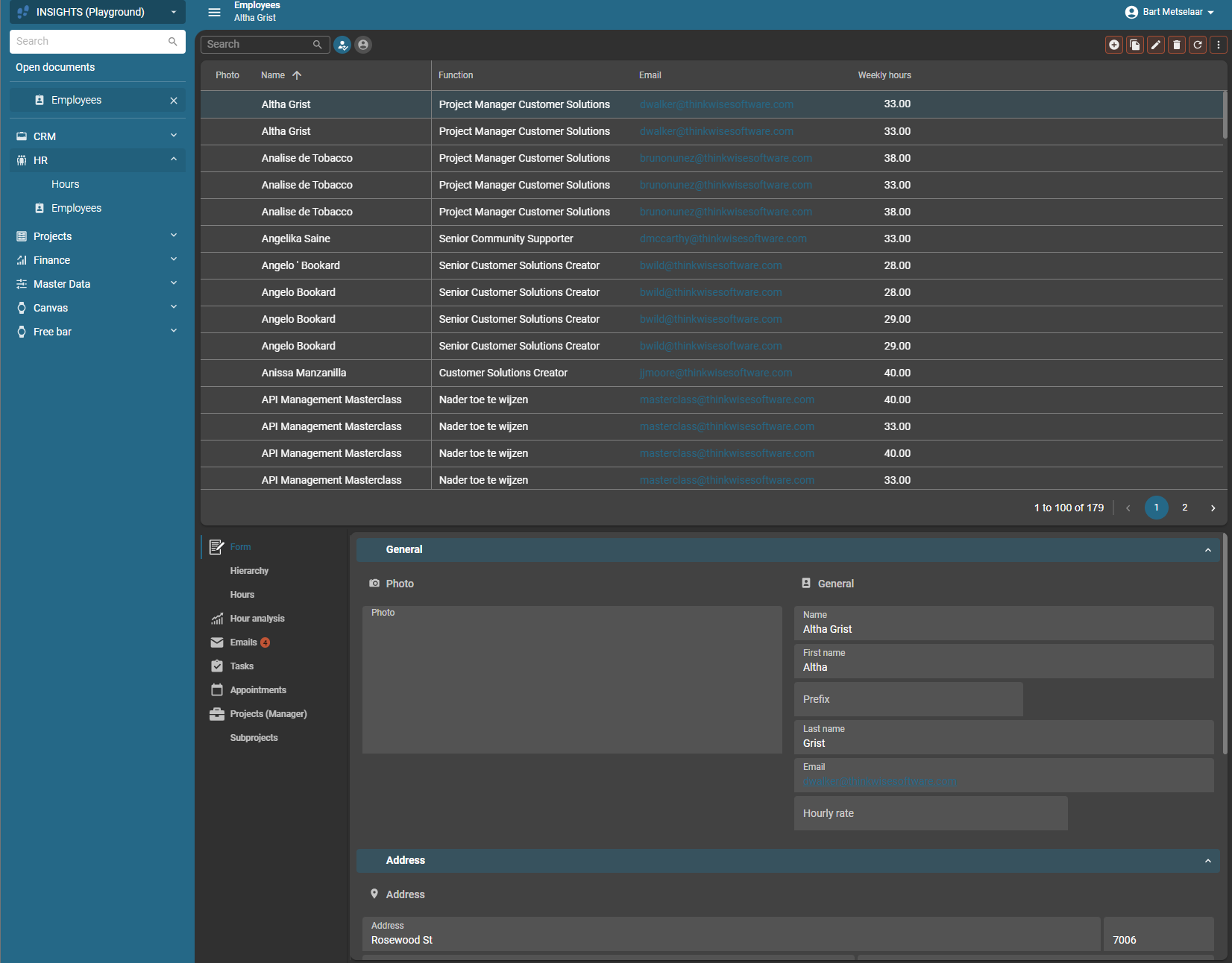
In this image, you see the form with the collapsible sections:
The ‘General’, ‘Address’ (and ‘Contract’) sections can now be collapsed by your user on their own demand
Next to all of this, we have the new Configurable Action Bar.
This new screentype component lets you put the actions and prefilters where you want them to as needed.


