
Hello everyone,
In this release, we have added support for a number of new features that have become available with the Thinkwise Platform release 2025.1. These features include the formalization of action bars, the assignment of actions to screen areas, and the support for default expand grouped grid.
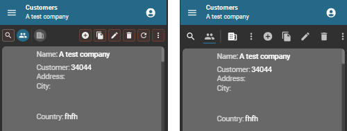
We have also implemented the new UI styling for the action bar and grid rows.
Demo
As always, we have made a demo for you: try it here. Before trying it out, press 'Clear Cache' on the login screen.
Read the Universal GUI user interface guide to get familiar with the GUI.
Universal GUI version 2025.1.10
For more information about setting up the Universal GUI, see the Universal GUI setup guide.
Note:
- Use a modern browser to access the Universal GUI, for example, a recent version of Chrome, Firefox, Edge, or Safari mobile.
- Deploy the Universal GUI on the same server as Indicium or an allowed origin in
appsettings.json. - Run all hotfixes on IAM and the Software Factory that you plan to use for the Universal GUI.
- Use the latest version of Indicium.
Download the Universal GUI version 2025.1.10 here
Contents
Breaking
Thinkwise Container images
If you use a container image from the Thinkwise Container Registry, the default port has changed from 80 to 8080.
For more information, see the blogpost Thinkwise Container images breaking change.
New and changed
Action bars formalized
new
As of Thinkwise Platform release 2025.1, the Universal GUI uses Action bars and Custom action bars. The screen component Toolbar is no longer available as of this platform version. When starting this Universal GUI version against an older platform version such as 2024.3, the Toolbar will still be displayed.
The new action bars offer you more flexibility in their content and appearance. For more information about configuring the (Custom) action bars, see User interface - More control over action bar placement in the Universal GUI in the Thinkwise Platform 2025.1 release notes.
The following features are available in the new action bars:
- New styling for prefilter, CRUD, and task/report buttons as described in the blog post Styling update of the Universal GUI.
- In Comfortable mode, the buttons are bigger and have more space around them. This mode is mainly used on mobile devices, and is now more suitable for touch devices.
- The reintroduction of task and report group dividers, once temporarily introduced in the Universal 2024.3.12 release candidate.
- Extended display types for table tasks, table reports, prefilters, and cube views, which override the default display type for the action bars. For more information, see Display types in the Thinkwise Platform 2025.1 release notes.
- A more even distribution of space between buttons. The (Custom) action bars try to keep as many buttons visible as possible. If an action bar is configured with, for example, many Icon + text (> text > icon) buttons, it will first collapse all buttons to Text, then to Icon, and finally to the overflow, from far to near.
- Contrary to the Toolbar, the (Custom) action bars do not display prefilters both in the bar and in an overflow to the right of the prefilters. This saves screen space. However, it is possible to place prefilters in the overflow menu. Note that the prefilter overflow menu has been removed, there is only one overflow menu at the far end of the action bars.
Custom CSS changed
The new action bars come with changes to your custom CSS; the styling has been improved, possibly making your custom CSS obsolete.
Note that the HTML structure, CSS classes, and data test IDs have changed, making your CSS selectors mostly unusable for the action bars. This applies to all parts of the selector, for example: div[data-testid=”toolbar”] > div > .icon > svg.
We recommend using the default styling.
For an overview of the changes:
Differences between the test IDs for toolbars and the new action bars:
| Area | Toolbar test ID | Action bar test ID | Notes |
|---|---|---|---|
| General | toolbar | actionbar | |
| start-toolbar | - | ||
| - | actionbar-near | ||
| - | actionbar-far | ||
| toolbar__overflow-menu | - | ||
| toolbar__overflow-menu__button | actionbar__overflow-menu__button | The action bar has only one overflow menu. It is located action bar-far for far buttons, or else in action bar-near. | |
| Search | search-toolbar__search | actionbar__search__input | |
| Prefilters | prefilter-toolbar-group-0__<prefilter id> | prefilter-actionbar-group-0__<prefilter id> | The number (index) differs based on the button visibility |
| prefilter-toolbar-section | - | ||
| CRUD | crud-toolbar__add | actionbar__add | |
| crud-toolbar__copy | actionbar__copy | ||
| crud-toolbar__edit | actionbar__update | In action bars, Edit buttons are always hidden in default editable subjects | |
| crud-toolbar__delete | actionbar__delete | ||
| crud-toolbar__save | actionbar__save | In action bars, Save buttons are always available in default editable subjects | |
| crud-toolbar__cancel | actionbar__cancel | In action bars, Cancel buttons are always available in default editable subjects | |
| crud-toolbar__refresh | actionbar__refresh | ||
| Tasks | task-toolbar-section report-toolbar-section | - | |
| toolbar__task__<task id> toolbar__report__<report id> | actionbar__task__<task id> actionbar__report__<report id> | ||
| Cube views | cubeview-toolbar-section | - | |
| toolbar__cubeview__<cube view id> | actionbar__cubeview__<cube view id> | ||
| Extra actions in the overflow menu | - | actionbar__overflow-menu__context | |
| toolbar__overflow-menu__item__quickfilter__icon | actionbar__quick-filter | ||
| toolbar__overflow-menu__item__filter | actionbar__filter | ||
| etc. | etc. | ||
Note: hidden buttons are no longer rendered. This is not relevant for styling but is relevant when test IDs are used in automated tests. For example, when adding rows is forbidden in the subject, the Add button was available in the Toolbar, but not shown. In the (Custom) action bars, the button is not in the DOM (Document Object Model) at all.
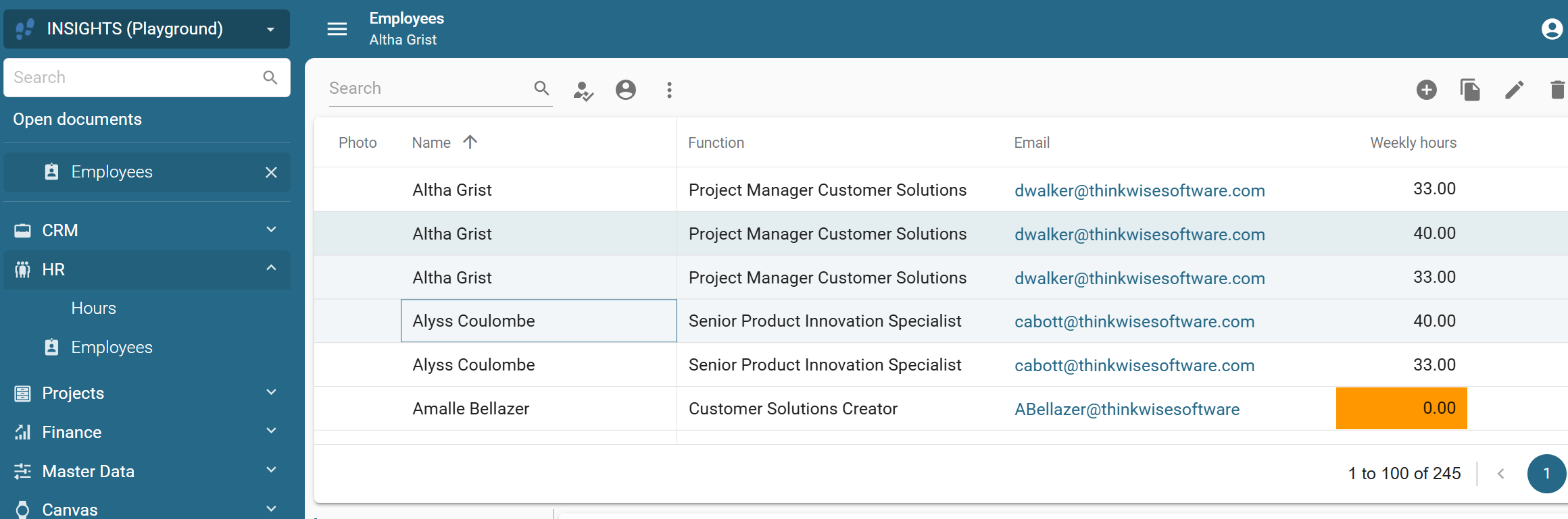
Screen areas to assign actions to screen components
new change
As of Thinkwise Platform release 2025.1, Detail groups have been renamed to Screen areas.
You can use these Screen areas to assign actions to Action bars and Custom action bars and mark them as fallbacks for all unassigned actions. This allows you to divide actions across multiple bars or make the most important actions stand out in a screen type. You can assign a screen area to the following types of actions in the (Custom) action bars:
- Tasks
- Reports
- Cube views
- Prefilters
In the screen type, you can assign the same screen area to task and report tiles, and to task, report, prefilter, and cube view bars. Here, you can also select whether the tiles or bars should be used as fallbacks. You can reuse a screen area multiple times in a screen type, allowing tiles and buttons to be available more than once on a screen. This also applies to the fallback mechanism: a table task, table report, cube view, or prefilter can fall back to multiple bars or tiles.
Screen areas remain available for details, the only difference is that a detail tab is placed on a subject only once, whereas actions can be duplicated.
For more information, see Screen areas also for tiles and bars in the Thinkwise Platform 2025.1 release notes.
Support for default expand grouped grid
Community idea new
It is now possible to set a grouped grid to be default expanded. When the setting Default expanded has been enabled, you can set the level of groups that will be expanded by default (menu User interface > Subjects > tab Default/Variants > tab Settings > group Grid). For example, if you enter '3', three nested groups deep will be expanded by default.
Note that the group and all its parents containing the active row are always expanded, even if the expansion level is set to '0'.
For more information, see User interface - Setting for expanding grouped grid in the Thinkwise Platform 2025.1 release notes.
Support for disabling multirow selection
new
A new setting is available for enabling or disabling the possibility for users to select multiple rows in the grid. The setting is called Multirow selection enabled and is available in the menu User interface > Subjects > tab Default/Variants > tab Settings > tab General.
Disabling multirow selection ensures that the following actions are performed on a single row: Task, Mass update, Delete, Export.
For more information, see User interface - Multirow selection in grid in the Thinkwise Platform 2025.1 release notes.
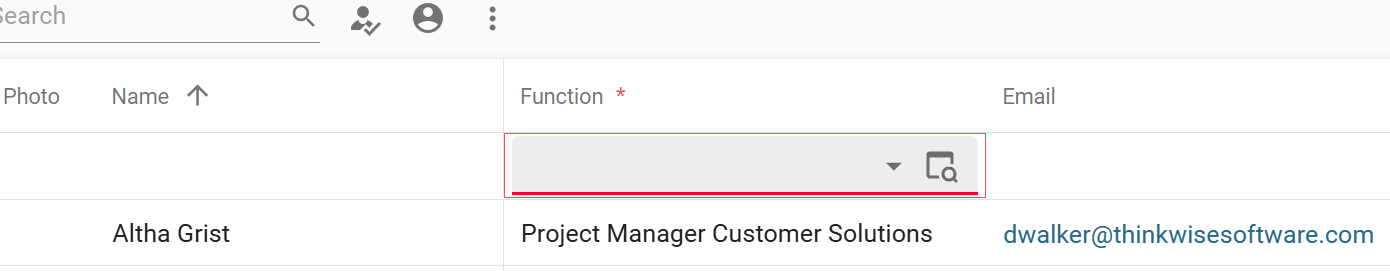
Support for collapsible form sections
new
In the Universal GUI, form tabs are not implemented because forms can extend indefinitely vertically. Instead, new tabs are interpreted by the Universal GUI as new sections. For example, the Trace info in the Software Factory is displayed as a tab in the Windows GUI, but in the Universal GUI, it is implemented as a section.
For all supported Thinkwise Platform versions, the form sections can now be collapsed or expanded by users.
As of Thinkwise Platform version 2025.1, you can use the Software Factory setting Default Expanded to specify whether a section should be expanded or collapsed by default. For this setting to work, the first column in a section must have the setting Field on next tab page enabled.
Sections without a Tab page label to explain the information available in the section cannot be set to default collapsed, neither in the Software Factory nor via user preferences.
For more information, see User interface - Collapsible sections for Universal GUI forms in the Thinkwise Platform 2025.1 release notes.
Check the test ID for `<section>`
For custom CSS, the data test IDs are unchanged.
Note that the <section> element with the editors in it is now wrapped with some additional <div> elements brought up by the collapse panel. You may need to update your selectors for that.
The test ID for the <section> element is form-section__<first editor column name>.
Support for calculated cube fields
new
Calculated cube fields are fields that are not directly available in the database but are calculated based on other cube fields. They are evaluated on cells and (sub)totals after intervals have been applied to dimensions and after values have been aggregated.
In the Software Factory, you can now create calculated fields by selecting the aggregation type SQL Expression (menu User interface > Cubes > tab Tables > tab Default/Variants > tab Values > tab Form). The Universal GUI will fetch and display these fields in pivot tables and charts like any other aggregation type.
For more information, see User interface - Calculated cube fields in the Thinkwise Platform 2025.1 release notes.
Row visibility in the grid
change
We have enhanced the way active, selected, and hovered rows are displayed in the grid:
- Row highlighting - The active, selected, and hovered row colors now use a gradient based on the main color selected for your theme in the Software Factory instead of a gray shade.
- Error indicators - Cells with errors are now more clearly highlighted for better visibility.
- Active row design - The indicator at the beginning of the active row has been removed for a cleaner look.
Security update
new
We have fixed the following security advisory: GHSA-mmhx-hmjr-r674.
This resolves a security issue affecting some areas where HTML is displayed in the Universal GUI, including:
- HTML control (view-only mode)
- Preview component displaying an HTML field
- Prefilter, task, and report button tooltips
- Column, report, and task column tooltips
- Tooltips for grid headers
- Maps marker popups
If a malicious actor were to inject an HTML value into one of these areas, such as through the Indicium API, this vulnerability could be exploited. In such a case, if a user had one of these elements visible, the attacker's JavaScript payload could be executed. In the worst-case scenario, the attacker could execute Indicium requests using the victim's credentials.
Thanks to Indicium's Content Security Policy, the risk of exploitation was low. In addition, we strongly recommend always configuring Security headers.
Minor fixes and tasks
- For hierarchical trees without grouping, the conditional layouts were not applied the first time the user entered the screen. This has been fixed.
Questions or suggestions?
Questions or suggestions about the release notes? Let us know in the Thinkwise Community!