


January 28, 2022:
- Changed beta release to the full version: 2022.1.10
Hello everyone,
In this sprint, we finished the FormList component in a basic form, and added some CSS styling classes for custom.css. Also, you can now execute a task on multiple rows in a grid in combination with a Popup for each row. And when importing rows, you can now download the rows that were not imported successfully.
As always, we have made a demo for you: try it here. Before trying it out, press 'Clear Cache' on the login screen. You can read the GUI user manual to get familiar with the Universal GUI.
We will keep you updated regularly about Universal's progress.
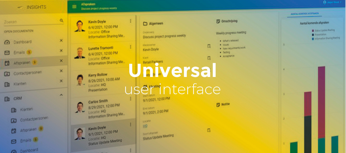
Universal GUI version 2022.1.10
Like with every blog, we have released a version to test the Universal GUI out for yourself. Do not forget the documentation and be sure to keep the following in mind:
- A modern browser is required to access the Universal GUI, e.g., a recent version of Chrome, Firefox, Edge, or Safari mobile. Using the Universal GUI with IE is not supported.
- The Universal GUI must be deployed on the same server as Indicium or an allowed origin in appsettings.json.
- The Universal GUI only works with version 2019.2 and up of the Thinkwise Platform.
- Make sure you run all hotfixes on the IAM and SF that you plan to use for the Universal GUI.
- Make sure you are using the latest version of Indicium Universal.
Download the Universal GUI version 2022.1.10 here
Contents of this release
New
FormList component
The Universal GUI now supports the FormList component in a basic form. In a FormList, each record in a dataset is represented as a separate form. This form looks and feels like a default-editable autosave form. Using a FormList, you can create a dynamic form without the need to re-generate your Software Factory projects.
This first, basic support is targeted at making questionnaires. Suppose a survey contains multiple questions with different types of answers. For example, a full name (string), a birth date (DateTime), and a Yes/No checkbox that indicates whether the end-user wants to receive commercial emails or not. But you could also think of a five-point scale that measures user satisfaction. Using a FormList, this survey would look like this:
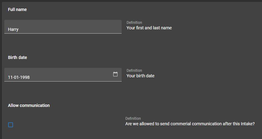
Example of a FormList
In this example, a Layout control procedure in combination with an answer type field can be used to show the correct answer field for the related question. The corresponding stored procedure is then executed to determine the visibility of each control.
Using a Group label control type in a Form or FormList component results by default in a bold (group) label. See the labels Full name, Birth date and Allow communication in the image above.
The Universal GUI supports the following control types: Default, Multiline, Numeric, Currency, Date, DateTime, Time, Checkbox, and RadioButton.
- HTML, file, and lookup controls are not yet supported.
- The component and fields are always in edit mode.
- There can only be one form column. Multiple form columns are not supported yet.
- For adjacent fields, the width is evenly distributed over the available width, regardless of the settings in menu User Interface > Subjects -> tab Components -> tab Form.
- When grouping controls for a single record, the
field in next groupandfield in next taboptions are not supported. - FormList is default editable and works around the subject editing mechanism. Without any other editable components, like form or grid, CRUD buttons are hidden on the action bar.
- FormList patches directly to the table just after changing a value. To keep the editing experience fast and smooth for now, no data is refreshed and field visibility has not been updated yet.
- The layouts are not re-fetched after a patch.
- The dataset is not re-fetched after a patch.
- As layout mode, only the navigation layout mode can be used.
Execute a task for multiple rows with a popup for each row
In the Universal GUI, you can now execute a task on multiple rows in a grid with a Popup for each row. With this general task setting enabled the GUI displays a popup for each row to give the user the opportunity to give input to the task execution.
Currently, a popup will be displayed for all rows. In the Universal GUI, it is not yet possible to abort this flow.
Until now, tasks with a Popup for each row could only be executed for a single row.
CSS styling classes for custom.css
When using custom CSS to enhance theme settings, you can now specify style sheet rules that are specific for light or dark mode, and for comfortable or compact mode. You can use the following classes:
.light{ }
.dark{ }
.comfortable{ }
.compact{ }
Download failed rows
When importing rows, you can now download failed rows using the DOWNLOAD FAILED ROWS button in the summary dialog.
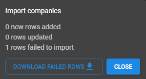
Example of a dialog with a 'Download Failed Rows' button
Changed
Hide actions bar buttons when there are no editable components on the screen
If a screen does not contain any editable components, the action bar now no longer contains buttons for adding, editing and copying. These buttons are not necessary when viewing a cube or chart, for example.
Tip: you may also be interested in hiding the toolbar .
Marker popup in the maps component contained too much padding
In the Maps component, the marker popup was not displayed correctly, it contained too much whitespace. This has been corrected.
Minor fixes and tasks
- When the browser autofills the username/password dialog, the Login button would remain disabled until the user clicked somewhere on the page. This was unintended behavior. The Login button is now always available. If the user clicks on the button with an empty username, it will disable and focus the username field.
- In a tree component, icons were not displayed correctly in compact mode. This has been fixed.
- When a screen with detail tab pages with badges was opened, and the dataset took a while to load, a 400 network error would occur. This has been fixed.
- Badges showed a 0 (zero) when there were no rows or when a row was added. This was unintended behavior. Now, the badge will be hidden in these cases.
- In dark mode, the font color used for text on colored backgrounds was inconsistent. This has been fixed.
- The HIDE_TOOLBAR screen component property now works correctly regardless of its value.
- In a Preview component, when a search returned no results, the default text No preview available was aligned at the top left instead of the center. This has been corrected.
- After changing the password from the user preferences menu, or when changing an expired password after login, the Universal GUI browser tab was not immediately displayed in front. This has been corrected.
- When a screen contained both a form and a grid, the grid component could become editable, even if this was not configured in the Software Factory. This has been fixed.
What we will be working on next sprint
The next sprint we will be working on:
- Non-edit mode filled style - The ability to have the filled style displayed in non-edit mode.
- Repeat offline tasks - All tasks that are flagged as offline will repeat. This behavior will be added as an option in the Software Factory in the future.
- Hide read only parameters in offline tasks - Parameters the user cannot fill in an offline situation will be hidden.
- Continue improving grid performance and make it less flickering.
- Continue automatic testing.