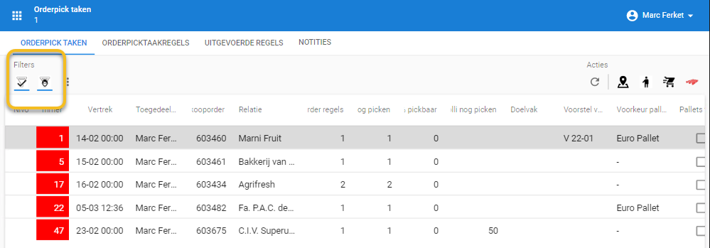
I am curious about a couple of things in the Universal GUI: We have a subject with 2 prefilters, showing perfectly on a bigger screen:
Prefilters showing up top left
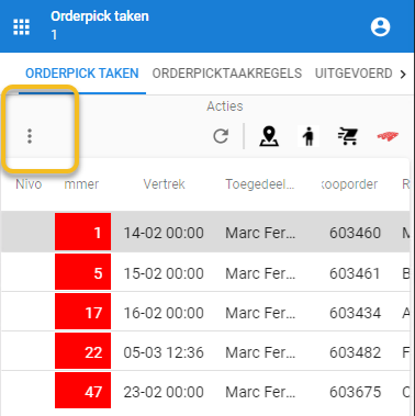
But when the screen gets smaller, the prefilters are hidden behind the 3 dots, in my opinion there is enough space left to show the prefilter buttons, is this by design? And can we influence this by a setting? And can we influence if only 1 prefilter shows, which one that would be, is that with the “order no” ?
Prefilters hidden top left.
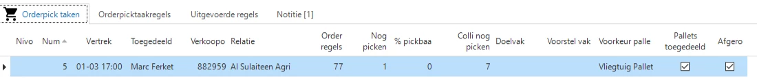
The next question is about the alignment of the headers in universal, we see them aligning with the same alignment of the data, the same behavior as the windows GUI.But in the Windows GUI we see that the text that is aligned on the right side, still starts at the beginning, as in the Universal GUI we only see the end of the text, is this by design? Cause I would prefer the same behavior as in the windows GUI since this is more clear.
Alignment right, with “verkooporder” & “Nummer”
And 1 final question, in the translation we use an “enter” to make the header a bit bigger and keep the column smaller, the Universal GUI ignores this, will this be added any time soon?
Best answer by Sebastiaan Meijerink
Robbert,
The prefilters (or the whole filter/search section) of the action bar currently are allowed to take up 50% of the space, the other 50% being reserved for the crud/task/report bar. And it favours the crud actions, so when you go smaller and smaller it will alway try to keep those out of the overflow menu. You are absolutely right that there is more space available and we are aware of the fact that the top actionbar as a whole could be more intelligent about deviding this extra space, but at the moment it isnt’. There is feature on the backlog for this, but it has not risen the ranks of priority yet.
The text beging cut at the right side of right aligned elements is a bug and you should raise a ticket for that.
About the header height. At least I think you mean you would like to make the header contain multiple rows. Enters in the header text will be ignore, the browser platform ignores newlines. I will make a story for this. For tracking purpose please make a wish in TCP.
Is this feature in the community? Can you share a link so we can give extra votes for this feature? The screenshot is of a 'real live situation' and for users it is incomprehensible that 1 (filter) button is hidden behind dots while there is still more than enough space available. And some users do not know that a filter is active, because the button is not visible :-(
@Sebastiaan Meijerink I thought the header being cut incorrectly was already raised as bug by your internal Universal testers? Does it help to raise more TCP issues for this? Then we’ll pitch in too.
@Robbert van Tongeren On the header enter: couldn’t you do this with custom.css? We make the header text bold using custom.css for example.
@Arie V Dividing the header more based on the available space instead of just 50/50 is indead already on the backlog. I've tagged you as a stakeholder on that story to;) And I bumbed it up in the priority order.