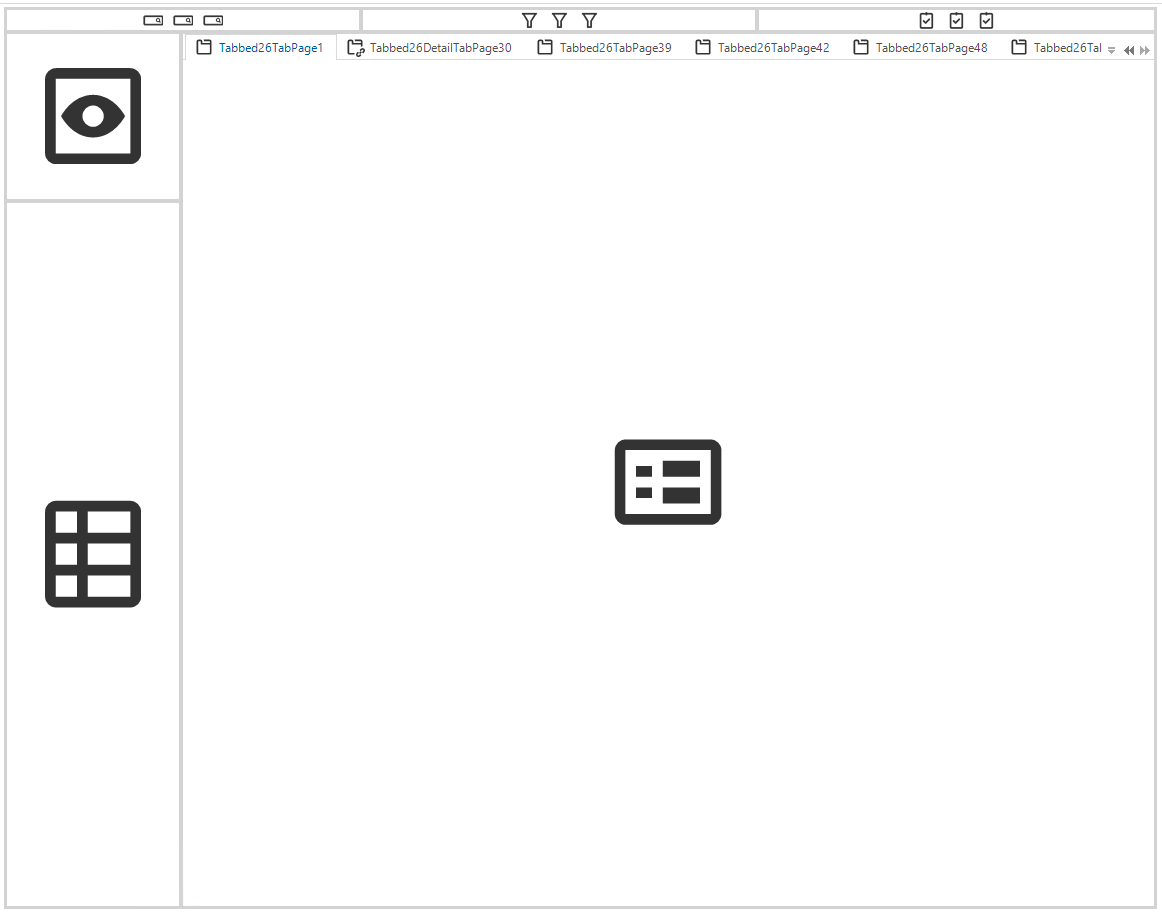
We upgraded to latest Universal version (2023.1.13) and the position of the toolbar is still not as desired. Did we do something wrong?


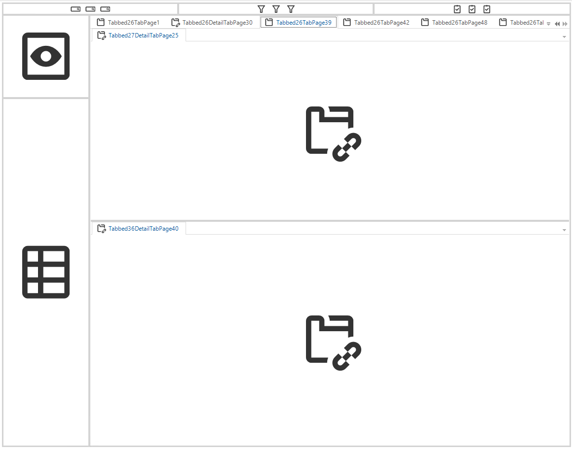
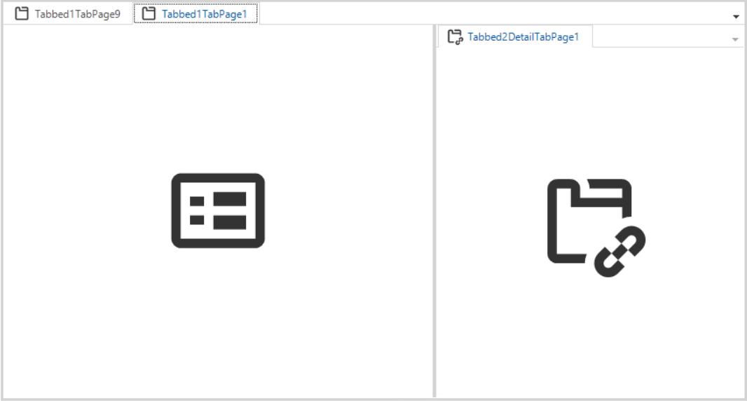
The screen exists out of a main tab container with a grid on the first tab and a form plus detail tab_container on the second tab. See below.


Tab 1
 

Tab 2
 

Hi Harm, 

Sadly this case currently doesn't work. You can create an Idea for this. The technical details are a bit too complex to explain here.

Edit: We'll make a support ticket


Hi Mark,

Really, do you want me too make an idea for this? This sounds very disappointing to me.

I think this should be treated as a bug and solved as soon as possible. The original idea was clear I think and is not correctly implemented. 


No worries, we agree that making a support ticket for this may be a better solution to this. Upon closer inspection this should indeed also be working as you would expect. I'll create the ticket in your name for this using the details you've mentioned.

The positioning of these buttons looks easy but has technical complexity. I just spoke to the developer that implemented the feature. This case is an unimplemented situation. The buttons should be positioned correctly when no tab pages are used.


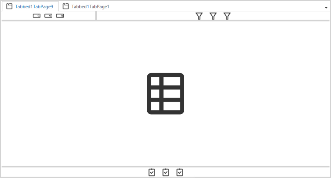
@Harm Horstman The following should work, but that would mean the detail will be visible regardless of having the grid or form active:

Working situation - Details next to the Tab page container


@Mark Jongeling Thanks for the follow up.

And I have seen that this alternative scenario works, but the idea of a grid is in our case to have as many columns visible as possible. That is why we combine form and detail tabs on a separate tab page.


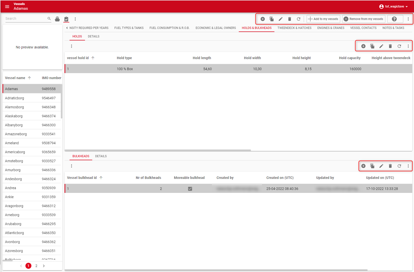
@Mark Jongeling Some more input here, for the below Screen type we'd hoped to see different behavior with Universal GUI 2023.1.13 version too, but we didn't see a change in placing the Action bar. Might be a bit of an edge case, since we apply your suggested workaround here:

Grid + Form
Grid + Detail tabs


GUI interpretation