Solved

Scatter plot with dynamic x-axis and y-axis

  • October 29, 2024
  • 3 replies
  • 67 views

Forum|alt.badge.img

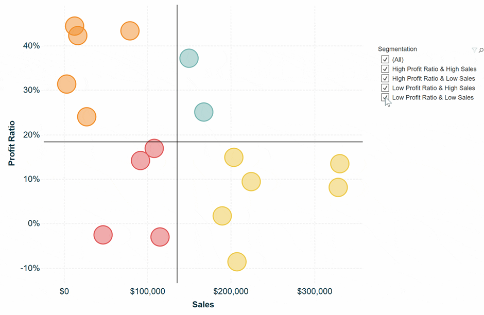
I was wondering whether it is possible to visualize a scatter plot within Thinkwise cubes? If so, which chart type should I use? Furthermore, I want to be able to set up the x- and y-axis dynamically such that they are always at the average level of the value specified on the x- and y-axis (see picture below). Is this possible?


Best answer by Alexandra Egri

Hello @Stan Wolters,

At the moment scatter and point chart type are not supported and the dynamic axis are not possible.

I would suggest to create two separate ideas for this two topics.

Thank you!

View original
Did this topic help you find an answer to your question?
This topic has been closed for comments

Alexandra Egri
Moderator
Forum|alt.badge.img

Hello @Stan Wolters,

This is not possible at the moment. Could you create an idea in the ideas section? This would help us gauge interest from others and might inspire more ideas on this topic..


Forum|alt.badge.img

Hii @Alexandra Egri,

Is the scatter plot idea not possible or is the dynamic axis idea not possible? I found a picture on the Thinkwise Documentation page (Business intelligence in the Windows and Web user interface | Thinkwise Documentation (thinkwisesoftware.com) ) where both a scatter diagram and a point diagram are presented as possible graph presentations. Those would suffice I guess. However, I have not yet figured out how to set up the cube view fields such that my data is displayed in the right way.


Alexandra Egri
Moderator
Forum|alt.badge.img

Hello @Stan Wolters,

At the moment scatter and point chart type are not supported and the dynamic axis are not possible.

I would suggest to create two separate ideas for this two topics.

Thank you!


Cookie policy

We use cookies to enhance and personalize your experience. If you accept you agree to our full cookie policy. Learn more about our cookies.

 
Cookie settings