

The Universal GUI now supports most of the Filter-related features that also exist in the Windows GUI. Over the period in which additional features have been added, I have been struggling a bit to form an opinion. I am off course happy that more options are available, but I also doubt how intuitive and accessible it is to end users. I'm trying to figure out what should be improved to ensure our end users actually utilize these features. What do you think?
A couple of thoughts from my side:
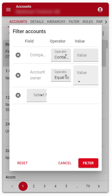
- In my experience the average end user doesn't click on Overflow menus, unless they are explicitly searching for something. As a result, the Quick filter and the Filter form are not used that often, while they offer great functionality to quickly filter out data. Instead, the Combined search is used way more often, but that one is slower and less specific.
- I believe it would be benificial to always have the Filter button on the Action bar next to the Combined filter or as the first button in the Pre-filter bar.
- Clicking the button would open the Filter form
- This button should be underlined if something is filtered on (similar to enabled Pre-filters).
- The Reset button (maybe translate to Clear) in the Filter form should clear out all Filters, also Domain element filters or Quick filters that are set outside the Filter form.
- Then I suppose the ‘Clear all filters’ option could be removed from the Overflow menu.
- I believe it would be benificial to always have the Filter button on the Action bar next to the Combined filter or as the first button in the Pre-filter bar.
- From my perspective the Combined filter, Pre-filter, Quick filter and Filter form all serve the same purpose of finding specific records and it made sense to have them all grouped together.
- The latest Universal GUI (2023.3.13) has moved the Quick filter and Filter form options to the general overflow menu at the right. I don't know if I perceive that to be an improvement, as they are moved to a less related and less intuitive location.
- The Filter form looks terrible on Mobile devices. Can this be improved?
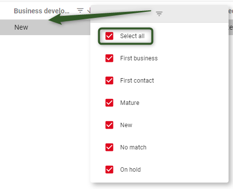
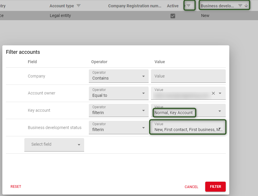
- The Domain element filter behavior could be improved
- Locate the filter right below the Grid column header, not at the right
- Ensure that ‘Select all’ effectively disables the Filter, instead of adding all options
Hope we can get to some great solutions, which we can recommend to Thinkwise!
