Hi all,
When transitioning from the Windows GUI to the Universal GUI, we are experiencing some problems with the layout of the form that pops up when activating a task with editable task parameters. In Windows, we created this layout:

The last column shows editable fields when the checkbox for that particular row is checked.The only problem we had with this layout is that the columns are a little too wide (which is caused by the top radio button). We created this layout with the help of the following options: “Next group”; “Group label”; “Field in next column”; “Field no. of positions further”; “Field width”.
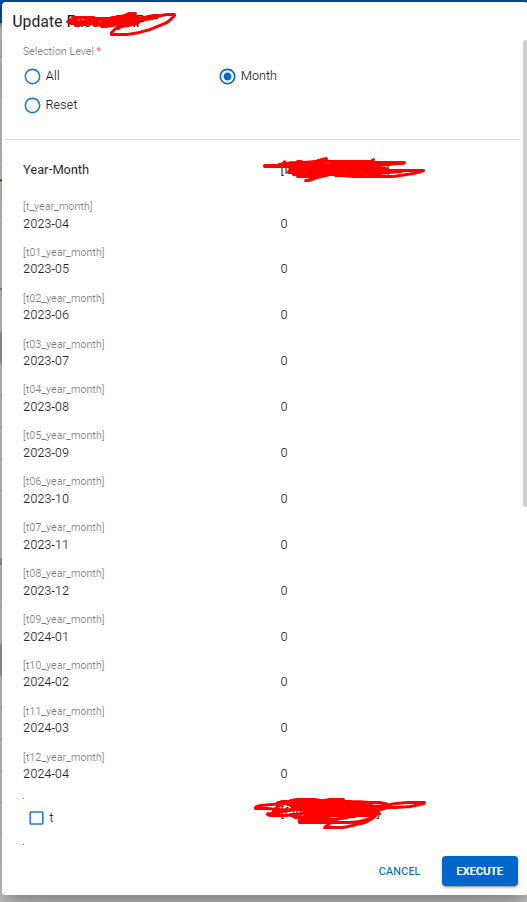
Now when switching to Universal, the layout looks like this:

Aside from the field width issues, the columns are placed vertically. The closest I can get to the Windows layout is as following:

It is impossible to achieve a layout with more than 2 columns at the moment (which also weirdly puts the last radio button option on the next row), and we strongly have the feeling that the options in the Software Factory are not working as they should. At the moment, it is a real challenging and time-consuming task to modify all of our task layouts to our needs.
Are there any solutions for more control in the task layouts?


