Hi Everyone,

We’re having a CSS question. I once saw a topic specifically for such questions, but I can't seem to locate it anymore.
We're successful in changing the appearance of the Universal looks for a client. However, one minor detail seems difficult to style. It concerns lookup fields. Have a look at the screenshots below.


The yellow arrow points to a lookup. This input looks alright. Until it gets focus. See below.
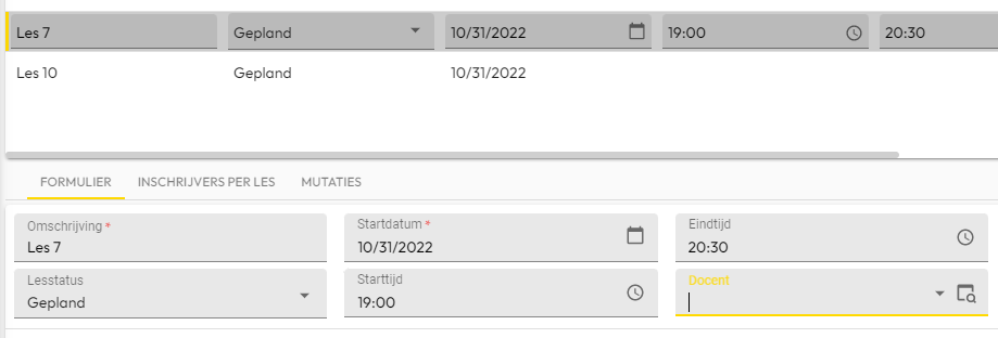


The placeholder text gets transformed and colored. It being colored is the issue here. We want it to remain legible, and colored the same way as our tab texts; black. How do we make it so?

Best regards,
- Alex.

Hi Alex,

something like this should do the trick

.form-field .has-lookup label {
color: black;
}

please note that you have .dark and .light classes on your html element. These should help you descern whether the color should be dark or light.

Kind regards,

Tim de Lang


Thanks Tim! That works! 🙂 It doesn't work on date and time inputs though, and combo boxes stay behind as well. I can't grab these as .form-field .time-input label, and input .time-input label  doesn't seem to work either. Do you happen to know the trick to grab these as well?


Hi Alex,

Yeah no problem, we can just get rid of the lookup bit and make sure we override all other styles:

.form-field label {
color: black !important;
}

This should work for all labels in the form. Even if they have conditional layout for example. Be mindful that a form field can look different depending on many things (e.g. dark/light mode, background/no background, conditional layout), and that can affect the readability of the text.

Kind regards,

Tim de Lang


Ah, yes! Brilliant! Thanks Tim, this works wonders!