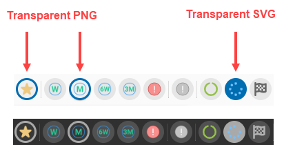
We prefer using SVG for icons, but the circle around active prefilters with a png icon are more clear
It is also difficult to find a optimal solution, that works for dark and light mode
Hopefully this can be improved a little.


 +21
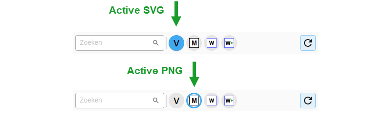
+21We prefer using SVG for icons, but the circle around active prefilters with a png icon are more clear
It is also difficult to find a optimal solution, that works for dark and light mode
Hopefully this can be improved a little.
Enter your E-mail address. We'll send you an e-mail with instructions to reset your password.