


UX around us
At the Developer Event of 2025, I was invited to tell my story: the importance of UX design and how you can use simple guidelines to optimize your products’ UX.
User eXperience Design is an often-overlooked element in our complex world of core systems. We as developers can become accustomed to users working daily with our application, and assume these users (eventually) get used to the processes and tasks we develop for them. However, we can tremendously decrease complexity for our users when we take steps in our development processes to improve usability.
Empathy
The starting point is observing your user when using your product.
Functionality is often considered “done” once it technically works. But especially for frequent or complex tasks, usability makes a difference. Ask the user to perform their task in the product and then watch and listen to what they are doing, so you gain insight into what works and what can be improved. Inform the user upfront to narrate everything they are going to do, as we cannot look into their minds.
Use tools like the empathy map to structure your observations. It helps you (and your team) to understand where and why improvements can be made.
Use empathy to:
- Align the team with a single, shared understanding of the user.
- Remove bias from our designs.
- Discover weaknesses in your research.
- Uncover user needs that they themselves may not even be aware of.
- Understand what drives users’ behaviors.
- Guide you towards meaningful innovation.
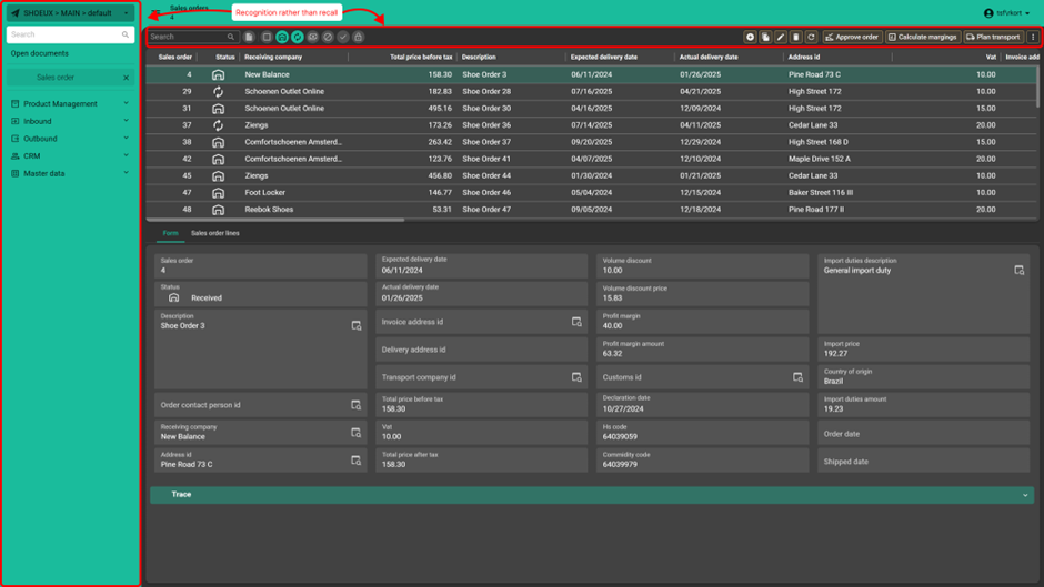
Recognition rather than recall
The sixth heuristic of Jakob Nielsen’s interaction design guidelines, informs us that we as humans have limitations on our short-term memories.
Our users are used to other products (like email providers, social media platforms, smartphones etc.) which raises expectations about how software should work (the so-called ‘Jakob’s law’). The human brain quickly recognizes patterns and expects those patterns to function the same way (i.e., login pages, menu navigation, and what a button looks like). Use this to your advantage to help guide a user through your product.
An extra element on this subject is repetition: our products have several ways to interact with them. By reusing Screen types, repeating button placement, setting up Forms with repeating structures etc., we help users recognize where they need to be across different screens.
Minimize the number of options
Although our products can be complex, it should not be complicated to work with them.
- The more choices we give to a user, and the more complex the options are, the more time it will take to decide. This is called ‘Hick’s Law’. While we support complex tasks and large data sets, don’t overwhelm users with too many options at once.
- Another great guideline is Fitt’s Law, which tells us that the time to reach a target depends on the distance and size of that target. By placing interaction methods in the path of how a user goes through a screen, we improve usability.
Use the Empathy step if you have doubts/questions about the number of options a user needs to go through during a task.
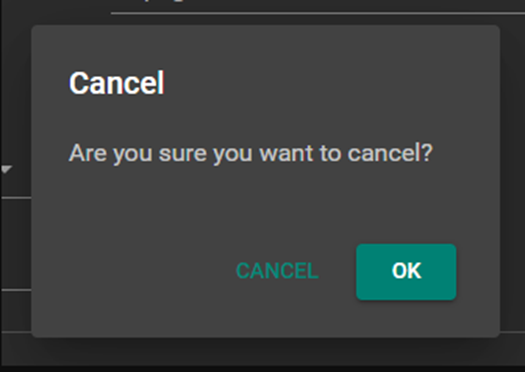
Be concise about the options you give a user in text. We’ve had the ‘Cancellation, cancellation, confirmation popup messages’ where a popup asked: ‘Are you sure you want to cancel?‘ raising doubt and confusion. A better solution would be: ‘Discard changes.’
Also check out Mustafa’s blog about Configurable Action bars to improve your button placements!
Grouping
I presented two ways to group elements with which a user can sift through data more easily.
- Chunking
With Chunking, the data is presented in such a way that it is easier to scan. I showed the example of a column filled with phone numbers, where all records had ten numbers. Mobile phone numbers were shown with 06 [space] and then the rest, whilst net numbers (like 038 for my city) had different spacings to instantly be recognizable as what type of phone number they were. - Miller’s Law
Miller’s Law describes the concept that the average person can keep seven items (plus or minus two) in their working memory. We do not state that a group should have a minimum of five items, or that it is a strict rule to follow, but it is a guideline to help you organize larger sets of data into smaller, clearer chunks to help minimize cognitive load.
Universal now supports the Collapsible Form Sections, with which we can make distinctive groups even more recognizable. Users can opt to collapse groups of data when desired (which also expands again if the cursor_to_col_id moves to that collapsed section)
Highlighting
To guide users in the right direction, we can use the looking order and size/color of elements to support that direction.
In the western world, we scan through text in an ‘F’ style until we find what we are looking for. A vertically aligned form would therefore be beneficial to your user. Especially with the collapsible form sections and their colored background as highlight.
We are also going to offer you the Call To Action option for buttons. With this setting, the background color of that button gets 100% opacity, instantly standing out from the rest. Be sure to use it wise and sparingly! Because if everything demands attention, nothing gets attention.
Above principles applied to the Universal UI:
Let’s take a typical Master-Detail Screen type, with elements like the menu (recognizable as an area of navigation) and the round prefilters (which are improved in their on/off state by coloring the background), versus the distinctively recognizable square action buttons, improving recognizability.
When we put all the ideas of this blog together, we can separate the action buttons (above the Grid) and CRUD buttons (above the Form), to minimize the options a user must sift through.
This makes the functions recognizable and relatable to the area where they are located and reduces distraction.
We made the ‘Add’ button an Icon + Text button, to highlight that as a focus button, drawing attention of the user as a primary action.
The ‘Plan transport’ button has gained the future 100% opacity background, instantly recognizable across the whole screen. Deliberately placed as the last button of the group of three, so the eyes still go over the two other buttons.
The Form itself is divided into smaller groups of a maximum of 7 form fields, separated into Collapsible Form Sections, making it easier for the user to scan through.
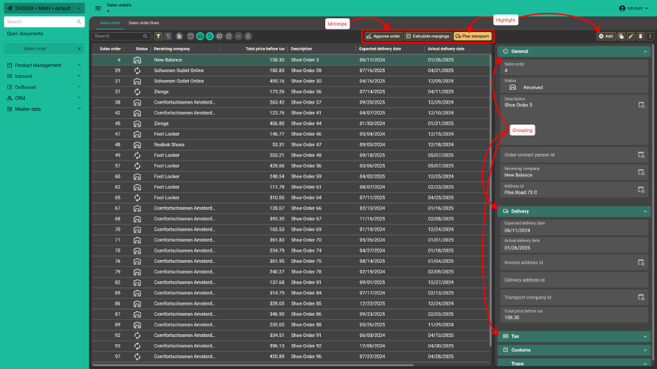
The changes might be subtle, but they tremendously improve usability, as the same data is presented slightly differently, to offer a scannable, recognizable, and above all, repeatable screen. Use these guidelines to not only make a technical scalable platform, but also a UX proven scalable platform.
Useful links:
https://www.nngroup.com/articles/ten-usability-heuristics/
https://www.nngroup.com/articles/empathy-mapping/
https://www.nngroup.com/articles/usability-101-introduction-to-usability/
https://lawsofux.com/