


On Wednesday, April 9, I gave a presentation at the Thinkwise Developer Event about the possibilities of the Action Bar. For those who couldn’t attend, I’ve outlined my presentation in this blog post. My blog ties in nicely with this blog by Bart Metselaar, in which he explains how to design user-friendly screens using UX principles.
Changes Over Time
In Platform Release 2025.1, the Toolbar Screen component has been replaced by the Action bar and the Custom action bar Screen components. These provide a more flexible and balanced action button and prefilter layout that better adapts to the available space. The updated styling integrates seamlessly with the rest of the UI as well.
As a result you can now assign Tasks / Reports / Prefilters to dedicated Screen areas of the Screen type (similar to Detail groups), add Action bars with different configurations to a Screen type (for instance have a different Action bar above a Grid versus a Form), and determine the availability, order and Display type for each and every button on the Action bar (similar to the Task Display type).
Action Bar configuration
Action bar configuration can be done at multiple levels:
- Model level: set a Default Action bar at Models → Model Overview → Tab Branches → Tab General Settings → Tab Default action bar. This serves the key principle of recognition– ensuring your users can quickly familiarize themselves with the available actions.
- Screen Type level: add the Default Action bar once or multiple times. Here you can explicitly Exclude actions from the particular Default Action bar. This allows for example to add the Default Action bar above Grid and a Form, where all actions are shown above the Grid and a subset of actions is shown above the Form.
- Screen Type level: add the Custom Action bar to serve a couple of purposes: use a different Order, Position (Near vs Far) and Display type compared to the Default action bar, or assign specific Tasks / Reports / Prefilters to another Screen area.
Remarks:
- The Toolbar used to be applied implicitly in the Universal UI, each screen showed a Toolbar (except if you used the setting Hide main action bar). The Action bar needs to be set explicitly.
- The Prefilter overflow menu is removed, the Action bar has a single overflow menu at the far end of the bar.
- Near/Far refers to positioning: Near is close to the zero point (top left). On a horizontal axis, this means left, and Far is on the right. On a vertical axis, Near is at the top, and far at the bottom.
- The fallback Display type behavior is evaluated for each individual button, starting at the far side of the screen. In a default setup, this means that all Tasks, Reports, and CRUD buttons will first reduce in size and then move to the overflow menu before any Prefilter. Search will be the last to fall back to icon size or the overflow menu.
Note: the Custom Action bar is a good replacement for the Task / Report /Prefilter bars as it offers more flexibility. But if you’re still using the Windows GUI, you need to keep the existing bars.
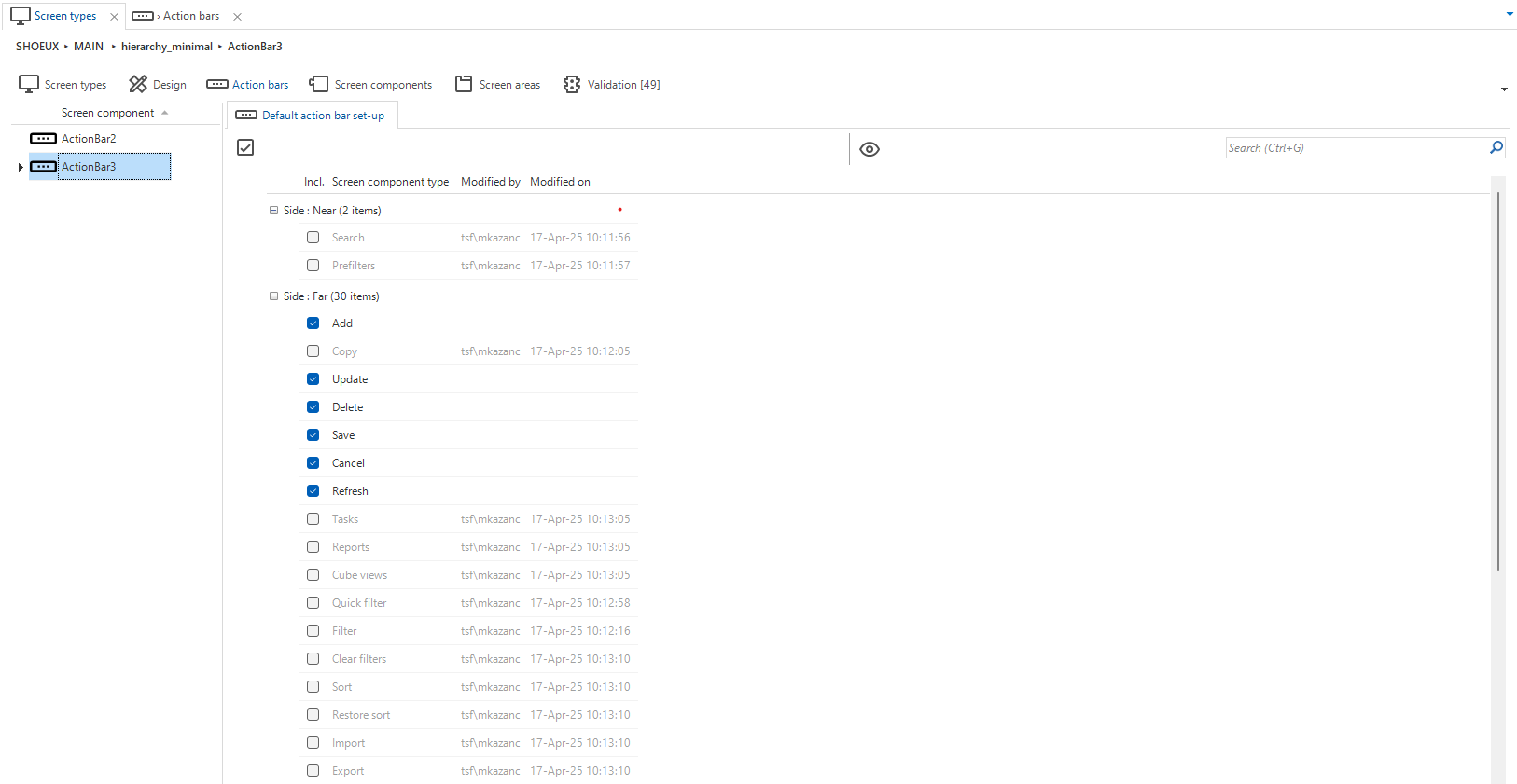
Example 1: Default Action Bar
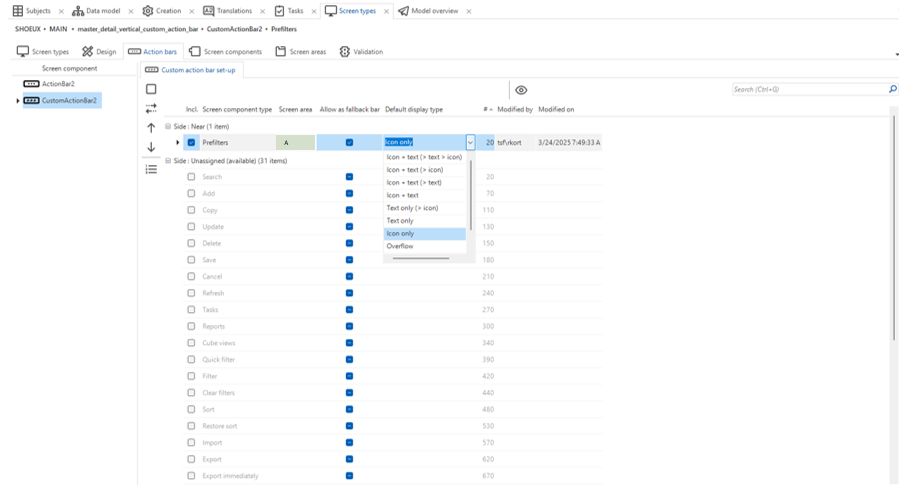
In this example, we’ll use the Default Action bar to make the Filter buttons more accessible (which were by default hidden in the Overflow menu) and make the Add button stand out more.
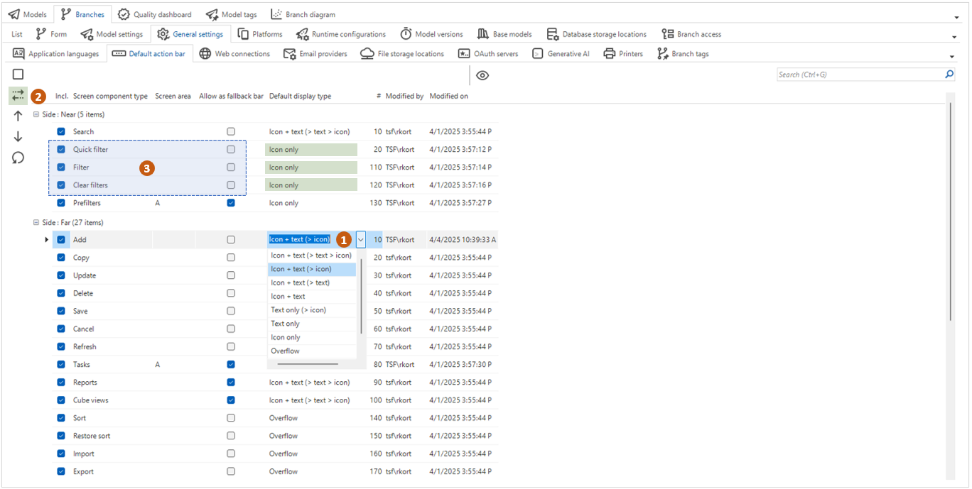
In the Model Overview (Models → Model Overview → Tab Branches → Tab General Settings → Tab Default action bar) you can configure the entire Action bar via General Settings. In the example, the Filter has been repositioned: using the dropdown, you specify that it should not go into the Overflow but be shown as an icon instead. You then place the element in the "Near" zone.
To improve visibility and context, the Add button Display type is changed to icon + text (>icon), which makes it stand out more.
In the edited Default Action bar at Model level, the data filter capabilities are neatly grouped and the Add button clearly stands out, fully in line with the grouping design principle.
This is just one example to explain how you can configure the Default Action bar. We recommend you configure it to fit your specific Use Case.
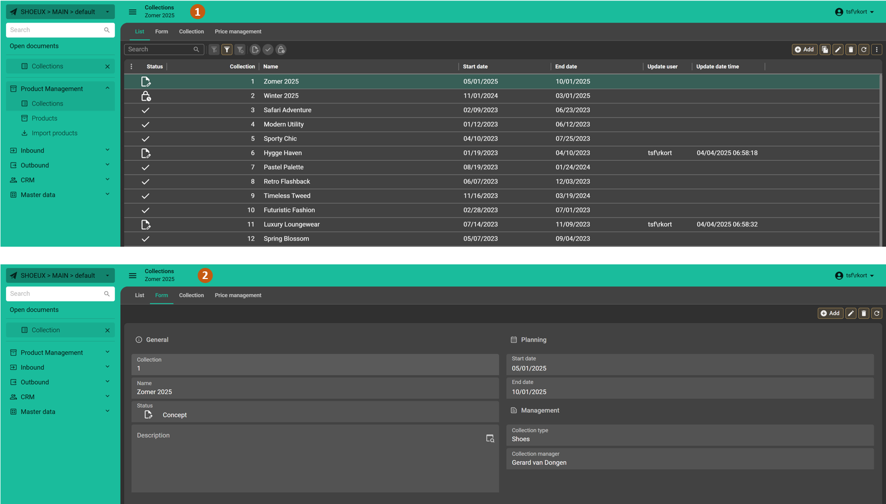
Example 2: Combine two Default Action bars
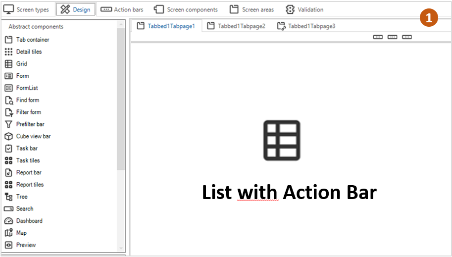
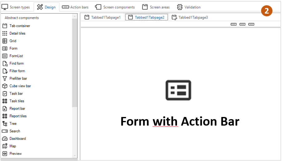
In this example, we'll show how to combine Default Action bars on a Screen type.
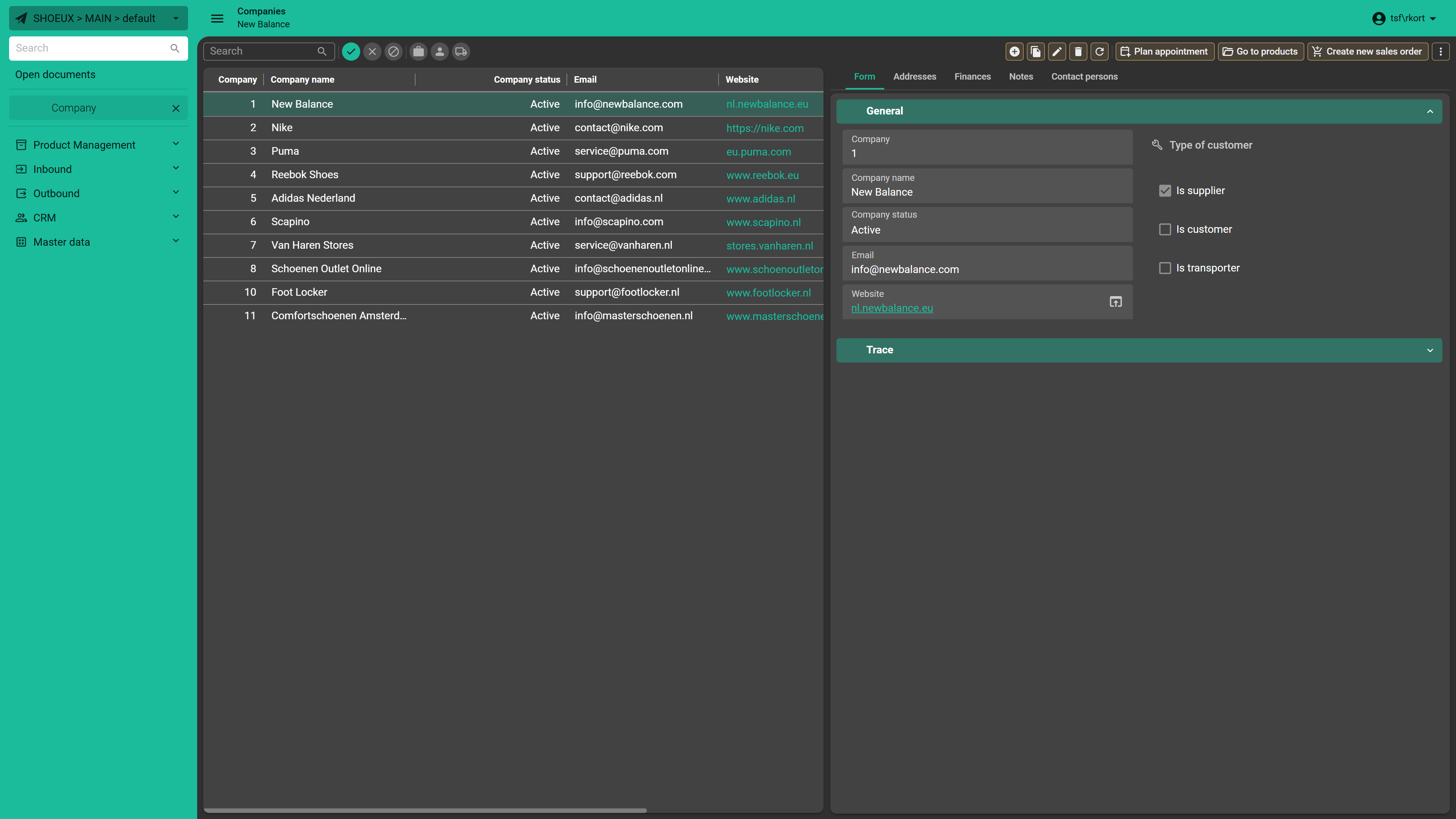
On tab 1, we display a list with a Default Action bar, while tab 2 also uses a Default Action bar, but with different actions based on the context. Depending on the active tab, we only display the relevant actions. In the tab Action bar (3), I’ve disabled some actions on the Form-related Action bar to keep the interface clear and focused.
In the GUI, we see how the Action bars work seamlessly together. On the list page, the standard Action bar is displayed with all actions visible. In the form another Action bar is shown, where unnecessary actions like Search, Copy, and Filter are removed, as there’s only one record visible. A great example of minimizing actions to maximize focus.
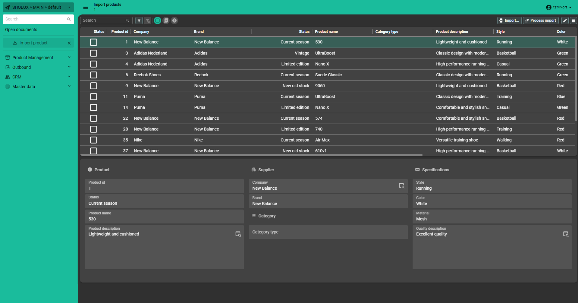
Example 3: Custom Action bar to highlight functionality
We manually add the Import button to the Import screen using a Custom Action bar, since it’s not included by default. This allows us to bring it out of the Overflow menu and position it more prominently within the interface. The Near-zone is reserved for Filters, so we place the button in the Far-zone and make it extra noticeable. We can disable standard actions such as Add and Copy, so we can lay the focus entirely on importing.
In the GUI, we see the result: the focus is on importing, positioned on the right. The principles of minimizing and highlighting are clearly reflected here: unnecessary actions are disabled, and the relevant buttons stand out.
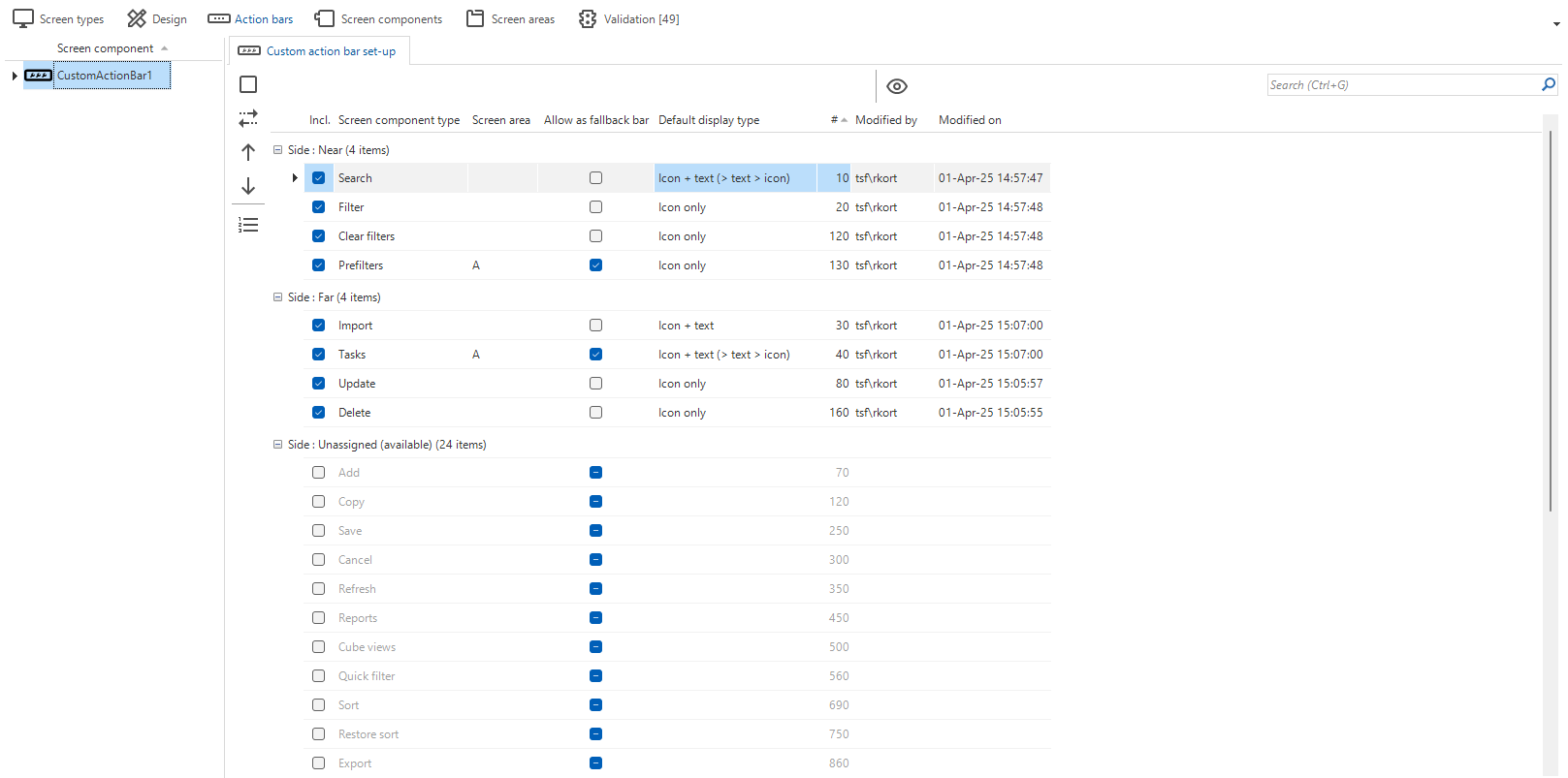
Example 4: Custom Action bar
Let’s assign specific Prefilters and Tasks to different Screen areas by using a Custom Action bar and a Task tile. Screen areas are designated for specific components or actions.
In my example, I assign specific Prefilters and Tasks to a different Screen area, moving some of them out of the Default Action bar. First, I add a Custom Action bar and a Task tile Screen component to the Screen type. Prefilters are moved to Screen area A (Custom Action bar) and Tasks are moved to Screen area B (Task tiles).
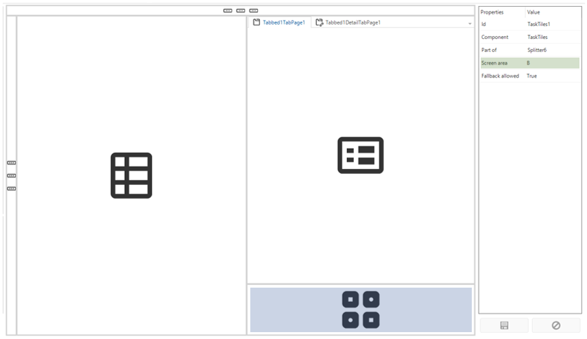
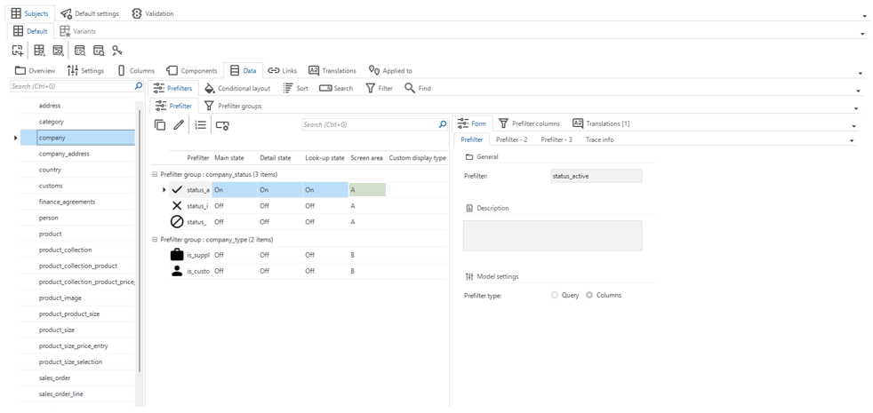
In the Subjects (Subjects → Default → Tab data → Tab Prefilters → Tab Prefilter), I link each Prefilter to a Screen Area. Now that we’re in the Subjects, we’ll also assign Tasks to a specific Screen area. In Subject → Links → tab Table Tasks, we link a Task to a designated Screen area. In our case, Screen area B. This ensures that the task is displayed as a Task tile in the correct section of the screen.
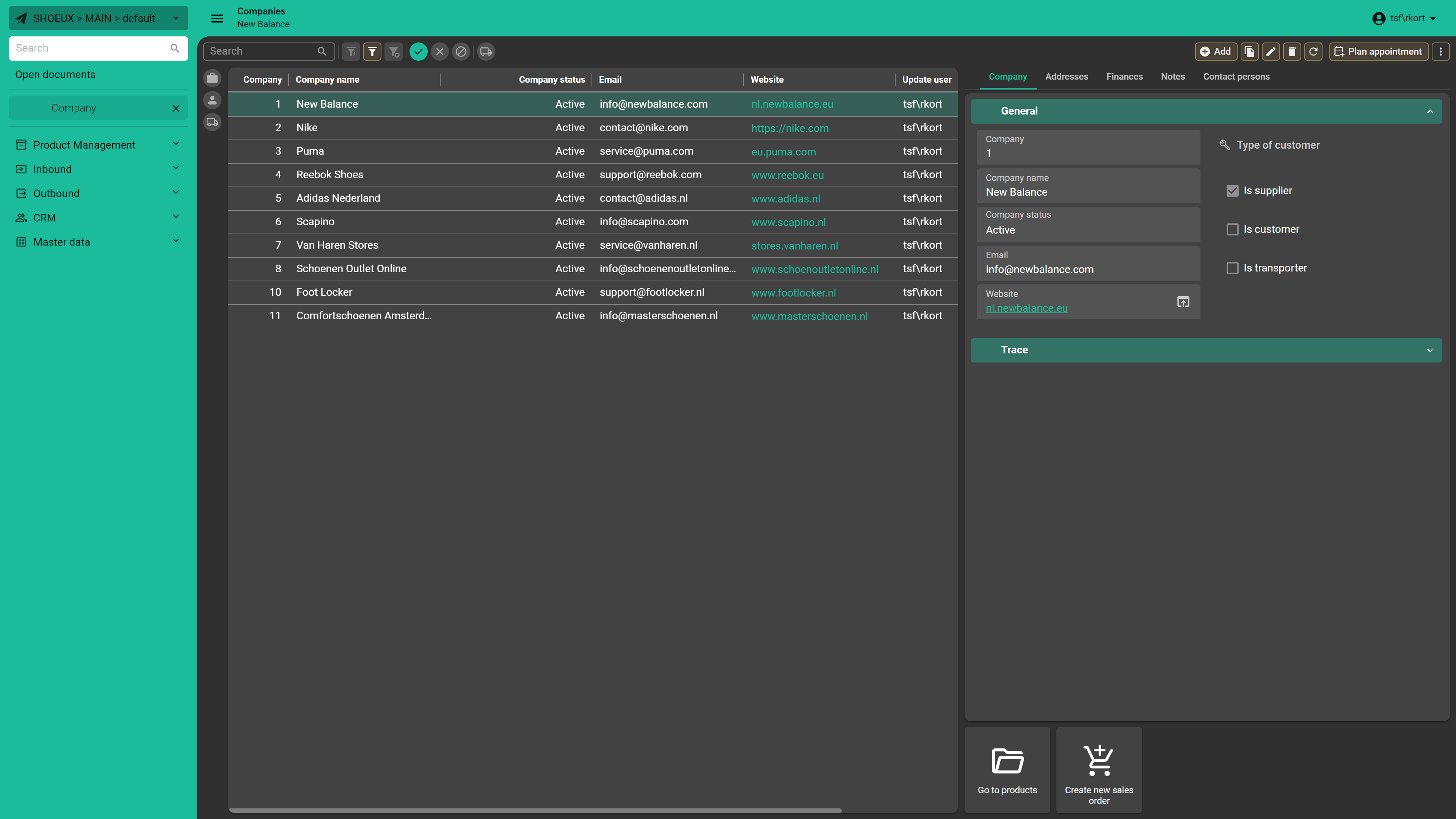
In the GUI, we can see that the specified Prefilters are neatly positioned in Screen area A (Custom Action bar), while the specified Tasks are clearly displayed in Screen area B as Task tiles.
Summary
The Action bar replaces the Toolbar and offers significant improvements such as new styling and much more efficient usage of space. The default can be defined on a per model basis. If necessary you can hide Action bar items on a specific Screen type.
The Custom Action Bar offers complete freedom to choose which actions are visible and where they are positioned. This enhances both efficiency and usability, helping users to quickly find the action they are looking for.
Now you know how to configure the Action bars in the Universal GUI. Let us know if you have any questions!