We often get questions about customizing the Universal GUI, particularly the login page. We plan to offer several model-options to customize it in the future, such as the logo, colors, title text and background image, and to display maintenance messages, for example. But with the latest release of the Universal GUI, it is already possible to make these adjustments manually, using custom CSS!


Setup

Starting with the latest (beta) release of the Universal GUI it is possible to inject your own custom CSS to change the styling of various parts of the user interface.

To get started, simply rename the custom.sample.css file in the public folder of the Universal GUI to custom.css. This file will then automatically be loaded by the Universal GUI. By renaming the file, it will no longer be overwritten with Universal GUI updates.

Next, add your own CSS to the custom.css file and you’re off!


CSS classes

The Universal GUI provides static CSS classes for a selection of elements, mainly on the login page, using the BEM — Block Element Modifier (getbem.com) naming convention to structure classes. 

Not all components have fixed classes yet, but we will expand this in the future. If you need fixed classes to customize specific controls or components, just let us know!

Please note that we don’t recommend using the generated CSS classes (like css-dz6rn8) for components that don’t use BEM yet, as they will change over GUI versions. In some cases it is possible to use pseudo-classes, like :after or :nth-of-type(x) instead, which are less likely to change.


Examples

Add a background image

/* Add a background image */
.form__container {
background-image: url('https://docs.thinkwisesoftware.com/img/thinkwhite.png');
background-size: 5em;
}

Replace the logo

/* Hide the original logo */
.login__group--icon {
display: none !important;
}

/* Display an alternative logo */
.login__group--icon-container {
background: url('https://office.thinkwisesoftware.com/thinkwise2.png');
background-position: center;
background-size: contain;
background-repeat: no-repeat;
height: 4em;
width: 4em;
margin-bottom: 8px;
}

Replace the title

/* Hide the original title */
.login__group--title {
display: none;
}

/* Display an alternative title */
.login__group--header::after {
content: 'Alternative title';
font-weight: 500;
font-size: 1.3125rem;
font-family: Roboto, Helvetica, Arial, sans-serif;
padding-bottom: 9px;
}

Display a message

/* Display a message */
.card-content__login::after {
content: 'Maintenance is scheduled for Sunday between 8AM and 12AM. The application will not be available then.';
font-weight: 300;
font-size: 0.9rem;
font-family: Roboto, Helvetica, Arial, sans-serif;
color: #ba000d;
display: inline-block;
text-align: center;
}
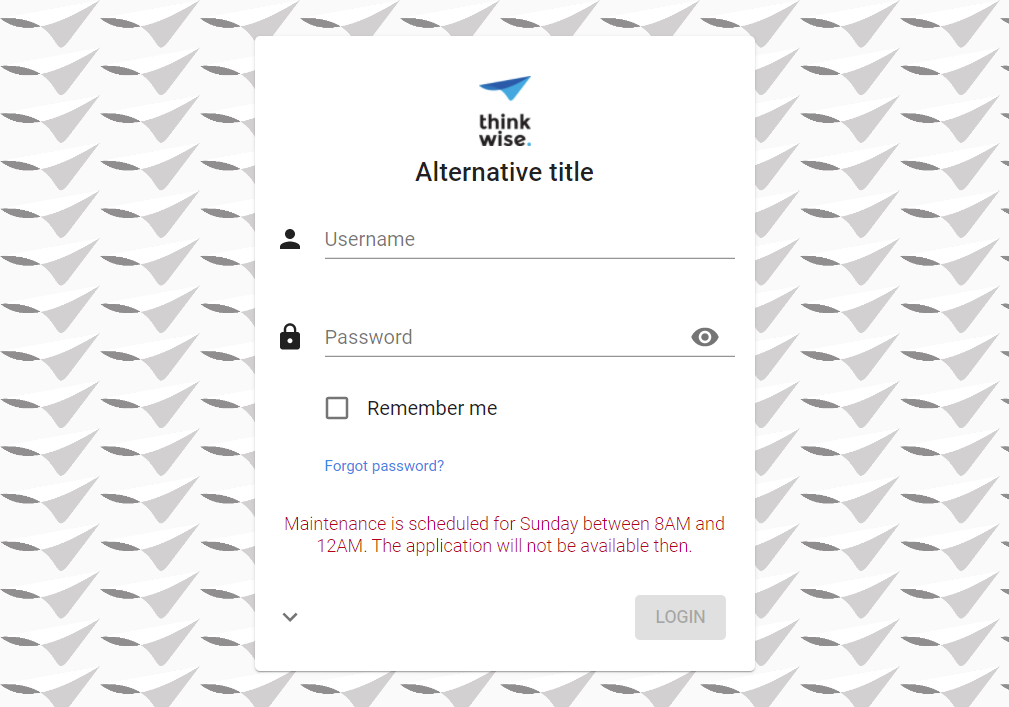
 

Login page with a background image, alternative logo and title, and a maintenance message.


Hide the menu and header

You can also customize the styling of the main screen with CSS, for example to hide the menu and header and only show a dashboard or other start-object.

/* Hide the sidebar menu */
#root > .sidebar {
display: none;
}

/* Hide the header */
#root > main > header {
display: none;
}

/* Resize and reposition the main screen*/
#root > main > div {
height: calc(100% - 16px);
width: calc(100% - 16px);
left: 0px;
}
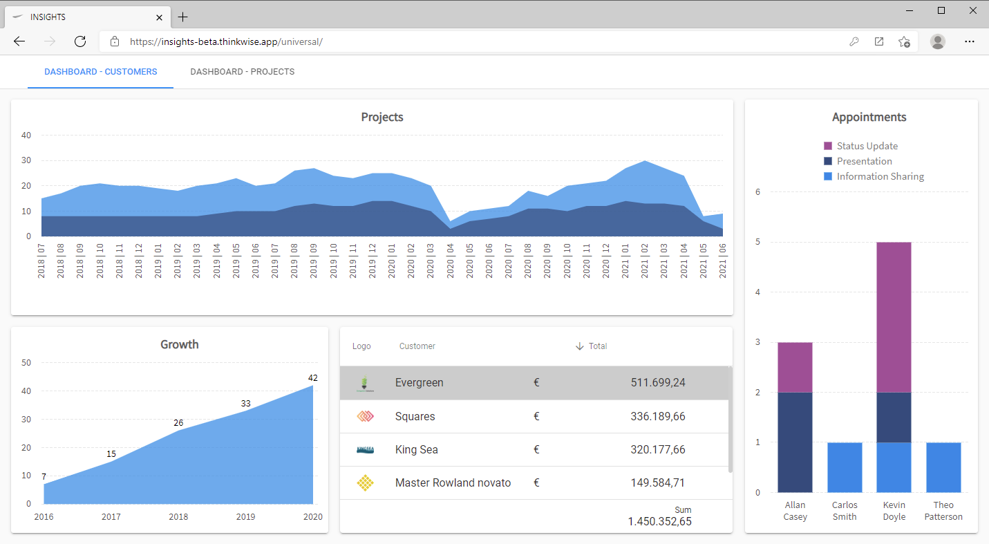
 

Hidden menu and header

Do you have any additional examples or ideas? Please post them in the comments!

Show company logo in scrollbar

.scrollbar-container
{
background: url(company logo url);
background-position: center bottom;
background-repeat: no-repeat;
background-size: 200px;
}

Transparent login form

.card__login
{
background-color: rgba(255, 255, 255, 0.9) !important;
}


Hide the Forgot password? link

#resetPassword {
display: none;
}


How can you identify if you are in Dark or Light mode to have different settings for (text color) or logos ?


Hi @mperrott , 

Unfortunately this is not possible at the moment. We will take this into account in further developments.

https://docs.thinkwisesoftware.com/docs/sf/themes#custom-css-settings-for-specific-modes 


Here's another regularly requested customization:

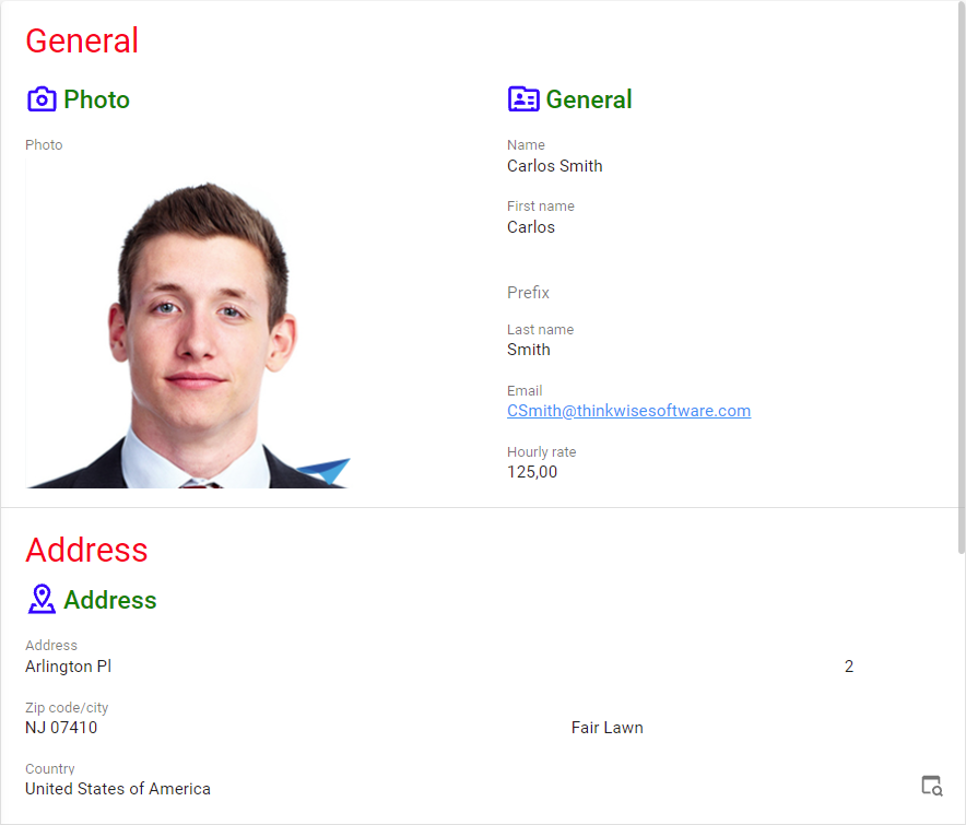
Form section titles and group titles

/* Section title */
.section-title .text {
font-size: 2rem !important;
color: red;
}

/* Group icon */
.group-title svg {
width: 28px !important;
height: 28px !important;
fill: blue !important;
}

/* Group title */
.group-title .text {
font-size: 1.5rem !important;
margin-top: -2px; // Align text with icon
}
.group-title {
color: green !important;
}


Add this CSS code to the custom.css file to only show the lookup buttons on hover over the form or when in edit mode (only for devices that support hovering).

You can also play around with the opacity of the lookup button, for example to emphasize the button when hovering over the field. 

@media (hover: hover) {

.MuiPaper-root .lookup-popup-button {
visibility: hidden;
}

.MuiPaper-root:hover .lookup-popup-button {
visibility: visible;
opacity: 30%;
}

.form-field:hover .lookup-popup-button {
visibility: visible;
opacity: 100%;
}

.MuiPaper-root .edit-mode .lookup-popup-button {
visibility: visible;
opacity: 100%;
}

}

It is now also possible to define custom CSS for dark/light and compact/comfort modes specifically:
https://docs.thinkwisesoftware.com/docs/sf/themes#custom-css-settings-for-specific-modes 


Show the application icon fully in universal instead of application icon and application translation

Add this code to the custom css to show just the application icon as a logo in universal, above the menu:

/* Hide the translation of the application */
.css-18kl4y0 {
    display: none;
    max-width: 0% !important;
    overflow: hidden;
}

/* Maximize the icon of the application */
.css-1pdvkst img {
     max-width: 100% !important;  
     max-height: 100% !important; 
    height: 100% !important;
    width: 100% !important;
    object-fit: contain;
}

/* Maximize the icon of the application in dark mode */
.css-120iyol img {
     max-width: 100% !important;  
     max-height: 100% !important; 
    height: 100% !important;
    width: 100% !important;
    object-fit: contain;
}


This unfortunately will not work as expected. These .css-{something} classes are automatically generated and will be different in a different version of Universal


To change the background image (and optionally its sizing and positioning) depending on the width of the screen (responsive):

@media screen and (max-width: 992px) {
header.MuiPaper-root + div > div:only-child:empty {
background-image: url(https://picsum.photos/1000);
background-position: inherit;
background-size: cover;
}
}

@media screen and (max-width: 768px) {
/* 768 is when the menu is collapsed */
header.MuiPaper-root + div > div:only-child:empty {
background-image: url(https://picsum.photos/1001);
background-position: bottom right;
background-size: auto;
}
}

@media screen and (max-width: 576px) {
header.MuiPaper-root + div > div:only-child:empty {
background-image: url(https://picsum.photos/1002);
background-position: inherit;
background-size: contain;
}
}

Of course you can also combine this with the dark, light, compact and comfortable modes. Just put the relevant class name in front of the header tag, e.g.: .light header.MuiPaper-root... 


Highlight active pre-filter

/* Change the background color of active prefilters to the primary color */
.prefilter-button[active="true"] {
background: var(--primary-color, #0095f7);
}

Hide active pre-filter bottom bar

/* Hide active pre-filter bottom border */
.prefilter-buttonnactive="true"]:after {
display: none;
}


Reply