
With the Universal GUI forms are scrollable which is great. However when you want to place a detail tab below a form on a screentype, the form and the detail have their own scrollbar. This limits the viewable space of the form a lot because the detail will be always using the space on a screen which makes it not a good solution in many cases.  

So what I would like to be able to configure is a form with one or more details below that has one combined scrollbar. And it would be even better if it could work like the tab pages of a form so that you can collapse each detail. This way you could for example create a sales order form with the sales order lines directly below without having to worry about enough visible space for both the form and the lines. 

While I see the best use case as a form with detail(s) below, maybe this could even be made more generic as a vertical-scrollbar-container screencomponent so that you could create one container detail page which has several (collapsible) details combined with one scrollbar.

Maybe a max height could be configured at the reference for each collapsible detail so that in case of a big list it will not become too large (this would mean the page has it’s combined scrollbar and the detail also has one itself, similar to how Microsoft SQL Management Studio shows results from multiple queries).

Sidenote: I think this should only work with a vertical scrollbar since most users are not really accustomed to scroll horizontally.  


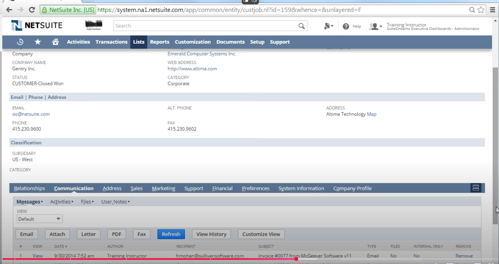
Inspiration screenshot of how something similar works in Netsuite:


Hello ​@PeterKeeris!

If I understand you correctly, you are searching for a kind of so-called ‘accordeon’ style screencomponent, right?

When introducing a scrolleable/collapsible area which combines screentype components, we will introduce a feature that will make it very easy to ‘hide’ screentype components, only visible by a scrollbar, making it hard for the user to identify there is more to be seen. How would you inform your user that there is (a lot more) information to reach?

Wouldn't you also solve this issue by placing the form on the left/right side of a screen and adding a detail below that with another form on the side?


This way, you optimize the vertical scrolling of the form (and collapsible nature of the form sections).


The main thing I want to achieve is one scrollable page with form and detail(s) in it so that a user can use the whole height of the screen to view it.

Basically something like this:
 

The current behaviour when using this screen is that about 50% of the screen height is used for the form and 50% of the screen height is used for the details. With a splitter in between.

What I want to achieve is that the GUI uses a vertical scrollbar container (the blue painting) so it uses 100% of the screen height to show both the form and the detail(s) below.


Hi Peter! 

Thanks for the update (at the Developer Event as well).

To refer back to your example of Netsuite, it distracted me that the form has so much room, a vertical placement here would be WAY more intuitive and readable than this horizontal aligned form.

A vertical, scrollable container screentype (with fixed heigt and collapsible details) can certainly have it's benefits (like dashboards), but we do have to tread carefully here. Like you already said yourself, it introduces a lot of settings and quickly pushes elements outside the visible area of a screen.

Can you give us an insight in your specific situation, and see what challenges your users encounter with our product? 


NewUnder review