


Hello everyone,
As I was working on a chart I found one obstacle: the colour palette. In our application we have several operations a production employee can perform. And our end users can create more of those operations. Each operation has a unique colour. Now that is what I want to see in the chart, but that seems to be impossible at the moment.
Now a chart has a pre defined colour palette, but I would like to see it user defined. As in: in the application therre is an option to make operations, each with a user defined colour, I'd like to use those colours as my colour palette, so I can make each column of each planned item the colour of the given operation.
So when I have three operations, and 5 items in the chart, then I would want to see three colours, now there are 5 unique colours that don't correspond the operatoins of the planned items I made:
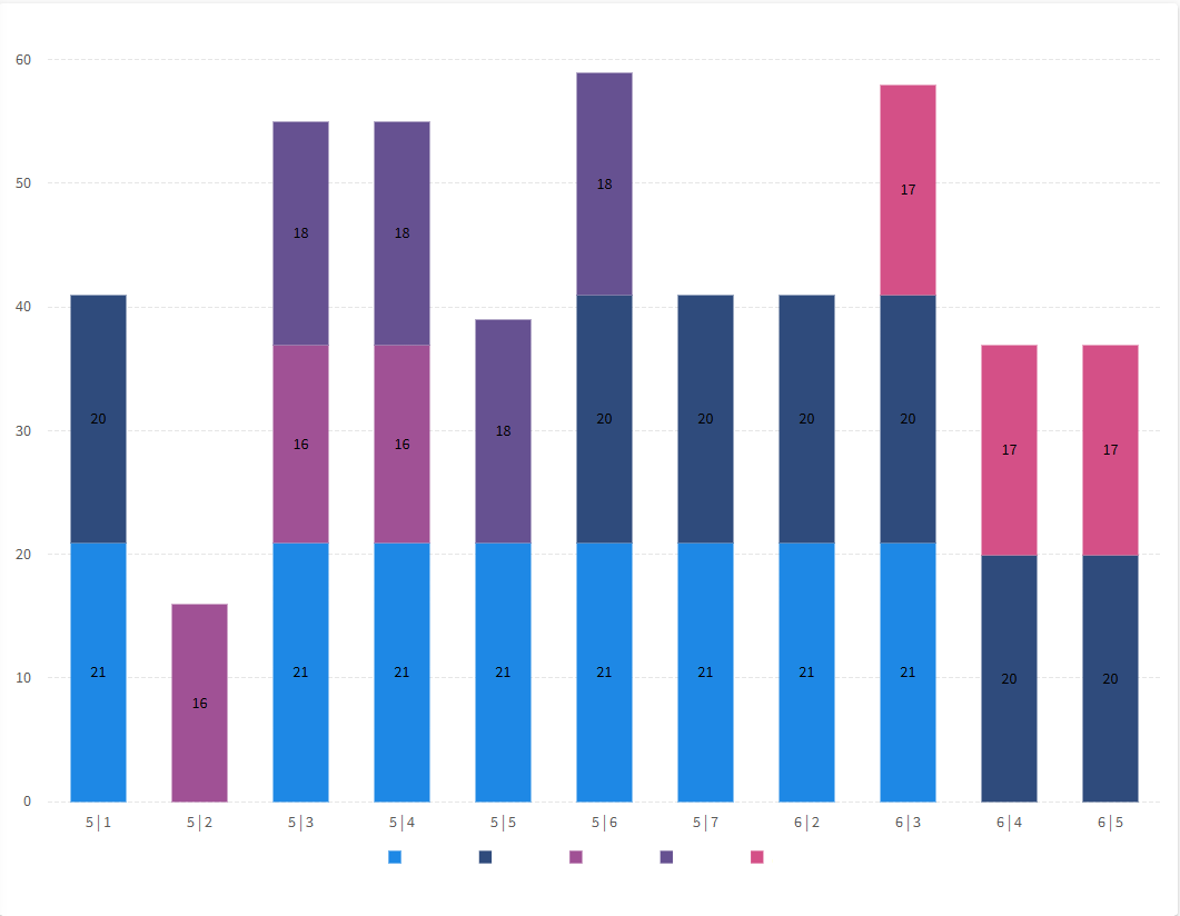
So for instance, the operation colours were red, yellow and green, I want to only see those three. but if there are 5 operation, I would want to see those 5 colours on there, each planned item its own corresponding colour.


