


The main goal here is to show you some of the possibilities R has to offer regarding forecasting. I will show you how to prepare a dataset, fit different types of models to your data, using those models to forecast, visualize your results, and calculate evaluation metrics.
Forecasting
Forecasting is a method of predicting the future based on past data. For example, company X has kept track of all sales orders of product Y for the last 2 years and wants to predict next month's demand for Y.A simple method that company X can use is to sum up demand per month and then average over that. The resulting monthly average can then be used as a best guess for next month's demand.
Of course, this simple method has several disadvantages.
- Gives equal weight to all historical months
- Will not capture any upward or downward trend
- Ignores possible patterns in the data
- Prediction is only a single value
- Exponential smoothing
- Autoregressive moving Average (ARIMA)
- Regression models
- (Recurrent) Neural Networks
Real-world example
The data used here is sample data of a supplier of fresh herbs. These herbs are bought directly from growers and sold to supermarkets among others. Only fresh products can be sold, implying that because of decay there is limited time available to stock items.Products are bought and sold on a daily basis. Obviously the most ideal situation is where stock exactly matches the expected demand. A stock that is higher than demand will lead to product loss, while a stock that is lower results in not being able to serve all your customers.
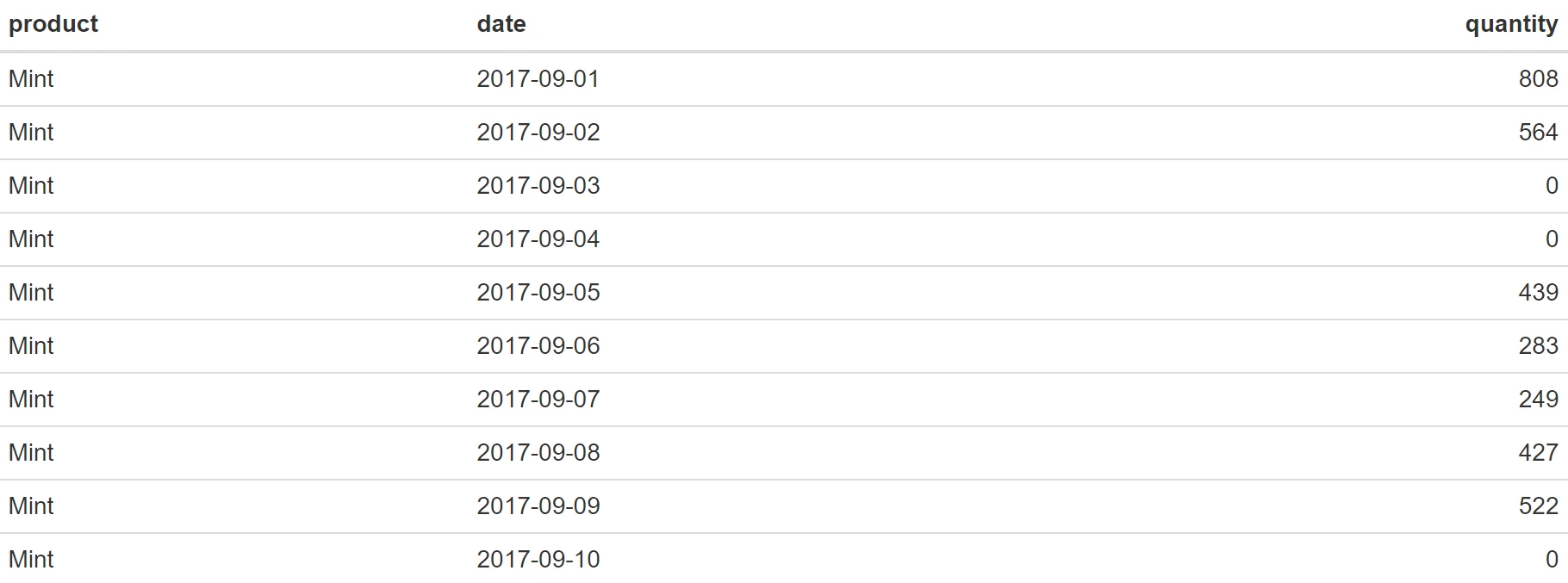
For this example, the product fresh mint is selected. Before doing any analysis, data has to be prepared. All historical orders have to be summed up per day, days without demand have to be filled up with 0 and everything needs to be ordered by date. Of course, this can be done using T-SQL, but the following example shows how you can do the same with R. As an extra challenge, the order date is split over a year, month and day column and we need it as a single date object.
What we want is to create a so-called tsibble object. This is an object class specific for the storage of time-series data. It requires an index, which will be our date column and a key to identify a specific time-series. A nice thing about these objects is that you can now use functions specific for time-series data. An example of this, which can be seen below, is fill_gaps that is used to add missing dates with a certain value. In this case a zero is used, but for other types of forecasts it may be more appropriate to use some interpolation technique. Another example is the index_by function, which makes it easy to switch from daily data to other intervals like weeks or months.
Before a tsibble can be created we first load the required packages. We of course need the tsibble package, but we load the tidyverse package as well for data manipulation and visualization. As mentioned, we need to create a new date variable from the provided year, month and date. For this the make_date function from the lubridate package can be used. In the example below the lubridate package is not loaded, but the function is directly called from the package by using ::
We can combine all the data preparation steps to create our new tsibble object, called data_ts, in a single statement:
code:
require(tidyverse)
require(tsibble)
data_ts<-data %>%
  mutate(date = lubridate::make_date(year,month,day)) %>%
  mutate(product = "Mint") %>% # Add extra product column as key
  group_by(product,date) %>%
  arrange(date) %>%
  summarise(quantity = sum(q)) %>%   # Summation per day
  as_tsibble(index = date, key=product) %>%    # Time-series tibble
  fill_gaps(quantity=0, .full=TRUE)  # Replace missing with 0

# Show first 10 rows
head(data_ts, n=10)
A good next step is to do a visual inspection of your data. This way you can see if there are any clear patterns in your data or the presence of outliers. It will also give you a feel for which forecasting method will probably give the best results. Using ggplot2 we can plot out data:
code:
data_ts %>%
 ggplot(aes(x = date, y = quantity, colour = product)) +
 geom_line() +
 theme_minimal() +
 geom_hline(yintercept=mean(data_ts$quantity), linetype="dashed", color = "black") +
 scale_x_date(labels = scales::date_format("%b %Y")) +
 theme(axis.title.x =element_blank()) +
 ggsci::scale_color_aaas()
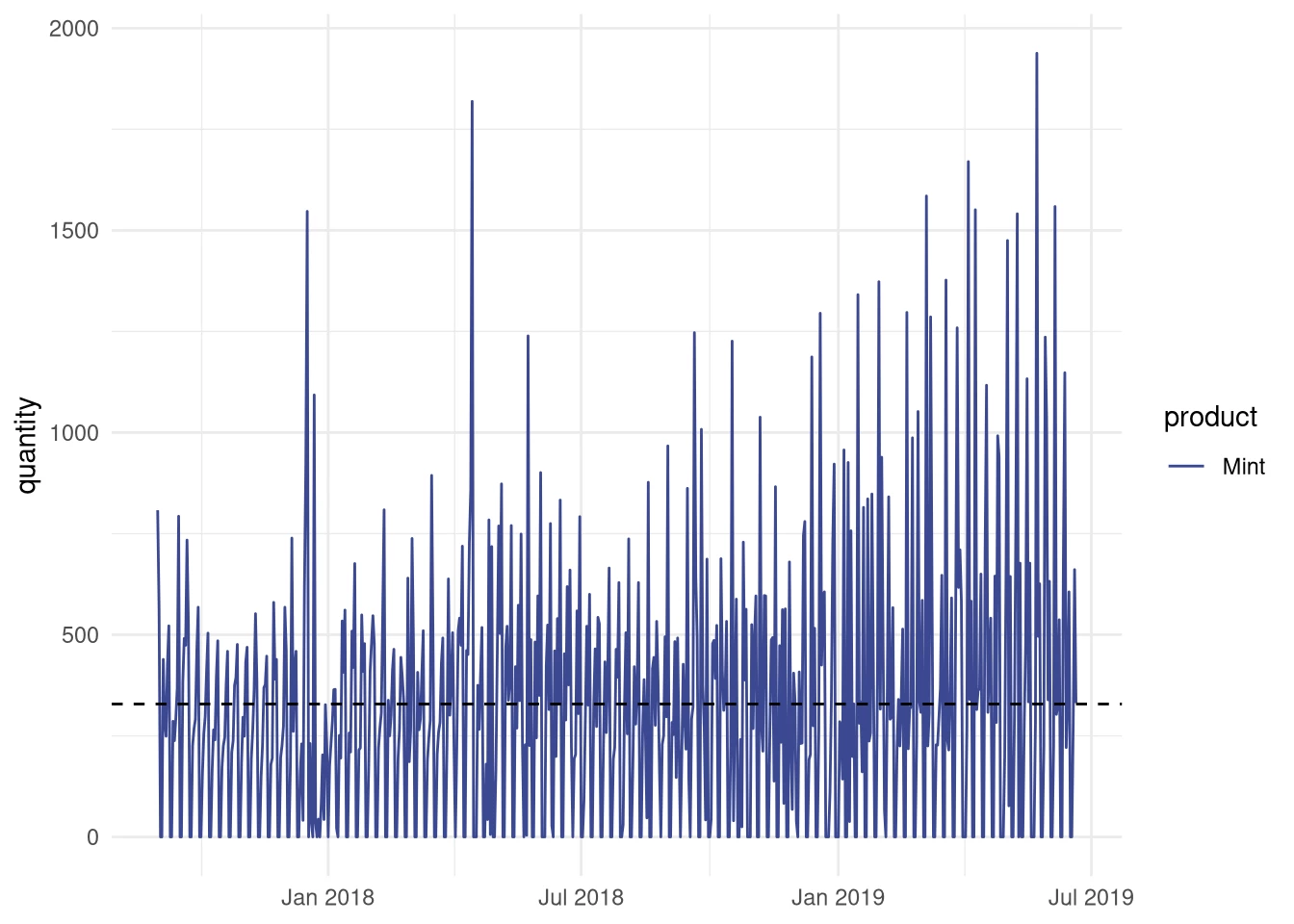
The visual inspection seems to reveal that there may be a weekly pattern present in our data, something we would like to capture in our forecasting model.
Now lets start with creating such a model. I will begin with one of the most often used methods for forecasting called single exponential smoothing. This method is given by the following equation:
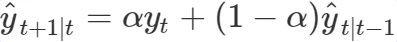
The single exponential smoothing method is a weighted average over all previous observations
yt⋯yT and this weight decreases exponentially with the smoothing parameter α. The intuition behind this method is that more recent orders are more important for your prediction than older ones.
For the actual forecasting we will use the fable package. This package is developed to be the successor of the highly popular forecast package. It is still under high development and not as feature rich as the forecast package, but since it shows great promise I decided to use it for this blog post.
To continue, a good practice in forecasting is to split the original dataset in a training and a validation set. In this example I will use the last 30 days for validation and the rest for training.
code:
val_days <- 30 #use 30 days for validation

# Add extra column indicating training or validation, useful for visualisation
data_ts <- data_ts %>%
 mutate(type = if_else(date > max(date) - lubridate::days(val_days), "Validation", "Training"))
# Select training data
train_data <- data_ts %>%
 filter(type == "Training")

# Instead of filtering, we can now also anti-join on train_data
val_data <- data_ts %>% anti_join(train_data, by = "date")
We can now apply the single exponential smoothing (SES) on our training data. In the fable package SES is a member of a larger family of parameterized exponential smoothing methods. The required parameters are error, trend and season. The SES method does not take trend or seasonality into account so those parameters need to be set to N(one). The error parameter is set to A(dditive).
As shown in the code below, we first fit the SES or ETS(A,N,N) function on our train data before we use the resulting model to forecast the next 30 days.
code:
require(fable)
fit.ses <- train_data %>% model(ETS(quantity ~ error("A") + trend("N") + season("N"), opt_crit = "mse"))
fc.ses <- fit.ses %>%
 forecast(h = val_days)
Now let’s visually inspect the results. For this we will create a plot containing the last three months of mint sales of which the last 30 days are our validation values. It shows both the values fitted on the training data as well as the 30 predicted values. The blue areas around the forecast are so-called confidence intervals. The widest of the two is a 95% confidence interval, which means that you can be 95% sure that the actual future value will be in that interval. Adding uncertainty to the prediction is often forgotten, but it conveys important information about the accuracy of your prediction.
code:
data_ts %>% filter(date > max(date) - months(3)) %>%
 ggplot(aes(x=date, y=quantity)) +
 autolayer(fc.ses, alpha = 0.6) +
 geom_line( aes(color = type)) +
 geom_line(aes(y = quantity, colour = "Forecast"), data = fc.ses) +
 geom_line(aes(y = .fitted, colour = "Fitted"), data = augment(fit.ses) %>%
       filter(date > max(date) - months(2))) +
 # Add a mean line for reference
 geom_hline(yintercept=mean(data_ts$quantity), linetype="dashed", color = "black") +
 theme_minimal() +
 scale_x_date(labels = scales::date_format("%b %Y")) +
 theme(axis.title.x =element_blank()) +
 ggsci::scale_color_aaas()
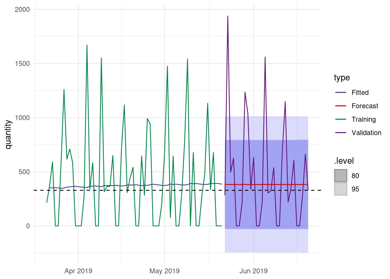
Hmm. The single exponential smoothing method does not seem to give an advantage over simply using the mean. Besides that, the forecast is constant over time, while the actual values show an oscillating pattern. A quick look at the forecasting function reveals why, the first forecasted value is repeated for the remaining days.
Now what? A more advanced method was promised, but we end up with hardly any improvement. This was done intentionally to show that you shouldn’t just use a popular method and expect a good result. Instead you should inspect your data, do some tests before choosing methods, and always validate the methods afterwards.
Of course, we can do much better. When looking at the demand, there clearly seems to be a weekly cycle. If we are somehow able to capture that we will already have a large improvement over the SES method. Maybe there is even a small trend or some patterns that are not clearly visible.
Again, there are several possibilities but the method we will use here is a linear regression on the data combined with a separate forecast on the residuals. The simplest regression model can capture a linear relationship between time and demand, therefore able to capture the presence of an upward or downward trend. Variable X is an independent variable and represent time in this case.
Basically this is a simple linear equation where β0 is the y-intercept and β1 determines the slope of the line. The error term ϵt is the difference between the actual value and the fitted value and is known as the residual. During fitting the β variables are the ones that need to be estimated.
This model can then be extended to capture the influence of the seven weekdays. To do this we need to add them to the model as extra predictors. For this we need to create dummy variables for every day of the week, represented by Dt in the regression model. These dummy variables take on the value 1 when a datapoint belongs to that given day or 0 when it belongs to another day. Like the βXt term these dummy variables have a β associated with them, determining the slope associated with that day.
The complete regression model is now given by the equation below:

You may have noticed that only six days are added to our model. This is not wrong: when you add qualitative predictors to a regression model, one of those is used as reference. For instance when the average quantity of mint sold on a Monday is the reference, ignoring the trend, then the β2D2,t term is the difference between Monday and Tuesday. For the whole week this would mean that the predicted sales on a given day is the predicted value on the reference day + the predicted difference for that day. In our complete regression model we also try to predict a possible trend and its effect is then added to the prediction as well.
The following block of code shows how this regression model can be created. You could create a regression model by hand, but fable has the TSLM function which automatizes the process of extending the regression model and creating the dummy variables.
code:
# Use a more advanced regression model.
# Fit a linear model with trend and season
#
# TSLM is a convenience function that creates
# and adds the dummy variables to the model.
#
# Because the data_ts index is set to days
# TSLM will automatically use weekdays as predictors
fit.tslm <- train_data %>%
 model(TSLM(quantity ~ trend() + season()))
#Fit the regression model
fc.tslm <- fit.tslm %>%
 forecast(h = val_days)

# Display the regression table
report(fit.tslm)
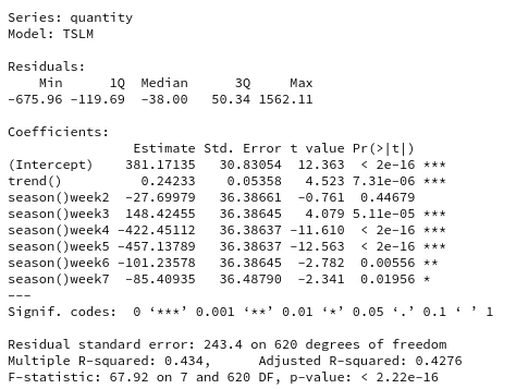
The code above demonstrates the fitting and forecasting of the regression model using fable. To inspect the influence of the weekdays and whether a trend is present, the regression table is also printed. The last column in that table reveals that all the weekdays except day 2 are significant predictors, and there is evidence for a small upward trend. This is good news, because this confirms that there indeed is a weekly pattern that can be captured.
Since seeing is believing, we will create a new plot demonstrating the regression model.
code:
data_ts %>% filter(date > max(date) - months(3)) %>%
 ggplot(aes(x=date, y=quantity)) +
 autolayer(fc.tslm, alpha = 0.2) +
 geom_line( aes(color = type), alpha = 0.8) +
 geom_line(aes(y = quantity, colour = "Forecast"), data = fc.tslm) +
 geom_line(aes(y = .fitted, colour = "Fitted"), data = augment(fit.tslm) %>%
       filter(date > max(date) - months(2))) +
 geom_hline(yintercept=mean(data_ts$quantity), linetype="dashed", color = "black") +
 theme_minimal() +
 scale_x_date(labels = scales::date_format("%b %Y")) +
 theme(axis.title.x =element_blank()) +
 ggsci::scale_color_aaas()
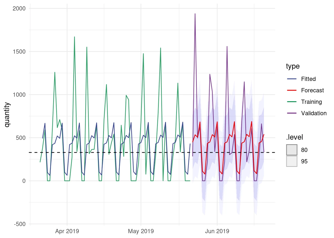
The blue (fitted) and red (forecasted) lines show the output of the regression model. It can be seen that the model clearly captures a weekly pattern. Because there is no trend present in the data, the predicted value is now only a function of the 7 weekdays. It does not matter if those days are in June or December, the prediction for each week will be the same. Consequently, any other pattern possibly present in the data is now ignored. For instance, mint sales may be higher in spring than in winter.
We can use the residuals ϵ=actual - predicted for trying to capture any remaining patterns in our data. You can use many different forecasting method for that purpose, but in this case an ARIMA model will be fitted on the residuals. Similar to the exponential smoothing models, ARIMA models are a large family of models that can capture different aspects of our data. Instead of specifying a specific ARIMA model, as we did with the ETS function, we let fable search for the best model. For
code:
# Fit ARIMA on residuals from the regression model
fit.res <- augment(fit.tslm) %>%
  select(product,date,.resid) %>%
  rename(residual = .resid) %>%
  model( ARIMA(residual, stepwise=F, approximation=F))
# Forecast residuals
fc.res <- forecast(fit.res, h=val_days)

# Plot (Code not shown)
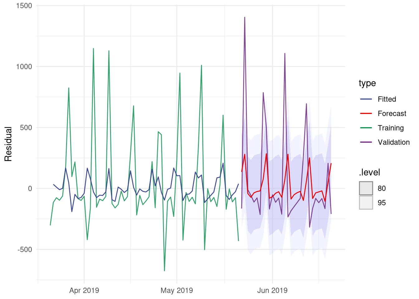
Even though the residuals show a noisy pattern, the fitted ARIMA model did manage to capture a pattern. Otherwise the forecast line would have been a straight one. The next step is to combine these two forecasts. Combining the point forecasts is just summing the values from the regression and ARIMA forecasts, however we are also interested in the uncertainty associated with our combined model. Since fable still lacks the functionality to combine these two types of models, it is necessary to manually adjust the probability distribution that is used to create the confidence intervals.
The following code demonstrates how you can manually construct a fable object containing our combined forecast and the adjusted distribution. Of course, we finish with visualizing our results.
code:
# Combine regression and Arima forecast
fc.combined <-fc.res %>%
 inner_join(fc.tslm, by=c("product","date")) %>%
 mutate(quantity=quantity+residual) %>%
 as_tsibble() %>%
 select(product,date,quantity) %>%
 # Create a new distribution for our confidence intervals
 mutate(.distribution = dist_normal(mean=quantity,
                   sd=purrr::map_dbl(fc.res$.distribution,
                          function(.x) .x$sd)
                   )) %>%
 mutate(.model = "Regression + Arima(Residuals)") %>%
 as_fable(quantity,.distribution)

# Combine fit
fit.combined <- augment(fit.tslm) %>%
 inner_join(augment(fit.res), by= c("product","date")) %>%
 mutate(.fitted = .fitted.x + .fitted.y) %>%
 mutate(.model = "Regression + Arima(Residuals)" ) %>%
 select(product,.model,date,.fitted)

# Plot forecast and validation data
data_ts %>% filter(date > max(date) - months(3)) %>%
 ggplot(aes(x=date, y=quantity)) +
 autolayer(fc.combined, alpha = 0.4) +
 geom_line( aes(color = type), alpha = 0.8) +
 geom_line(aes(y = quantity, colour = "Forecast"), data = fc.combined) +
 geom_line(aes(y = .fitted, colour = "Fitted"), data = fit.combined %>%
       filter(date > max(date) - months(2))) +
 theme_minimal() +
 scale_x_date(labels = scales::date_format("%b %Y")) +
 theme(axis.title.x =element_blank()) +
 ggsci::scale_color_aaas()
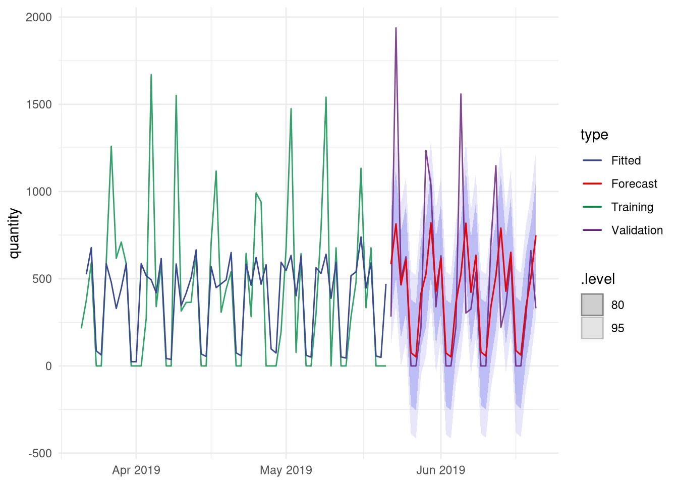
By combining the two models we seem to be better able to capture the large spikes that are present in our validation data. The problem with these spikes is that they are more present in the last half year of our data than before. In the full dataset they are actually pretty rare. This is something which is also indicated by the confidence bands, since both large spikes in the validation area fall outside the 95% confidence interval meaning that the chance of such a large actual value is less than 1 in 20. It may be that the spikes are not random fluctuations, but actually represent an increase in Mint sales. If this is true, then over time such larger quantities will become more prevalent in the data and you should rerun the model fitting procedure to adjust for the new situation.
In the final step, a number of evaluation metrics will be calculated to objectively compare the different models.
code:
accuracy(fc.ses, data_ts) %>%
  bind_rows(accuracy(fc.tslm, data_ts)) %>%
  bind_rows(accuracy(fc.combined, data_ts)) %>%
  select(-MPE, -MAPE, -ACF1)
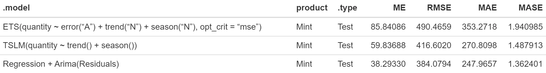
The table above shows several popular evaluation metrics calculated for the SES, regression, and Regression + Arima(residual) forecast models. For all those values lower means better. It is clear that our final Regression + Arima(Residuals) outperforms the other two models. Especially the difference with the SES model is very large. From this we can conclude that by inspecting our data and by taking good care in selecting the right methods we are able to successfully exploit the patterns present in our data.