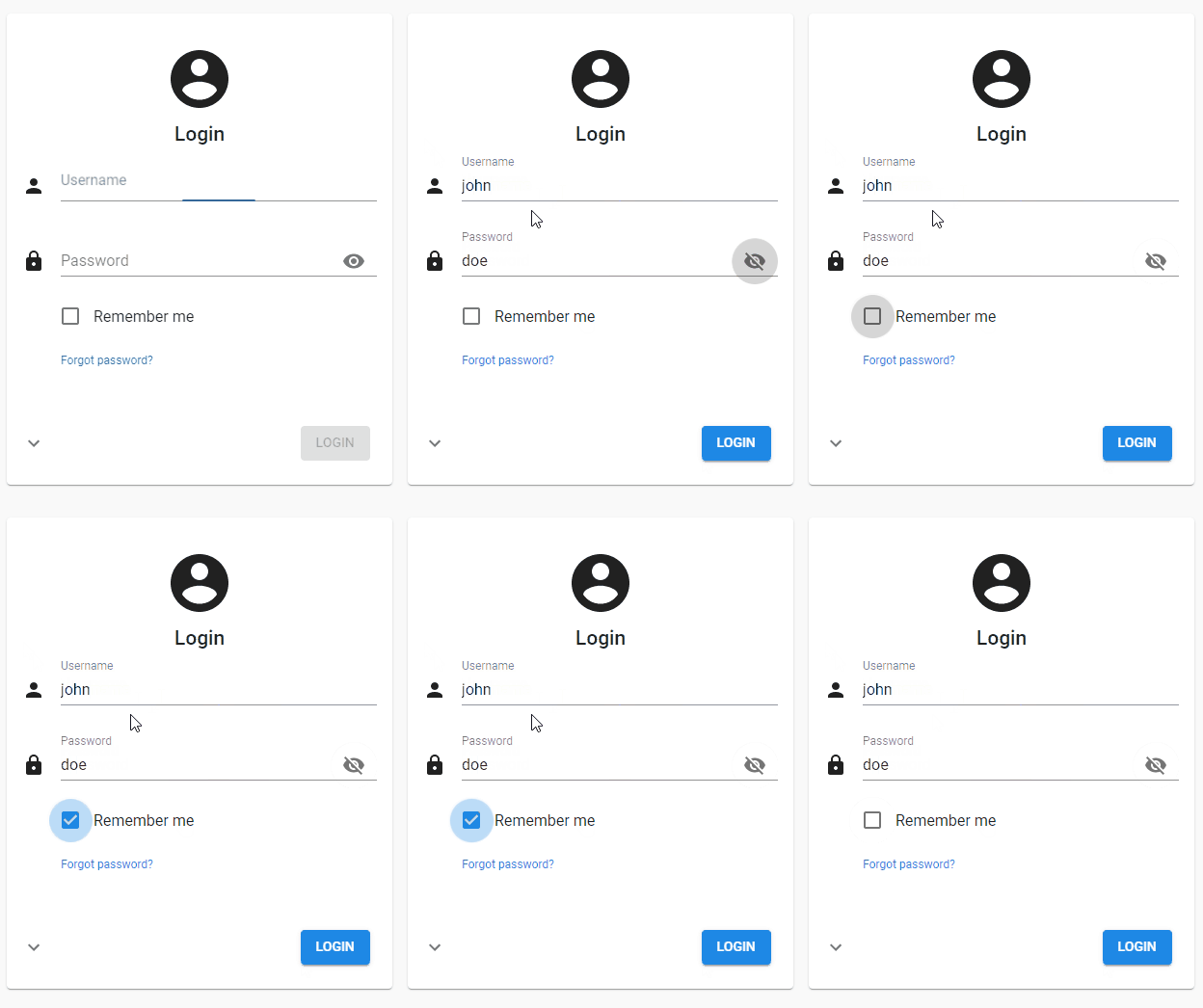
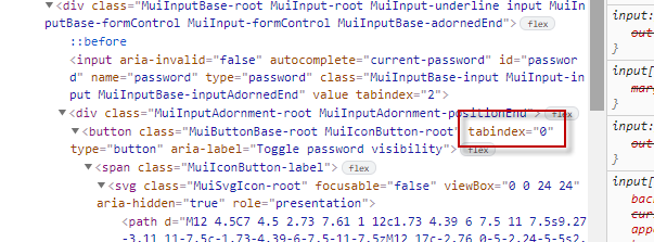
With the latest version of the Universal GUI the checkbox “Remember me” is added. When tabbing through the fields from password to remember me, I expected it would go to remember me, but it didn't, it went to the “Eye” from “Show password”.
If you hit spacebar immediately, your password is shown. We've discussed this internally and think this is not appropriate. Lets say I was lucky that there was no colleague standing next to me or I was sharing a screen  .
.
Maybe should the “Eye” be excluded from the tab stops?

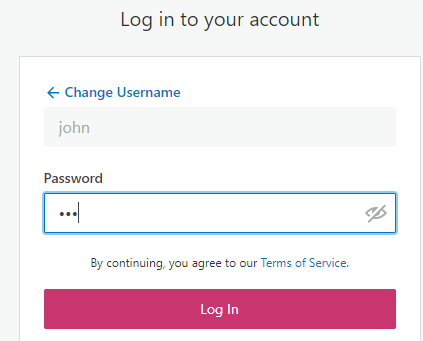
Other applications I've seen you can only use the ‘click’ to show te password (e.g. Windows login) or have an explicit link / button that is more clear that it is a button / part of the tab sequence. I didn't expect the eye to be part of the tab sequence, because it's inside the password box.


