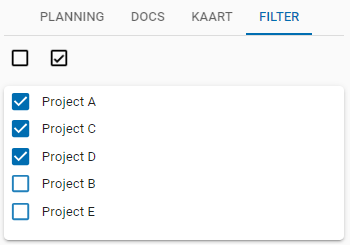
Has anyone managed to reduce the row height or the distance between records in a formlist?

The field spacing settings in TSF do not seem to have any effect. It may be possible with custom css, but I think a test-data-id is missing to be able to control this properly.

By placing the lines a little closer together, we get more data on the screen and the end users have to scroll less.
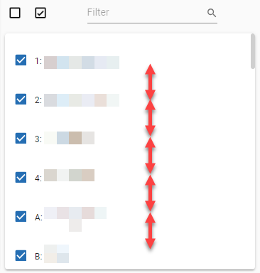
 In addition to this, I think it will be possible to adjust the height by adding some lines in custom.css but we mis a data-testid for tsf-emotion-....


We apply the same spacing to the editors form and the formlist. When other types of (text)editors are used you need that space, but in this case I can imagine that you want more density. There is no setting for this, so custom CSS is the only option.

For now you can write a selector to select all "section” elements and lower down the “grid-template-rows” height. Like this:

.FormList section {

   grid-template-rows: repeat(auto-fill, 40px);

}


Note: you might have to realign the editors in a section because they expect that 47px height. Also, decreasing the template row height might cause some empty space at the bottom of the formlist. 

We hope this helps.


Erik,

Thanks for your suggestion, we needed a little more css coding to come to the desired result.


/* -- FORM LIST --  */

.FormList section {
grid-template-rows: repeat(auto-fill, 25px);
margin:0px; !important;
}

.FormList section .checkbox__container {
padding:0px !important;
width:30px !important;
}

.FormList section span{
padding-top: 0px !important;
padding-left: 0px !important;
width:auto !important;
}

.FormList .scrollbar-container {
padding-top: 2px !important;
padding-left: 4px !important;
}


Great. That looks very nice!