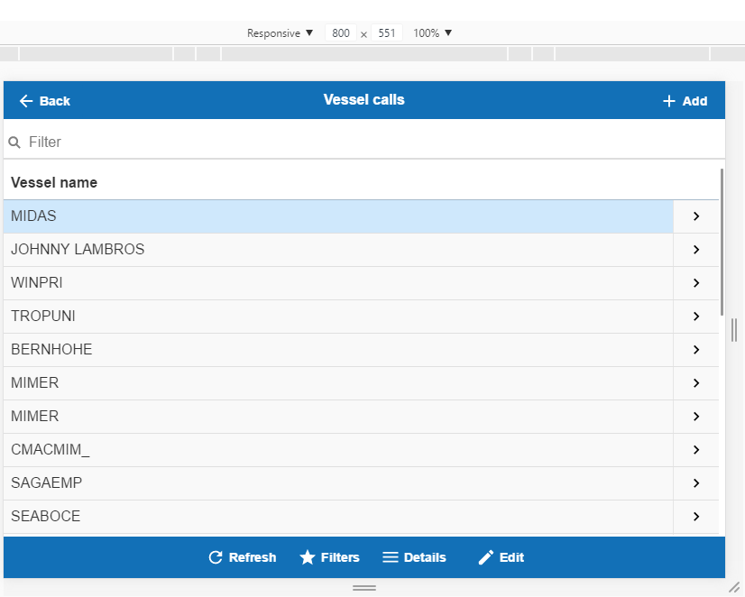
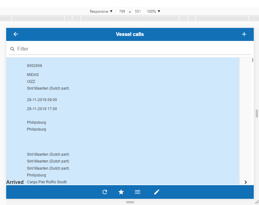
Apparently the mobile app starts resizing the columns to a “collapsed format” when the screen size is lower than 800px. It looks like if all information for the entity is displayed in a single column, this give the following result:

Both images are the same grid. Is there an option or setting so we can force the display of the grid to not collapse this information, and start showing the configured columns (second image)?


