Hello
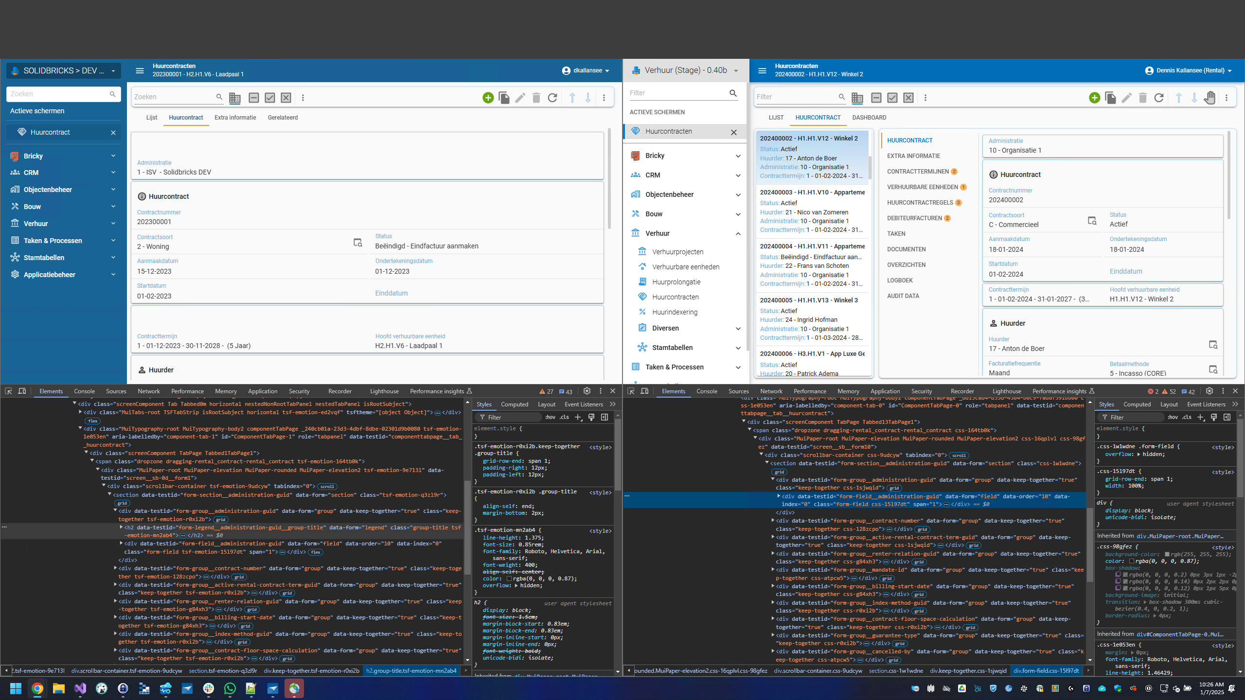
Since we upgraded to 2024.3.13.1 we are experiencing issues with some GUI elements. For example if you take a look at the screenshot below (left = new, right = old) you see the following.
At the first section there is a enormous white space because in the upgraded version it seems like Thinkwise is rendering a <h2> tag even in there is no title present for the group. We don't always want to use titles for groups because it makes the page longer than needed and it results in this.
How do we fix this? Also because of the extra <h2> the <div> beneith as a grid-row-end: span 2; instead of grid-row-end: span 1;
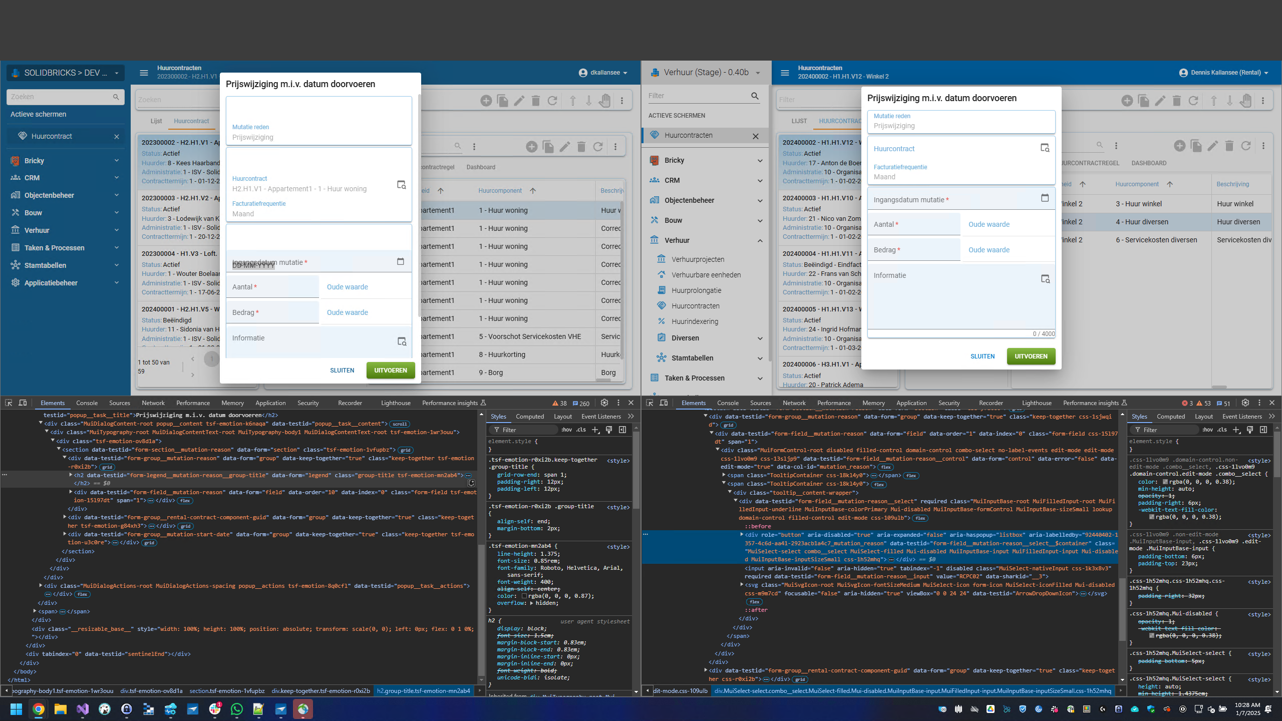
It is even worse in a popup (task). That is exactly the reason why were are not using titles for group, because it makes your popup way to long / heigh.
Also for some reason in the upgraded version the grid seems to calculate or render columns in a different way, which results in a big white gap we didn't have in the previous release. See pictures below (old vs new). How do we fix this?


Another thing that just popped up is the following.
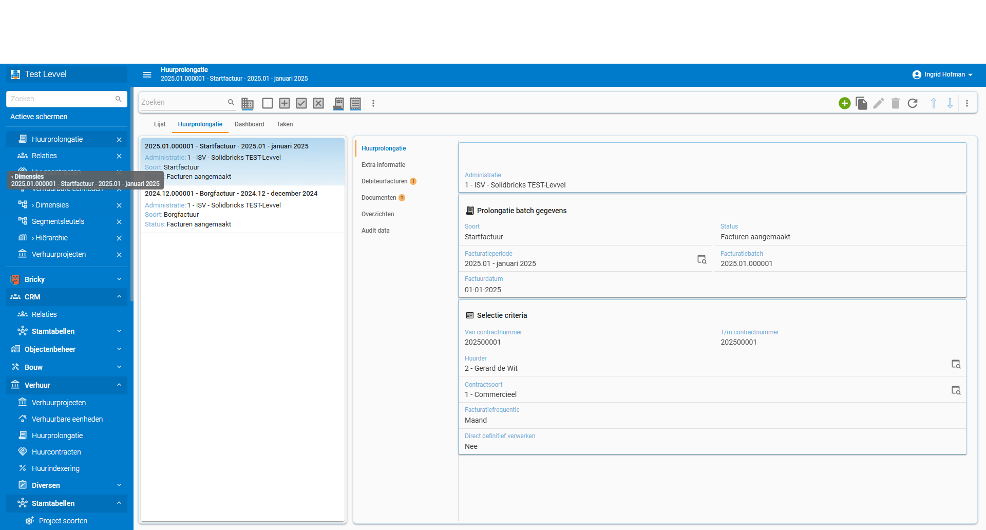
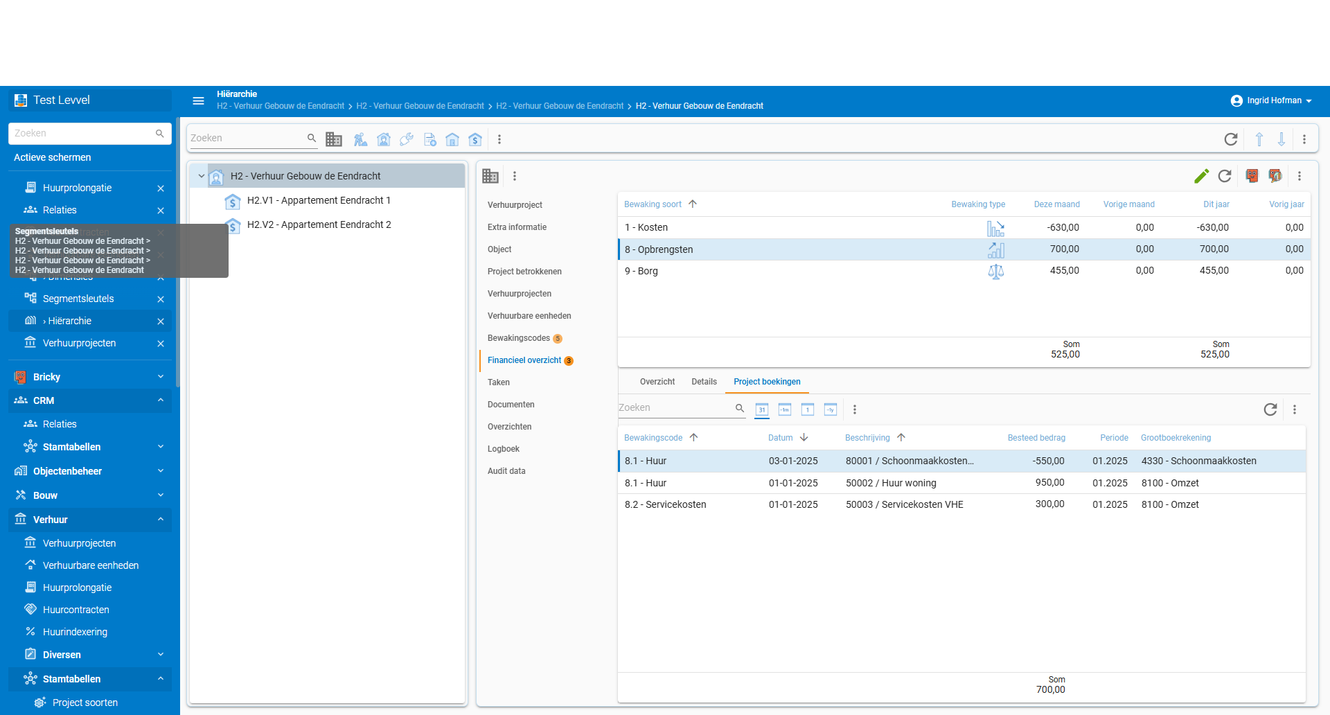
When you hover over the active screens with your mouse, extra information is displayed. However, this extra information doesn't actually pertain to the active screen you're hovering over:
-> The heading in the tooltip does indicate which one it is, but you already know that. It's not additional information.
-> And the following line doesn't provide information about the active screen you're hovering over, but instead refers to the screen that is actually active on your display. Very confusing.
See also screenshots below. How do we fix this?
I hope to hear from you.
Greetings,
Dennis

