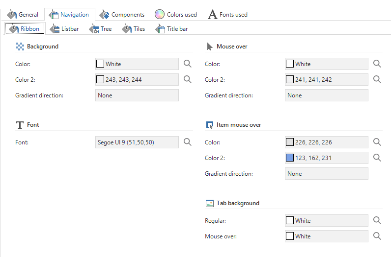
The theme for our application was developed a long time ago (2014 with TSF G8).
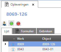
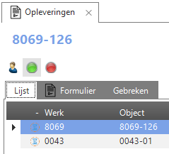
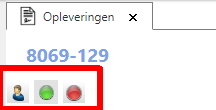
Because we are now using the screentype component “Prefilterbar” more often, we need to improve how this looks. When we designed this, apparently the background color was set to gradient (white to gray) but now it is not always clear when a prefilter is active or inactive. This is especially a problem in the web GUI. In the Windows GUI it does look how we would like to have it.
This is how it looks in the web GUI (no clear contrast between active and inactive):

This is how it looks in the Windows GUI (clear contrast between active and inactive):

The same theme is used for both platforms. What do I have to change to improve the look and feel for the inactive prefilters the web GUI?


