
Hello everyone,
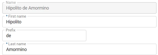
With this Universal release we are introducing impactful, long-awaited updates to the Universal UI styling and Data density! Most notably the Outline style for Form fields and displaying the Lookup value as a hyperlink (in Read mode). All Controls are slightly smaller in height, compared to the previous styling. The most important implications are the following:
- Form field height is reduced, resulting in more data density on the Form
- Default Grid row height is reduced from 36px to 28px, resulting in more data density on the Grid
- Grid row height is now also respected for Editable grids. Control buttons are properly display up until a minimum Row height (px) of 20 pixels.
- Field labels are no longer enlarged in empty fields
- Lookups in Read mode are displayed as hyperlinks and now also available on a Grid in Read mode
- Mandatory indicator (*) is now shown at the beginning of the label instead of the end to ensure it won't fall out of sight
As a result the following Ideas are marked as Completed:
These changes have made the extended properties useFormFieldBackgroundColor and DisableGridRowHeightSafeguards obsolete. Support for these is removed.
Universal GUI version 2025.2.13 (release candidate)
For more information about setting up the Universal GUI, see the Universal GUI setup guide.
Note:
- Use a modern browser to access the Universal GUI, for example, a recent version of Chrome, Firefox, Edge, or Safari mobile.
- Deploy the Universal GUI on the same server as Indicium or an allowed origin in
appsettings.json. - Run all hotfixes on IAM and the Software Factory that you plan to use for the Universal GUI.
- Use the latest version of Indicium.
Download the Universal GUI version 2025.2.13 (release candidate) here
This is a release candidate that you can use to test the new features. It is not suitable for use in a production environment. The full release will be available this Monday.
Contents
Breaking
Support for Thinkwise Platform release 2023 has ended
breaking
In accordance with our Lifecycle Policy, the Universal GUI support for Thinkwise Platform releases 2023.1, 2023.2, and 2023.3 has ended.
Upgrade to at least Thinkwise Platform version 2024.1.
Removed the useFormFieldBackgroundColor configuration option
breaking
We have removed the configuration option useFormFieldBackgroundColor. This option could be enabled or disabled to control whether form fields had a background color or not, for both editable and non-editable fields.
We now use the 'outline' field style, meaning that all form fields get a border. Non-editable fields can still have a background color. Both colors can be configured with custom CSS.
Check your custom CSS We cannot guarantee compatibility with your current custom CSS.
- The classes
filled-inputandfilled-stylehave been removed from the Universal GUI because they were used for the removed configuration optionuseFormFieldBackgroundColor. - We have made various changes to the DOM structure to enable outlined fields.
Custom CSS example with the new styling (background colors for disabled and read-only fields, outline color for mandatory fields):
Background colors are set for disabled and read-only fields, and the outline color is set for mandatory fields.
  /* Background color for non edit mode inputs */
  .tsf-control.disabled {
    background-color: pink;
  }

  /* Background color for Read Only inputs */
  .tsf-control.read-only {
    background-color: purple;
  }

  /* Outline color for mandatory fields */
  .tsf-control.mandatory .tsf-control-outline {
    border-color: fuchsia;
  }
To set no color, use:
 .tsf-control.tsf-control {
      background: transparent;
  }
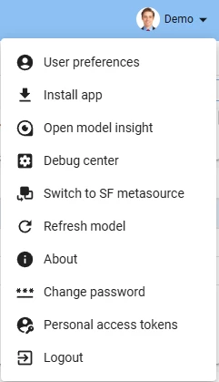
Debug center available in profile menu
new
The Debug Center was introduced in the Indicium release 2025.2.13. It combines the Error log, the Database Event Log and the Process Flow Monitor into one centralized page with a new look and feel. By selecting Debug Center from the profile menu in the Universal GUI you can access the Debug Center directly. Alternatively, you can access it through the Indicium url (for example, /indicium/account/ui/login).
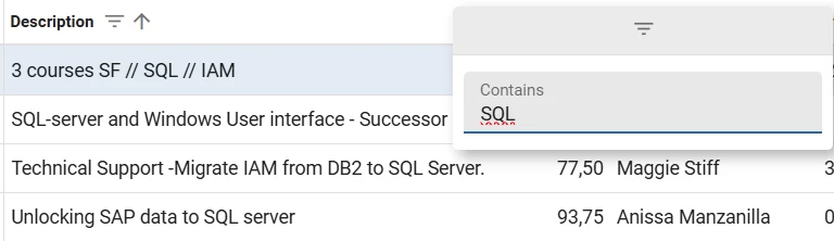
Filter multiline value types in grids
new
You can now filter columns that contain multiline values in a grid. To do this, select the three vertical dots in a column header. The menu is automatically available if the column contains multiline values. In the pop-up, enter a query in the field Contains. Close the pop-up to apply the filter.
Drag-and-drop upload support for file and image controls
new
Previously, files for file and image domain controls could only be uploaded by selecting the corresponding icon in the Universal GUI. You can now drag files for the following domain controls to upload them:
- FILE LINK
- FILE UPLOAD
- IMAGE LINK
- IMAGE UPLOAD
Updated layout for radio button controls
change
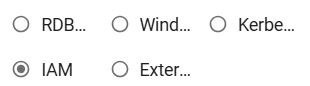
The Radio button control now follows the setting Field height in positions.
Previously, a Radio button control distributed all radio options over a maximum of two columns. This sometimes caused options to be out of sight. For example, a radio button with the Field height in positions set to '2' would show a maximum of 6 options, with three options under each other in two columns.
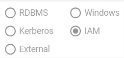
With this release, all radio options are now displayed according to the number of rows specified in Field height in positions, and distributed over a dynamic number of columns. A radio button with the Field height in positions set to '2' will now show a maximum of two options under each other, displaying them in as many columns as necessary.
This improvement ensures that all radio options are always visible, but it may reduce their readability. Therefore, review your screens to avoid situations such as the one below. In this situation, the Field height in positions is set to '2', but the options have become unreadable. You can resolve the issue by setting Field height in positions to '3'.
Improved conditional layout for resource columns in Scheduler
change
Previously, when you applied a conditional layout for a subject to a scheduler resource, it was applied to all scheduler resource columns for a table instead of the selected one, even if the selected column was not visible.
Now, the selected column to which the conditional layout is applied is no longer ignored. So, no conditional layout will be shown if the column is not the Group by column that is visible in your application as the resource for the schedule.
- To configure the conditional layout for a subject: go to the menu User interface > Subjects > tab Data > tab Conditional layout, select Show conditional layout, select a Column, and select Apply to Scheduler resource.
- To configure the Group by column: go to the menu User interface > Schedulers > tab Tables > tab Scheduler, and select a column in the field Group by column.
When conditions are evaluated, only the first matching record per resource is considered to determine which layout is applied. Additional matching records are ignored.
As of Thinkwise Platform release 2025.3, you can set multiple resource columns for a scheduler, increasing the amount of information for a resource. From that release onward, it is possible to apply a conditional layout to any of the selected resource columns.
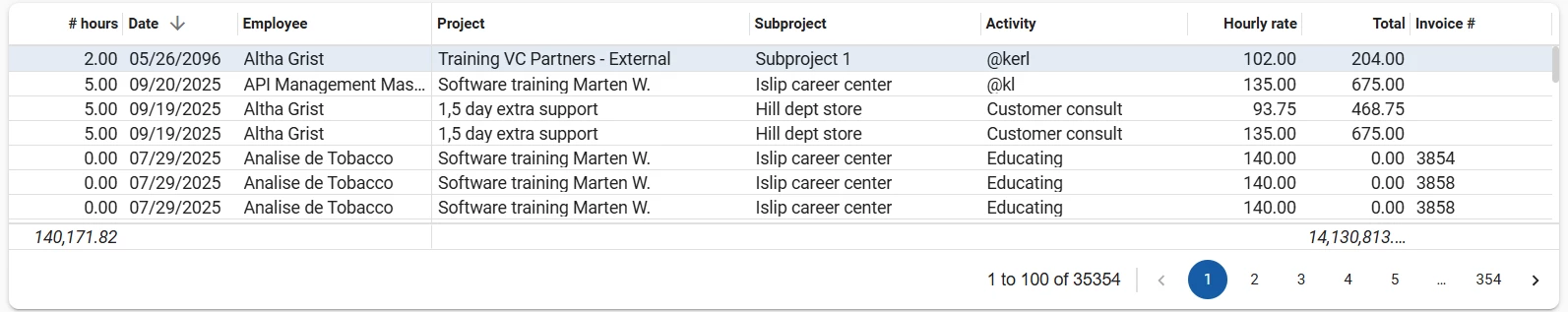
Improved form and grid styling
change
The form fields and grids have been redesigned to a more compact look and feel. With this change, you can now lower the grid row height to as little as 20px.
For more information about this change, see Form fields – Outlined style in the Community blog "Styling update of the Universal GUI".
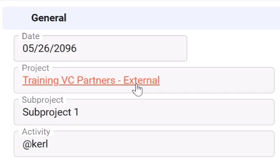
Clickable hyperlinks for read-only fields
change
The lookup control is no longer displayed as a clickable icon for read-only fields in grids and forms. Instead, the field text is now a clickable hyperlink to the lookup pop-up.
The clickable hyperlinks behave as follows:
- In grids, when a row is active or hovered, the lookup text is styled with the Accent color.
- When hovering over the lookup cell, an underline appears to indicate interactivity.
- Empty look-ups show a placeholder: 'Nothing selected' which is also clickable.
These changes apply only to read-only grids and forms. Editable grids and forms remain unchanged.
Improvements to cursor placement in filter pop-ups
change
We have improved the cursor placement when you open the filter pop-up in grids and forms. Now, when opening the filter pop-up, the cursor is automatically placed in the column's filter condition that matches the active field of the related subject. In grids and forms, the active cell determines in what filter condition the cursor is placed. For example, when you open the filter pop-up when 'Employee' is selected, the cursor is placed in the filter condition 'Employee'. This behavior only applies to default editable forms; it does not apply to non-default editable forms.
Changed display order of prefilters
change
Previously, the Universal GUI displayed user-defined prefilters after the model-defined prefilters in the action bar. To improve visibility, user-defined prefilters are now displayed at the start of the action bar. This makes it easier for users to find and apply their custom filters.
Improved tile texts
change
We have improved the tooltip and text truncation behavior for tiles:
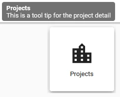
- Menu tiles - When text is truncated, hovering over a menu tile will now show a tooltip containing the full text.
Menu tile with tooltip - Detail tiles - A tooltip with the full text will now be shown when hovering over a detail tile.
Detail tile with tooltip -
Task tiles - The tooltip would sometimes not be shown when no custom tooltip text was defined. This has been fixed. Now, tooltips are always shown on task tiles, even when no custom tooltip text is defined. In those cases, the tooltip displays the translated title.
-
All tiles - When tile text was truncated with an ellipsis (
…), the top of tall characters (such as “h”, “i”, “}”) would incorrectly appear on the next line. This was a rendering issue and has been resolved.
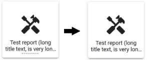
Fixed text truncation in tiles
Improved breadcrumbs
change
We have made the following changes to the breadcrumb behavior:
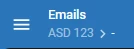
-
Previously, the breadcrumb would disappear from the top bar if you did not select any row. Now, it displays a dash ('-') at the end when no row is selected, indicating that no selection is made.
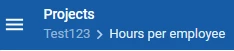
Breadcrumbs now display a dash where no row is selected - When you add a new row, the breadcrumb now displays the label 'New row' at the end. This label is translatable and will reflect the user's preferred language settings.

Breadcrumbs now display 'New row' when a new row is being added - In cubes, the breadcrumbs now display the cube view name.
Breadcrumbs now display the cube view name
Minor fixes and tasks
Fixes for aggregations in grids:
- When the Aggregation type is Max, "5e-324" was wrongly shown in some cases.
- When the Aggregation type is Min, "1.7976931348623157e+308" was wrongly shown in some cases.
- When the aggregation value is "0", it was not displayed.
Fixes for icons:
- We removed the width and height attributes from
.svgimages in the Image combo domain to prevent icons from being displayed at incorrect sizes. - We fixed the misalignment between the selectable icons and the main field of the Image combo domain.
Other fixes:
- Previously, if a user changed the Language in Profile menu > User preferences, it could take up to a minute for Indicium to apply the new setting. During this time, users continued to see messages in the old language. We have improved the functionality so Indicium now updates immediately when a user changes their language preference. This ensures a smoother and more consistent experience.
- When a whole row was set to read-only in a grid, the layout checkboxes appeared to be editable even though they were not. This has been fixed.
- Resolved an issue when using defaults in combination with layouts on checkboxes in a grid. In this case, clicking rapidly on the checkboxes caused the Universal GUI and the backend to lose synchronization.
- Previously, when entering an incomplete date in a date/time field, the Universal GUI cleared the field. Now, when you partially enter a date into an empty field, the Universal GUI automatically completes the entry with today's date and time. For example, when you enter the day '9', the current month and year are automatically added to the field. The time defaults to 0 minutes and 0 seconds.
- Fixed an issue where the settings Apply to cell, Apply to total cell, Apply to custom total cell and Apply to grand total cell were not applied correctly in conditional layouts for cube views.
What we will be working on next sprint
The next sprint we will be working on:
- Filter bar screen component.
- Extended filtering support for grid headers.
- Improvements for initial focus and navigation for editable pivot grids.
Questions or suggestions?
Questions or suggestions about the release notes? Let us know in the Thinkwise Community!