October 28, 2024:
- Full release 2024.3.11 (from release candidate 2024.3.11)
- Solved the following issues found in the release candidate:
- The date control flashed when choosing a different date from the one already set. This is fixed now.
- When updating the date, two PATCH requests were sent to Indicium. This is now a single request.
- Once a record was dropped into the grid, the records could not be dragged again. This is fixed now.
- In charts, Domain element translations were only shown for multi-series. Now also single-series are included.
- We improved tooltip behavior to hide it once the element is left by the mouse cursor. This way the user can't unexpectedly click a button by clicking its tooltip.
- We have fixed an issue where the subject could get unresponsive after dragging a splitter to resize its components.
Hello everyone,
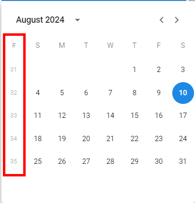
In this release, we made sure users are always working on the latest deployed version when the Universal GUI is started. Besides, we added support for the conditional layout setting 'Apply to' and for multi-record selection in the default editable grid. For the barcode control, we introduced the option to suppress the on-screen keyboard on mobile devices. We also improved the date input and added week numbers to the date calendar on desktop. Additionally, we resolved several minor issues and tasks.
Demo
As always, we have made a demo for you: try it here. Before trying it out, press 'Clear Cache' on the login screen.
Read the Universal GUI user interface guide to get familiar with the GUI.
Universal GUI version 2024.3.11
For more information about setting up the Universal GUI, see the Universal GUI setup guide.
Note:
- Use a modern browser to access the Universal GUI, e.g., a recent version of Chrome, Firefox, Edge, or Safari mobile.
- Deploy the Universal GUI on the same server as Indicium or an allowed origin in appsettings.json.
- Run all hotfixes on IAM and the Software Factory that you plan to use for the Universal GUI.
- Use the latest version of Indicium.
Download the Universal GUI version 2024.3.11 here
Contents
Breaking
Support for Thinkwise Platform releases 2022.1 and 2022.2 has ended
In accordance with our Lifecycle Policy , the Universal GUI support for Thinkwise Platform releases 2022.1 and 2022.2 has ended.
Upgrade to at least the Thinkwise Platform release 2023.1.
New and changed
Now always using the latest version when loading Universal
change
We have made sure users are always working on the latest deployed version when the Universal GUI is started. This is a long-awaited feature on the community with a lot of upvotes (59!). This also fixes issues where it was not possible to log in to an application after a platform upgrade because the cache was not yet refreshed. The cache is now refreshed before the login page is shown.
Going forward, a user should only get messages about a new version when the model is updated while the user is active in the application. Note that this solution is only applicable from this version onwards.
Date picker and date field changes
change
On desktop, we have replaced the date picker component (used for Date and DateTime controls). This fixes some issues and allows us to now show week numbers. This was a highly requested community idea with 37 upvotes. In addition, the keyboard input has improved using input masks. For example, typing the year as '24' will now become 2024 instead of the input becoming empty after leaving the field.
Besides this, in some browsers, when using the calendar to pick a date in a Date or Datetime control, we have fixed the field value being updated immediately after a user selected a different month. This fixes prematurely triggering the layout and default logic.

Support for conditional layout setting 'Apply to'
new
In the Software Factory, you can specify to which components a conditional layout should apply. We have now added support for this setting in the Universal GUI. It is available in the Software Factory in the menu User interface > Subjects > tab Default/Variants > tab Data > tab Conditional layout > tab Form > tab Conditional layout > field Apply to. The following options are available:
- Grid, Form and Edit - The conditional layout is applied to grid and form, in both read and edit modes.
- Grid and Form - The conditional layout is applied to the grid and form, only in read mode
- Grid only - The conditional layout is applied to the grid, only in read mode
- Form only - The conditional layout is applied only the form, only in read mode
Additionally, we have solved a problem where using the same style for different conditional layouts would only apply to the last conditional layout.
Support for multi-record selection in a default editable grid
change
Previously, it was only possible to execute a task or Excel export on a selection of records when the grid was not editable. In particular, in a default editable grid, these features excluded each other. Now, multi-record selection is available in a default editable grid as well.
Support for the Between/Not Between operator in the Filter form component
new
Users can now apply the Between/Not Between operator in the *Filter
To enable this, they must first select the Between/Not Between operator in the Filter pop-up from the toolbar and enter the desired values. You can also set the default operator to Between in the Software Factory menu User interface > Subjects > tab Data > tab Filter. Then, the chosen field in the inline Filter form will show two input fields that the user can adjust as needed.
Button to open preview in a new tab
new
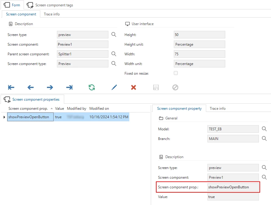
Due to CORS and the way browsers work, the Universal GUI cannot always show URLs in preview components.
For that reason, we have added a button to preview components to open the previewed content in a new tab. This button is also shown when the file can be shown, which has the advantage of showing it larger in a separate browser tab.

This is opt-in, so the button only appears if you add the Screen component property showPreviewOpenButton to the Preview component in the menu User interface > Screen types > tab Screen components > tab Screen component properties.

Barcode control - Suppress on-screen keyboard
new
You can now suppress the on-screen keyboard for the barcode control on mobile devices by adding the extended property SuppressBarcodeKeyboard. Set the value to yes. This feature is useful when using a barcode scanner that automatically enters the barcode value into the control.
Minor fixes and tasks
For cubes and charts:
- If a cube field was configured with a specific number of decimals, the chart would previously show only 2 decimals. Now, it respects the setting configured in the Software Factory.
- Domain elements were not translated in the x-axis and legend of a chart, and in the pivot grid. The displayed values were the raw database values instead of the translated ones. This has been fixed.
- Cells with
NULLas a value in a pivot grid were displayed as0.00. This has been fixed.
For grids and forms:
- When a user used a task to add a record to a table detail, the badge for the detail would not update. The same issue occurred if the user refreshed the table with the Refresh button. This issue has been fixed.
- The
Not equal tolayout condition was incorrectly applied to cells that had no value. This has been fixed. The conditional layout is now only applied to cells that have a value.
For grouping in grids:
- The rules for enabling grouping in grids were not applied correctly. The behavior has been adjusted to work like this:
- Non default editable grid:
- If not in edit mode, grouping is enabled
- If in edit mode and auto-save is enabled, grouping is enabled
- If in edit mode and auto-save is disabled, grouping is disabled.
- Default editable grid:
- If auto-save is enabled, grouping is enabled (regardless of whether the user has changed a record in the grid)
- If auto-save is disabled and no records have been changed, grouping is enabled
- If auto-save is disabled and a record has been changed, grouping is disabled
- Non default editable grid:
- Previously, when grouping by a column in the grid and changing the active record, the grouping would be removed. This issue has been fixed, and grouping now persists across row changes.
- Group columns were not always added to locked columns. This issue has been resolved, and group columns are now correctly displayed within the locked columns area.
What we will be working on next sprint
The next sprint we will be working on:
- Finishing context-sensitive breadcrumbs
- Multi-record delete
- Editable pivot grid (we expect this to take multiple sprints)
- Pivot grid column width
Questions or suggestions?
Questions or suggestions about the release notes? Let us know in the Thinkwise Community!
