


March 18, 2024
- Full release 2024.1.12.
- In the Release Candidate, we added support for user-defined prefilters. However, we had to make the decision to postpone that feature due to unexpected issues. We expect to release it again as part of the next release.
Hello everyone,
In this sprint, we have added a large number of user preference features to the Universal GUI. Users can now, for example, save custom cube views, show or hide columns, and save their custom filters as a prefilter. To improve the migration from the Windows GUI to the Universal GUI, we have added Windows GUI-like navigation options for editable fields in forms and grids. Additionally, we have further enhanced the Formlist component and the pivot grids. For custom CSS, we have added more options.
We have also done some minor fixes and tasks.
Demo
As always, we have made a demo for you: try it here . Before trying it out, Select Clear Cache on the login screen.
Read the Universal GUI user interface guide to get familiar with the GUI.
Universal GUI version 2024.1.12
For more information about setting up the Universal GUI, see the Universal GUI setup guide.
Note:
- Use a modern browser to access the Universal GUI, such as a recent version of Chrome, Firefox, Edge, or Safari mobile.
- Deploy the Universal GUI on the same server as Indicium or an allowed origin in appsettings.json.
- The Universal GUI only works with version 2022.1 and up of the Thinkwise Platform.
- Run all hotfixes on IAM and the Software Factory that you plan to use for the Universal GUI.
- Use the latest version of Indicium.
Download the Universal GUI version 2024.1.12 here
Contents
New and changed
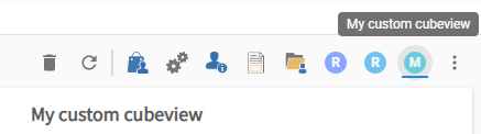
User preference - Save custom cube view
new
Users can now save custom cube views by selecting Save as cube view from the overflow menu. They can enter a name and select the default type.
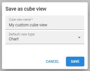
The saved cube view will show next to the model cube views.
To delete it, users can select Delete cube view [name] from the overflow menu.
User preference - Show or hide columns
new
Users can now show or hide grid columns in read-only grids. This option is available in the overflow menu of the grid. Additionally, they can change the Lock columns until setting.
To configure the availability of these options for your users, see Configure user preferences .
User preference - Remember prefilter status
new
The Universal GUI can now remember and apply a user's preferred state for a prefilter (activated or de-activated). A prerequisite for this feature is that in the Intelligent Application Manager, the setting Prefilter status is enabled in the Advanced menu > Master data > UP availability. For example, if a user deactivates a prefilter that was initially activated, and returns to that screen, the prefilter will automatically be deactivated by default.
In this release candidate, the status for user-defined prefilters is not yet remembered.
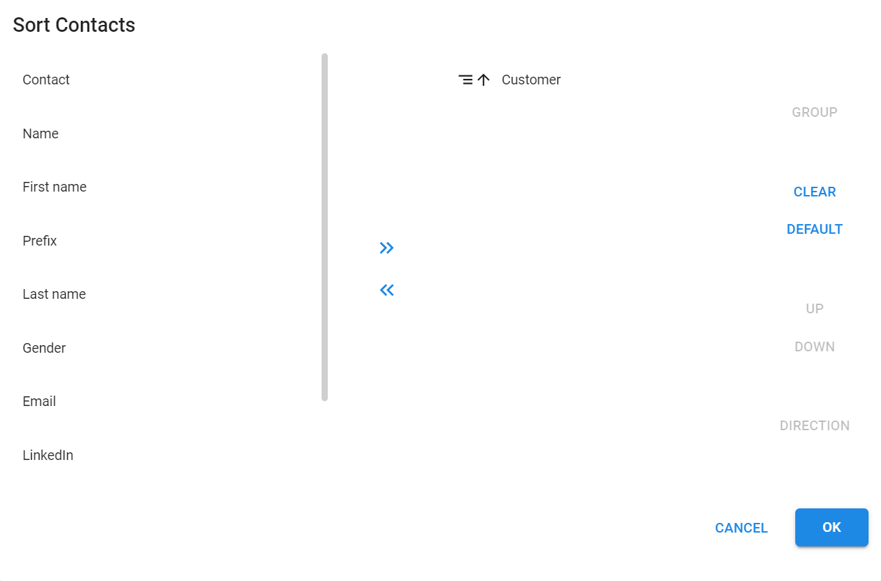
User preference - Sort & group
new
Users can now change the sort order in a grid if the permission Allow sort has been selected for that table (menu User interface > Subjects > tab Settings > tab Permissions > group Data).
With this permission enabled, a user's changes in the sort order and grouping will be saved, and the next time they log in, their preferences will be applied to the table.
If a user selects the option Sort... in the menu, the Sort popup will appear. Here, a user sees the current status of the table: the columns on which the grid is sorted, the order of the sorted columns, and the direction in which the data in every column is sorted. If the Group permission has been selected in the Software Factory, a user also sees the Group button and if the data in the table is grouped by column(s).
In the Sort popup:
- To sort data, users can select column(s) on the left and use the >> button to add and sort columns in ascending order.
- To exclude columns from sorting, users can select column(s) on the right and use the << button to move the columns to their default position on the left.
- To group columns, users can select columns on the right and then select the Group button. If the selected column has been grouped already, the columns will be ungrouped.
- To move all the columns from the right to the left, users can select the Clear button. If OK is selected, all the groups and sorting will be removed.
- To return to the default settings as set in the Software Factory, users can select the Default button.
- To change the column order on the right, users can select a column and the Up button. If the column above is grouped and the selected one is not, the selected one becomes grouped, too. Users can use Down to move columns down in the same way.
- To change the sorting direction in a column, users can select a column at the right and the button Direction.
Known issue:
When a column that is not visible in the grid is added to the sorting, it will be temporarily visible. Refreshing the Universal GUI, going into edit mode, closing and reopening the document, or switching pages in pagination will hide the column. Then, it will no longer become visible.
Changed filtering in lookup-type columns
change
To enable further development of filtering from grid column headers, we have changed how other column filtering methods like filter forms and quick filters work.
Multiple records may have the same display value, like two employees with identical names. When filtering by that name, we now show all matching records for both individuals. This means we filter by the display value and duplicate names appear only once in the dropdown list.
However, column filters applied through the Change filter process flow action filter by key. These filters are treated as system filters and no longer visible in the filter form or grid header. Users can add more filters to the column to refine their filtering. System filters are automatically cleared using the Clear filters option from the toolbar because system filters may be applied to hidden columns.
Once a column is filtered, the in-line filter form dropdown shows all relevant options. Previously, the dropdown was filtered by its filter value, resulting in a single option being shown.
Windows GUI-like navigation option for editable fields in form and grid
new
Users can now use Windows GUI-like navigation through the editors of editable components in the Universal GUI. This can be helpful if you migrate from the Windows GUI to the Universal GUI.
We have added the extended property KeyBindings to support changing how you navigate your application with the keyboard. You can configure it per application or model in the Software Factory. Choose the value "Classic" for Windows GUI-like navigation or the default value "Modern" for the standard Universal GUI navigation.
The keyboard shortcuts are as follows:
| Navigation | Classic | Modern |
|---|---|---|
| Move to next editable control in form/grid | Enter | Tab |
| Move to previous editable control in form/grid | Shift + Enter | Shift + Tab |
| Open the file explorer from the file editor | Alt + Enter | Enter |
We have added new keyboard shortcuts to avoid conflicts if you choose to use "Classic" navigation.
- You can create a new line in a multiline editor by pressing Alt + Enter instead of Enter.
- You can open a dropdown list by pressing ↓.
The following editors do not support "Classic" navigation:
- Label
- Group header label
- Group header icon
- Signature
- Image upload
- Image blob
- Image link
- Video link
- HTML (in grid)
Formlist - Lookup editors
new
We have added support for lookup editors in the Formlist screen component. Previously, it only showed a loader and no editor.
Now, the editor is shown, and the selected value is saved right after the user selects an option, just like the supported types of editors already do.
Note:
- Related lookup editors are not yet supported. For example, booking hours: the selected project filters the subproject field with the subjects that belong to the selected project.
- The pop-up button is not available. We aim to keep the Formlist simple, so there is no option to look up or select a record from the pop-up.
- The configuration of a lookup relation in the Software Factory knows different control types. In a Formlist, comboboxes will become suggestion controls. Comboboxes (dropdowns) have the disadvantage that the list of options is loaded directly. This would result in many requests for options on initial load or data refresh. Suggestion controls load a limited number of options and only when working on the field.
Formlist - more enhancements
new
In addition to the support for lookup editors as described above, we have added even more functionality to the FormList component:
- In a default procedure, the Formlist will now correctly apply new values, also to other columns than the edited column.
- For a layout procedure, the layout will be applied after a value has been changed.
- For the following setting, the Formlist rows will be refreshed after a value has been changed: menu User interface > Subjects > Settings > Performance > group Refresh > field After update > select Subject. Note: if refreshing is not strictly necessary, select None since refreshing slows down performance.
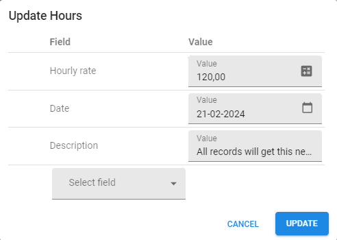
Grid - Update multiple records
new
Users can now update multiple records ('mass update') in tables at once, by selecting the Update option from the overflow menu. They can select the fields to update and enter a new value for each of them
After the update, a message appears, showing the number of records updated and any errors found.
- Updating lookups directly is not supported. This feature will be included in a future update.
- Mass update is unavailable while the subject is in edit mode.
Custom CSS - More control over combo and suggestion controls
new
We support two different types of combobox controls: the Combobox (dropdown list) and the Combobox with a suggestion. Previously, these types shared the same CSS styling.
We have added new CSS classes to make it possible to use different CSS styling for each type of combobox:
- 'combo-select' applies to the Combobox (dropdown list) control
- 'autocomplete-select' applies to the Combobox with a suggestion control
You can now visually distinguish between the controls if needed.
Custom CSS - Classes for identifying mandatory fields in a grid
new
The grid now includes classes on each cell to show the column's state. This allows you to hook into these classes in your custom CSS. You can find these classes on the .conditional-layout-container. Use this option to make certain types of cells stand out more, for example, if they contain an error.
The classes are:
.mandatoryfor cells with a mandatory field.readonlyfor cells with a disabled field.has-errorfor cells with a field that has an error
Import - Asynchronous import function on Azure
change
The import function on Azure now runs asynchronously to avoid timeouts. This ensures the file imports are completed regardless of their duration. This feature requires WebSockets. The system will fall back to the synchronous method if WebSockets are not configured.
For more information on the configuration of WebSockets, see Enable WebSockets in Azure. This also applies to the Universal GUI.
Pivot grids - Conditional layout
new
We have added support for conditional layouts for pivot grid fields (menu User interface > Business Intelligence > tab Cube views > tab Conditional layout). This allows you to draw a user's attention to specific fields.
Situations where the conditional layout is useful:
- In standard cube views (not custom cube views)
- In basic conditional layouts. A cube view can have multiple conditional layouts.
- For grand totals and nested fields (categories)
Pivot grids - Access underlying cell data
new
It is now possible for a user to double click a pivot grid cell to open a pop-up with a grid containing the underlying data for that specific cell. This new grid is read-only and adheres to any filters set on the pivot grid.
Pivot grids - Collapse/expand nested series
change new
Nested series (columns) in pivot grids are no longer default expanded, but users can still expand them manually. This is now similar to the categories (rows).
For both series and categories, we have added support for the setting to expand them by default. It is available in the menu User interface > Business intelligence > tab Tables > tab Cube fields > tab Cube view fields > tab Form > checkbox Expand.
Minor fixes and tasks
- A layout can change from mandatory to non-mandatory. Saving an empty non-mandatory field that was previously saved as mandatory resulted in the error
cannot_save_document_field_error. This has been fixed. - Non-existent data was incorrectly displayed as 0 in the chart. Now, the chart no longer draws these absent data.
- We have resolved two issues that incorrectly positioned tasks in the action bar, even though they were located elsewhere on the screen. This has been fixed.
- Sometimes, the overflow menu did not appear in the action bar on mobile phones. This has been fixed. Now, when space is limited, the CRUD buttons will collapse individually into the overflow menu.
- It was possible to use the CRUD buttons while an operation was already in progress, resulting in an error. This is no longer possible.
- When the process action Activate detail was used as a starting point, a 'bad request' error would appear. This has been fixed.
- In some cases, the pinned cell within the grid that shows the sum aggregation of data showed a non-numerical element like a checkbox instead of a number. Now, it always shows a number if a sum value can be calculated.
- In grids with the option Auto-save enabled, manually saving a record left the grid in edit mode. This has been fixed. Now, the grid exits edit mode automatically after saving.
- Editing shortcuts are now limited to components on the screen that allow add, copy, and edit actions.
- Lookup pop-up buttons did not always open the pop-up on the first click. This has been fixed.
- If a user opened a lookup pop-up and clicked the Add button quickly enough, the pop-up would occasionally not switch to the tab where the data for the new item could be inserted. This has been fixed.
- If you used the filter form with numeric or date/time controls, this could result in a bad request network error, causing empty controls on dropdowns. This has been fixed.
Fixes in full release 2024.1.12
- The value "Classic” of the
KeyBindingsextended property that was added to the release candidate was case-sensitive. We have fixed this, so it is no longer case-sensitive, and the value "classic" now also works. - Filtering a dropdown using the IN operator was not applied since the last release candidate. This is fixed now.
- On both numeric controls and dropdowns (data value), filters on value 0 are now applied.
- We have fixed an incorrect translation in the new
Mass updatefeature. - The default width of fields in filter forms has been reduced to 250px, just like fields in the regular form.
-
As part of the release candidate of this version, we introduced the concept of system filters. These are filters from the
change filterprocess flow action. We decided not to show system filters to the user anymore.
It turns out that some of our customers used these filters as initial input for the filter form, where users can modify it to see another set of data, for example, to show all data from the current year 2024 initially.It is now possible again to filter on these columns from the filter form.
The system filters are still not displayed to the user. They will be replaced when the user filters for a different value/criteria in the same column.
What we will be working on next sprint
The next sprint we will be working on:
- Grid header filtering for look-up-type columns
- Pivot row (category) grand totals
- Mass-update lookup-type columns
- Pivot grid sorting improvement
- Pivot grid total positioning user preferences
- Vertical bars
- Freely positionable prefilter, cube view, report and combined filter (search) bar
- Action bar content alignment
Questions or suggestions?
Do you have any questions or suggestions about the release notes? Let us know in the Thinkwise Community!