May 4, 2021:
- Changed beta release to full version: 2021.2.10
Hello everyone,
in this sprint, we've added more awesome features, like multi-row selection for touch devices, basic import functionality, and a basic filter form. We'll also give you a sneak preview of the upcoming conditional form layout!
As always, we've made a demo for you: try it here. Before trying it out, press 'Clear Cache' on the login screen. You can read the GUI user manual to get familiar with the Universal GUI.
We'll keep you updated regularly about Universal's progress.
Universal GUI version 2021.2.10
Like with every blog, we've released a version so you can test the Universal GUI out for yourself. Don't forget the documentation and be sure to keep the following in mind:
- A modern browser is required to access the Universal GUI, eg a recent version of Chrome, Firefox, Edge, or Safari mobile. Using the Universal GUI with IE is not supported.
- The Universal GUI must be deployed on the same server as Indicium or it should be an allowed origin in appsettings.json.
- The Universal GUI only works with version 2019.2 and up of the Thinkwise Platform.
- Furthermore, make sure you run all hotfixes on the IAM and SF that you plan to use for the Universal GUI.
- Make sure you are using the latest version of Indicium Universal.
Download the Universal GUI version 2021.2.10 here.
Breaking
Support expired
As per our Lifecycle policy, the support for the Thinkwise Platform version 2019.1 has expired.
New
Multi-select for touch devices
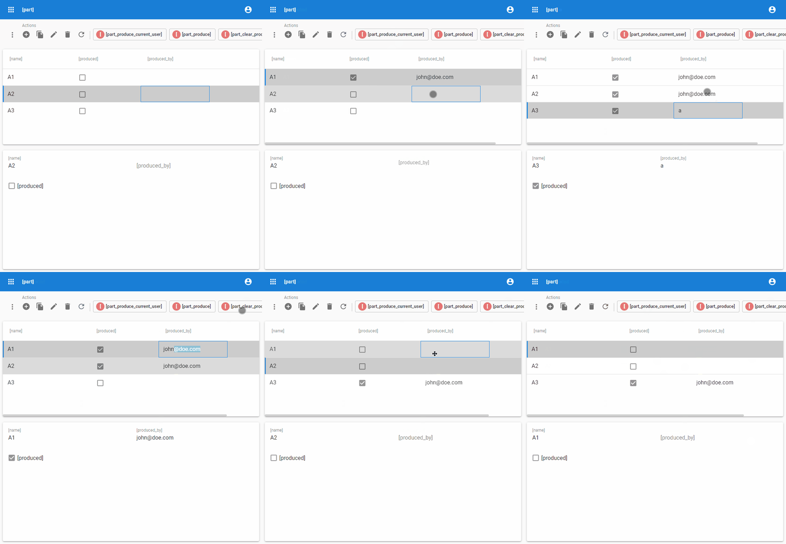
For mobile and tablet devices, we now support multi-select in our Grid component. By long-pressing on a row, the checkboxes will appear, meaning you can select the rows. This is useful when you want to execute a task on multiple rows. You can turn off the multi-selection by either long-pressing on a row or using the Cancel [x] icon at the top bar. Here are also the currently selected rows displayed. A Select all [-]/Deselect all [v] button is also available in the header of the Grid.
Since the top bar displays the selection, only one subject can have multiple records selected at the time. A selection on other subjects will be rejected.
Note: you can't use multi-select in Edit mode.

Import screens
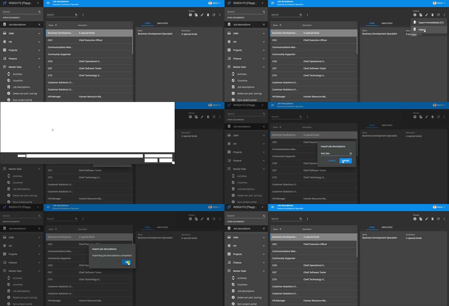
If a tab allows importing and adding records, a basic version of the import functionality is available now. This basic version is limited to .csv, .xls and .xlsx files. For the API limitations, please refer to the Indicium 2021.2.10 release notes.
Influence field focus in task/report parameter popups
In release 2021.1.14.1, we've added support for focusing on a specific form control while activating edit mode and after updating a control value. On Add/Edit/Copy, the Universal GUI places the cursor in the first editable control. For replacing the cursor after updating a control value, the parameter cursor_to_col can be set in the default stored procedure on the database, see Default.
Now we've introduced the same for task and report parameter dialogs. Also, the initial focus on open is checked and fixed. This puts the cursor in the first editable parameter unless the default has set a cursor_to_col_id.
Filter form as a screen component inside a document
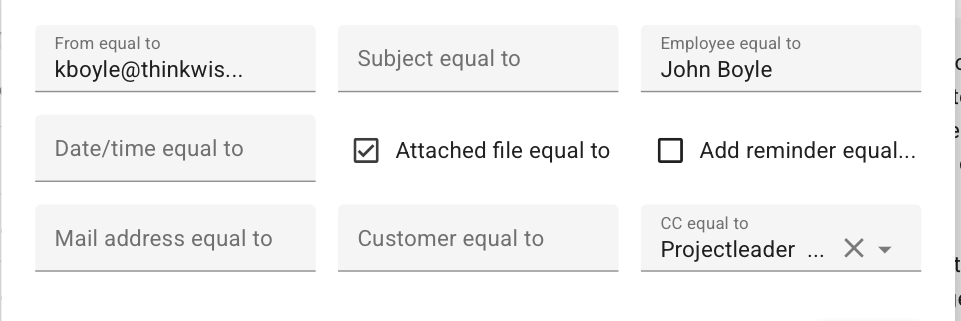
The Universal GUI will now present a basic filter form to the user when the screen type of a document requires it.
The presentation differs from what you're used to in our other GUIs. The supported columns are placed side-by-side, and there is no option (yet) to change the condition to filter the data set. The default is always equal to.
The following columns are not yet supported:
- Lookup columns.
- Columns with data type 'Binary'.
- Columns with these domain Control types (as set in the menu Data > Domains > tab Form > field Control ): Date, DateTime, Time, Label, Group header label, Group header icon, Html, Rtf, Sqleditor, Multiline, Image link, Image upload, Image BLOB, File, File upload, Signature, Video link.
The set will be filtered directly after a field is changed.
Changed
Improved numeric validation message translation
We've improved the translation message for a numeric field in which a value above the bounds of the datatype was entered.
- Was: ... "is not a number."
- Now: ... "has too many digits (was ...)".
Minor fixes and tasks
- We've fixed the multi-select for grid records, holding the [Ctrl] or [Shift] key.
- The conditional layout row background used to override the active row background. This has been fixed, the active row background will now take precedence.
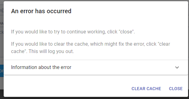
- In some cases, the 'An error has occurred' popup kept showing up after an error in the Universal GUI. This has been fixed. When this happens now, the page is reloaded so you will start with a clean sheet.
- We have fixed that the dropdown wrongfully opened when focussing on a lookup field. Instead of opening the dropdown, the Universal GUI will now just focus on the lookup field. This also fixes another problem with a similar scenario where a dependent lookup would get cleared when a user closed the dropdown. For example, the lookup Subproject would get its value cleared when the lookup Project was focused by
cursor_to_col_id, and the dropdown was closed by the user. -
We've fixed the issue where the user needed to click the Save button twice when the focus was still in the last changed field.
Coming up: filled form fields and form conditional layout
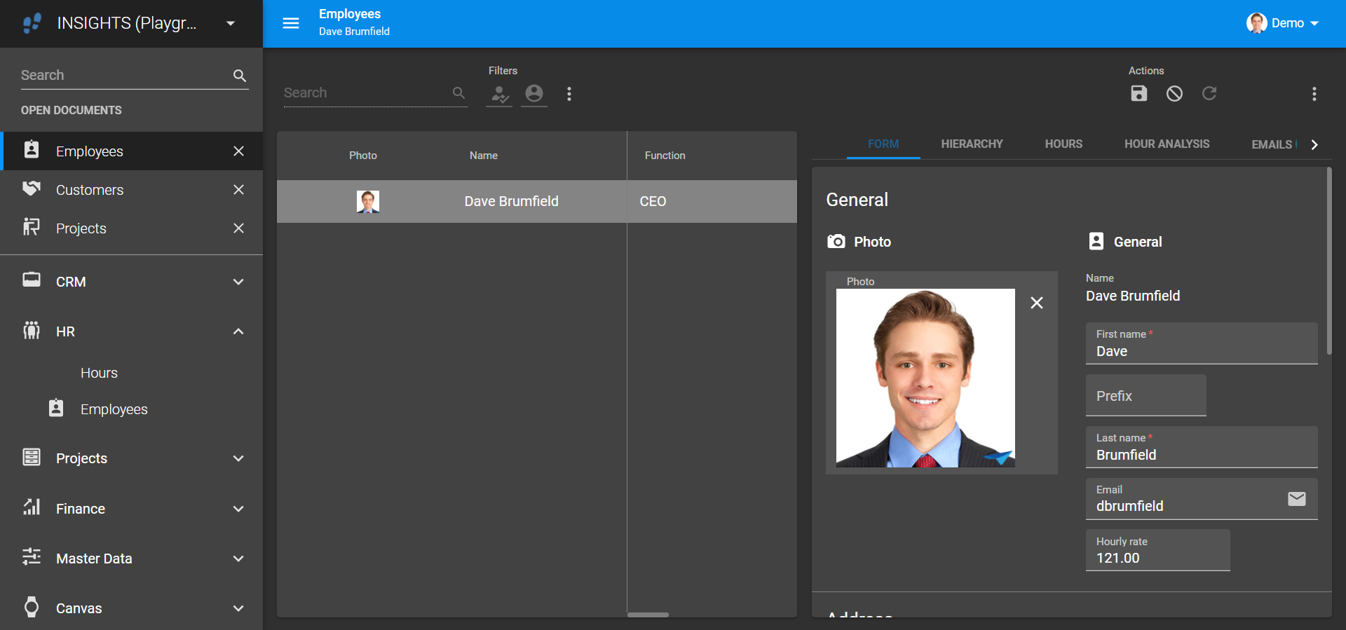
At the moment, we're working on form conditional layout. However, this is difficult to achieve with the current way form fields are styled. Because what, exactly, would get the background color?
Besides this, it's hard to discern where a form field starts and where it ends, especially when a field spans multiple rows and the colored bottom border falls outside of the visible part of the form.
To prepare for form conditional layout and solve the mentioned issues, we’ve decided to implement filled form fields. We’re still putting the finishing touches on them. The next step will be to add the conditional layout.
This is what it will look like:
What we'll be working on next sprint
The next sprint we'll be working on:
- Applying conditional layouts to form fields.
- Work in progress:
- Offline data
- Maps
- Quick Filter
- Pivot grid enhancements
- And we'll solve some issues.

