

Universal brought HTML rendering and multiline support to Scheduler activities and tooltips. Two additions that significantly improve the ability to format the Scheduler to your end users' liking. Think bold customer names, color-coded priorities, or descriptions that wrap instead of getting cut off.
This blog is meant to show you what’s possible and inspire you to make the most out of your Scheduler’s graphics. There is no single right answer for what to show. Every Scheduler has different information that matters at a glance, and now you can put exactly that front and center.
These changes works from Universal UI version 2026.1.15 and are backwards compatible with all supported Platform versions. Refer to our other blogs for detailed explanations of other features of the Scheduler.
How it works
Scheduler activities have always been a single line of text. This can now be changed. Set the control type of the domain used by your title/tooltip column to HTML or multiline, and the activity renders whatever your view produces.
The most direct approach is a CONCAT that builds the HTML around your data. Wrap a value in a tag and it comes out styled. Add a line break and the activity grows a second line automatically. There is no maximum height by default, so activities just stretch to fit.
One thing worth knowing: that flexibility cuts both ways. An activity with no height limit will grow as tall as its content. If you want a ceiling, wrap everything in a div with a max-height style.
Warning: an activity that uses HTML or multiline content ignores conditional layout for font size, strikethrough, and underline. Move that styling into the HTML itself.
What you can build
Here are a few examples to get you started, each adding more information to an activity or tooltip.
Status color
We want to change the color depending on the status of a task. To do this we add an outer apply to our scheduler view that maps the various statuses of a task to specific color values. We can then use this column in our HTML to color specific items.
outer apply (select case when s.task_status = 0 then '#00bcd4'
                         when s.task_status = 1 then '#2196f3'
                         when s.task_status = 2 then '#009688'
                         when s.task_status = 3 then '#ffeb3b'
                         when s.task_status = 4 then '#8bc34a'
                         when s.task_status = 5 then '#f44336'
                         else null
                    end as activity_status_color ) ac
A second line, Outlook style
We start simple: a bold title, with the location underneath in italics. The activity reads like an Outlook appointment. This is useful if you want to display where an activity is being worked on.
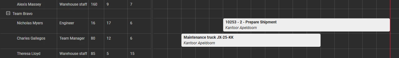
concat('<b>', s.title, '</b><br /><i>', s.location, '</i>')The <br /> starts the second line. <b> is used to make text bold, <i> is used to make text italic.
Status indicators
A status indicator is a small but powerful way to show the status of an activity by just using color. This makes it easy for a user to scan all activities on a scheduler and quickly look for outliers that have the color red, those need your attention. Here are a few examples of different styles. The background color of the <div> will change the color of the status indicator.
Filled circle

concat('<div style="display: inline-flex; height: 16px;">
    <div style="width: 14px; height: 14px; background: ', s.activity_status_color ,';
         border-radius: 50%; margin-top: 4px; margin-right: 5px;"></div>
    <span style="margin-top: 3px;">', s.title, '</span>
</div>')
Rounded square

concat('<div style="display: inline-flex; height: 16px;">
    <div style="width: 14px; height: 14px; background: ', s.activity_status_color ,';
         border-radius: 3px; margin-top: 4px; margin-right: 5px;"></div>
    <span style="margin-top: 3px;">', s.title, '</span>
</div>')
Line

concat('<div style="display: inline-flex; height: 16px;">
    <div style="width: 6px; height: 14px; background: ', s.activity_status_color ,';
         border-radius: 3px; margin-top: 4px; margin-right: 5px;"></div>
    <span style="margin-top: 3px;">', s.title, '</span>
</div>')
Outlined circle

concat('<div style="display: inline-flex; height: 16px;">
    <div style="width: 14px; height: 14px; border-radius: 50%;
         border: 3px solid ', s.activity_status_color ,'; margin-top: 4px; margin-right: 5px;"></div>
    <span style="margin-top: 3px;">', s.title, '</span>
</div>')
Pill labels
If you really want to get the attention of a user, a pill is a good way to do this. In this first example we have a red pill with an exclamation mark. This will immediately flag this activity to a user as important to look at. Use these sparingly otherwise they lose their meaning. If everything is important, nothing is.
You can put text inside a pill too. That works well for specific warnings or status labels, but the same pattern works just as well for showing which certificates an employee needs for a given activity. Change the background color and it becomes a general-purpose status indicator.

concat('<div style="display: block;">', s.title,
    '<span class="tag" style="display: inline-block; margin-left: 10px;
     padding: 0px 7px; background-color: ', s.activity_status_color ,'; color: #fff;
     border-radius: 20px;"><b>!</b></span>')
concat('<div style="display: block;">', s.title,
    '<span class="tag" style="display: inline-block; margin-left: 10px;
     padding: 0px 7px; background-color: ', s.activity_status_color ,'; color: #fff;
     border-radius: 20px;"><b>', s.activity_status, '</b></span>')
Progress bar
Progress bars can be a powerful way to display the status of a task as a percentage. This example allows you to set both the percentage and color of the bar. Change color value of the inner div to change the color of the progress bar.
We think this is also a solid way to replace the percentage field from the Windows GUI Resource Scheduler when transitioning to the Universal UI.
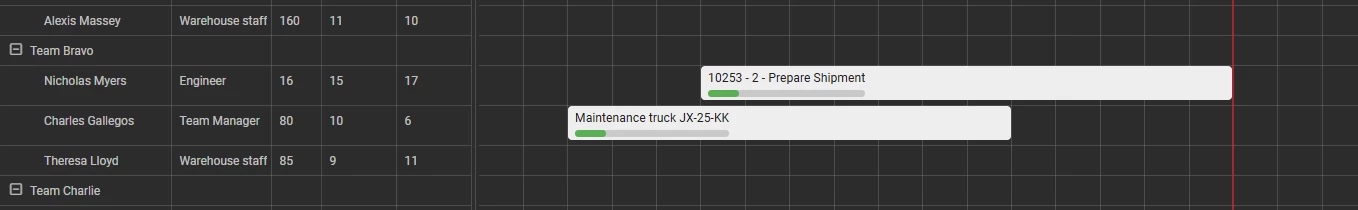
concat(s.title, '<br /><div style="width: 100%; height: 0.5rem;
    background: #e0e0e0; border-radius:5px; margin-top: 3px;">
    <div style="width: ', s.activity_percentage_complete ,'; height: 100%; background: ', s.activity_status_color ,';
     border-radius:5px; margin-top: 3px;"></div></div>')
Activity cards
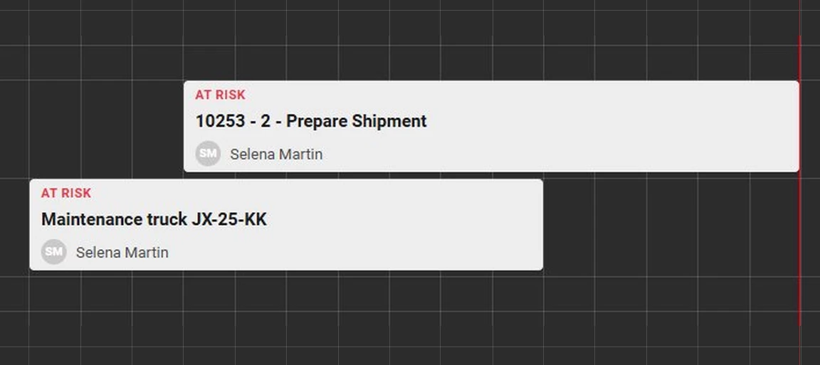
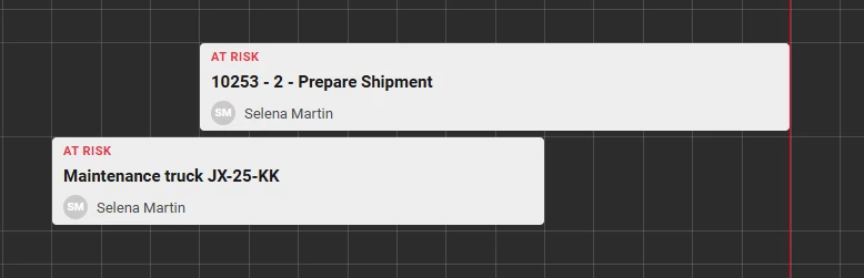
This is an example of an activity card that shows a lot more information than the default activities. We start simple by just adding a warning above the title text. In the second example we go a step further and also show the employee the card is assigned to. If you wanted to you could even replace the initials shown with a small picture or avatar of the employee, making it easily scannable at a glance which employee is working on which activity.
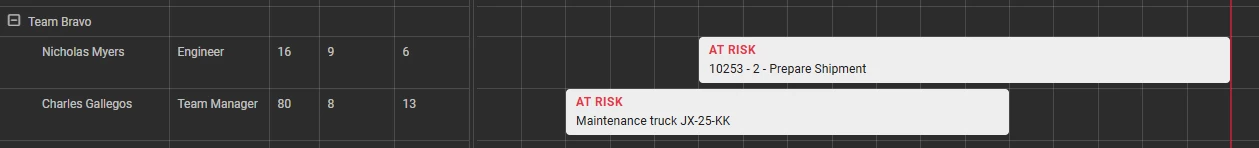
concat('<div style="flex: 1; padding: 2px 3px; display: flex; align-items: center;">
                    <div style="flex: 1;">
                        <div style="font-size: 12px; font-weight: 700; color: ', s.activity_status_color ,'; letter-spacing: 0.5px;">', s.activity_status ,'</div>
                        <div>', s.title ,'</div>
                    </div>
                </div>')
Activity card with an assigned employee
concat('<div style="flex: 1; padding: 2px 3px; display: flex;
    align-items: center;"><div style="flex: 1;">
    <div style="font-size: 11px; font-weight: 700; color: ', s.activity_status_color ,';
         letter-spacing: 0.5px; margin-bottom: 4px;">', s.activity_status ,'</div>
    <div style="font-size: 15px; font-weight: 700; color: #1a1a1a;
         margin-bottom: 5px;">', s.title ,'</div>
    <div style="display: flex; align-items: center;">
        <div style="width: 22px; height: 22px; border-radius: 50%;
             background: ; color: #fff; font-size: 10px;
             font-weight: 600; display: flex; align-items: center;
             justify-content: center; margin-right: 8px;">', s.assignee_initials ,'</div>
        <span style="font-size: 13px; color: #4a4a4a;">', s.assignee_name ,'</span>
    </div></div></div>')
Formatting works in tooltips too
The same idea extends to the tooltip. Set the activity’s Tooltip column to a column that uses an HTML or multiline control and the tooltip will also display this properly.
This is allows you to split information, have just the essential information in the activity itself, and add more information / context in the tooltip of an activity. A good example of this could be a checklist. This shows the current status of all tasks that have to be completed before the activity as a whole can be completed.
Because emoji’s are Unicode characters, you can also use them in your application, for instance in this case we are using them as icons to display whether a task has been completed.
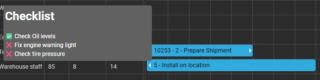
'<h1>Checklist</h1>✅ Check Oil levels <br> ❌ Fix engine warning light<br> ❌ Check tire pressure'What will your activities show?
Share your examples in the comments below. I would love to see how you have made the Scheduler your own!