Completed

U-GUI: Form tabs foldable

Related products:Universal GUI

Freddy
  • Thinkwise Local Partner Brasil
  • 529 replies

Hi. In the Universal GUI when you say in the SF to put something in the next tab it creates a new section. To have the same experience as putting something in the the next tab.. it would be nice have a section collapsable, so by default it doesn't clutter the screen and you can just fold it open when you want to see these details.  

And perhaps it can come with an extra setting to have only one section open at the time or multiple.. just like with pre-filters where you can have only one or more. 

Did this topic help you find an answer to your question?

22 replies

Mark Jongeling
Administrator
Forum|alt.badge.img+23

Similar to this idea, I'll leave your idea open for the time being; I'll discuss internally if these ideas could be merged 😉

Mark Jongeling


Mark Jongeling
Administrator
Forum|alt.badge.img+23
Updated idea statusNewOpen

Jeroen van den Belt
Administrator
Forum|alt.badge.img+9
The following idea has been merged into this idea:

All the votes have been transferred into this idea.

AndreKemmeren
Captain
Forum|alt.badge.img+3

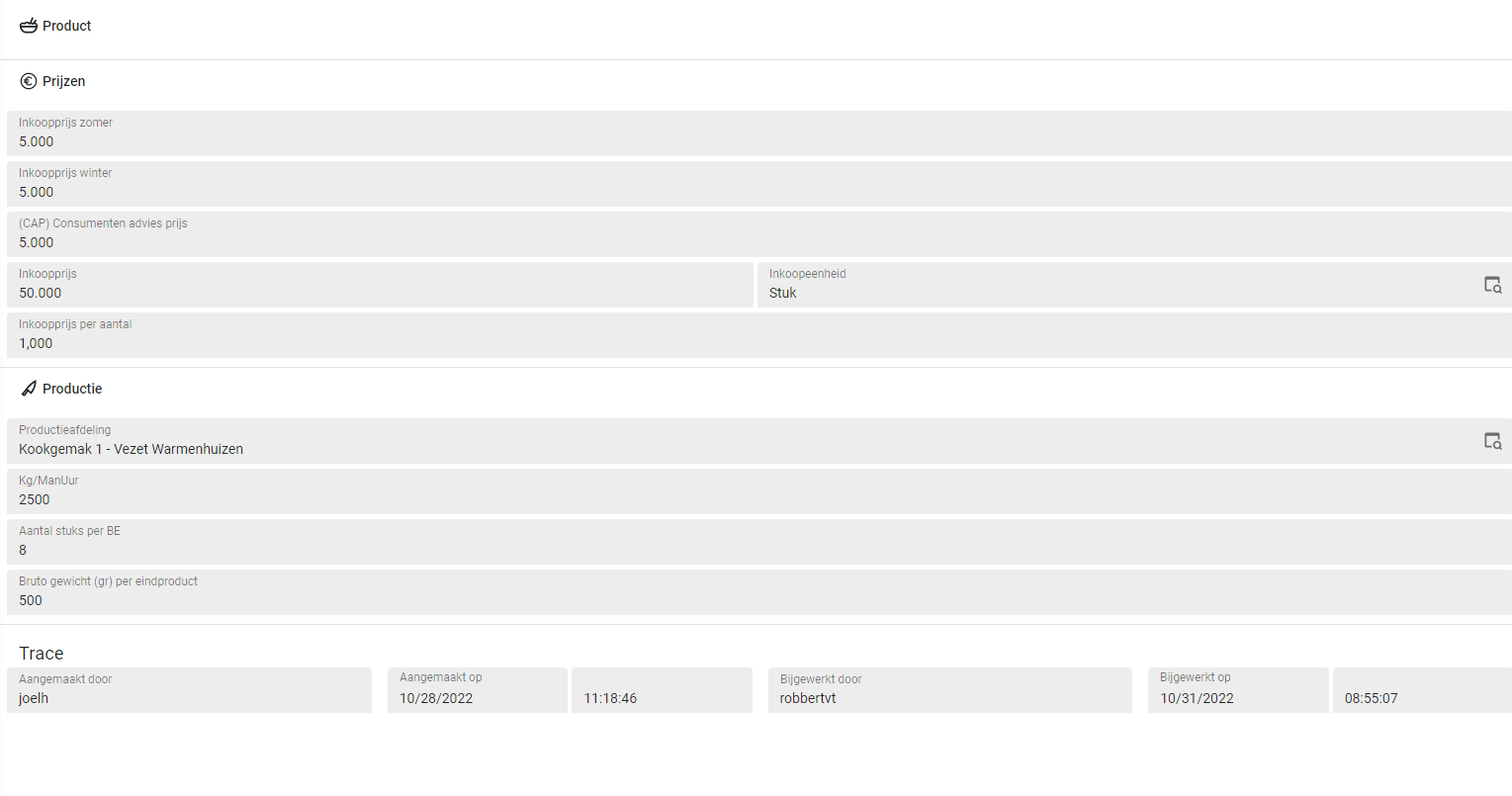
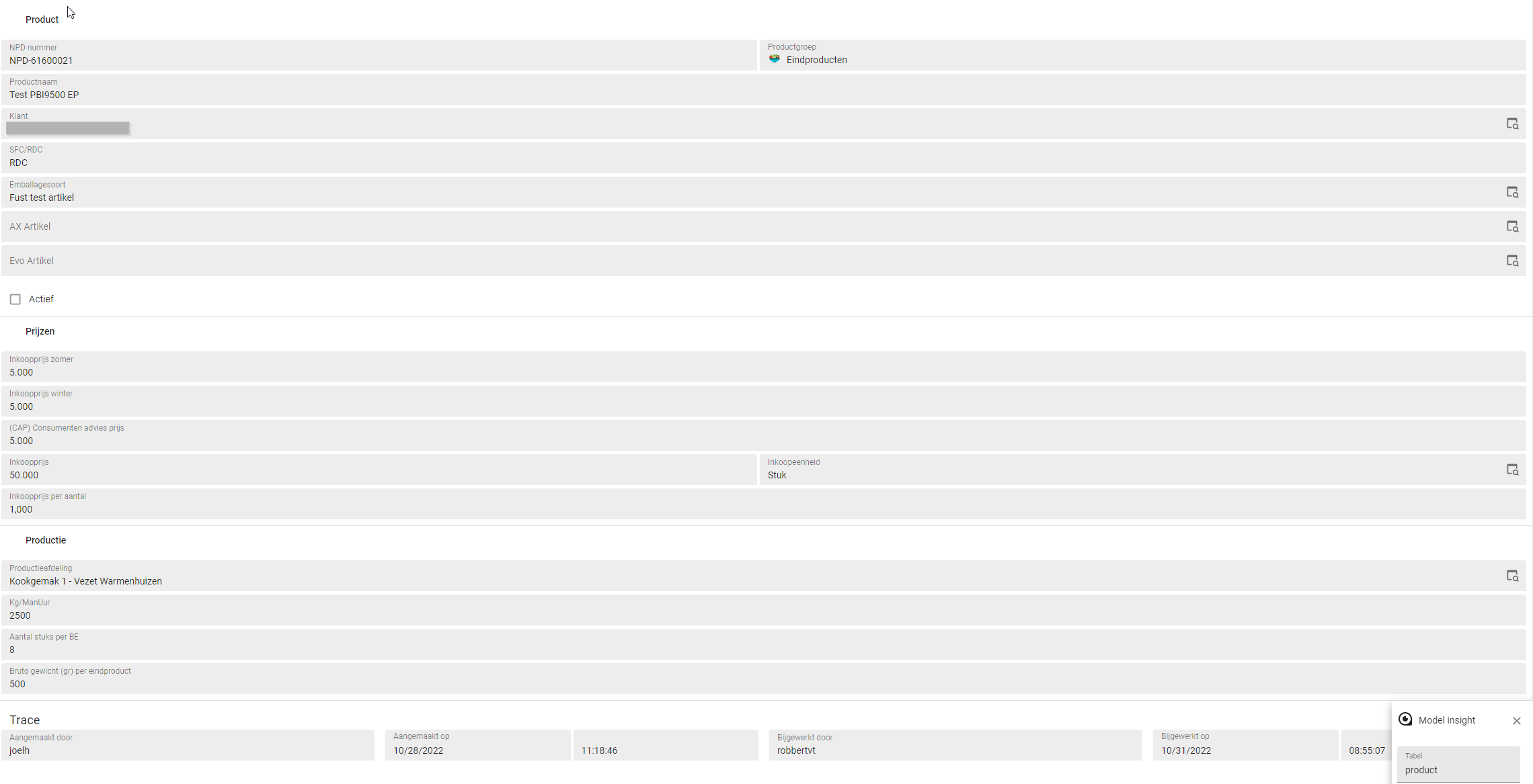
As this idea didnt have any mockup ive copied them out of my topic

Example how this would look (with some icon added that a section can be expanded):

Collapsed: 


Click on “Product” leads to the section to be extended;


Arie V
Community Manager
Forum|alt.badge.img+12
  • Community Manager
  • 986 replies
  • October 26, 2024
OpenPlanned

Arie V
Community Manager
Forum|alt.badge.img+12
  • Community Manager
  • 986 replies
  • October 28, 2024

This is planned to be resolved with the Roadmap 2025 H1 efforts.


Arie V
Community Manager
Forum|alt.badge.img+12
  • Community Manager
  • 986 replies
  • October 28, 2024
The following idea has been merged into this idea:

All the votes have been transferred into this idea.

Mark Jongeling
Administrator
Forum|alt.badge.img+23
  • Administrator
  • 3939 replies
  • December 10, 2024
PlannedWorking on it!

Arie V
Community Manager
Forum|alt.badge.img+12
  • Community Manager
  • 986 replies
  • February 20, 2025
Working on it!Next release

Jeroen van den Belt
Administrator
Forum|alt.badge.img+9
Next releaseCompleted

Arie V
Community Manager
Forum|alt.badge.img+12
  • Community Manager
  • 986 replies
  • February 24, 2025

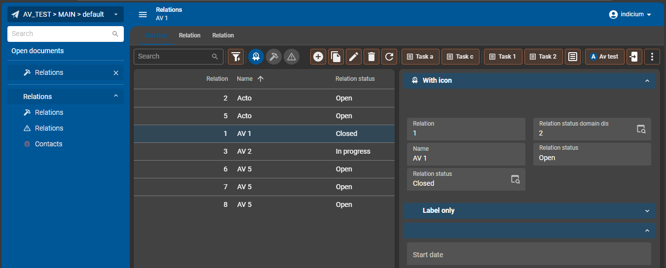
FYI: with Release 2025.1(.10) of today we have implemented most of the planned features related to this Idea, except for the User Preferences. The Universal GUI does not yet write the latest state (collapsed or expanded) to User Preferences, this will be introduced in a later Universal GUI release.

In addition to the information in the Docs and Universal GUI Release notes I would like to highlight that we took the opportunity to bring some color into the Form as well. A gradient of the Main color from the theme is applied to the Sections (and to active Prefilters and active Grid rows as of today): 


Freddy
Forum|alt.badge.img+16
  • Author
  • Thinkwise Local Partner Brasil
  • 529 replies
  • February 24, 2025
Arie V wrote:

FYI: with Release 2025.1(.10) of today we have implemented most of the planned features related to this Idea, except for the User Preferences. The Universal GUI does not yet write the latest state (collapsed or expanded) to User Preferences, this will be introduced in a later Universal GUI release.

In addition to the information in the Docs and Universal GUI Release notes I would like to highlight that we took the opportunity to bring some color into the Form as well. A gradient of the Main color from the theme is applied to the Sections (and to active Prefilters and active Grid rows as of today): 


@Arie V I just upgraded one of our development instances..  and it looks already a lot fresher. Coming weeks I'm going to play with 2025.1. Cannot wait for the other GUI enhancements.. but for now chapeau! 


Arie V
Community Manager
Forum|alt.badge.img+12
  • Community Manager
  • 986 replies
  • February 25, 2025

Glad you like it ​@Freddy! And we appreciate your compliment!


rickwenning
Vanguard
Forum|alt.badge.img+1
  • Vanguard
  • 21 replies
  • April 10, 2025

Hi all,

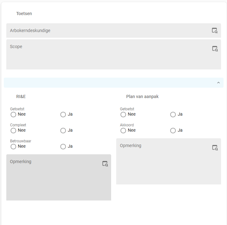
Is it possible to have the same functionality of the tabpage without showing the collapsible form? 

I want to nest two groups underneath another group. This works with tabpages, however with 2025.1 the collapsible form always shows:

Is it possible to disable the collapsible form but keep the layout?


Arie V
Community Manager
Forum|alt.badge.img+12
  • Community Manager
  • 986 replies
  • April 10, 2025

@rickwenning not with SF functionality. What’s your issue with this setup?


rickwenning
Vanguard
Forum|alt.badge.img+1
  • Vanguard
  • 21 replies
  • April 10, 2025

@Arie V no issue, I was wondering if it is possible. Our client does not have the need for collapsible forms in this screen. 

I want the layout to be the same, without the blue bar. I will create an idea tomorrow to have a checkbox for the visibility of the collapsible bar, as it might be a nice addition for a future release.


rickwenning
Vanguard
Forum|alt.badge.img+1
  • Vanguard
  • 21 replies
  • April 11, 2025
rickwenning wrote:

@Arie V no issue, I was wondering if it is possible. Our client does not have the need for collapsible forms in this screen. 

I want the layout to be the same, without the blue bar. I will create an idea tomorrow to have a checkbox for the visibility of the collapsible bar, as it might be a nice addition for a future release.

For people interested, I have created an idea regarding my post.


Forum|alt.badge.img+13
  • Hero
  • 149 replies
  • May 6, 2025

Is there a reason why ‘real’ form tabs in Universal aren't offered as an option, similar to form tabs in the Windows GUI? I do like the vertical scrolling forms with collapsible sections but on a PC with a mouse ‘real’ tabs feel like they could make it faster to reach the desired part of the form. It's also what our users are used to from the Windows GUI making the transition to Universal somewhat easier for them.


Arie V
Community Manager
Forum|alt.badge.img+12
  • Community Manager
  • 986 replies
  • May 6, 2025

@Roland Yes, there’s a pretty straightforward reason for this. The ‘Recognition rather than recall’ guideline as explained here: 

Basically we want to make sure that our application behavior is aligned with other browser-based applications and Progressive Web Apps as much as possible. We understand that this might mean a different User Experience for the same Functionality when transitioning to the Universal GUI, but are confident that on the long run this is a better experience for our users.


Forum|alt.badge.img+13
  • Hero
  • 149 replies
  • May 6, 2025

Thanks ​@Arie V for pointing out these guidelines. I have to be honest here that they have somewhat of a “everyone does it so it must be good” vibe although that doesn't really say much in my case. I have no knowledge about any research in the area of GUI’s and the science of how people interact with interfaces. Personally I don't have much experience with sectioned forms on websites so I can't really speak from that either.

From my own (very biased) point of view ‘real’ form tabs seem a natural extension of the already tabbed details of a main screen element. I love clicking from one tab layer to the next in the Windows GUI because it's so fast and it’s always the exact same user interaction with the same result.Then again I'm just one user and likely not even close to the typical user. On the other hand our end-product is far from a typical (web) application. Like most people here I can say our application is highly specialized to serve the needs of our organization and used by our people for many hours per week and as such I wonder if it really must look like your every day website. But if in the real world most users want vertically aligned sections instead of horizontally aligned tabs then they’ll have ‘em I guess.

Let me finish by saying that none of this means I’m any less happy about your progress with the Universal GUI. It looks great and much more mature now and I'm definitely looking forward to future versions.


AndreKemmeren
Captain
Forum|alt.badge.img+3

@Roland it's less of a case of “everyone does it so it must be good” and more because most people expect “the internet” (aka everything in the browser) to look and function a certain way.

Any time an application does not meet that expectation you get friction in the user experience. 


Forum|alt.badge.img+13
  • Hero
  • 149 replies
  • May 8, 2025

@AndreKemmeren I absotely understand that to be the case for the vast majority of websites. Personally I just can't relate this to an internal customized business application that people are using on a daily basis. A learning curve is to be expected but this plateaus after some time after which some friction is no longer an issue. I believe it to be more important for a GUI to be as efficient as possible and I think visual tabs are the more logical choice in this context.

It all depends on the type of application. We use ours as the main ERP system and we rarely get questions about the GUI structure. In other situations this might be different. It would be nice for a developer to have more freedom on how to structure the GUI based on the context in which the application is used.


Reply


Cookie policy

We use cookies to enhance and personalize your experience. If you accept you agree to our full cookie policy. Learn more about our cookies.

 
Cookie settings