Tooltips on Universal as per Roadmap discussion

Related products: Software Factory Universal GUI

Hi All,

Opening this as an Idea so that it can get votes and be implemented earlier. As per discussion on the Roadmap for the tooltips:

“We are missing the Tooltips on Labels in Forms in Universal. We would like to provide the user once he hovers on the label of the field an explanation of what the field is supposed to contain in case the translation is not clear enouph.
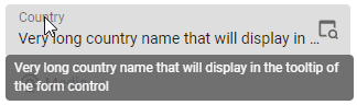
Right now we only get sort of tooltip with the complete value only when the value of the field is not fully visible. I suppose it should be configurable of what to show, a. the tooltip text or b. the value if not fitting the field width.”

“Any given field I would like to specify a different tooltip when hovering the label of the control. Same way I define a translation for a Label I would like to specify a tooltip visible upon hovering the label.”

“I expect the Universal GUI to read the Tooltip text column from the Subject > Columns > Translations and display that as tooltip when hovering over the (label/header of the) column. At least in the Form, but preferably also on the Grid header.”


NewOpen

@mperrott As an FYI: We had also raised this Tooltip request as a TCP issue. The solution requires both the SF team and the Universal team to make changes. I understood that the SF side has been done already, and that the Universal team has 5 User Stories on their backlog to make the necessary changes.

I hope they'll deliver with Thinkwise Platform release 2023.1 and adding votes here might definitely help!


Hi all,

Arie is correct, the SF developments have already taken place and will be delivered in the 2023.1 release. Now it's up to Universal to implement this on their side. This is scheduled for the upcoming weeks. Hopefully this coincides with the 2023.1 release, but otherwise I expect it won't be much later.


OpenWorking on it!

Update: the Universal GUI support rich tooltips on grid headers since the 2023.1.10 release already.

Last sprint we worked on support for editors on general forms and task/report parameters. We were really struggling to integrate the tooltips in a proper way in the Material UI design of our editors. Both the label and the value are placed in the same area, and both may trigger a tooltip. We decided to park it for now and to go back to the drawing board for this.


Hi @Erik Brink, what is the problem with applying it as suggested here? https://m2.material.io/components/tooltips#theming

To highlight 2 things:

  • Show on hover (desktop) or 

Accidentally sent previous post and unfortunately can’t edit…

Why wouldn’t this work for the Universal GUI?

Behavior 

A tooltip is displayed upon tapping and holding a screen element or component (on mobile) or hovering over it (desktop). Continuously display the tooltip as long as the user long-presses or hovers over the element.

Timing

Display the tooltip for 1.5 seconds. If the user takes another action before that time ends, the tooltip will disappear.


Hi Arie,

The challenge here is that the form control already displays a tooltip if the value doesn't fit. The control we are using does not allow us to specify a different tooltip for the label.

We have explored the options to keep both tooltips, but will probably overwrite the existing tooltip with the tooltip as defined in the model, if any. This is planned for the next sprint.


@Jasper is there no way to combine both the value and the tooltip text in a single tooltip box in such cases?


A little side-note on this topic, but kind of related: next release (2023.1.14) will add support for rich tooltip text on toolbar, buttonbar and tiles.

We are also working (again) on tooltip support on form editors as part of this sprint. Updates on that will follow later on.


Customized tooltip support on editors of the general form and task/report input will also be supported in the next release (2023.1.14). 

Please note the details in the release notes.

This is the last piece of this of idea, so we will close it now. 


Working on it!Completed