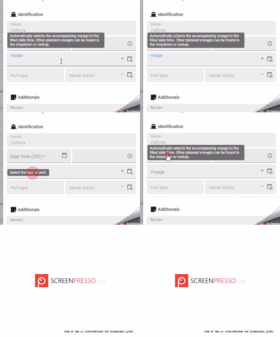
The current tooltip implementation in Thinkwise often leads to a frustrating user experience. Tooltips do not automatically disappear, which can block access to input fields below the pop-up. This forces users to either wait for the tooltip to fade or manually click away, which disrupts workflow and reduces efficiency.

We implemented a temporary fix using custom CSS (see below), but it would be far more beneficial if Thinkwise offered built-in support for tooltips that automatically disappear after a set time.

[role="tooltip"]:hover {
display: none!important;
}


Hi @HarryA,

Do I understand correctly that even while the cursor is still on the element that triggers the tooltip, you want the tooltip to disappear? There can be quite some information in the tooltip, so this can lead to the tooltip disappearing before the user has finished reading. If I look at some other webapplications with tooltips, they behave the same as Universal, they keep showing the tooltip until the user moves the cursor:

  • In Excel online and in Google Spreadsheets, while hovering over e.g. “B” (the bold icon)
  • Facebook, while hovering over e.g. “1 d” in a post to show the exact date

Besides that, I think its a separate problem, but its good to know that in Universal GUI 2024.2.13.1, we have fixed tooltips wrongly staying shown:

  • There were cases in which tooltips would wrongly stay shown even though the mouse cursor would be somewhere else on the screen. In some cases, tooltips would also only work the second time the mouse cursor went over the element with a tooltip. These problems have both been solved.


Kind regards,
Leroy Witteveen


Hi @Leroy Witteveen,

No this is not exactly what I mean, I think this GIF illustrates the problem quite well:


The tooltip for the Voyage field is blocking the Date Time (UTC) field.


@HarryA I could think of two improvements, how do you feel about these suggestions?

  1. Show the Tooltip at the top right of a field, so (space permitting) it is not displayed over the field directly above the one with the displayed tooltip
  2. Hide the tooltip when clicking on it (this is what Excel does for example)

NewNeeds feedback

I would opt for option 2, as the tooltip often gets in the way of other fields when texts get larger.


Needs feedbackOpen

To reply on “Arie V’s suggestion before ”, the problem is not the place where the tooltip appears. 

The problem is that the tooltip appears over something else which becomes unclickable as the tooltip is on top of it.

I think that the only solutions could be to allow the user to click trough the tooltip, or to create a tooltip algorithm which moves the tooltip to another place when the users mouse is above it. ( making sure that the tooltip does not block an intended click ).


OpenPlanned

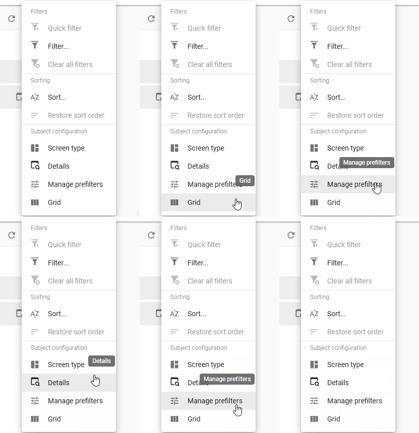
In addition to the frustrating User Experience, a recent change has also introduced the risk of performing unexpected actions: clicking the Tooltip of a Pre-filter or Task/Report actually triggers the Pre-filter or Task/Report. We aim to fix all at once during the current Sprint.


Currently we are working on letting the tooltips disappear when the user moves their mouse away from the original element. Besides that, we will display the tooltip starting from the top right of the original element, reducing the chance it obscures another element. A small demo video:


Does this solve the tooltip problems mentioned above for everyone? 🙂


PlannedWorking on it!

2024.3.11 just became available, this includes a part of the tooltip fixes:

  • We improved tooltip behavior to hide it once the element is left by the mouse cursor. This way the user can't unexpectedly click a button by clicking its tooltip.

Working on it!Next release

2024.3.12 will also include the top right alignment. With that we consider this Idea Completed.


Next releaseCompleted