


One of the most noticeable changes is that we’ve renamed layouts to themes, so from now on I’ll be talking about themes. If you’re still on a version of the SF that uses layouts, you can substitute layout.
Our goal was to make it easier to create a modern, fresh and usable look and feel for your application. In this article I’ll tell you what options you have and how to best utilize them to create a usable, clean, modern and awesome-looking application.
Grid
Alternating rows
You’ve never had the option to change the color of the alternating rows in the grid. The GUIs calculated a color for you, and that was it. You could remove the alternating background colors with a little trickery; but now there’s no need for that. You can enable or disable alternating row colors with a simple checkbox. If you choose to show the alternating rows you can also pick your own color.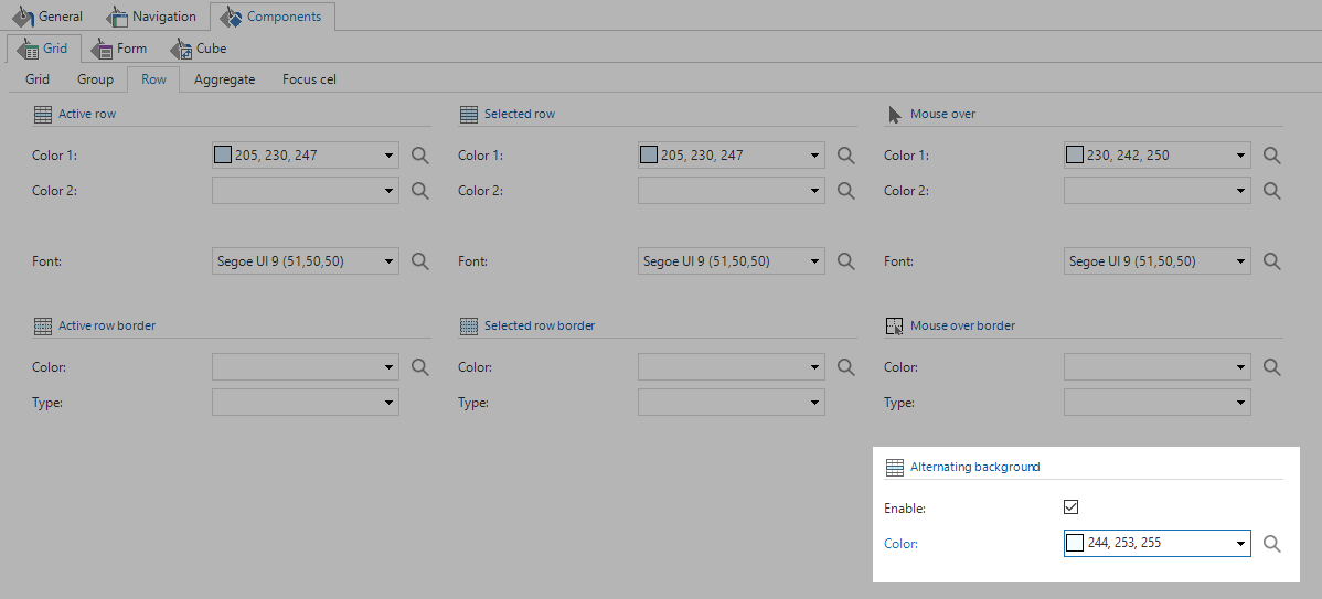
Vertical lines in the grid are hidden by default. To enable them you need an ini parameter called ShowVerticalGridlines. In SF 2017.1 a checkbox has been added to show or hide vertical grid lines, so there’s no more need for parameters.
We recommend that you do away with the alternating row colors and vertical grid lines when possible. The reason is that alternating row colors have a lot of non-data pixels that clutter up the screen. Non-data pixels are pixels that clutter up the screen, but don’t convey any data. It’s obviously not the goal to have no non-data pixels – that would be a very dull application indeed. It is the goal to remove as much non-data pixels as possible without compromising the aesthetics of the application. If you have larger row heights and subtle light gray horizontal lines the data is easily readable without alternating row colors.
Summary and header lines
The lines below the header and above the summary can now be given colors separate from the grid line colors. These lines now also span the entire width of the grid, rather than merely to the end of the data.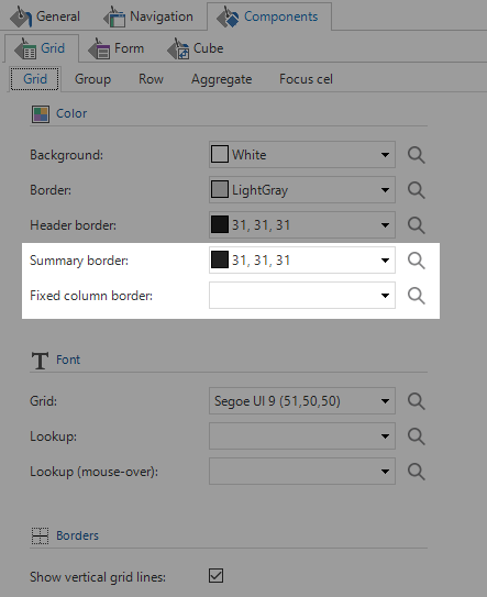
A good use case for this is to give the grid lines a light gray color, and then make the header and summary lines dark gray to visually separate them from the data.
Style summary (aggregation)
The summary or aggregation in the grid used to steal the grid header style. This meant you couldn’t influence it separately from the header. Since the 2017.1 SF we’ve added the possibility to style the summary, making it easier to visually distinguish it from the data without having to change the header style.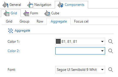
Forms
Non-edit style
A typical form can be quite busy. You have lines and background colors that help people navigate the data. These aren’t necessary if the user isn’t working in the form, but then they do cause a lot of non-data pixels.For this reason it’s now possible to style the form input controls in non-edit mode separately from when the form is in edit mode.
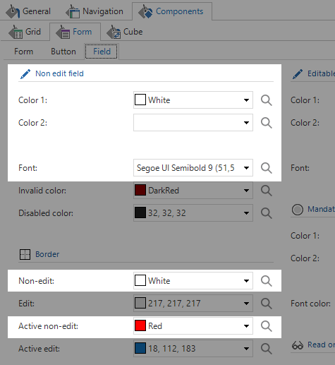
As you can see you can change the border, background colors and font. In Thinkwise Insights we’ve used this to remove the colors and make the font bold in non-edit mode. When the user starts editing a form the normal form colors and fonts come back.
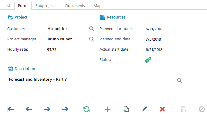
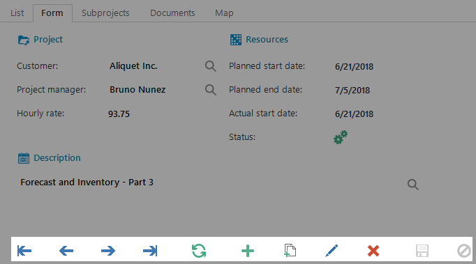
Show form buttons on hover
It’s now possible to make the screen a lot less cluttered by hiding the form buttons unless the user hovers over the form. This means that the buttons for adding or refreshing are only visible when the user intends to interact with them. The same goes for lookups.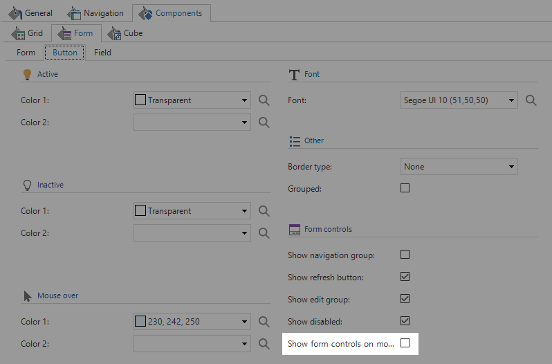
When you put a form in edit mode, the buttons will remain visible even if you move the mouse away. It looks like this:
Hiding buttons
Sometimes you’d like to remove all or some buttons under the form without disabling functionality or writing code. In the SF 2017.1 we’ve added options to hide groups of buttons and disabled buttons.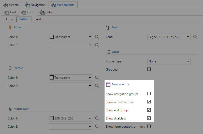
You’d typically want to remove the navigation and group in the form to tidy up the screen if it’s unlikely the user will need to navigate between records. If it’s unlikely the user will need to refresh often or has access to the ribbon or shortcuts, you can remove the refresh group as well.
The last bits of code are being written for this functionality, so if it doesn’t work you might have to wait for the next GUI release.
Button style
You can now set the background color and border for the buttons under the form. You can set these to the background color of the form to make them look more modern and minimalistic.
It’s crucial that you set a different mouse over style for these buttons to visually indicate that the user can interact with them. A good starting point is to decrease the luminance by at least 20 for the mouse over style and check if the difference is clearly noticeable.
Tabs
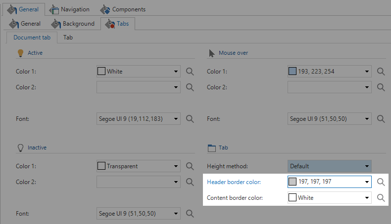
There are three kinds of tabs: document tabs, detail tabs, and form tabs.Now the tab border colors have been separated into header and content border colors, you can set the content border color to the same color as the background of your tab, effectively showing only the header tab.
Tab size
If you wanted to get bigger tabs in the SF prior to 2017.1, you needed to increase the text size. Now it’s possible to give the tabs padding so you don’t need to increase the font to increase the size of the tabs.We’ve added two options to the SF: Height method and manual height.
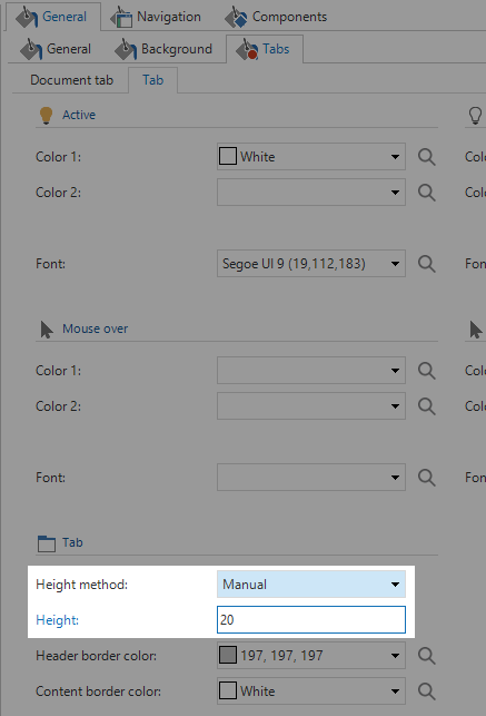
You get three options for height method: default, spacious and manual. If you pick default, the tab padding is the same as in previous versions of the SF. If you pick spacious you’ll get a little bit of extra room around the tabs. This size is calculated from the font size using the golden ratio. If none of these options suit your taste you can pick manual. This shows the manual height field, where you can enter any value you’d like. These settings can be applied to document and detail tabs.
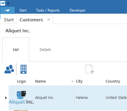
Here we have an extreme example of tab heights:
Detail
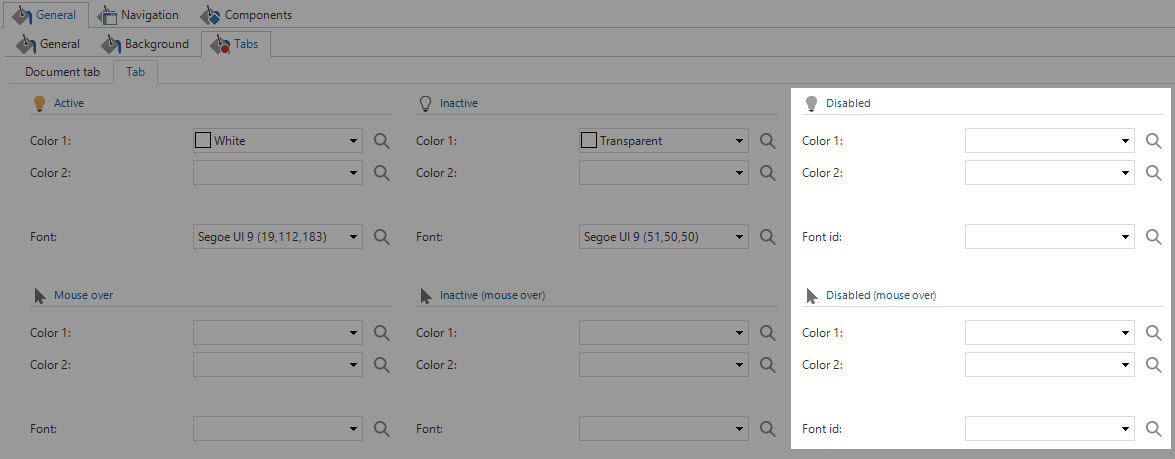
Disabled tabsSometimes you have a tab that the user cannot navigate to; it’s disabled. In previous versions of the SF you had no option to style it. The disabled style was picked for you, and you had no chance of influencing it. The problem was that some users had difficulty discerning the difference between those style, which lead to very confused users frantically trying to activate a disabled tab.
If you have a disabled tab or, more generally, information that a user cannot or should not be able to access you should strongly consider hiding that information from that user. The exception to this rule is when the information is available to the user in select instances. In that case, you should disable the tab to indicate to the user that yes, there is more information here; But no, you can’t access it right now.
Active and inactive tabs
Some of you might have noticed that the mouse over style of detail tabs is the same for active and inactive tabs. This makes no sense, because it gives the impression something will happen when you click the tab that’s already active. For that reason, we’ve separated this style into active and inactive mouse over styles.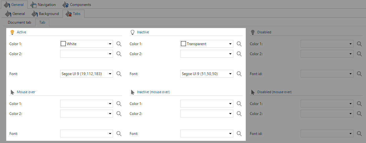
If you don’t know how to style the mouse over state for active tabs you would simply style it the same as the regular active tabs. This way there’s no visual difference for active tabs when you move your mouse over them and when you don’t and the user won’t have the impression something will happen when she clicks.
Hiding tabs
We’ve introduced two new properties to tab components in the screen modeler:- ShowTabHeader
- ShowBorders
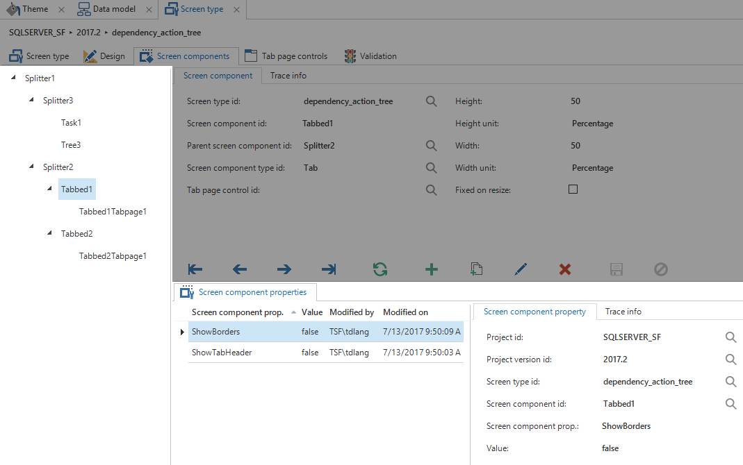
We need to remember this name. In the screen components tab we need to select Tabbed1 (just forget about the TabpageX part in the name). Here we can add our properties with a value of false to disable the header and the borders. Now we’ve accomplished the same as in Thinkwise Insights.
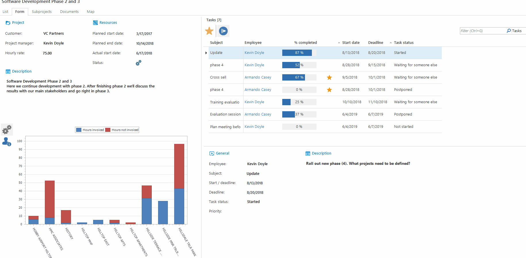
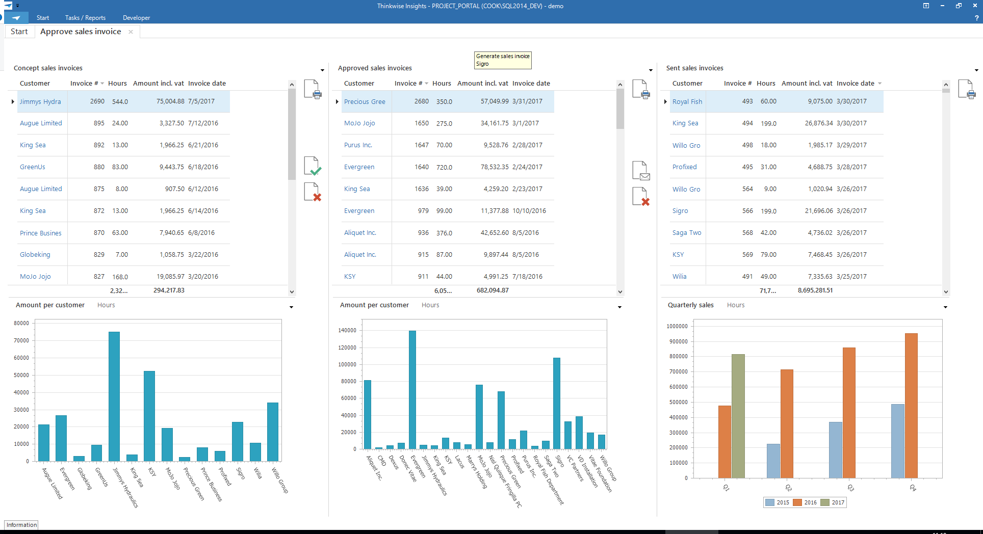
When you have a graph under a subject to communicate the data visually, you need to create a screen type with the subject and a detail component. For example, we have a list with concept invoices. It’s rather difficult to see how many invoices there are, and what the relative size of each invoice is. When we put a graph under this list the information is immediately clear and more understandable, but the lines around the graph and the header makes it look like the graph doesn’t really belong to the list above. So let’s get rid of those.
What you end up with is the following screen:
For now, it’s a bit cumbersome to hide the tab headers and borders. Especially since custom properties are removed when you resize anything in the screen type modeler. The work will become much simpler with a dropdown with yes / no for each property. This will work the same way as tab page control or docking works now.
For now, only one question remains: where in your application can you add a graph to increase the user’s comprehension of the data?
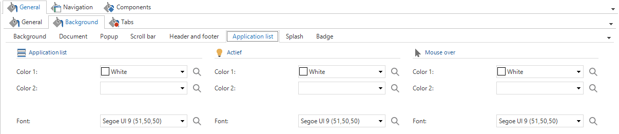
Application list
It’s now possible to style the application list separately from the list bar group headers. This is the bottom of the quickbar where you can change applications.
This used to inherit the style of the quickbar group, so if you had multiple applications you really couldn’t give the menu groups any background color you’d like, or you’d get a huge block of color in the lower left of your screen.
Process driven development
These UI and UX adjustments make it easier to create process driven screens, rather than data driven screens. Creating such screens makes your application more usable for its users.To do this you’ll need to be crystal clear about who your users are and what they’re trying to accomplish. This means that if multiple types of users need the same screen, that screen needs to be presented in multiple ways. Each so the intended user can complete her tasks in the most efficient way.
You can see an example of process driven screens in Thinkwise Insights (S:\Software_Fabriek\Applicaties\PROJECT_PORTAL\Shortcuts\Project Portal – Windows SF).
In the Approve Sales Invoice screen you’ll see three lanes for concept, approved and sent invoices. It’s very easy to see when you’re done: when the first two lanes are empty. If you want to move an invoice from one lane to another, you simply drag and drop it.
FAQS
I’ll treat this article and especially this section as a living document. As more or different questions become frequently asked, I’ll add them to this list. If you have anything you feel should be added to this list, let me know at tdlang@thinkwisesoftware.com.Prefilter buttons
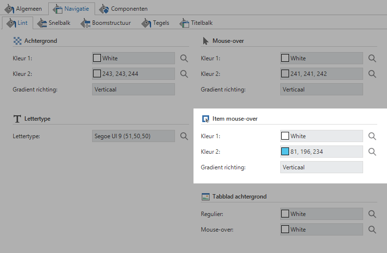
Some users have difficulty discerning which of the prefilters are active and which are not. Unfortunately, it’s a bit difficult to know what properties to set because it isn’t intuitive at all. Prefilter buttons listen to the item mouse over property of the ribbon, which can be found under navigation.These colors are the same
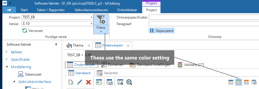
SF Settings
So the item hover style is the same as the active state of a prefilter. You can find the settings here:
Title bar
To style the title bar you used to have to change the settings for ‘menu’, This option has been renamed to ‘Title bar’ and can be found under the navigation tab.Breadcrumbs
To style the breadcrumbs you needed to set the Filter property in General > Document. This has been renamed to Breadcrumbs to make it more clear what it’s for. It can be found under General > Background > Document.The Title property above Filter has been removed since it wasn’t used anymore.
What to expect in the future
We’re not done with improving the UI and UX possibilities in the SF! This is an iterative process where we’ll keep improving things indefinitely.Scroll in form
If a form doesn’t fit on the screen completely you’ll get tabs to navigate to all information. This works, and is preferred in some cases, but sometimes you don’t want to see the ugly form-1 tabs. It would be much better to just get scrollbars. This is a feature we’ll be implementing rather quickly now.And in case you’re wondering: if you have a large form with clearly defined sections, just enough space and no interdependence between sections, you’d probably want to create your own named tabs in the form.
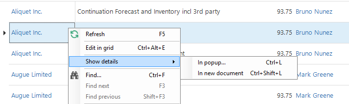
Lookup links in the grid
Sometimes when you are working in a grid you’d like a bit more information. For that reason we’ve been working on lookup links in the grid. These work similarly as the lookup buttons in the form. This feature isn’t finished at the time of this writing.When the developer enables lookup links in the grid for a given subject, she can indicate whether she wants to lookup to open in a popup (just like the form does), or open the lookup in a new document. The latter is useful when the lookup has a plethora of data which wouldn’t fit comfortably in a small popup.
Every user obviously has their own preferences, and these might not be the same as those of the developer. So we’ve given the user a choice: when the user right clicks on a lookup link in the grid, she’ll get two options: ‘Show lookup’ and ‘Show lookup in document’. Show lookup (Ctrl + L) isn’t new, but has been moved to the top of the list. Show lookup in document (Ctrl + Shift + L) is new.
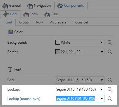
It’s also possible to style these lookup links. It’s important to style the font differently from regular text to indicate to the user that she can interact with them. Remember than not every user can distinguish all colors properly, so indicate lookup links with something else like an underline. You can style the regular and mouse over fonts separately and doing so will indicate to the user that she can click on a lookup in the grid.
To enable lookup links in the grid you will need an extender.