

Hello everyone,
In this release, we have added support for the Thinkwise Platform release 2025.2. We have also made several improvements to the color styling in dark mode, including new button styles and improved readability.
Demo
As always, we have made a demo for you: try it here. Before trying it out, press 'Clear Cache' on the login screen.
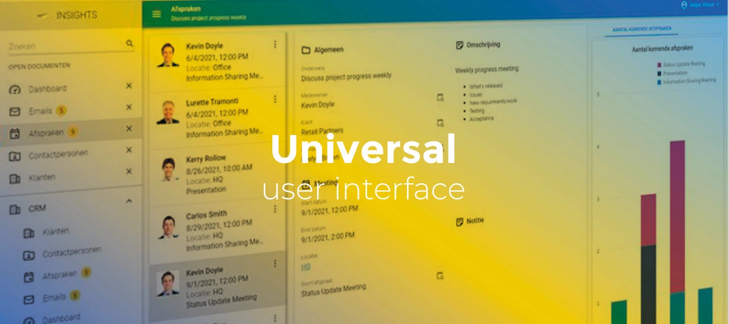
Read the Universal GUI user interface guide to get familiar with the GUI.
Universal GUI version 2025.2.10
For more information about setting up the Universal GUI, see the Universal GUI setup guide.
Note:
- Use a modern browser to access the Universal GUI, for example, a recent version of Chrome, Firefox, Edge, or Safari mobile.
- Deploy the Universal GUI on the same server as Indicium or an allowed origin in
appsettings.json. - Run all hotfixes on IAM and the Software Factory that you plan to use for the Universal GUI.
- Use the latest version of Indicium.
Download the Universal GUI version 2025.2.10 here
Contents
New and changed
Support for Thinkwise Platform 2025.2
The Universal GUI requires the newest version of Indicium. For this release, upgrade Indicium at least to version 2025.2.10.
In this release, we have added support for the Thinkwise Platform release 2025.2. This includes:
- For the Filter pop-up: filtering multiple levels deep on data in related subjects, and advanced options to create complex filter queries. This feature is backwards compatible with previous supported versions of the Thinkwise Platform.
- For Schedulers: task execution on a time cell, drag and drop external data, conditional layouts for scheduler resources and for time cell background colors.
- For Maps: the possibility to allow users to add a geometric type to a map, and to move a location marker on a map.
- For cubes: custom legend colors for charts.
- For (custom) action bars: configuration of primary actions ('call to action'), and an enrichment for placing Filter button after the Search field in the action bars.
- Alternative translations for Confirm and Cancel buttons in tasks and reports.
- A new screen component for custom components.
- Font settings for conditional layouts for grids, forms, cubes, tasks, and reports.
- Separate colors for the menu in dark and light mode, in addition to the main and accent colors.
- The possibility to improve the login experience, including branding.
For a complete overview of all new features, see the Thinkwise Platform 2025.2 release notes.
New button styling and improved readability in dark mode
To improve readability and user experience in dark mode, we have changed the styling of several buttons. In general, we can now discern four different types of buttons:
- Primary buttons - The main color is used as the background color, and the text is in uppercase.

- Secondary buttons - No background color, the text is in uppercase, and the text and border are in a contrasting color (black/white) to the component.

- Tertiary buttons - No background color, no border, the text is in uppercase and in a contrasting color (black/white) to the component.

- Utility buttons - No background color, no border, the text is in lowercase and in the accent color.

Improved readability in dark mode
change
To improve readability in dark mode, we have made several changes:
- For Grids and Card lists, the opacity upon (multi)selecting and hovering has been increased.
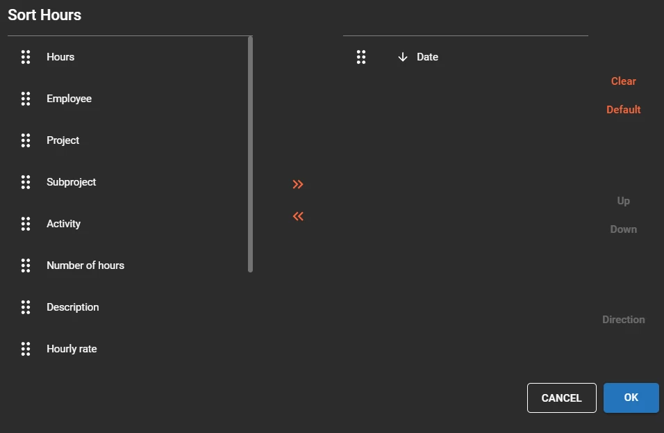
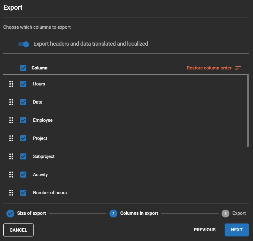
- The Drag and drop icons in the Export and Sort pop-ups were not in a contrasting color to the background color. This has been fixed.
- The buttons in the Sort pop-up now use the utility button styling (accent color).
- The button Restore column order in the Export pop-up now uses the utility button styling (accent color).
For example, the Sort pop-up now looks like this:
And the Export pop-up now looks like this:
Setting to prevent pruning
new
Previously, grids, trees, and card lists were pruned if a detail screen contained a form, aligning with the behavior in Windows GUI. Now, you can disable this pruning by setting the screen component property prevent_inheritance_multi_row_component_prune to true. This property can be added in the Software Factory, in the menu User Interface > Screen types > tab Screen components > field Screen component prop.
Minor fixes and tasks
- We fixed an issue where hidden prefilters were still claiming space in the toolbar even though they were not visible.
- When a vertical tab was nested within another tab, an unexpected empty area sometimes appeared next to the tab. This has been fixed.
- When an error was triggered in the default procedure, the pivot grid would not revert the values in the fields. This has been fixed.
What we will be working on next sprint
The next sprint we will be working on:
- Grid header filtering on text and checkbox type columns.
- Support for push notifications.
- Badges on open menu groups.
- Editor style improvements (outlined styling).
Questions or suggestions?
Questions or suggestions about the release notes? Let us know in the Thinkwise Community!