

June 10, 2025
- Full release (from release candidate 2025.1.14)
- There are no additional fixes in this release.
Hello everyone,
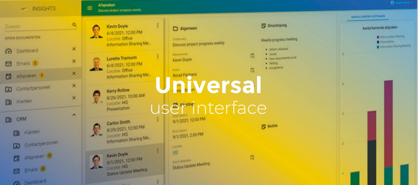
In this release, we have made several improvements to the Universal GUI, including readability improvements, support for hierarchical resources in the scheduler and increased data density in grids.
Demo
As always, we have made a demo for you: try it here. Before trying it out, press 'Clear Cache' on the login screen.
Read the Universal GUI user interface guide to get familiar with the GUI.
Universal GUI version 2025.1.14
For more information about setting up the Universal GUI, see the Universal GUI setup guide.
Note:
- Use a modern browser to access the Universal GUI, for example, a recent version of Chrome, Firefox, Edge, or Safari mobile.
- Deploy the Universal GUI on the same server as Indicium or an allowed origin in
appsettings.json. - Run all hotfixes on IAM and the Software Factory that you plan to use for the Universal GUI.
- Use the latest version of Indicium.
Download the Universal GUI version 2025.1.14 here.
Contents
New and changed
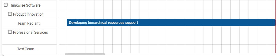
Support for 'Hierarchy' in the Scheduler
new
The Universal GUI now supports the Hierarchy option for Resource grouping in the Scheduler. This feature allows you to nest Scheduler resources, such as grouping employees within their respective departments. This provides a clearer and more organized view in the interface.
Usability improvements in the GUI
change
Previously, the configured primary color for the Universal GUI sometimes resulted in insufficient contrast between the text and the background in both light and dark modes.
To improve usability in the GUI, we have made several changes:
- In dark mode, the main background and the background of all components, such as forms and grids, have been darkened.
- Tab headers and labels no longer use the configured primary color, but switch to black or white depending on the user's setting for light or dark mode.
- Any URL-type domains, such as URLs, file uploads, e-mail addresses or phone numbers no longer use the configured primary color, but switch to black or white depending on the user's setting for light or dark mode. Upon hovering, in a selected row in a grid and while hovering a row, URL-type domains now use the configured accent color and underlining. It is possible to use conditional layout to change the appearance of rows. The conditional layout you have configured takes precedence over the standard settings in the GUI.
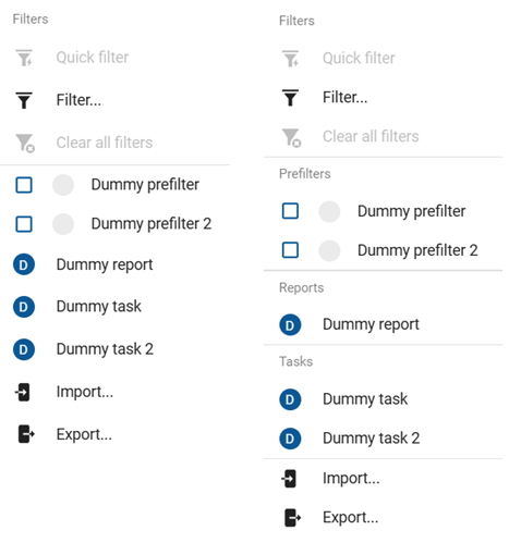
Additionally, we have added a default group label and separator line in the action bar overflow menu for tasks, reports, prefilters and cube views.
Increased data density in grid
change
We have decreased the padding for values in the grid to increase data density. The changes are as follows:
| Previous value | New value | |
|---|---|---|
| Compact mode | 3px (vertical), 9px (horizontal) | 4px (all directions) |
| Comfort mode | 3px (vertical), 13px (horizontal) | 4px (vertical), 8px (horizontal) |
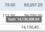
Grid aggregation type in tooltip
change
The row with the aggregate value in a grid no longer contains the aggregation type. Instead, it only shows the value. Both the type and the value are now shown in the tooltip of the aggregate value. As a result:
- The height of the aggregation row has been decreased significantly, improving data density. This height is fixed and depends on the density (Comfortable or Compact).
- Because the tooltip also shows the full value, the user no longer needs to change the column width to see the full value if it is too long to fit the column width.
Sort order of prefilters
change
Previously, user-defined prefilters and predefined prefilters were displayed together in an unsorted list. Now, user-defined prefilters are sorted to appear at the end of the list to improve usability.
Minor fixes and tasks
- In some cases, when you switched between tabs from a grid, the last scroll position would not be saved. When you scrolled down in a grid, switched to another tab, and then returned to a grid tab, the scroll position was saved. However, if you then scrolled back to the top in a grid, switched tabs again, and then returned, the scroll position would not be saved. This has been fixed.
- When you selected multiple rows in a grid on a touch device, the first row could be unintentionally deselected. In addition, when you executed a task on multiple rows, the entire selection would be deselected. This has been fixed.
- Previously, we improved optimistic update handling for lookup columns to prevent outdated values from briefly appearing when leaving cube fields. We have now ensured that all temporary updates are correctly reverted when an edit is canceled, preventing outdated values from being displayed.
- Previously, the pop-up blocker in Edge prevented file downloads from Thinkwise Products in TCP. In addition, when the Download file process action took too long to complete, Edge blocked the download pop-up. This has been fixed.
- When importing data, the preview now updates as expected when the starting header index or starting data index is modified.
- During data import, the data mapping now properly reflects changes made to the values of the starting indexes.
- When editing a form which has a column with the control type File link or File upload and it was set to Read-only, it would no longer open the attachment. In addition, the link to the attachment would sometimes be broken after cancelling edit mode. This has been fixed.
- The property
Show grid headercould not be used to hide the grid header. This has been fixed.
What we will be working on next sprint
The next sprint we will be working on:
- Improve filtering possibilities
- Toggle advanced filter from the filter pop-up
- Filter on all columns of a related lookup or detail subject, also known as 'reference filtering' (Thinkwise Platform release 2025.2).
- More types of columns will support filtering through grid headers. Text and checkbox types will be added.
- Pivot grid cell navigation - Filter the subjects dataset to be able to execute tasks on cell data and to make detail tabs show data related to the selected cell.
- Legend colors on charts - Make the legend respond to conditional layouts.
- Improve custom component support.
- Configurable task/report pop-up buttons.
- Offline: task execution supports file uploads.
- Scheduler time cell and resource conditional layout (Thinkwise Platform release 2025.2).
- New conditional layout options: strikethrough, underline, and font size (Thinkwise Platform release 2025.2).
Questions or suggestions?
Questions or suggestions about the release notes? Let us know in the Thinkwise Community!