


With release 2025.2, the filtering experience in the Universal UI has been significantly improved and expanded. The styling of the Default filter has been updated, making it more user friendly, and Advanced filter options have been introduced to support more detailed filtering capabilities.
We strongly recommend placing the Filter button on the Action Bar, next to the Search field. This approach provides users with clear and immediate access to filtering functionality. From 2025.2 onward, an Enrichment can update existing Models and new Models have it by default.
This blog outlines the thought process and design choices behind these updates, and aims to provide insight into how the filtering experience has evolved.
Filter pop-up
It starts with the updated filter pop-up, which now combines default filtering, detail filtering, and advanced options in one central location. The default filter allows for quick and straightforward filtering, including detail filtering on specific fields. By toggling a switch, users can transition into advanced mode, where more complex and layered conditions can be applied. Each feature is explained individually in the sections below for clarity.
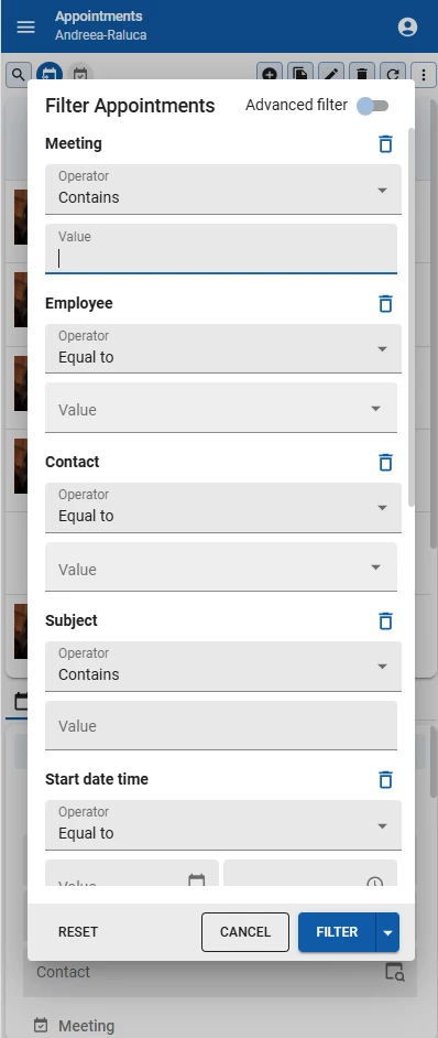
Default filter
The default filter is designed for speed and simplicity. It lets users quickly narrow down results based on the most commonly used fields. The layout has been streamlined to be more readable and intuitive, so you can make a selection with minimal effort. Filters are grouped logically and aligned consistently, reducing visual noise and helping users scan options more easily.
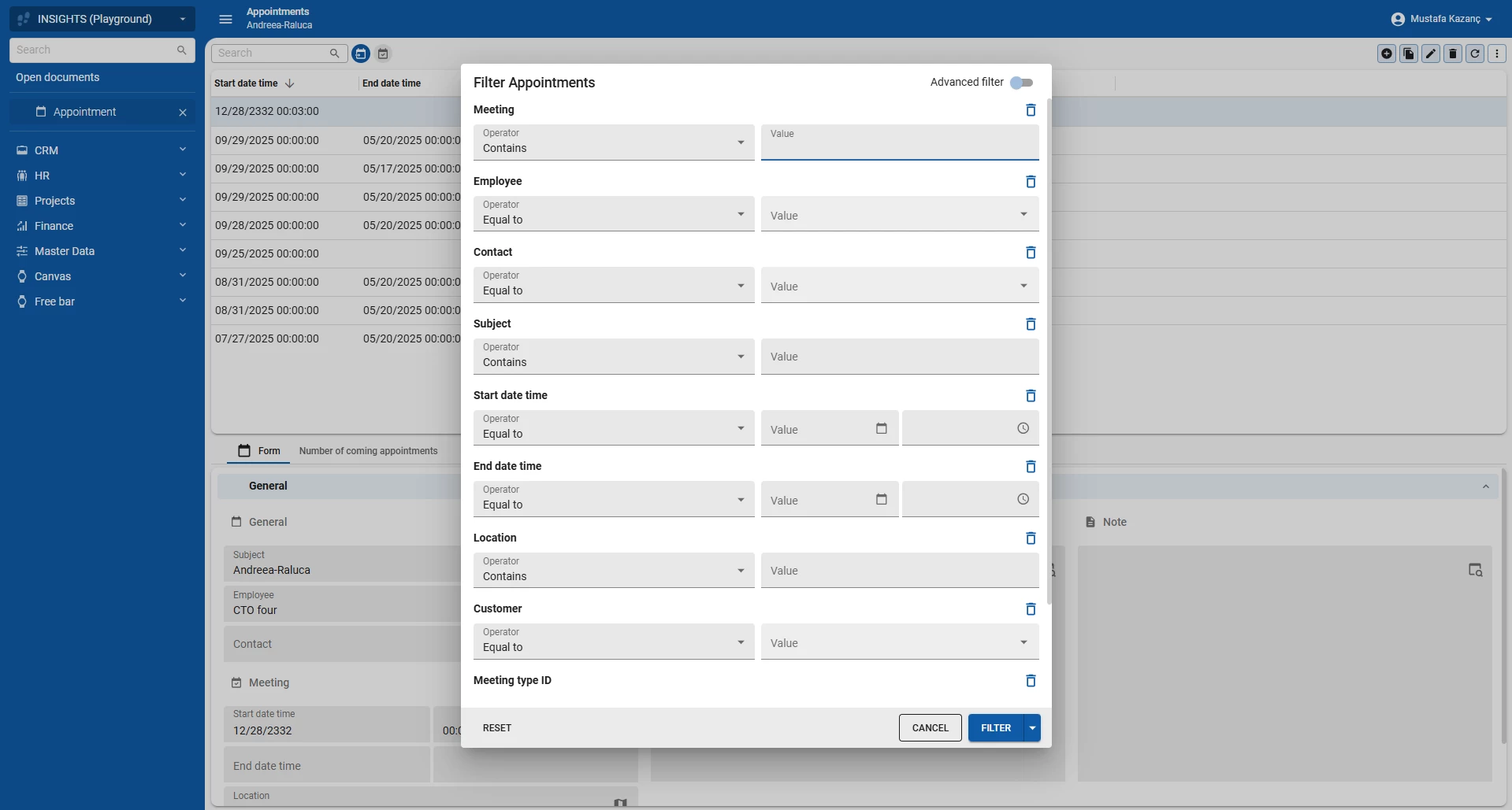
We also introduced a small but impactful visual improvement. The remove icon, represented by a trash can, is now placed at the end of each filter group line. This keeps the layout clean and ensures the title and the remove icon stay on the same line, even when the interface stacks vertically on smaller resolutions. Especially in responsive scenarios, this change makes the interaction feel more natural and keeps related elements visually connected.
The default filter is ideal when you want fast results without getting lost in too many options. We advise to limit the amount of columns visible in the filter (set to 'always' in the SF) to only the essential ones. Columns that are only occasionally used for filtering should be set to extended, allowing users to add them manually when needed without cluttering the default view.
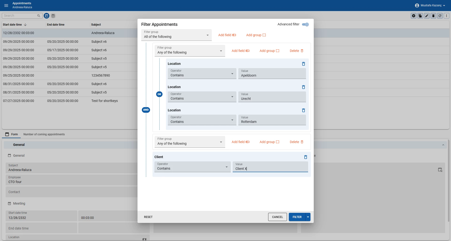
Advanced Filter
In the advanced filter, users can build more complex queries by adding multiple rules and organizing them with AND (all of the following) and OR (any of the following) logic. Any conditions already selected in the default filter are seamlessly carried over, ensuring a smooth transition without losing progress.
The Advanced filter lets you combine individual rules into groups, where each group can be connected using AND or OR operators. This means you can, for example, require that multiple conditions must all be true at the same time (AND), or allow for alternative conditions where any one being true is sufficient (OR). You can also mix and match these operators in nested groups to create highly specific and tailored filters.
This flexibility enables users to address complex scenarios, like filtering results where a field must meet one condition but another field can meet either of several alternatives. For example, users can filter for companies where the type is 'Client' (AND condition), and the office location is in Apeldoorn, Rotterdam, or Utrecht (OR condition). It empowers users with fine-grained control over how filters interact, making it possible to model both inclusive and exclusive criteria easily.
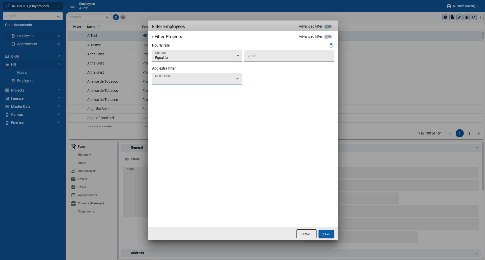
Filter in detail
Another new feature in the Filter is the ability to filter in detail tabs of the dataset, which is possible in both the Default and Advanced filter modes. The user selects a field within a detail tab by clicking Add field, and then defines a condition using an operator such as Includes.
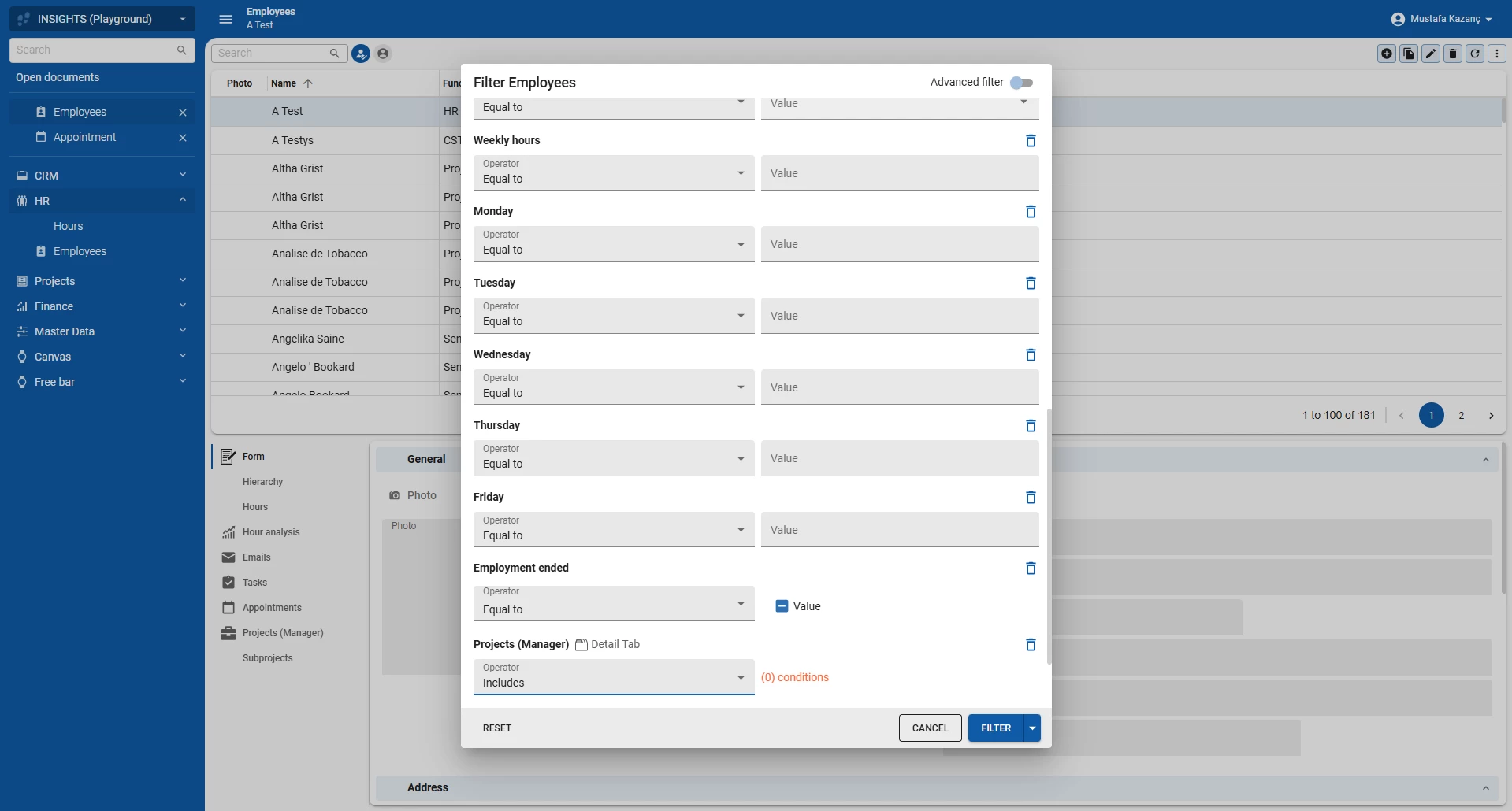
To filter data more precisely, users can create custom filter rules using fields, operators, and values. For example, when a user in filtering in the employee screen, they can add a detail filter on the project detail. When the user clicks on the orange (0) conditions button a pop-up will open where the detail filter can be set. Let’s filter on the all projects with an hourly rate above 100. The user can do this by setting the hourly rate field operator to Greater than and the value to 100.
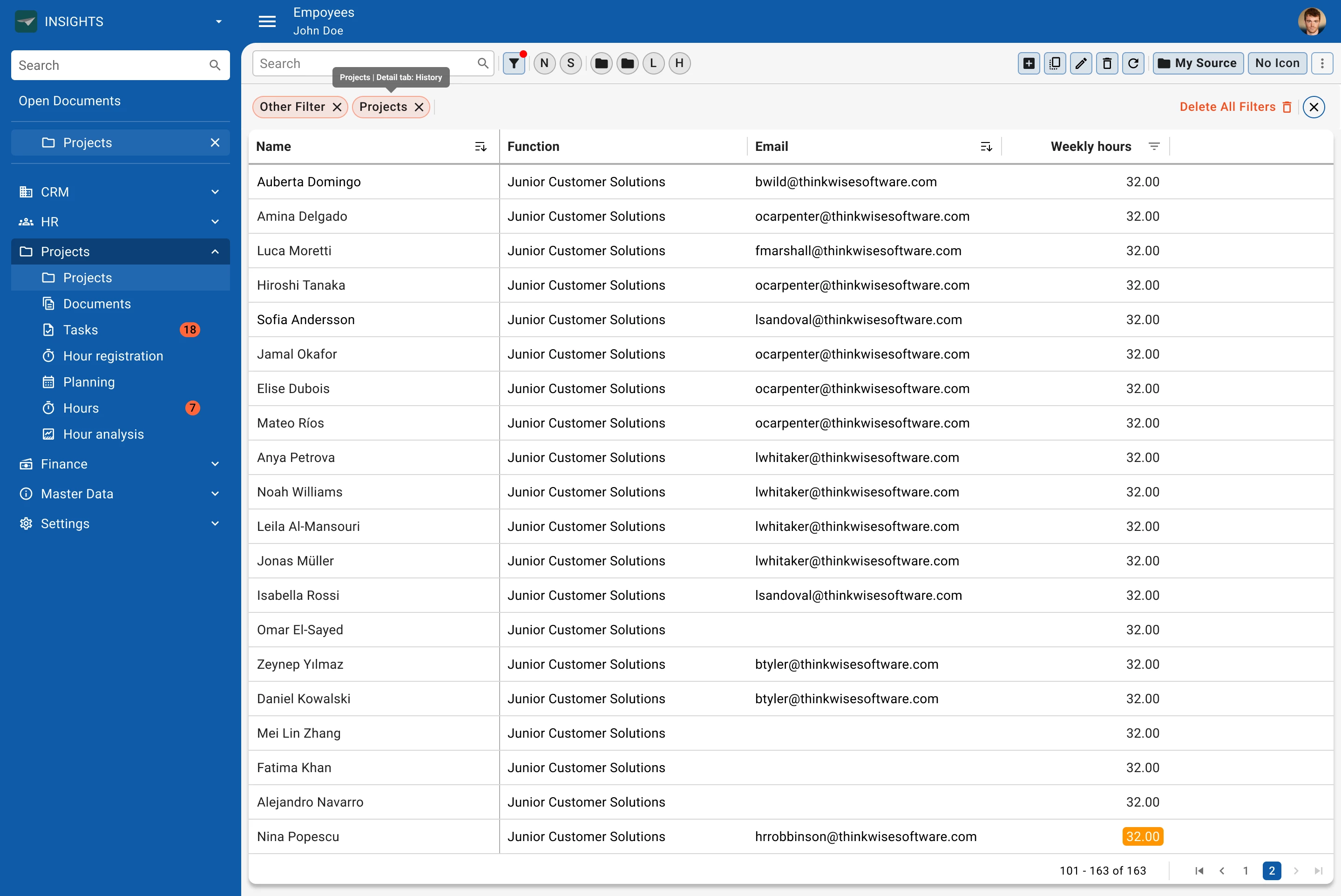
After adding the detail filter condition, the user is returned to the main filter view. The button label automatically updates to reflect how many conditions have been added (e.g., 2 conditions added), providing immediate feedback on the active filter set. This approach provides significant flexibility without compromising usability especially when filtering on fields nested within more complex or relational data models.
When this filter is applied it will show all employees with projects where the hourly rate was higher than 100.
It’s possible to filter on detail subjects of detail subjects, this is extremely powerful and allows for incredibly detailed filters, but do be aware of the performance cost of filtering across multiple subjects.
Future plans
Looking ahead, one important aspect we are going to tackle is making it clear when a filter is active. To address this, we plan to incorporate a Filter Pill Bar: a visual element that displays all currently applied filters as removable Pills. I have previously explained this concept in my filter design concepts. The Filter Pill bar will provide immediate feedback on active filters and allow users to quickly remove any filter with a single click, which will significantly improve usability.
I hope this gives you a clear picture of the enhancements and the thinking behind them. As always, your feedback is very welcome. Feel free to share your thoughts or questions in the comments below. Because together, we make the Universal UI more efficient and user friendly.