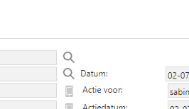
In the webgui the size of the magniefier glass is different (smaller) than the size of other icons like the telephone number. This results in the following situation, where the ‘Datum’ field is displayed a little to the left when using Field no. of positions further = 0 :

In the desktop/windows gui the size is equal, andf therefore there is no prblem when using the Field no. of positions further = 0 value.
I can (probably) solve this by increasing the width of the ‘Datum’ label , but it would be nice if the icons were the same size in the webgui, same as in the windows gui.


