
Visibility of mandatory fields in the Universal GUI


Forum|alt.badge.img+6

I've just recently upgraded to the 2025.1 version and I'm preparing the switch from the Windows GUI to the Universal GUI.

I've noticed that the mandatory fields in the Universal GUi are a lot less visible than they used to be in the Windows GUI.
Is there a simple way to make them a different colour like in this screenshot where I used a conditional layout (condition similar to 5 != 6) to force that this field is shown in Gold?


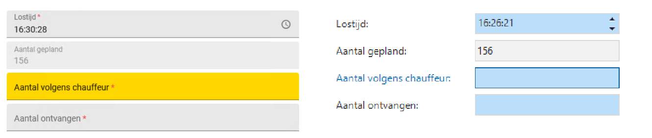
Technically I could think of a query that automagically adds the desired conditional layout for every task field where “mandatory” is set to true to easily force this but that fielss like a very dirty hack 🙄
Mainly because that is not what the conditional layout is for and it might even conflict with existing ones….

Did this topic help you find an answer to your question?

5 replies

Forum|alt.badge.img+6
  • Author
  • Hero
  • 86 replies
  • May 16, 2025

Just after submitting this I noticed:


I really like ​@Bart Metselaar his example but can we do this ourselves? And if so… How?


Forum|alt.badge.img+5

An asterisk as mentioned in the new Outlined input style for the Universal GUI will not conflict with other conditional formats. But ​@Bart Metselaar keep the asterisk * red. That makes more sense


Bart Metselaar
Moderator
Forum|alt.badge.img+3

Hi ​@Alban_T, I can not give you a direct answer as to how to build colored outlines yourself. But what is the timeframe you are working with? The form field restyling will become a reality in the future. Is it something worth waiting for, instead of putting in a lot of work which may become obsolete?

@avandervelden, that was definitely my first thought. However, since we’ve introduced a lot more color in the forms, I am afraid that deviating from the Main theme color and introducing another color only for asterisks may distract users. 

Red is often used, but other colors are also optional, what is your point against using the main theme color for the asterisk as a mandatory field indication?


Forum|alt.badge.img+5

In my opinion using the red color for the asterisk * to indicate a field is required, is only a very small extra indication but much better than simple a *. As it is used on many sites, this is familiar for most users

And if you read the above sentence, the red * will immediately stand out, and not the one in main color.


Forum|alt.badge.img+6
  • Author
  • Hero
  • 86 replies
  • May 20, 2025
Bart Metselaar wrote:

Hi ​@Alban_T, I can not give you a direct answer as to how to build colored outlines yourself. But what is the timeframe you are working with? The form field restyling will become a reality in the future. Is it something worth waiting for, instead of putting in a lot of work which may become obsolete?


Hi ​@Bart Metselaar, no immediate hurry.
My primary concern now it to get all our TW applications correctly running in Universal in order to get some key users test them.
But I suspect that this will be one of the points the key users will ask for so I want to at least be able to tell them that that is being worked at.


Cookie policy

We use cookies to enhance and personalize your experience. If you accept you agree to our full cookie policy. Learn more about our cookies.

 
Cookie settings