Solved

Universal GUI reserves to much room for prefilters

  • 24 August 2023
  • 5 replies
  • 126 views

Userlevel 1
Badge +4

Hello,

we have a group of prefilters that prefilter the status of a purchase order. As you can see in the image, the prefilters would easily fit in the top bar above the list. However, the prefilters are not shown here. 
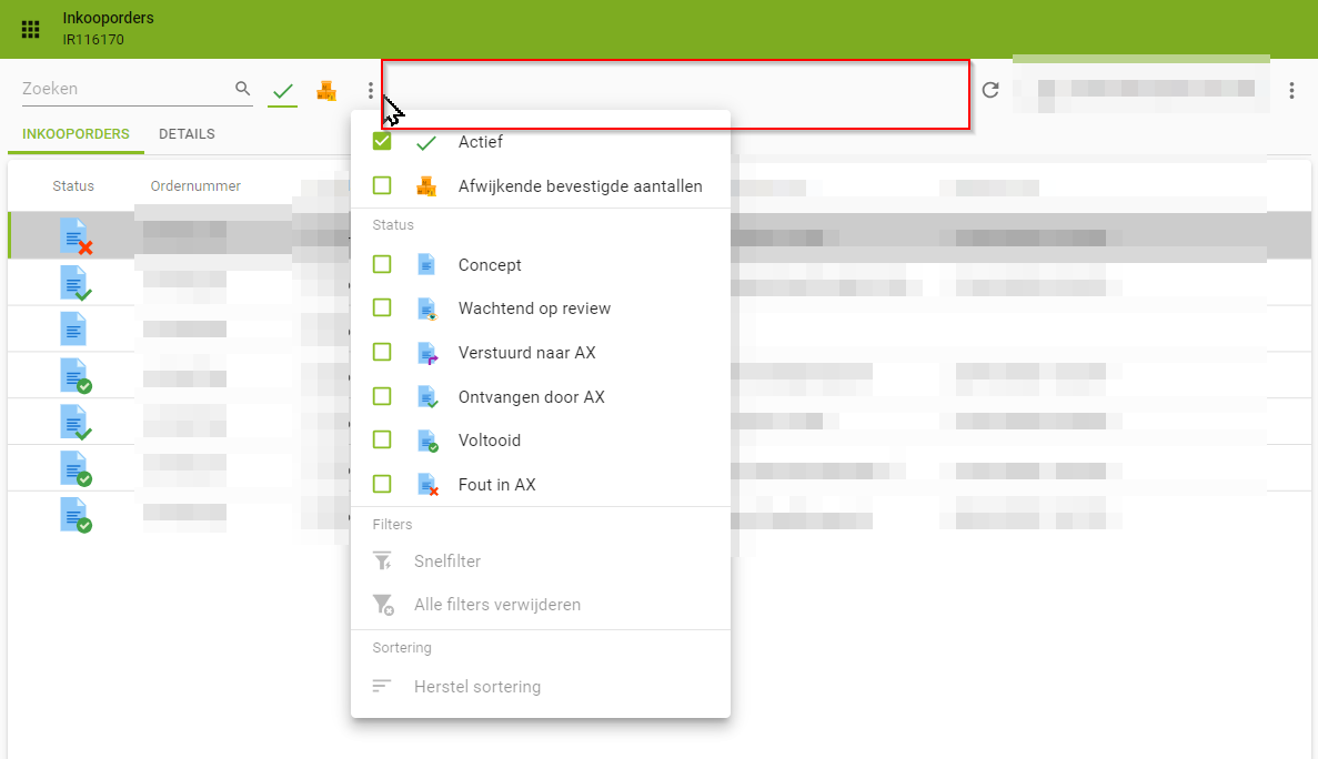
When we make the screen a little bit wider however, the prefilters are displayed as expected.
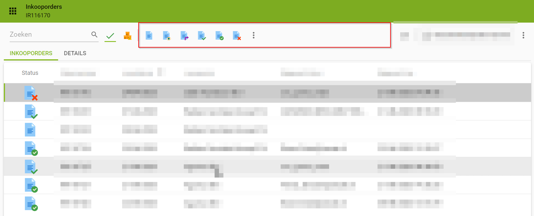
Is this considered a bug or is there any way a developer can influence this behaviour via the SF?

Thanks in advance.


icon

Best answer by Peter Verwijs 31 August 2023, 10:54

View original

This topic has been closed for comments

5 replies

Userlevel 1
Badge +4

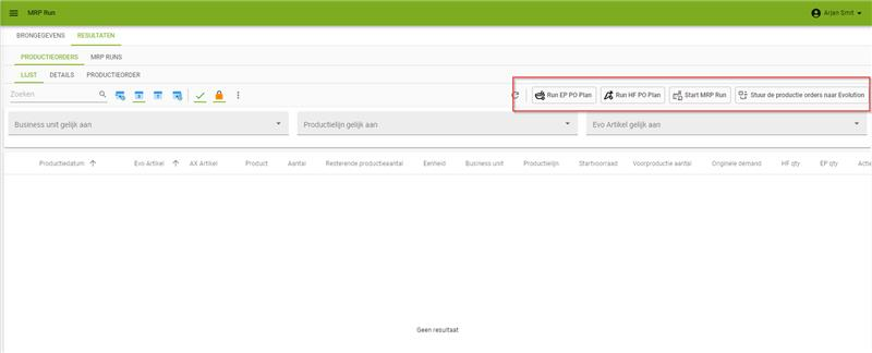
Same goes for tasks by the way. We have set our tasks to display type ‘icon and text’. when the list is empty, the tasks are shown normally:

But when the list contains data, the tasks lose their text. 

Is this also considered a bug or is this the expected behaviour? it looks to me like there is enough space to show the text...

Userlevel 1
Badge +4

hello,

is there any idea how this is supposed to work and whether this is a bug or intended by design?

Thanks.

Userlevel 3
Badge +2

Hello Bram,

This is a known issue. Sometimes the items on the action bar reserve too much space and therefore get pushed to the overflow menu. We have a ticket for this on our backlog, but right now I sadly can’t give an exact date when we expect this to be fixed.

Userlevel 1
Badge +4

Hello. Is this already solved or do you have any idea when we can expect this to be solved? 


Only showing icons can be quite dangerous, as it is not always possible to display an icon that really shows what the task does and what the impact is. We always display a tooltip, but it's preferrable to actually show fixed text that is not only displayed when someone hovers over  a task.

Userlevel 5
Badge +5

Hi Bram,

Comparing the screenshots with and without data, we noticed more tasks to become available when data becomes available.

Please let me expain how the toolbar currently works:

Currently, the toolbar is static divided in 50/50% for both ends, the filter part and the CRUD + task/report part. We've an item on the backlog to make this static allocation of the available space more dynamic.

In this case the total width of all tasks including their text is going just over the available space for the task part resulting in collapsing them by stripping the text.


If the task appearance it this important and you don't want to be dependent of the screen resolution of the user (which you may not always know), I would advise you to put the task in a separate bar elsewhere on the screen to create more room for them.

Note: you can also play around with the "Display Type” field in Table Tasks/Reports in the SF. This way you can make some tasks more important than others by including the text or not. This is available in platform version 2023.2 and in 2023.3 we've added more options.

I hope this gives you some options to work around this problem.

Best regards,
Erik Brink