What can we do to make forms in Universal look a little more perfect?

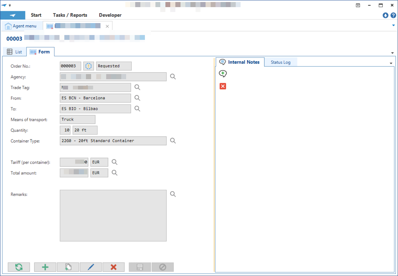
Fields should be arranged and sized like the Windows GUI does.

What can we do to make forms in Universal look a little more perfect?

Fields should be arranged and sized like the Windows GUI does.

Best answer by Mark Jongeling
Hi Harm,
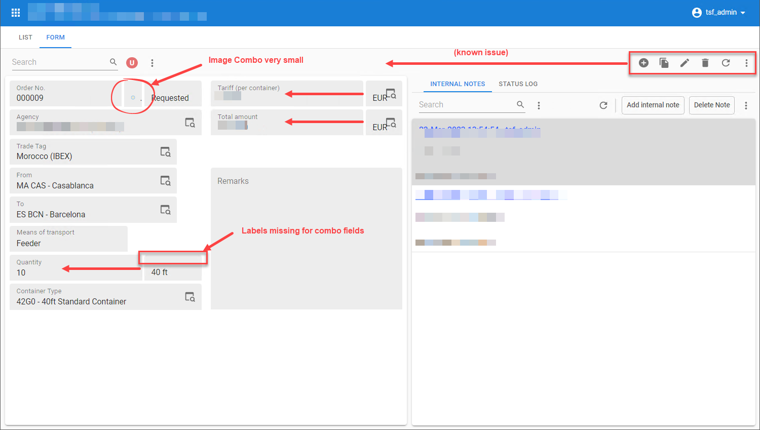
About the label missing, when you specify that the label width is 0, the label will not be shown in both GUI's. You can try setting it to 1 and see if that resolves the issue whilst still looking as intended in the Windows GUI.
About the sizing, that is how it is currently done. The complete width of the Form-column will be divides between the fields that are assigned to that place. In case of two fields, based on the given label and field widths, a percentage will be calculated. We do have a User story on this sprint to revise this a little and indeed make it like you want it to be 😉
The image combo does indeed look quite small. I guess this has something to do with automatic padding and resizing of images. I'll ask the Universal GUI team about this.
And the buttons, like you said, we are aware of this 😄
Enter your E-mail address. We'll send you an e-mail with instructions to reset your password.