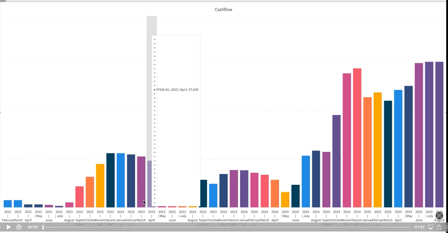
@Freddy,
I looked at the current docs, and I must admit that we could and should do better. To start off with, which ones work and not? The windows GUI had 3d charts, and those will all be mapped to a 2d version. That makes the 2d & 3d column the same setting. And all the charts that you could not model properly but were an option, have also been mapped to a column chart. Those are candle stick, gantt, point, range, scatter line, stock, swift-plot. If we were to bring them back, you would need to be able to provide more data than is currently possible.
Then it there is more thing that the Windows GUI could do, and Universal can’t. If you had a pie chart, but you would have more than 1 axis. The Windows GUI would render multiple pie charts. Universal does not yet support that. For the rest of this information, we will have to dive into it and make a good map of what happens when and add that to the documentation.
The legend you're showing in your screenshot looks like a bug to me! Could you raise a ticket?

